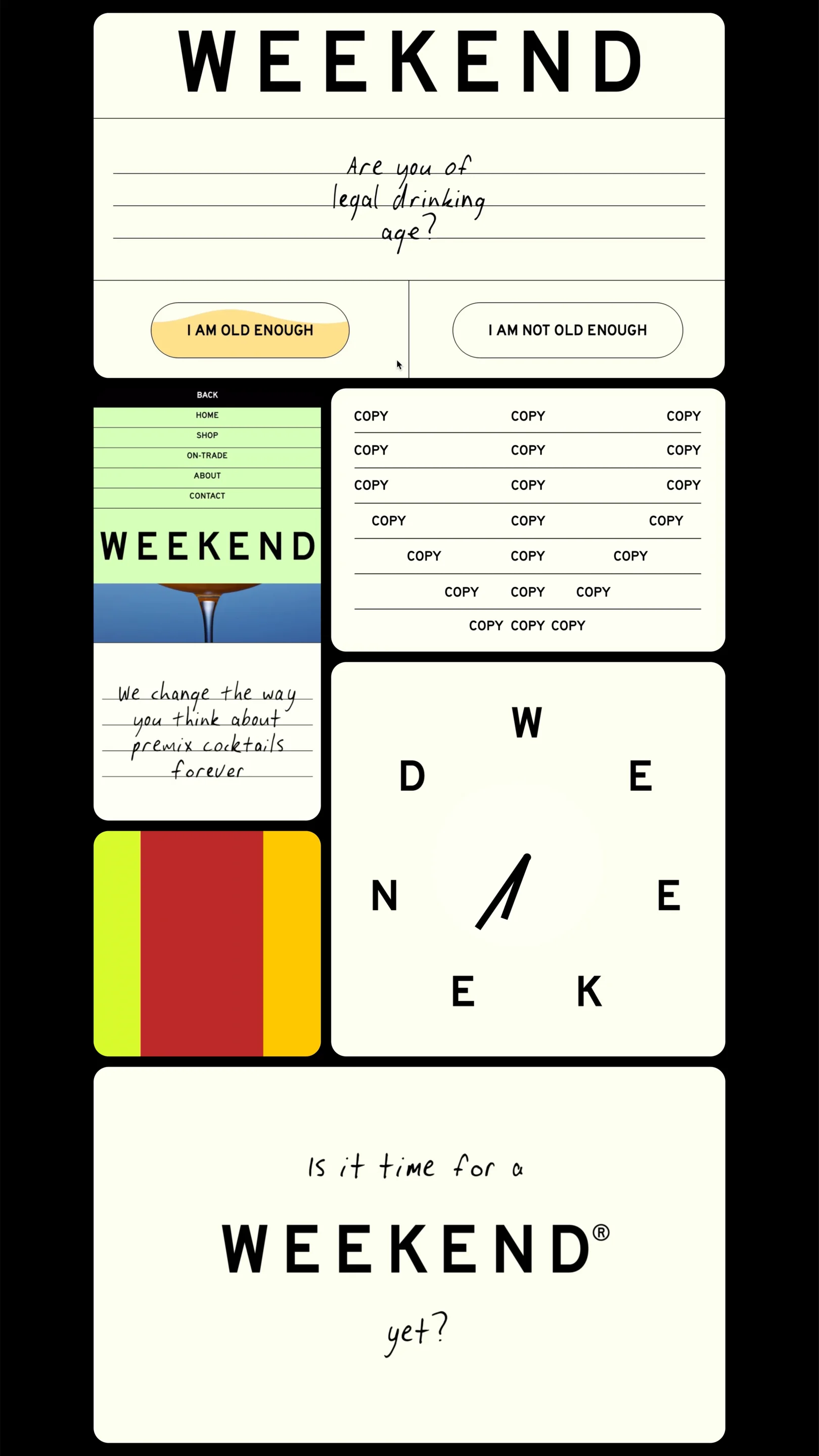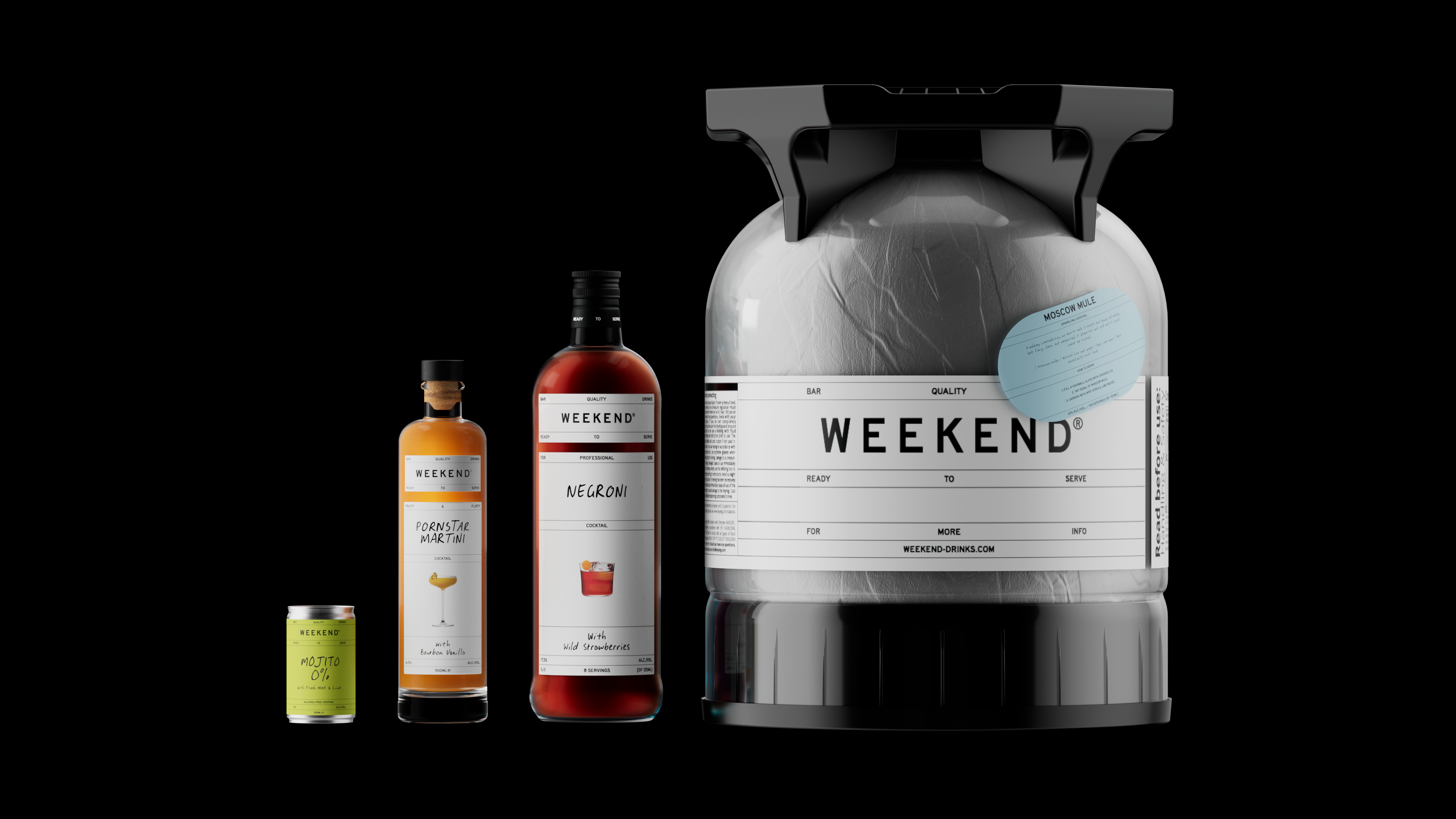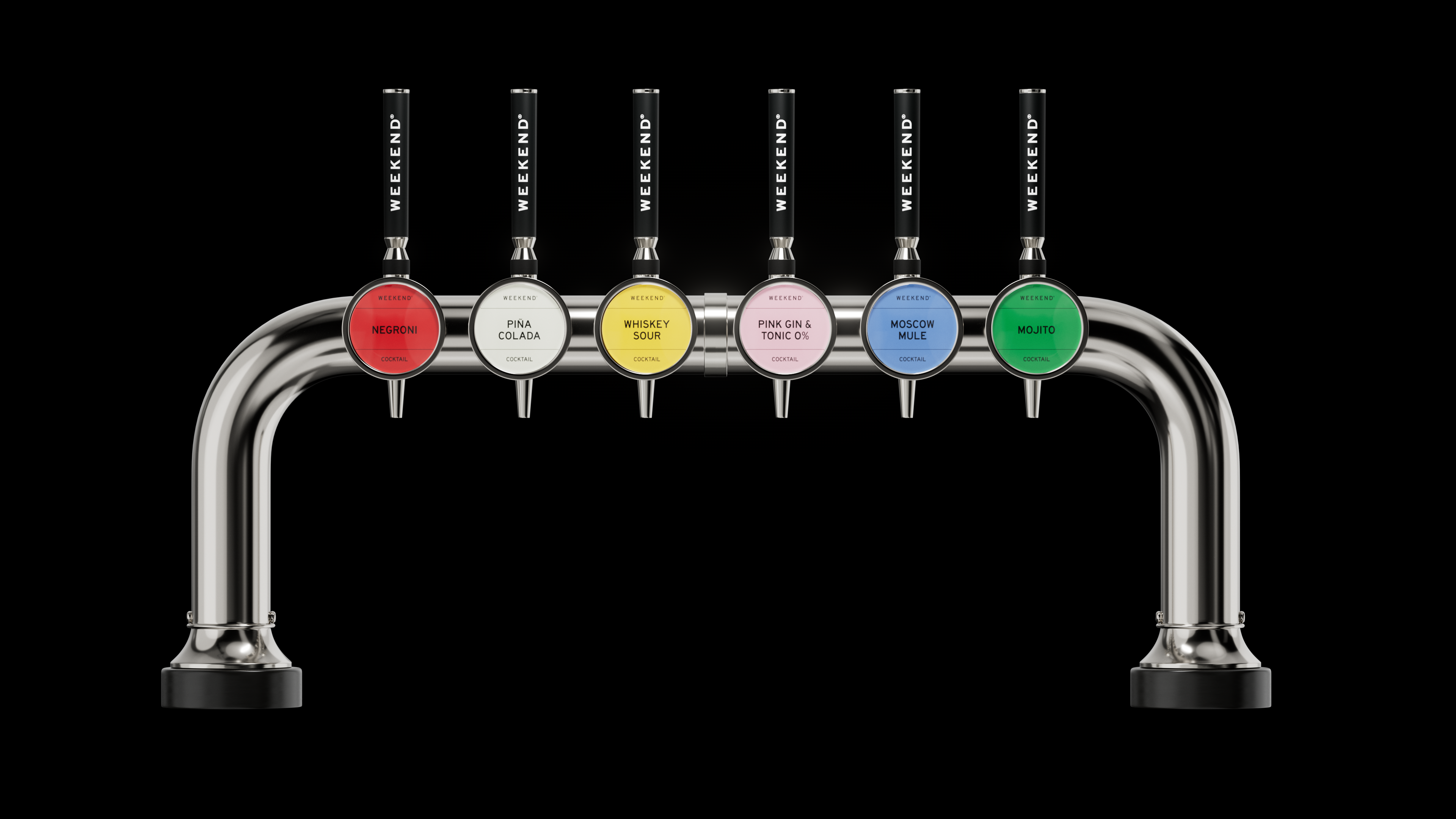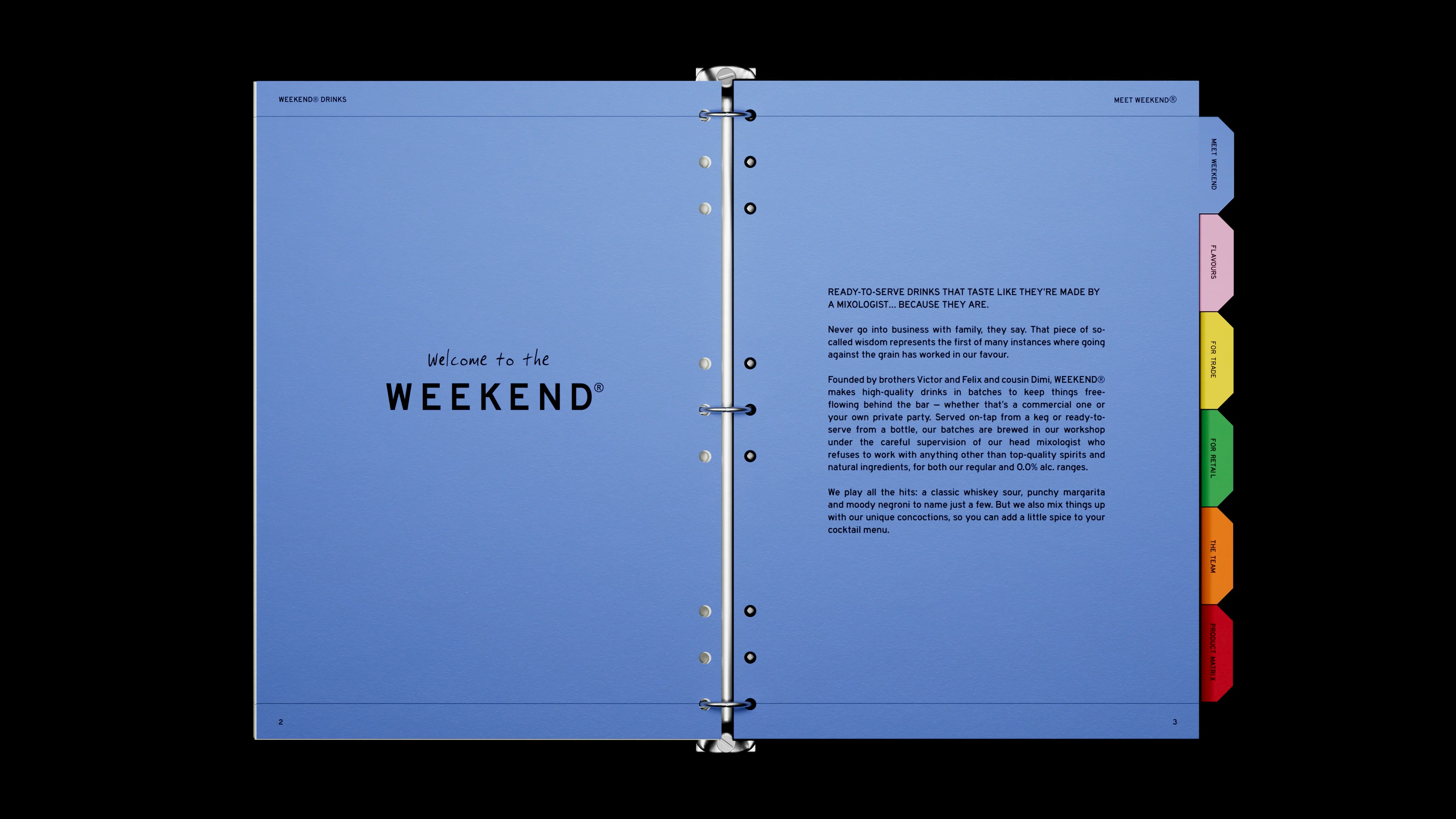
We were asked to rebrand Belgian-based “Dorst” into a more culturally relevant and impactful brand. The brand had previously functioned as a B2B brand focused on convenience and efficiency with a high-quality pre-batched cocktail-on-tap solution sold directly to bars or events. However, the company was in a growth stage, expanding production, hiring more employees and creating new products that opened up new D2C and retail audiences.
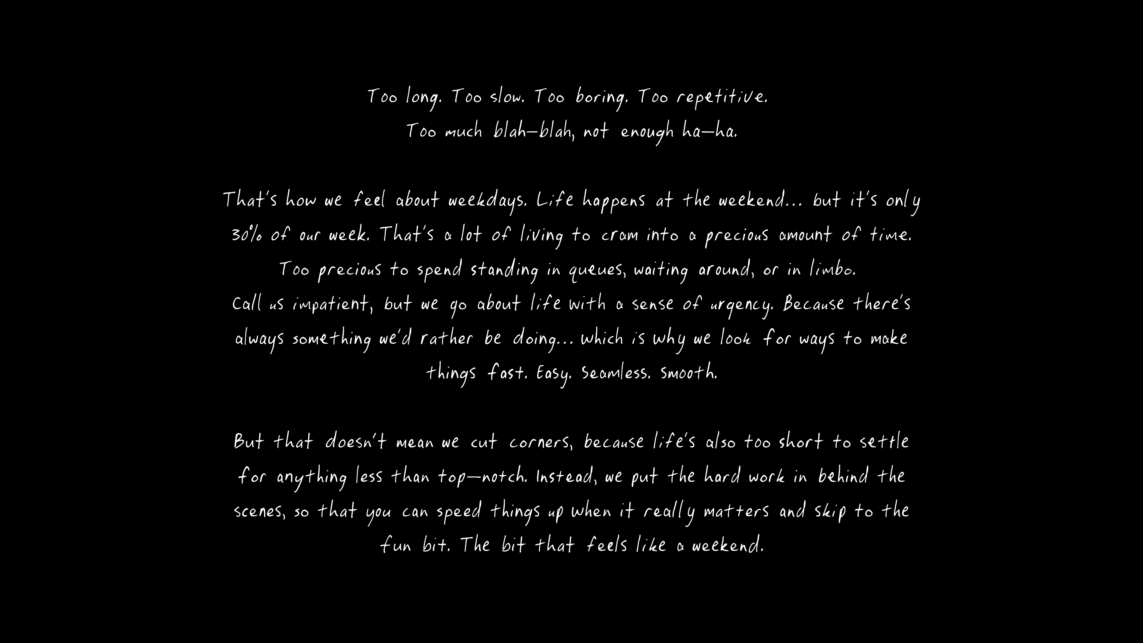
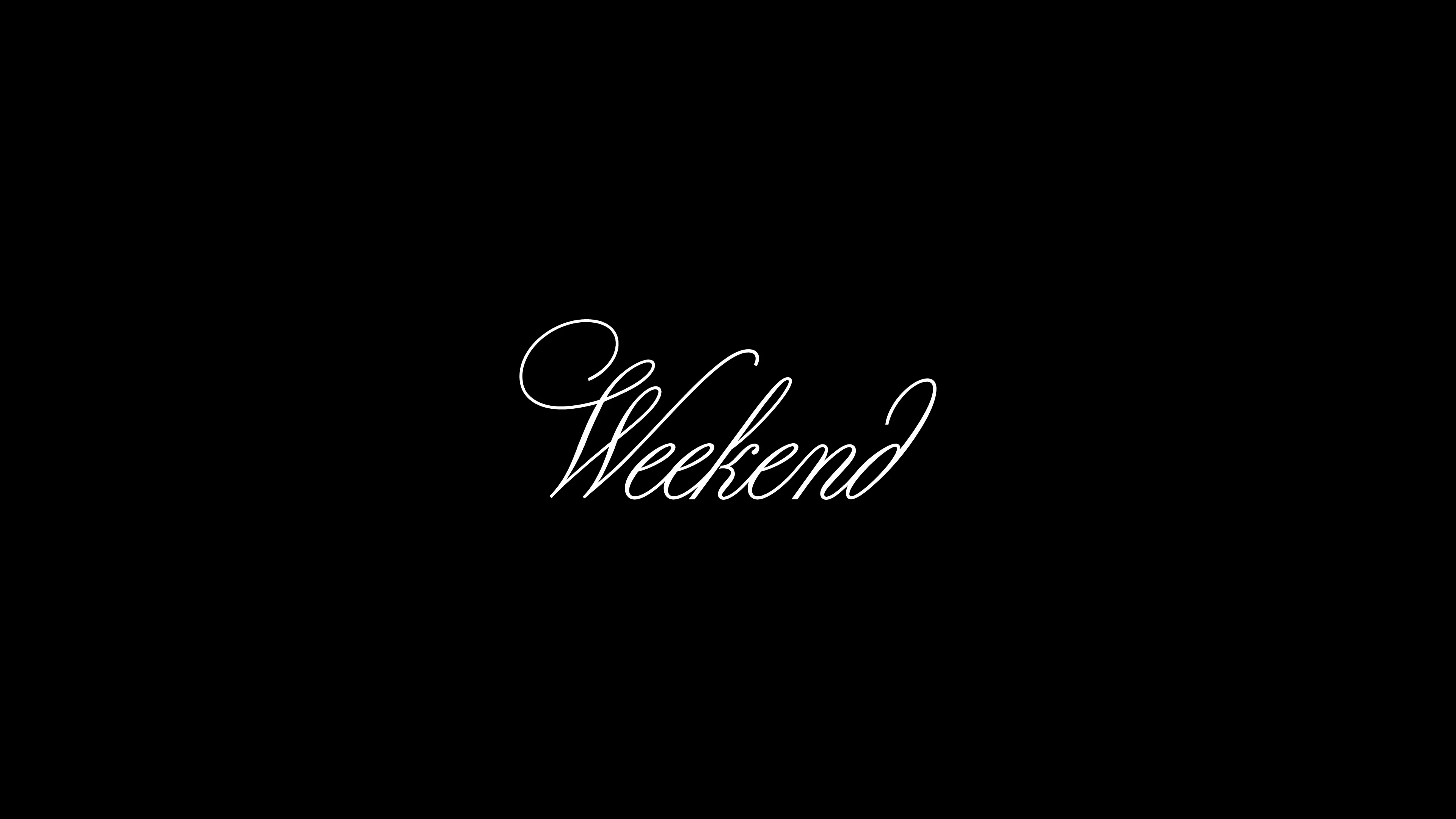
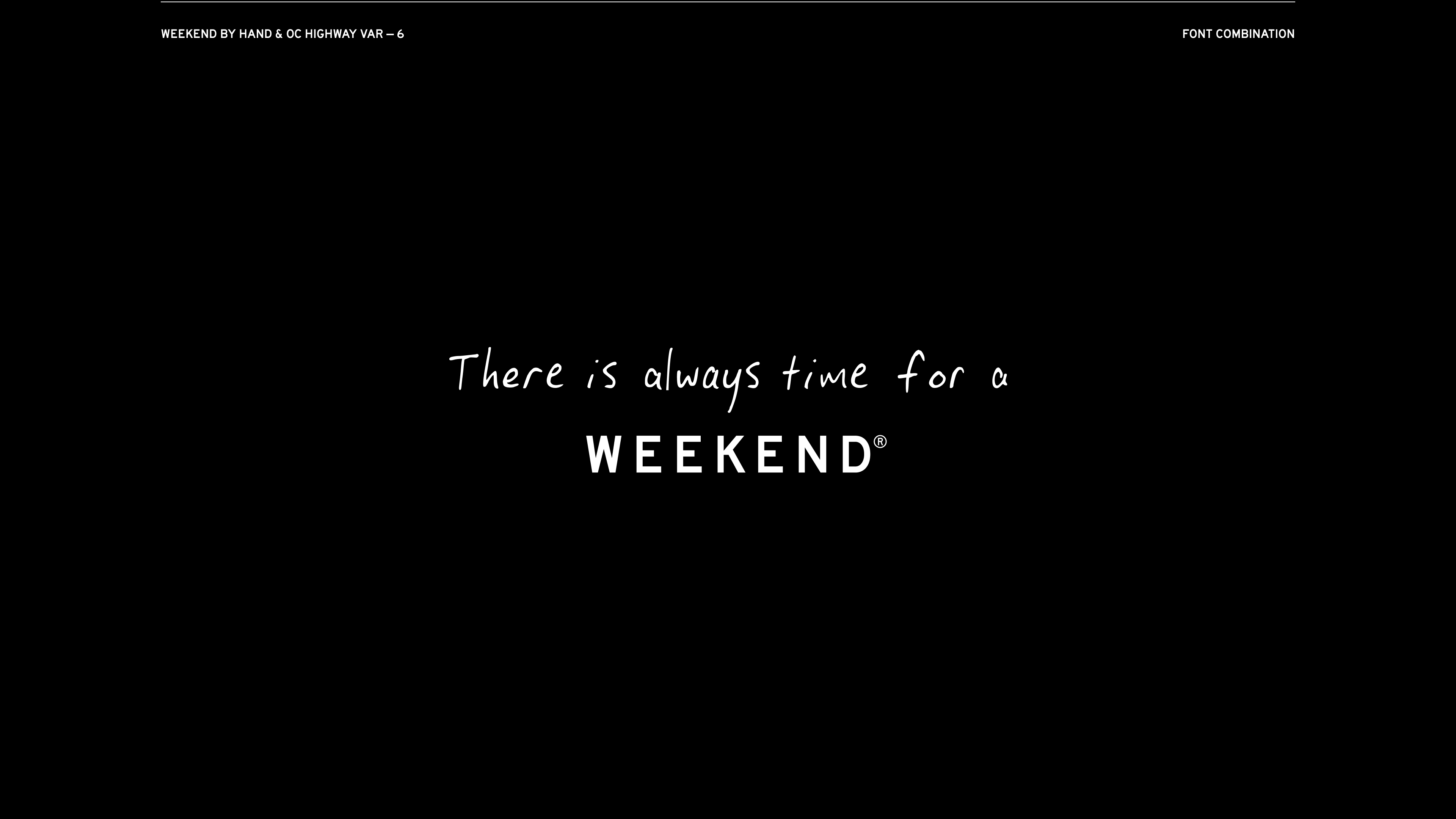
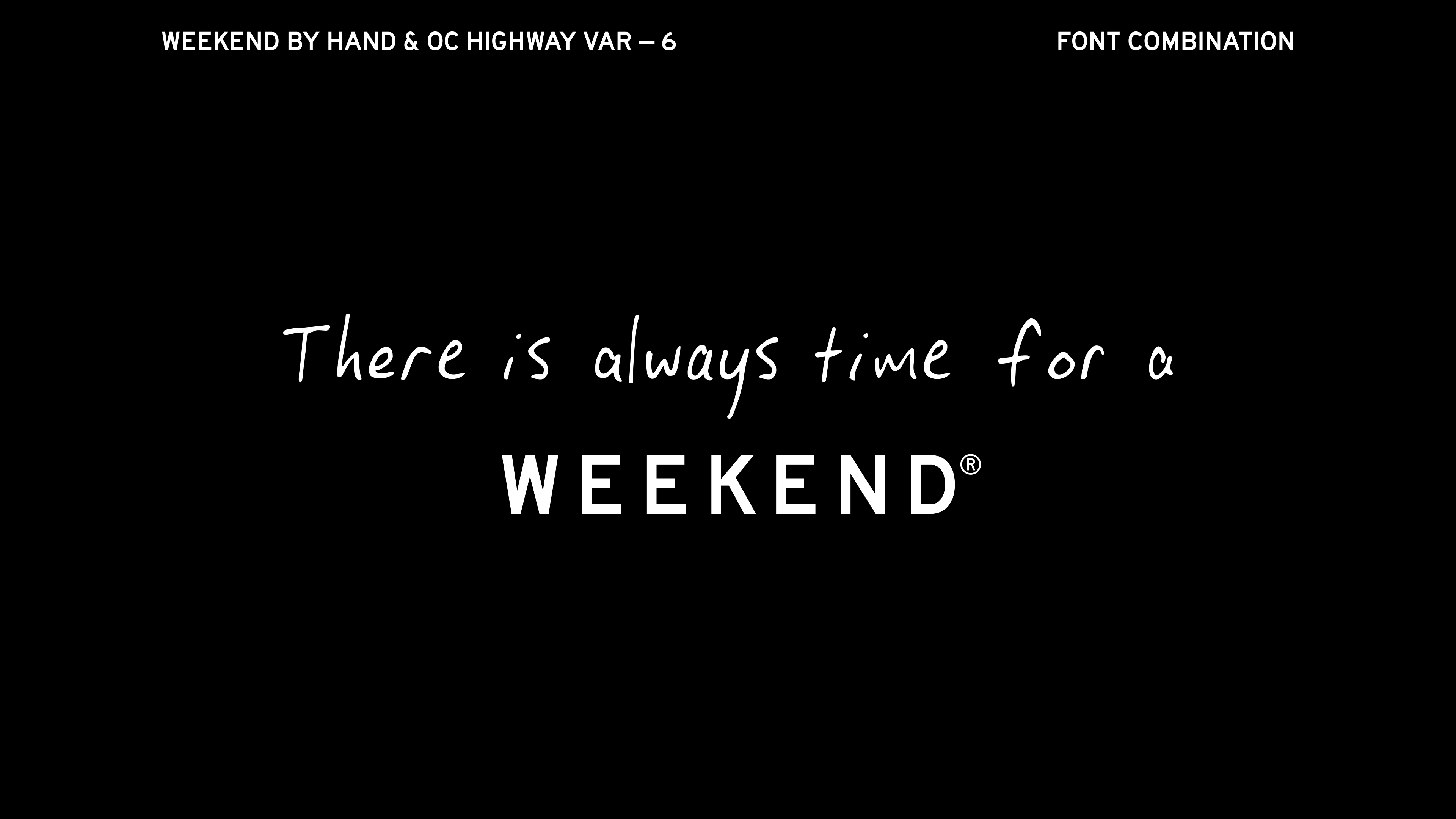
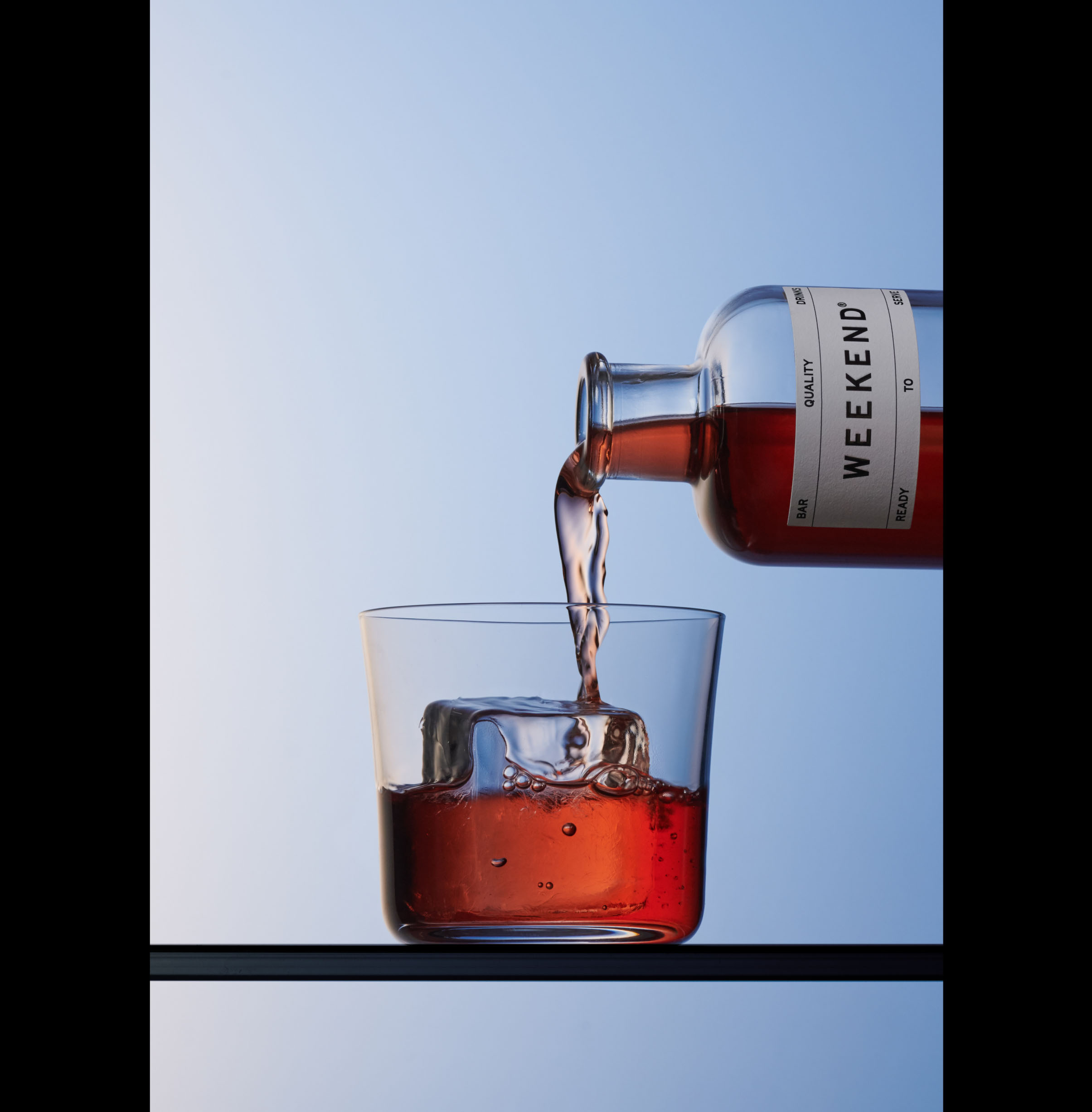
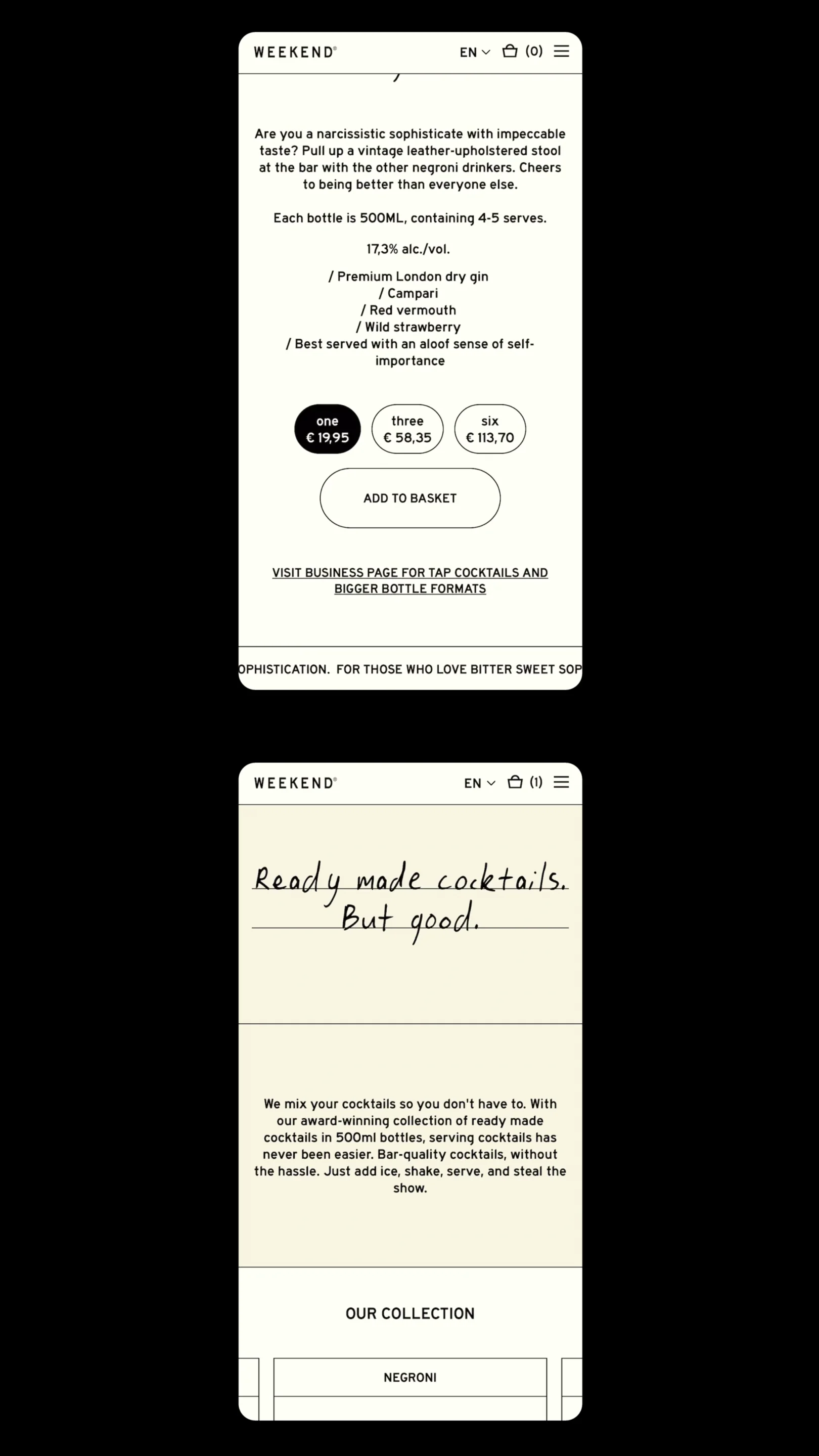
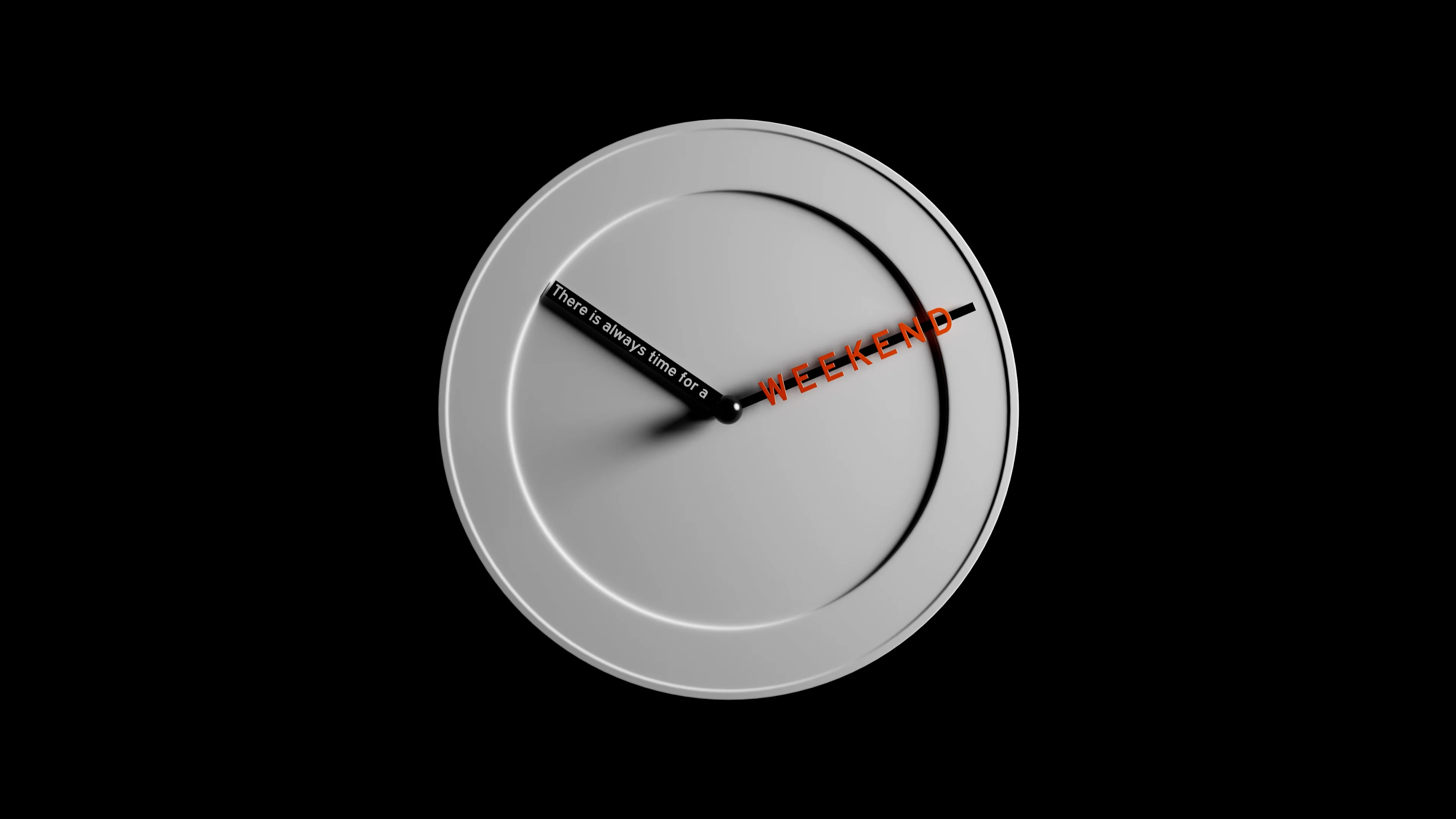
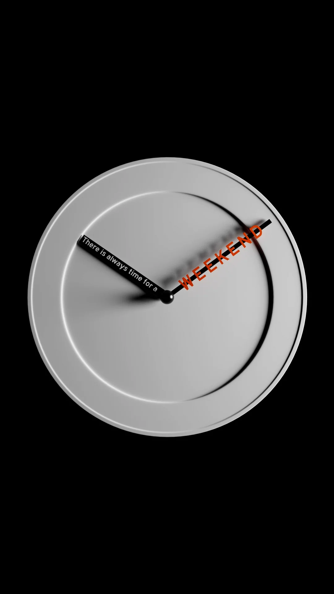
For the new name we felt strongly that we needed to go ‘feeling first’ - and find a name that focused on a more emotional and conceptual space. Initially, we explored ‘every drink is a journey’ as a basis for the new brand - however, this felt limiting, and instead of focusing on the drinks themselves, we decided to rather explore names that brought to life their brand benefits - namely convenience & ease of use. We wanted a name that captured the effortlessness that their product brings to any occasion - and thus, Weekend Drinks was born.
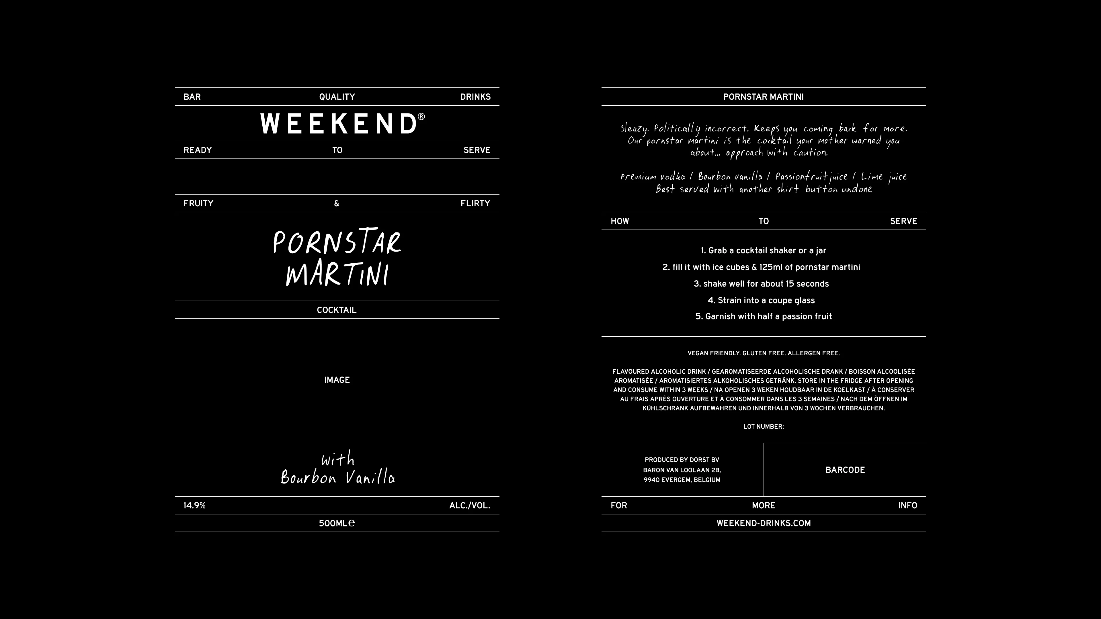
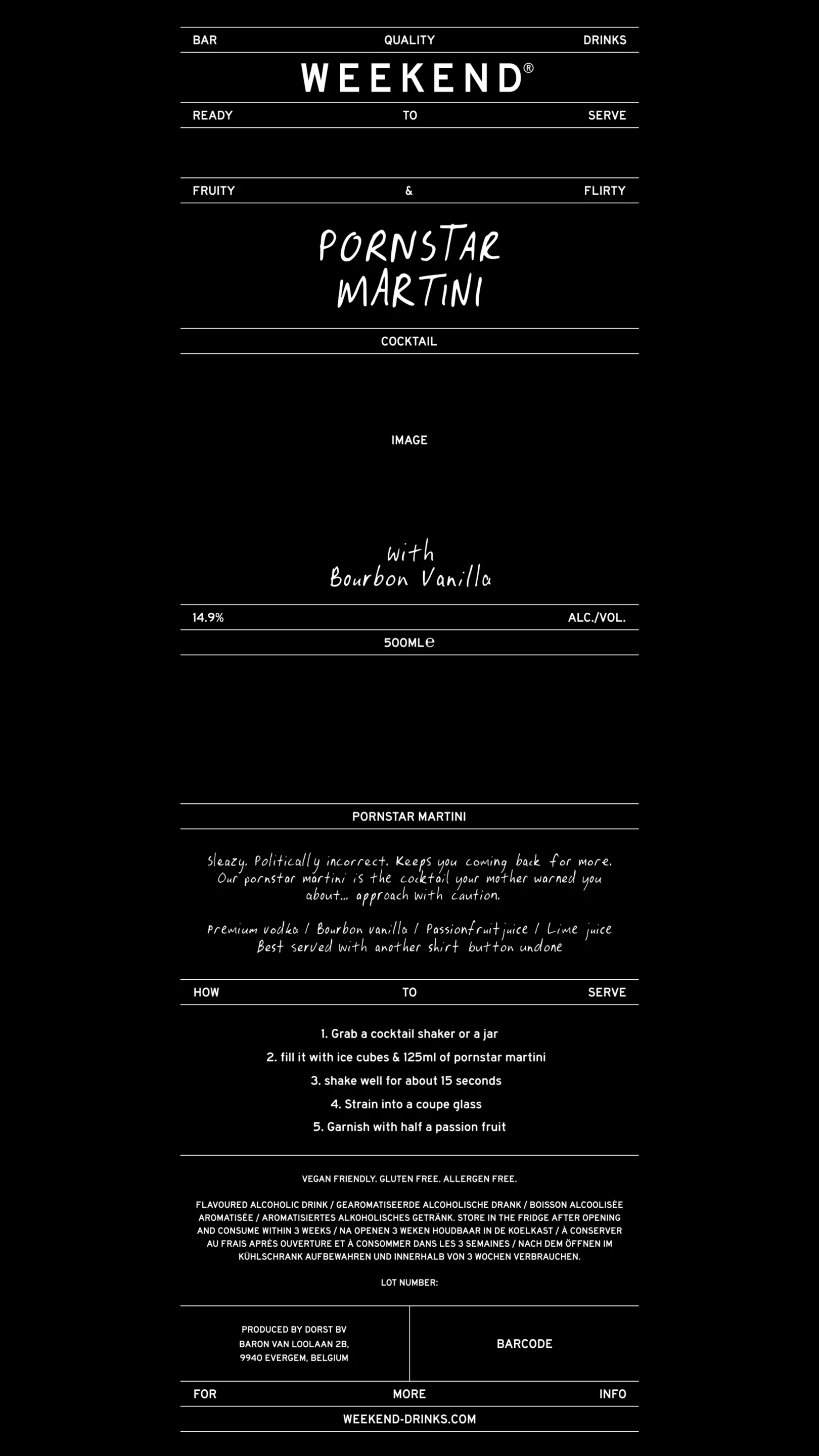
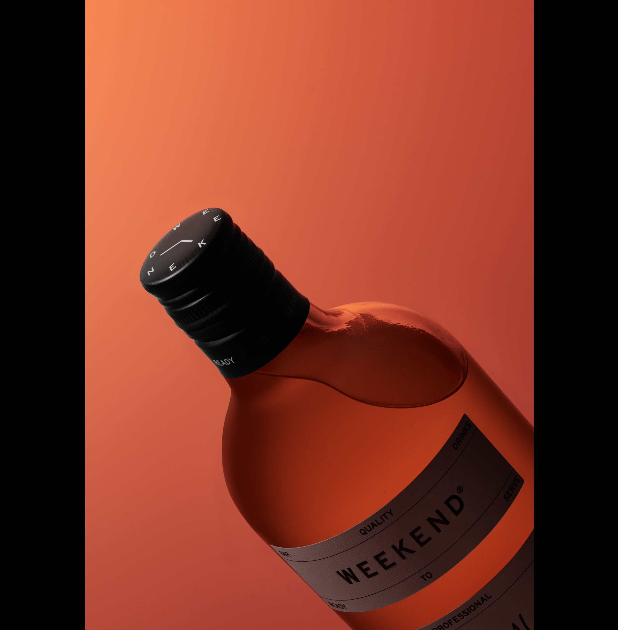
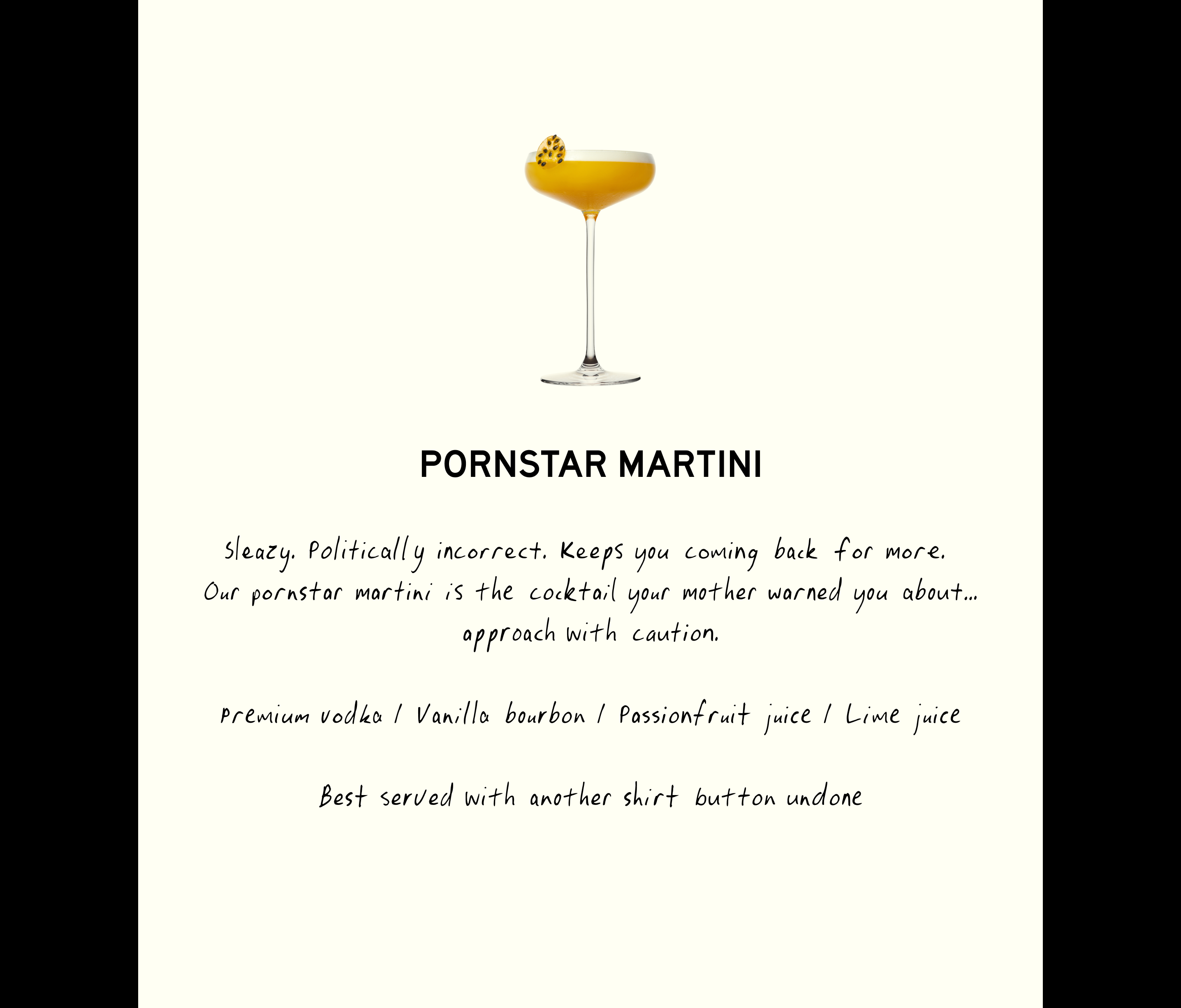
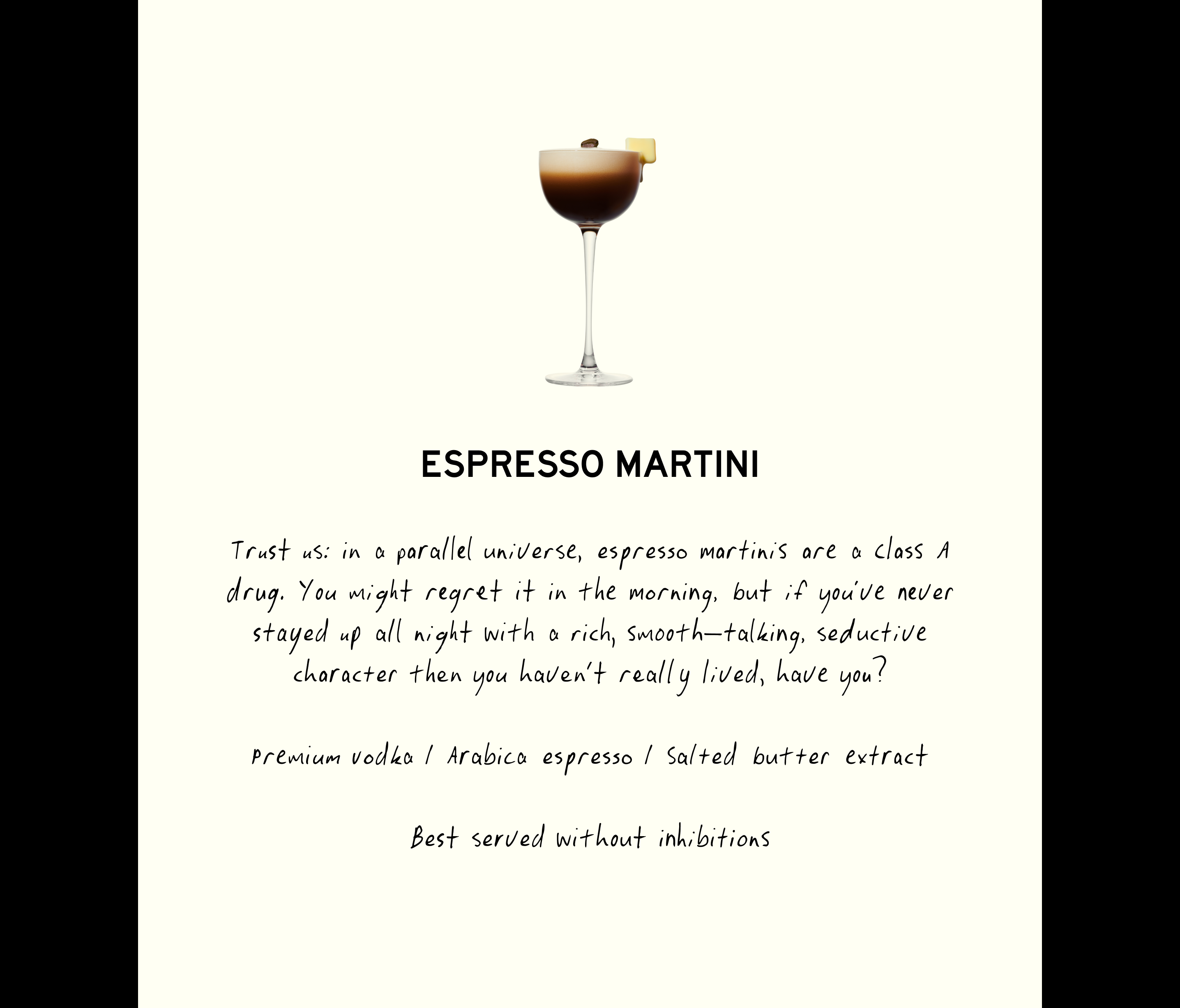
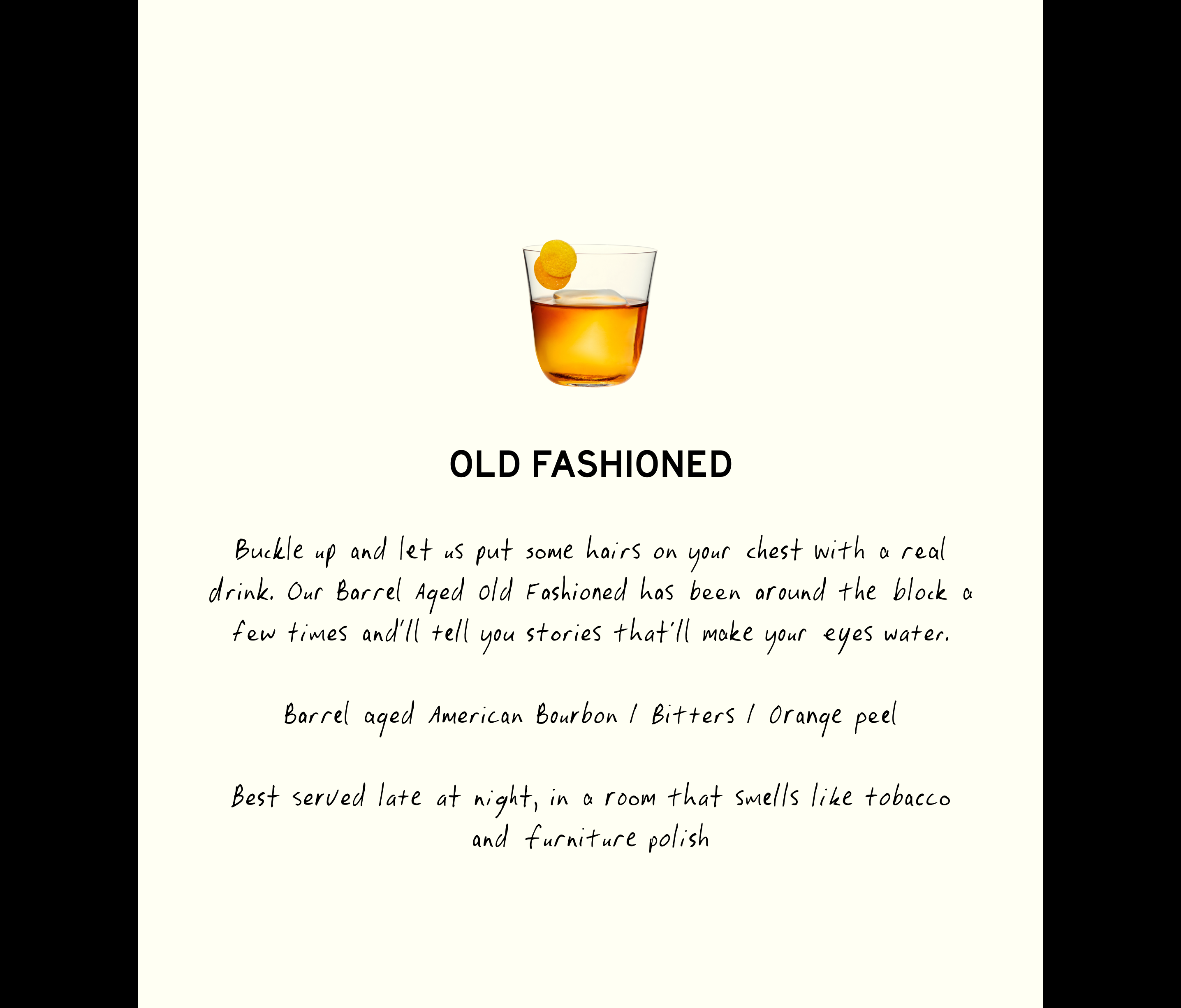
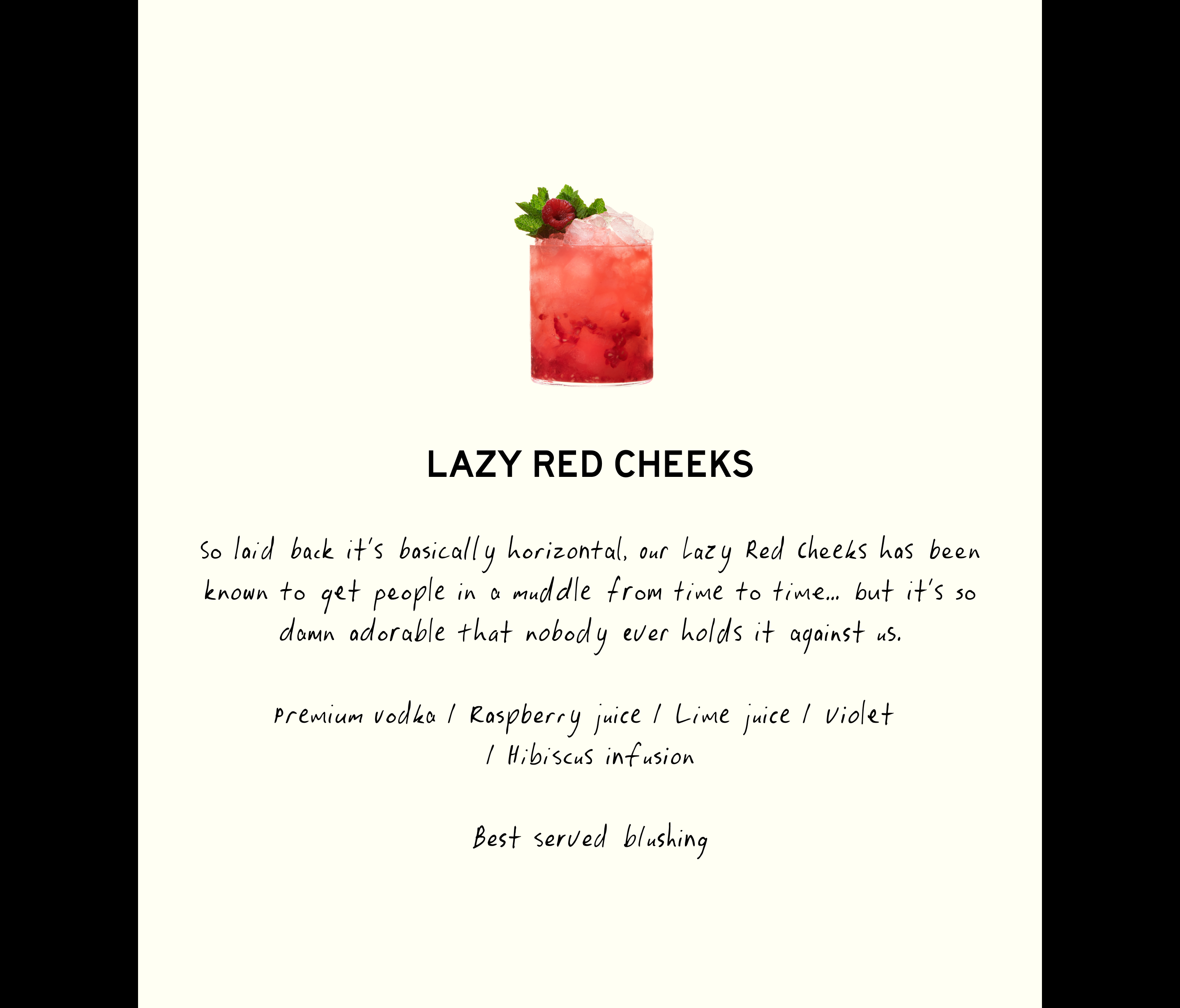
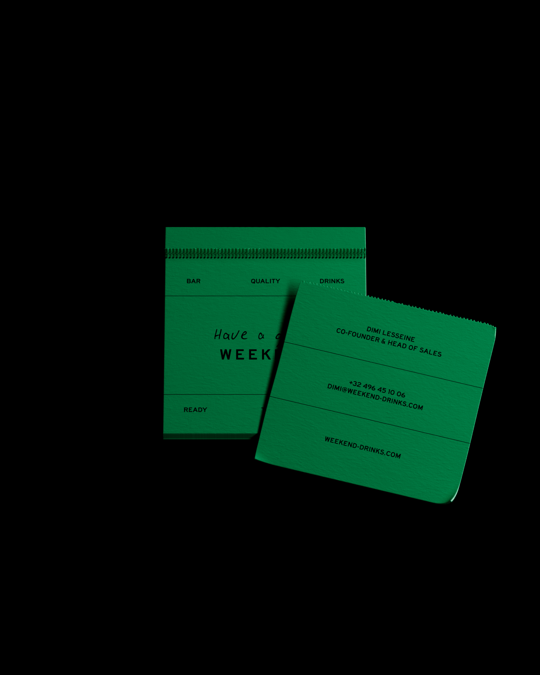
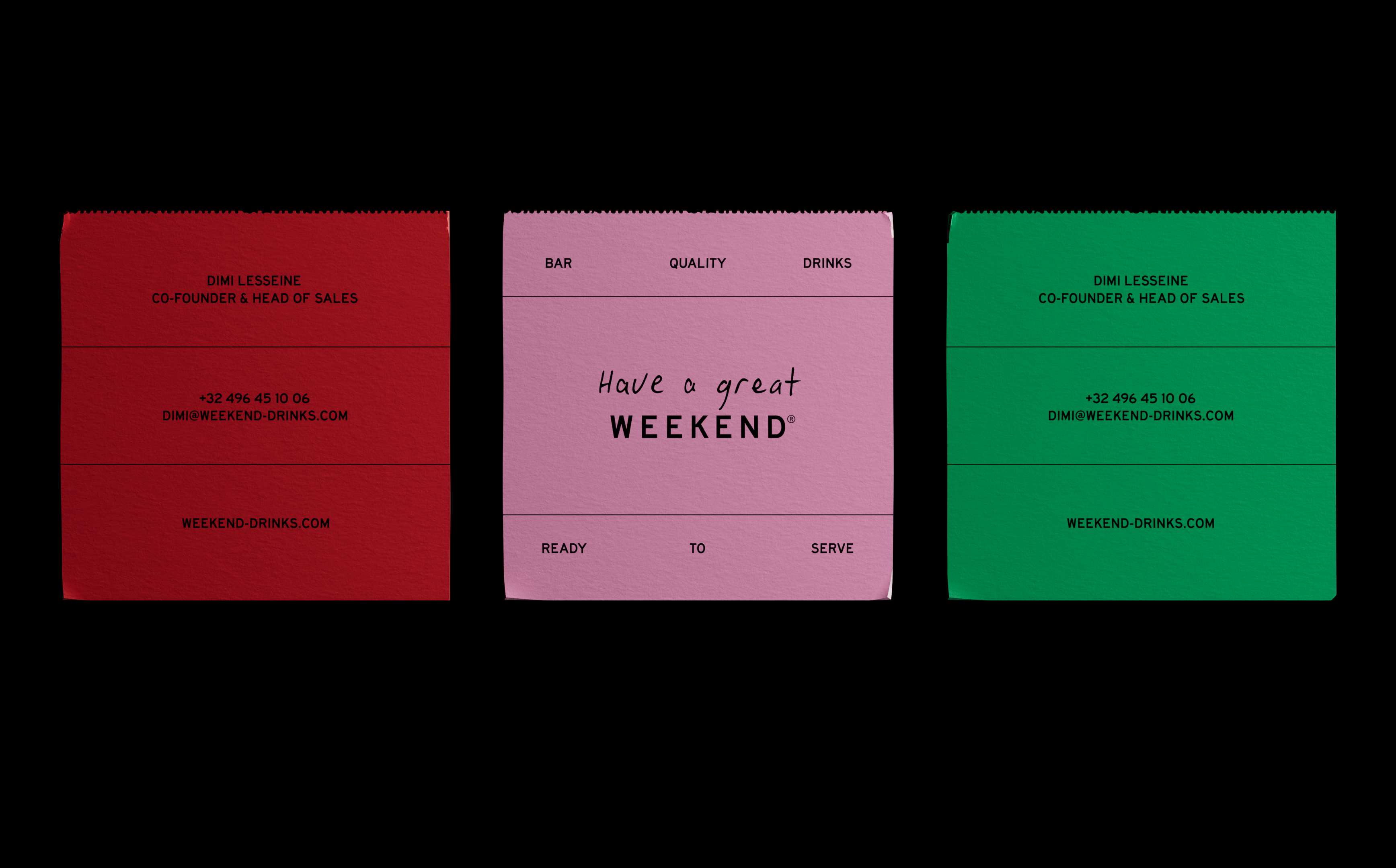
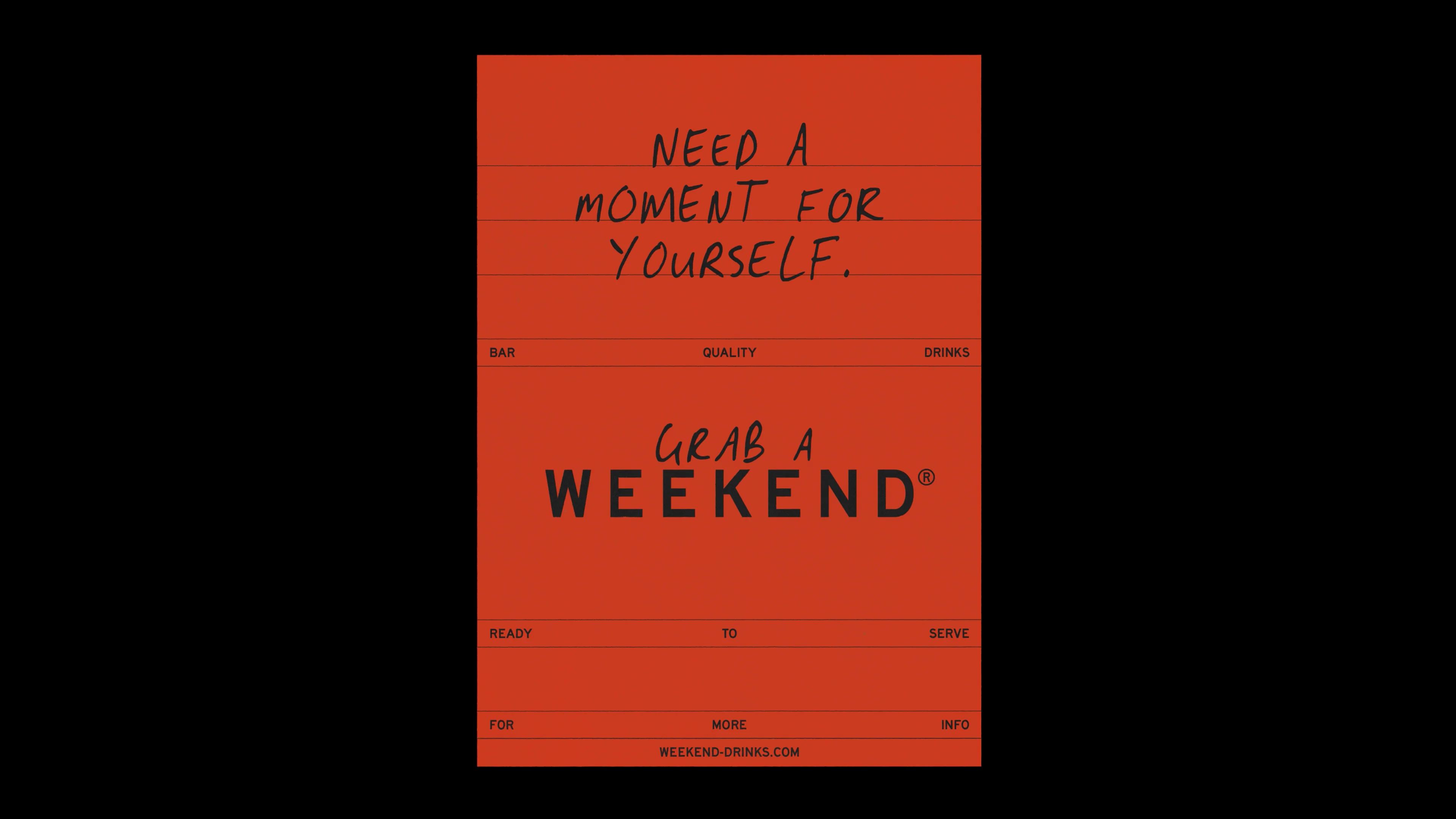
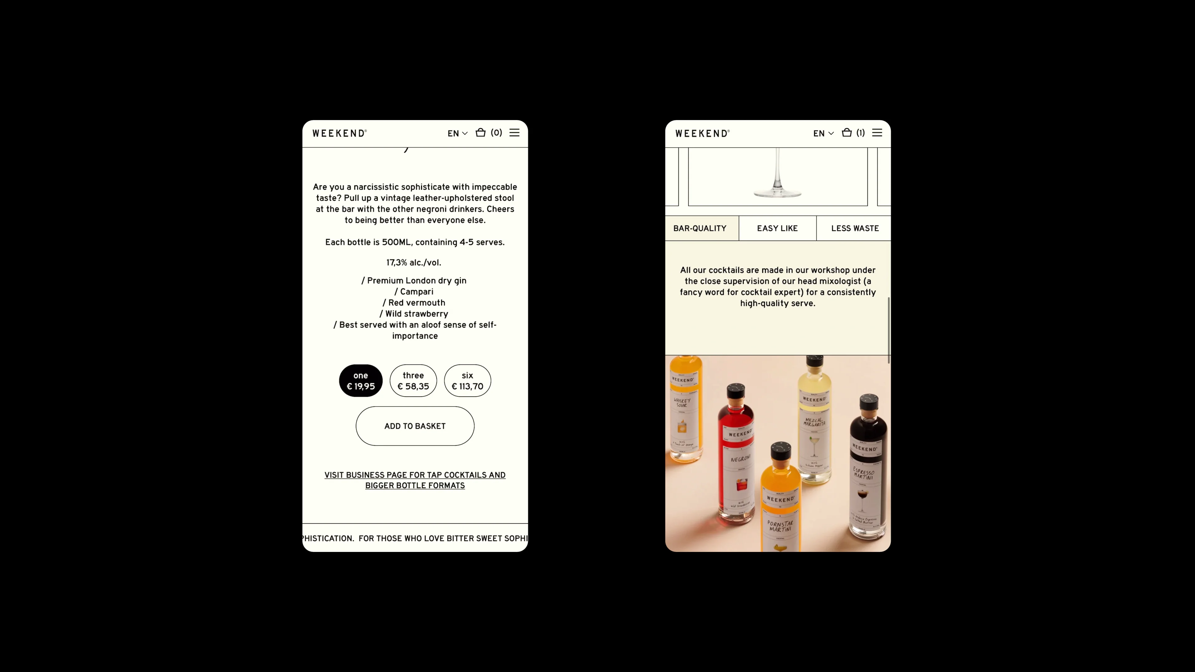
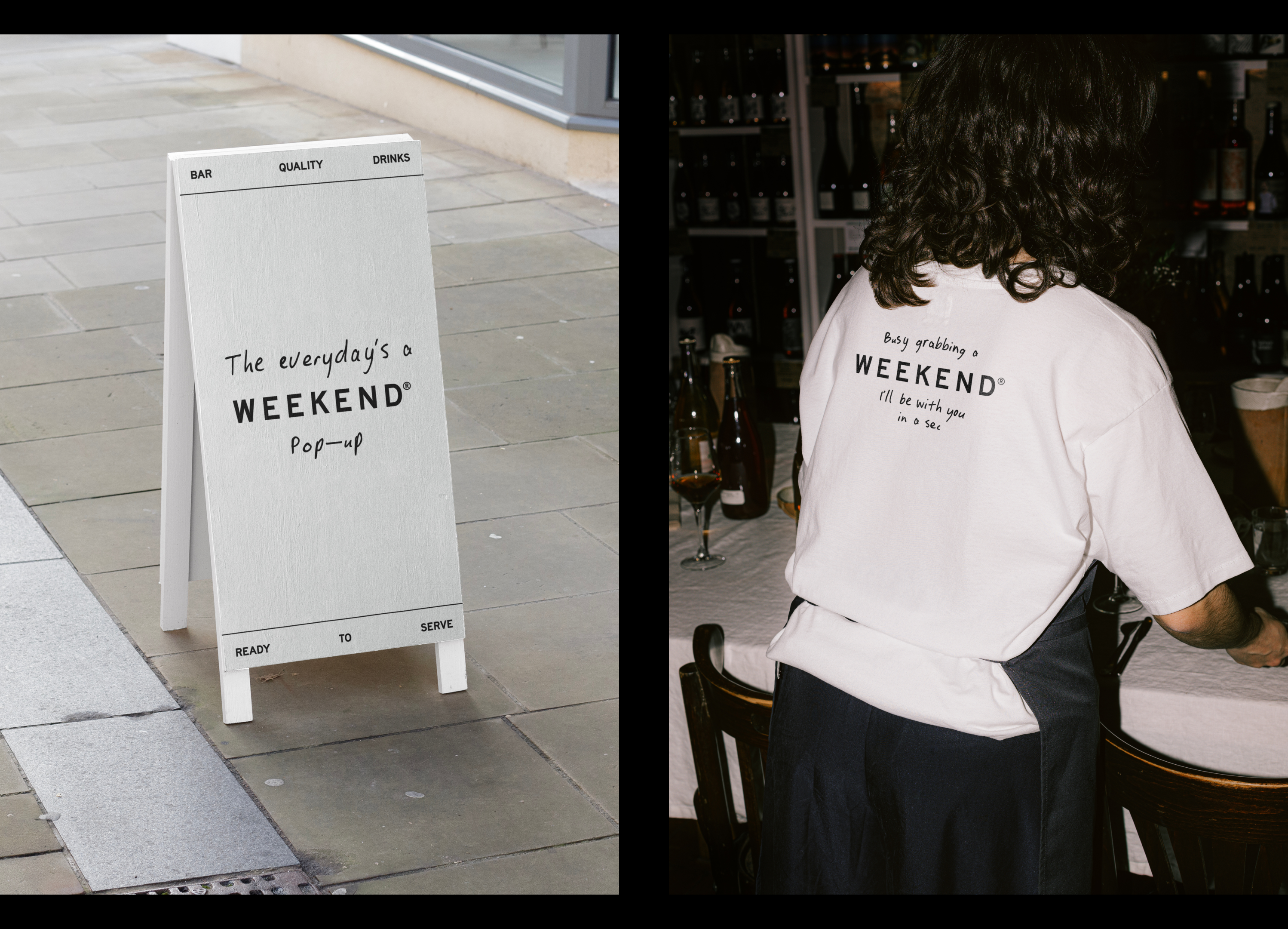
This name was supported by a succinct descriptor of "Bar quality drinks, ready to serve". Here we spotlight the artisanal touch (indicated by 'bar quality,' signifying professional-grade craftsmanship even in non-professional settings), the effortless 'ready to serve' convenience, and the potential for expansion beyond cocktails into a broader drinks category.
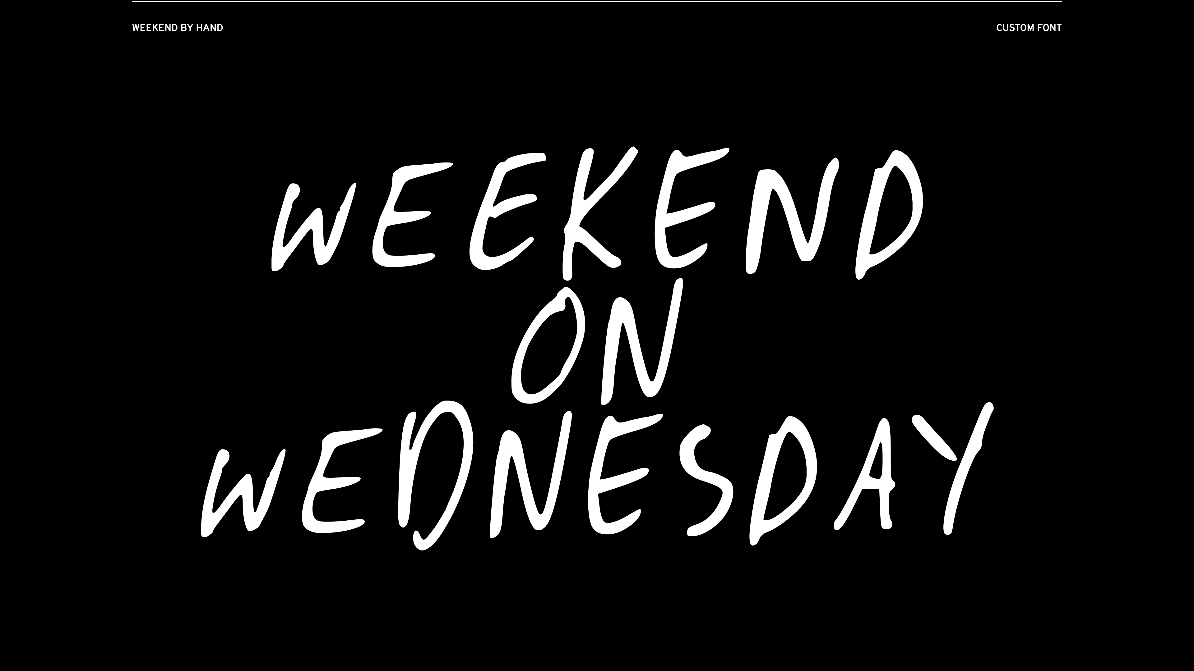
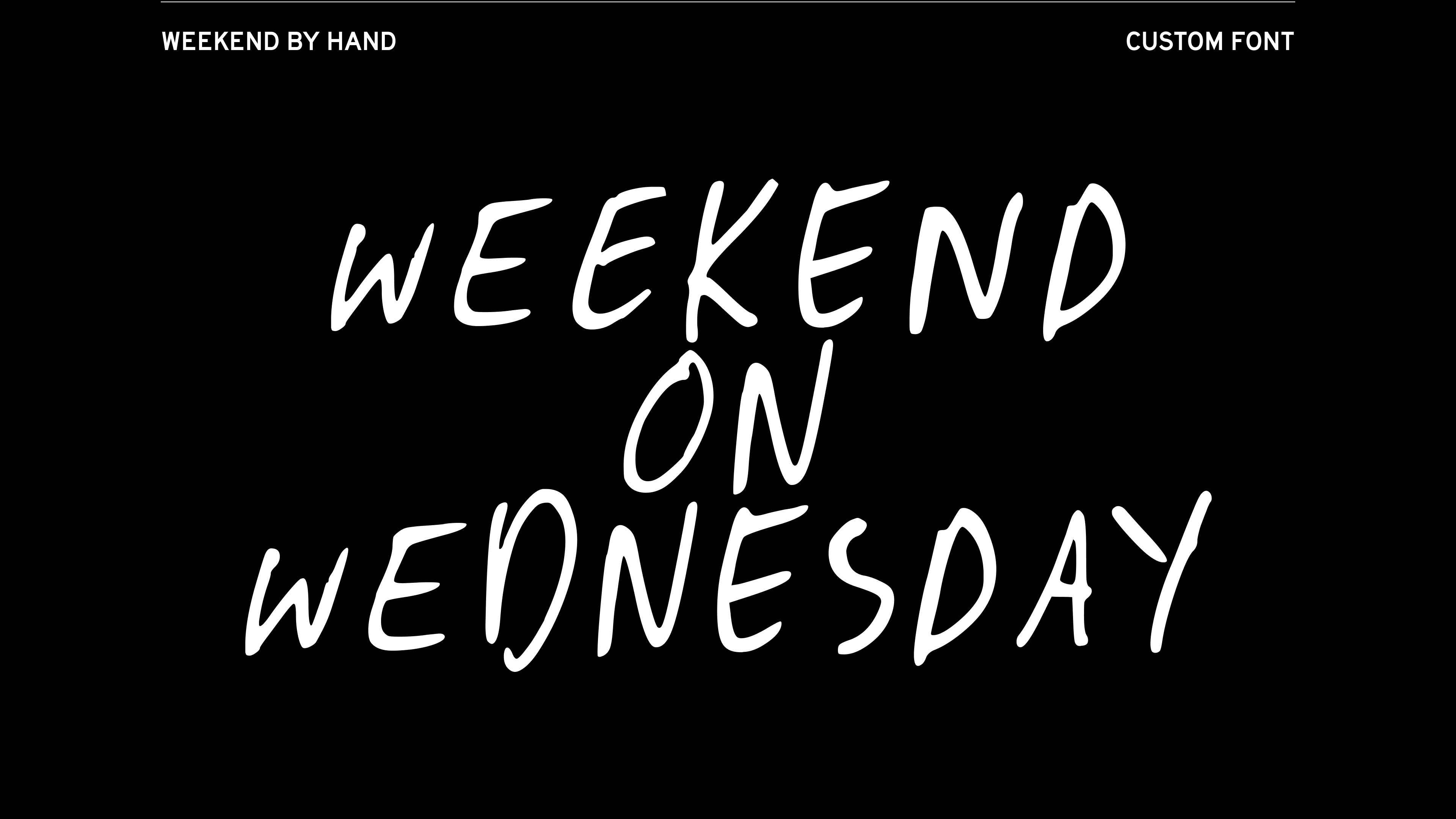
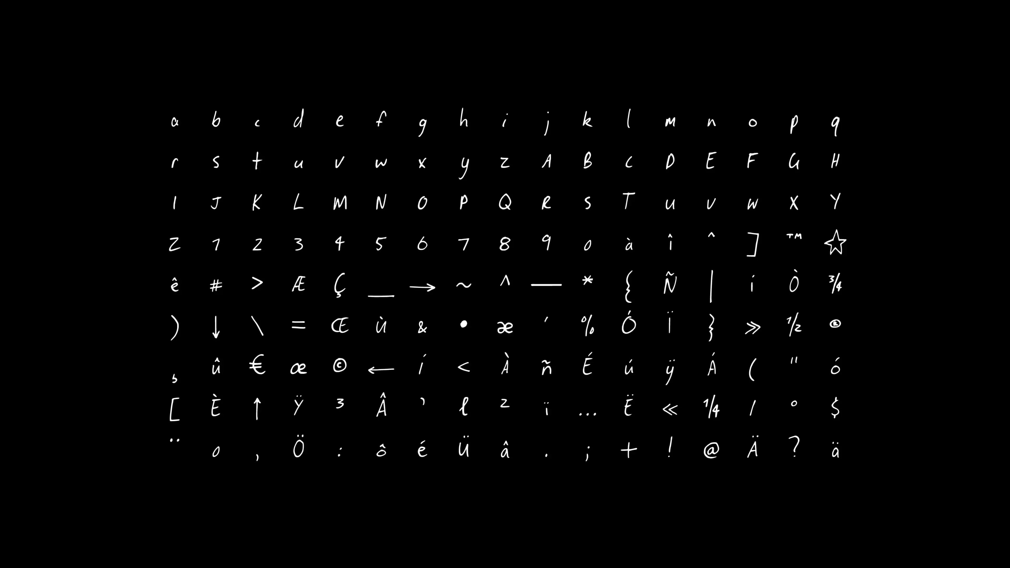
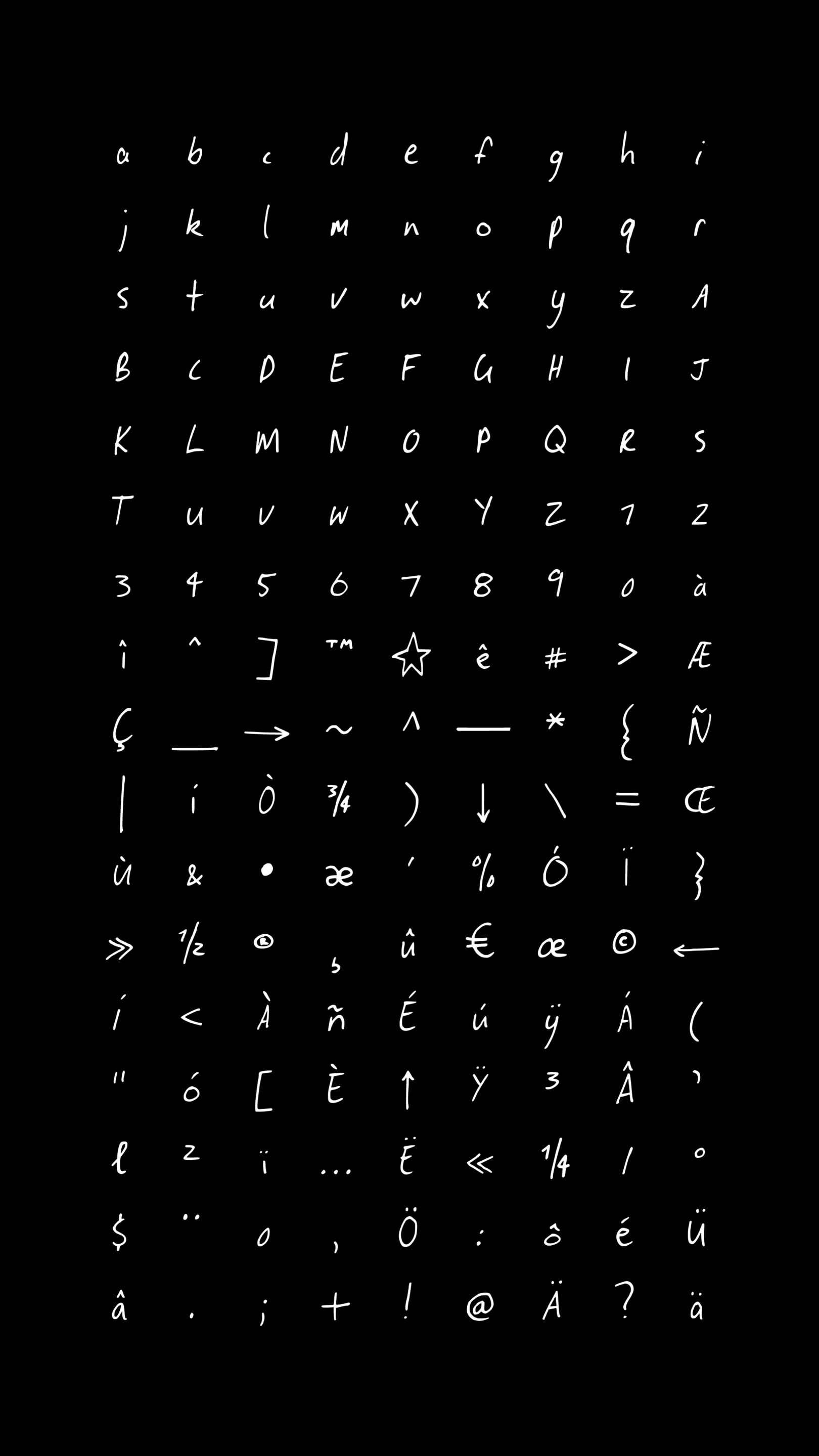
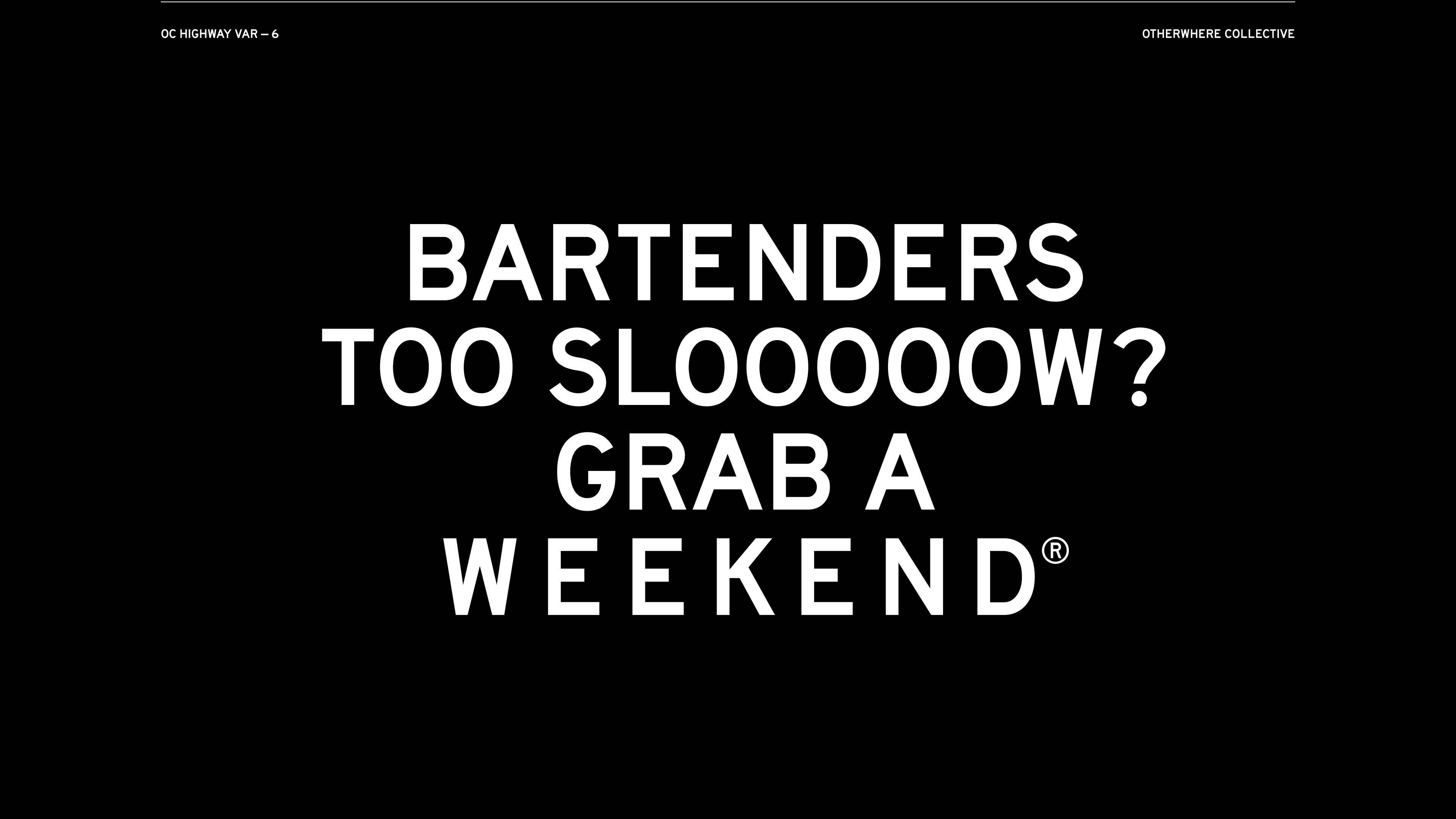
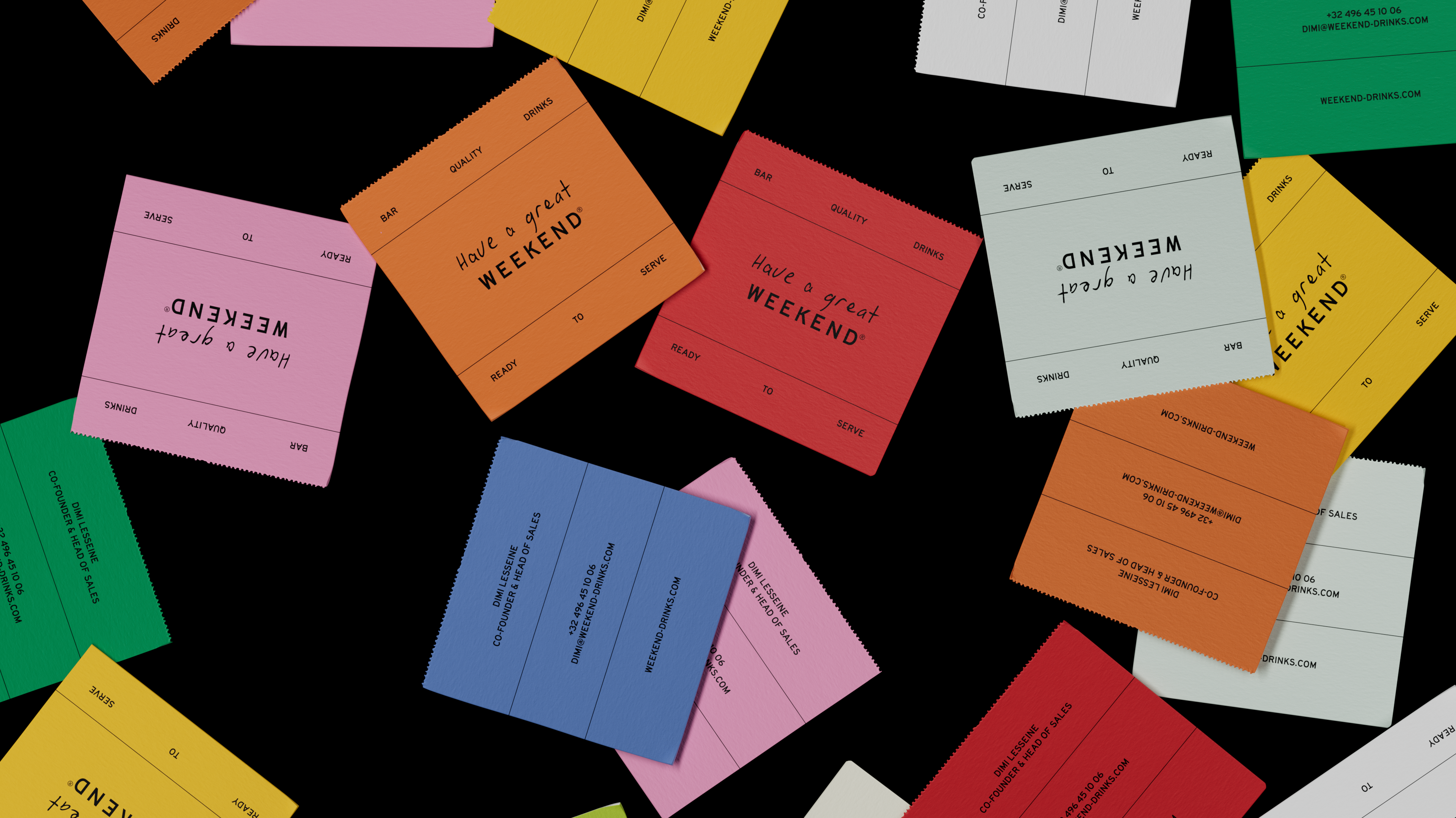
The design direction was based on the juxtaposition of the weekday vs the weekend. Weekdays = mundane, structured & rigid. Weekend = easy-going, carefree, effortless. Imagine a bar napkin had a baby with a Google calendar and you’re in the right zone. We created a graphic system that together with the font Highway VAR - 6 by Otherwhere Collective visualised a very structural, rigid and strict system of lines and copy - directly referencing the efficient and mundane approach of calendars and planners. To complement this we created a custom handwritten font - Weekend By Hand - that mimics scribbles and doodles - which balances out the rigidity of the design system. The Weekend By Hand font includes glyphs for 3 language sets, with 7 variables per character.
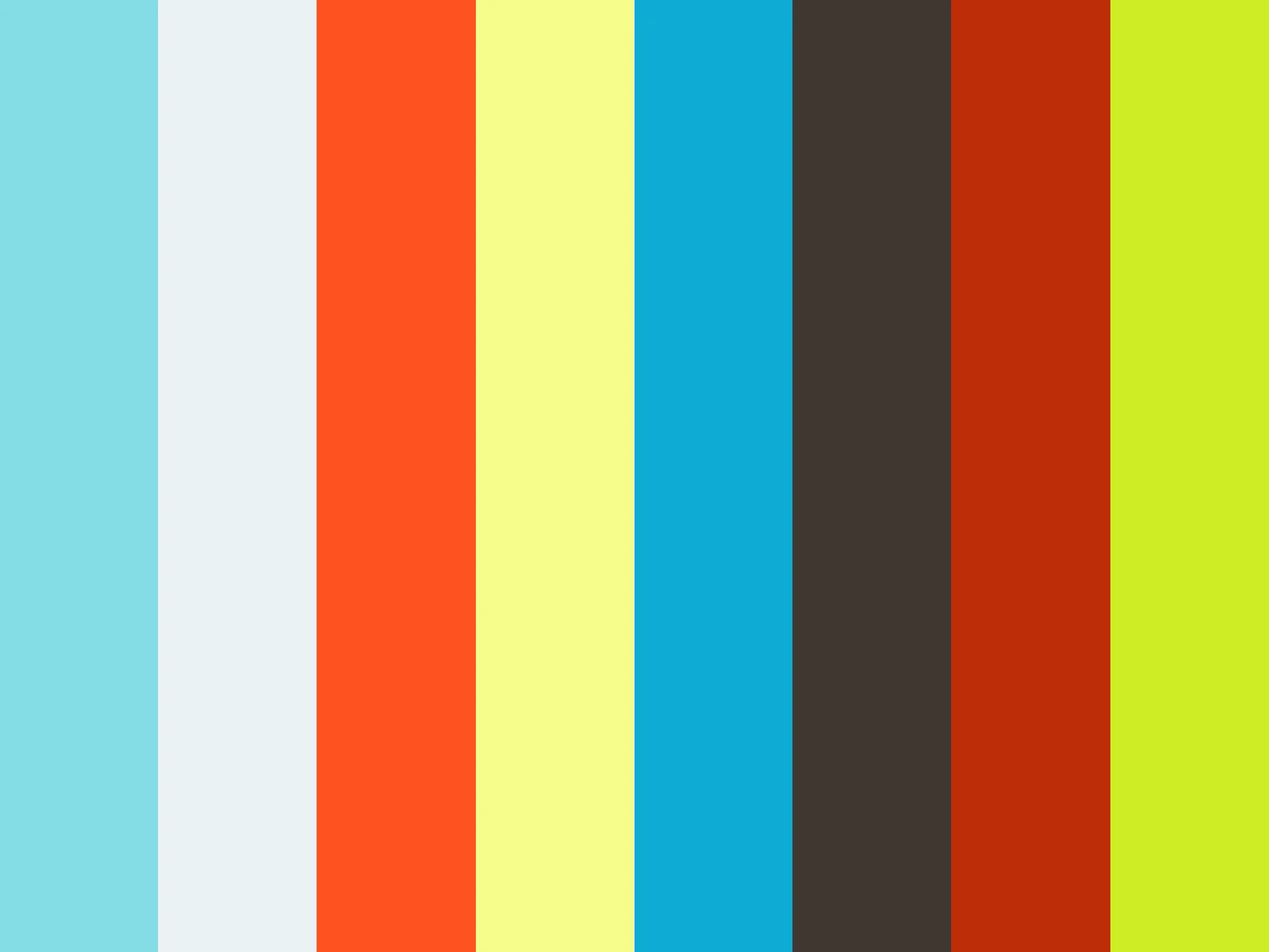
For colour, we used black type & lines with white and off-white shades for materials and surfaces as our foundation. We are then able to update colour choices based on the tones of the drinks or to bring necessary attention.
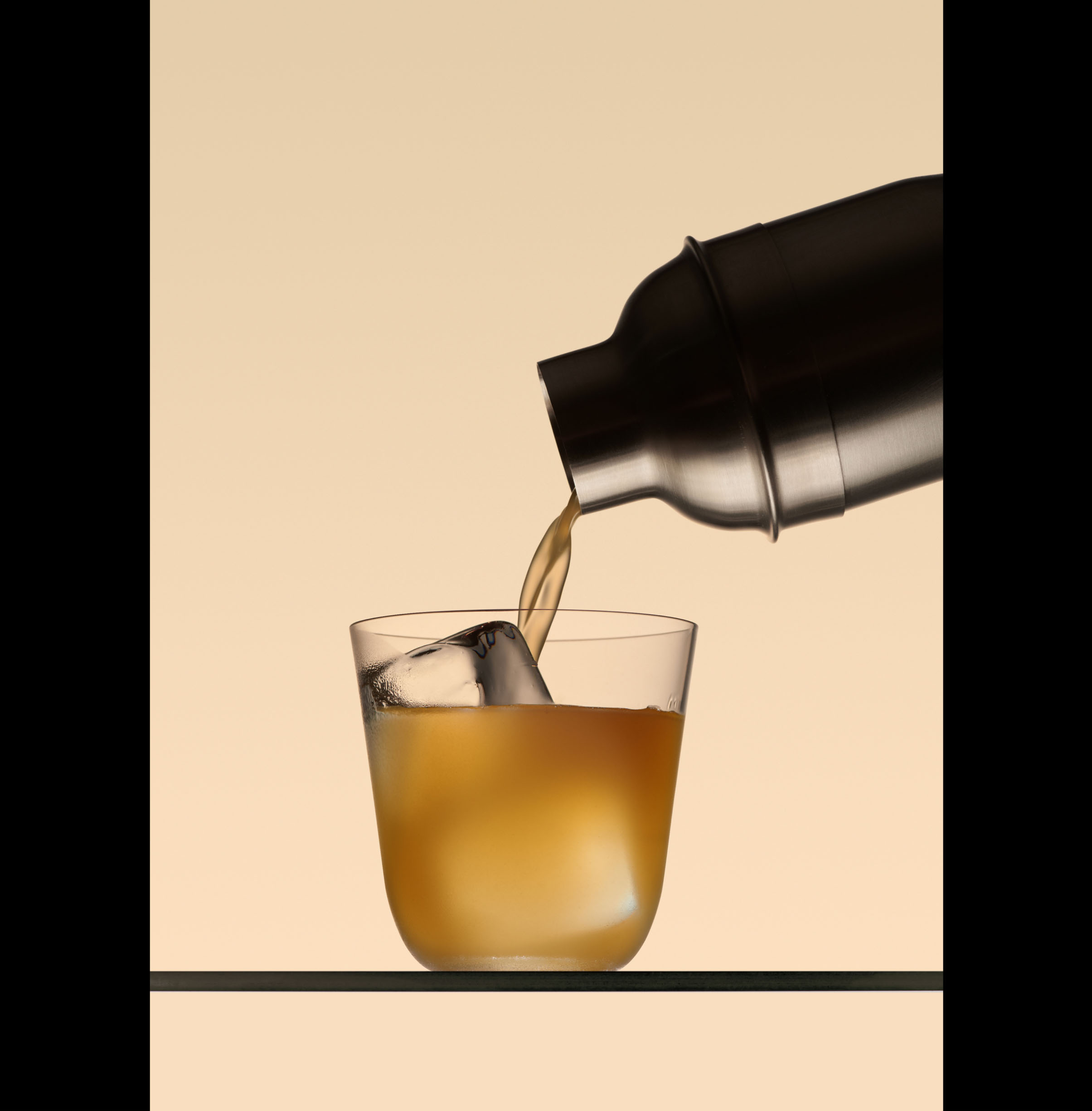
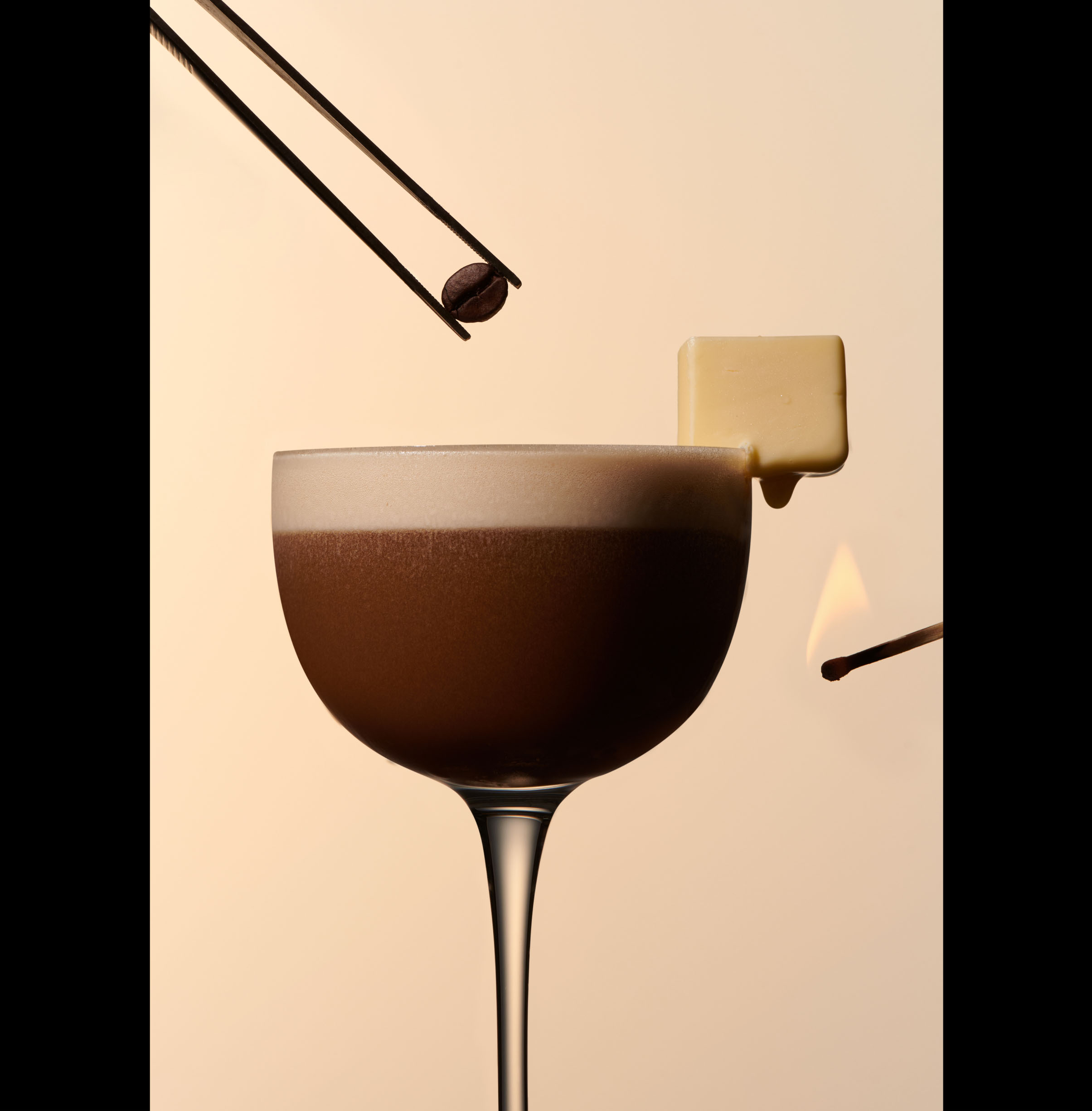
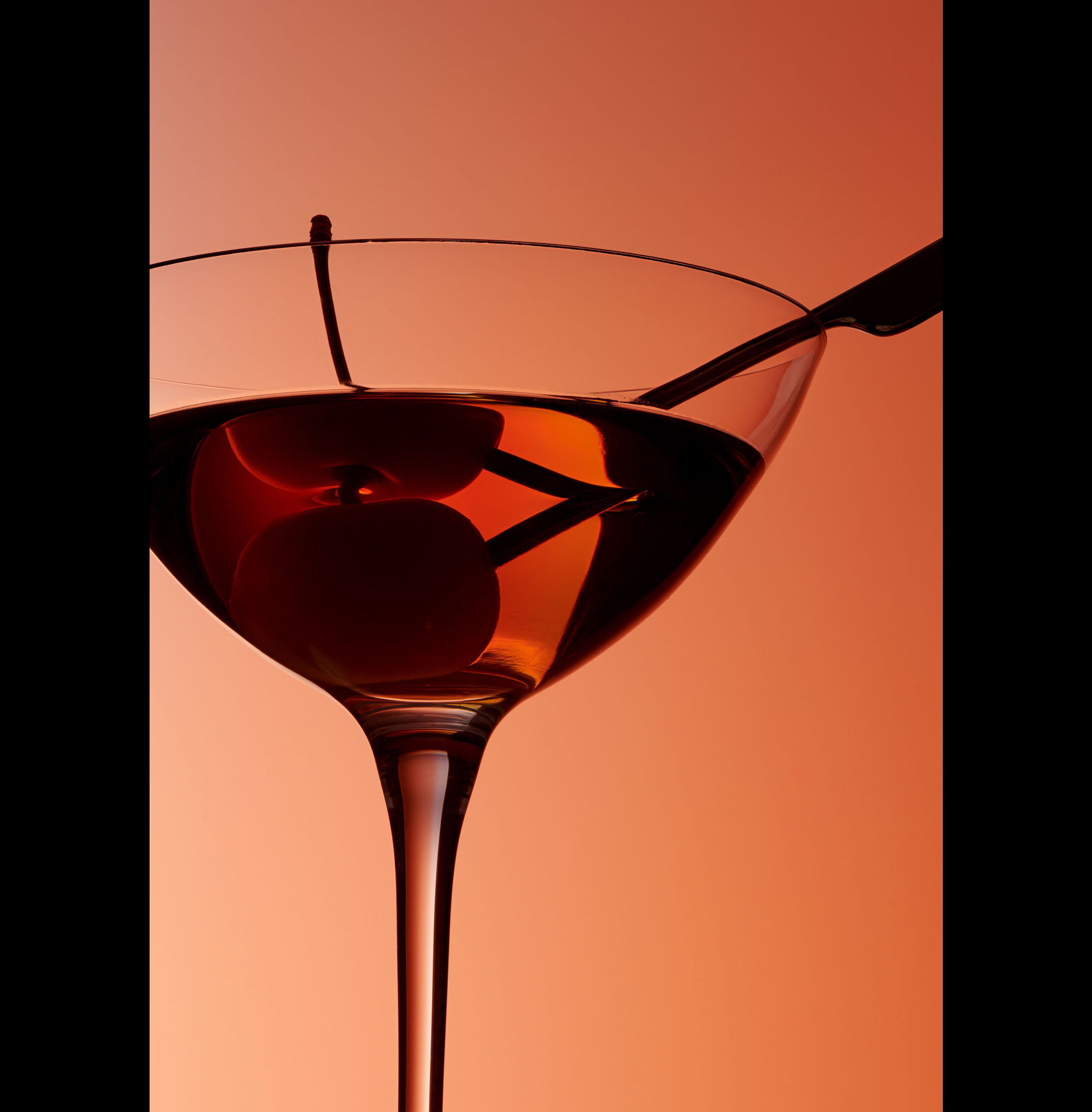
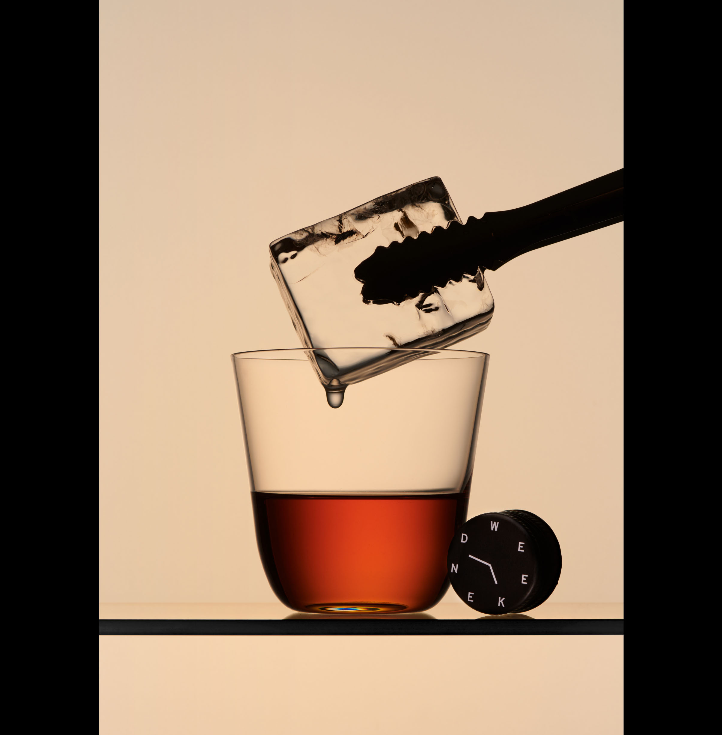
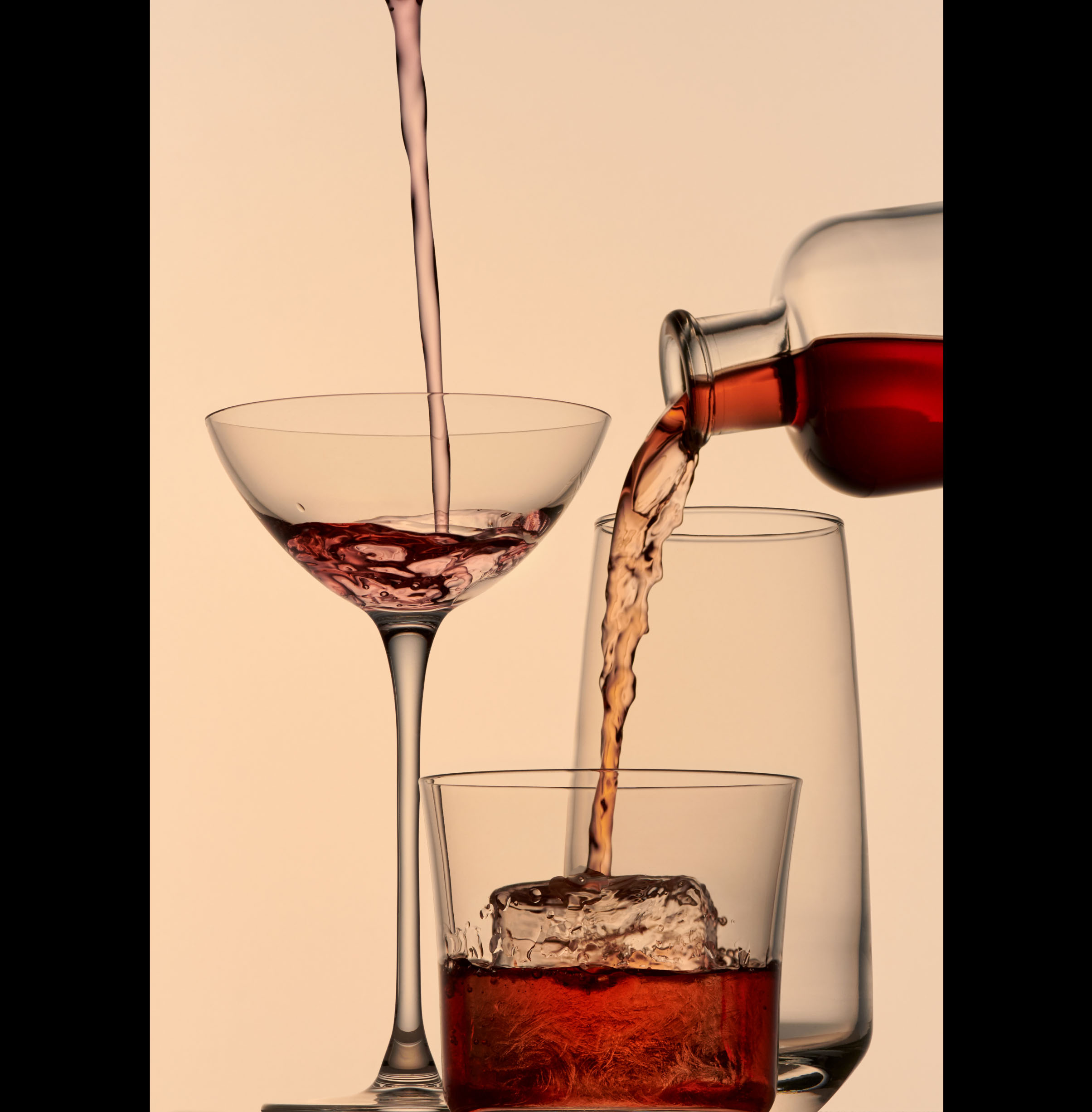
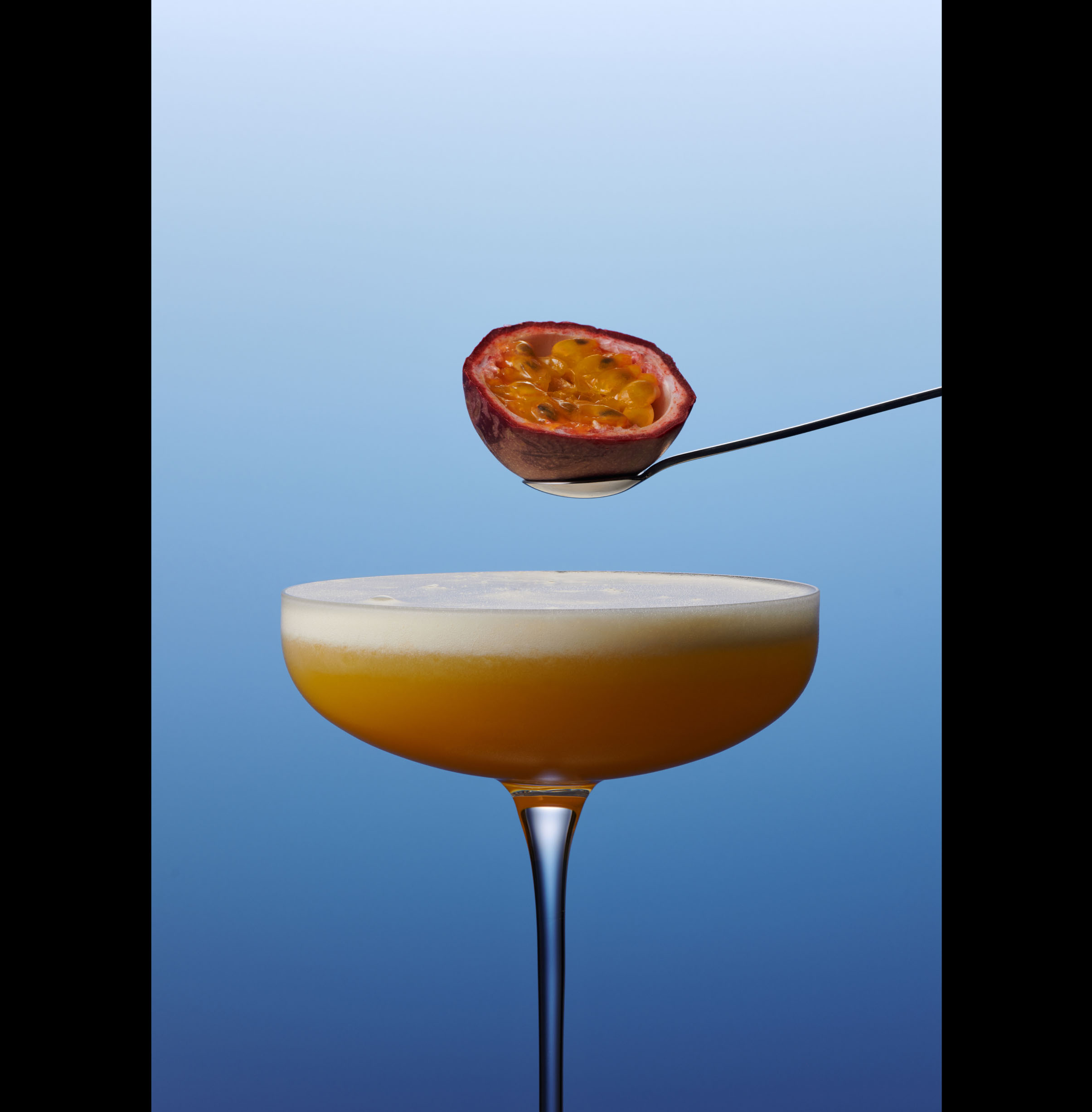
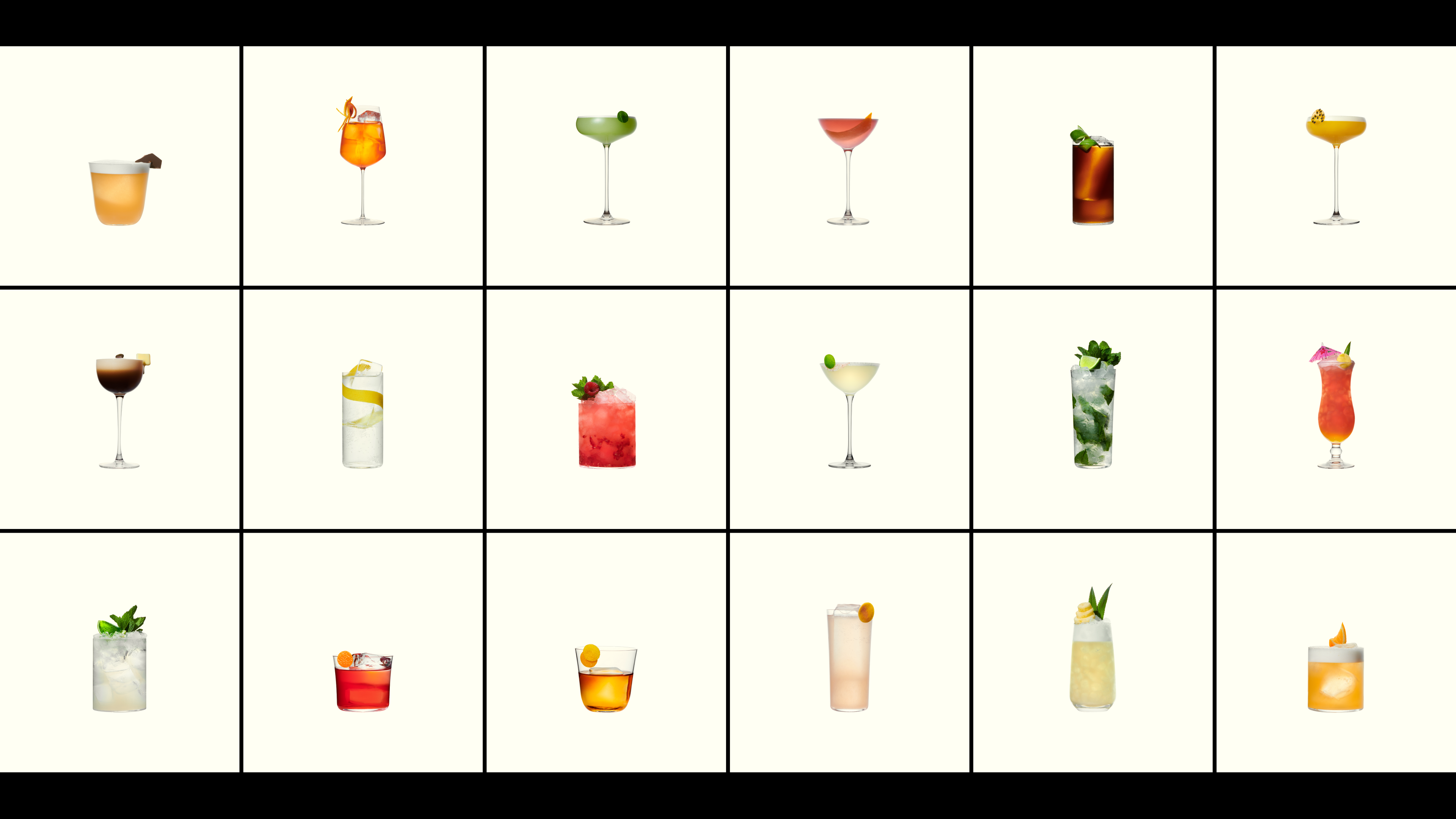
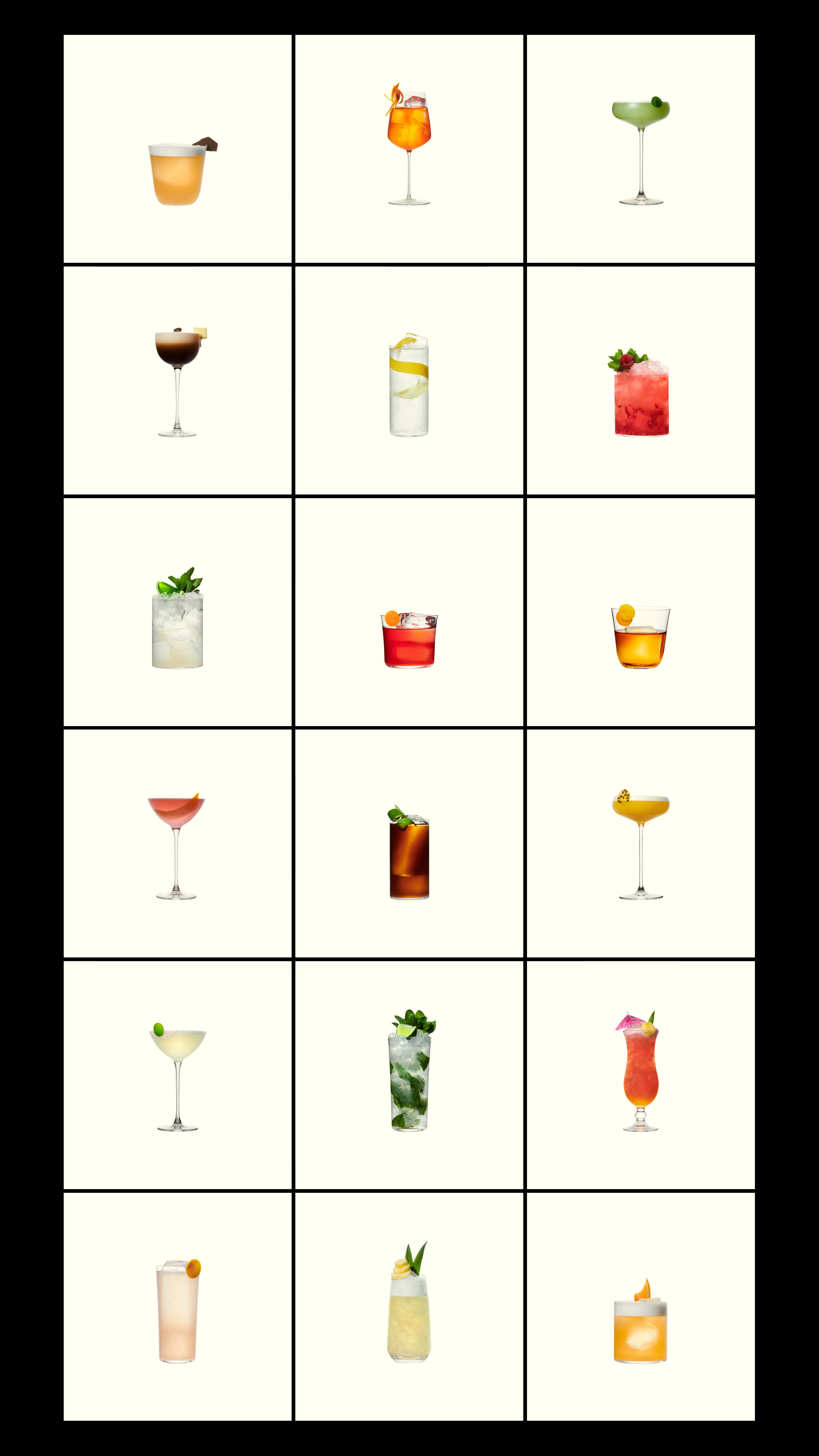
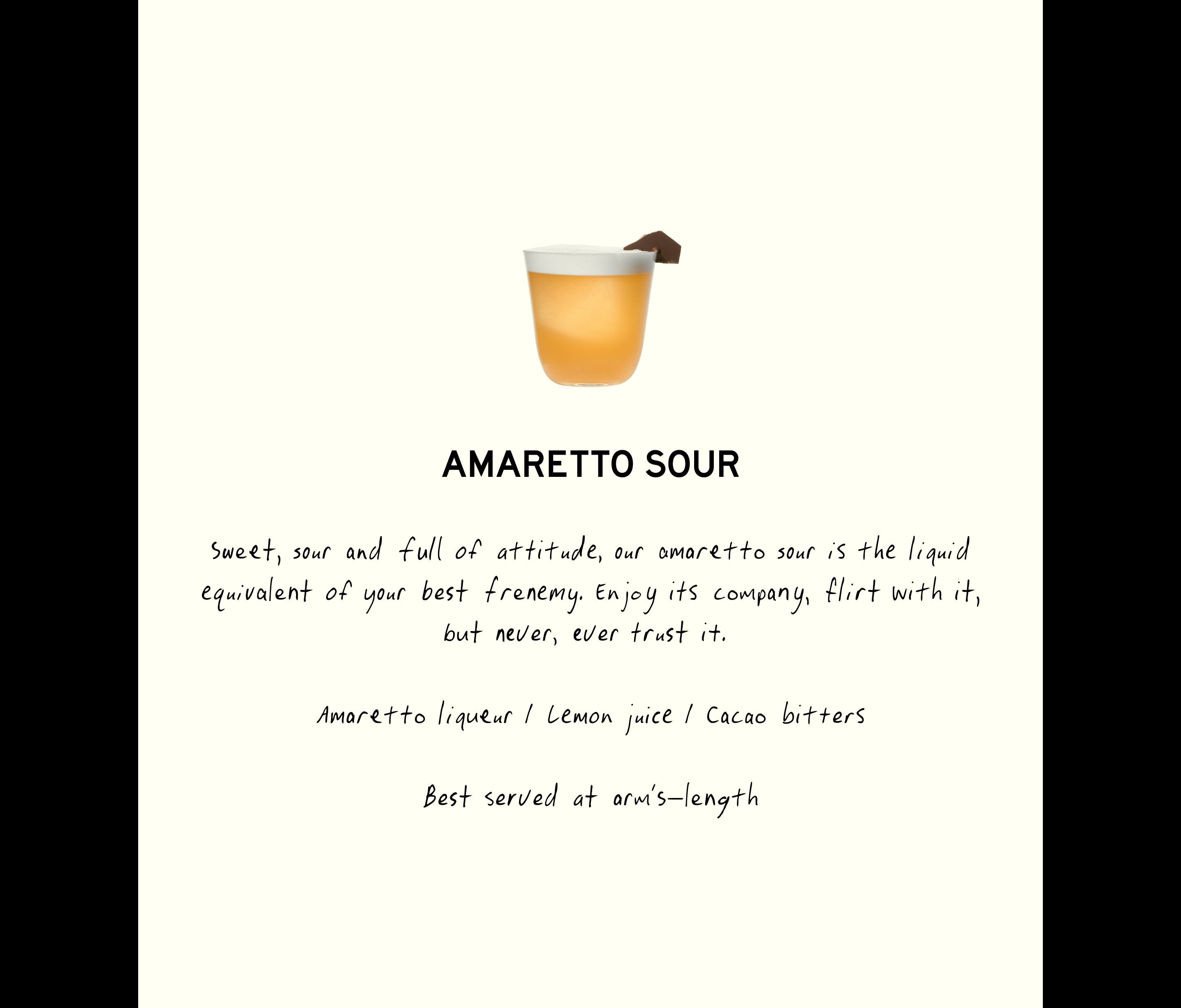
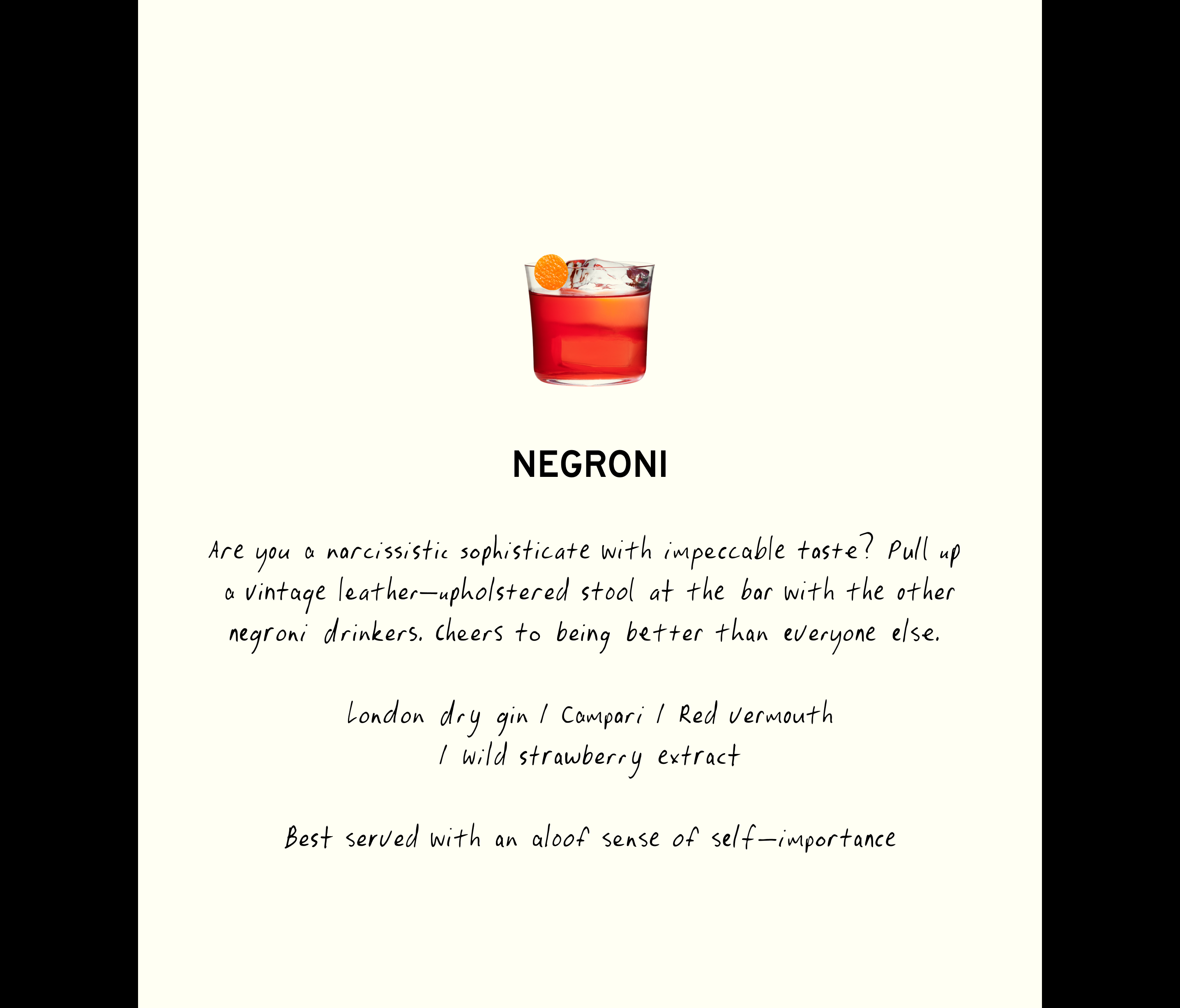
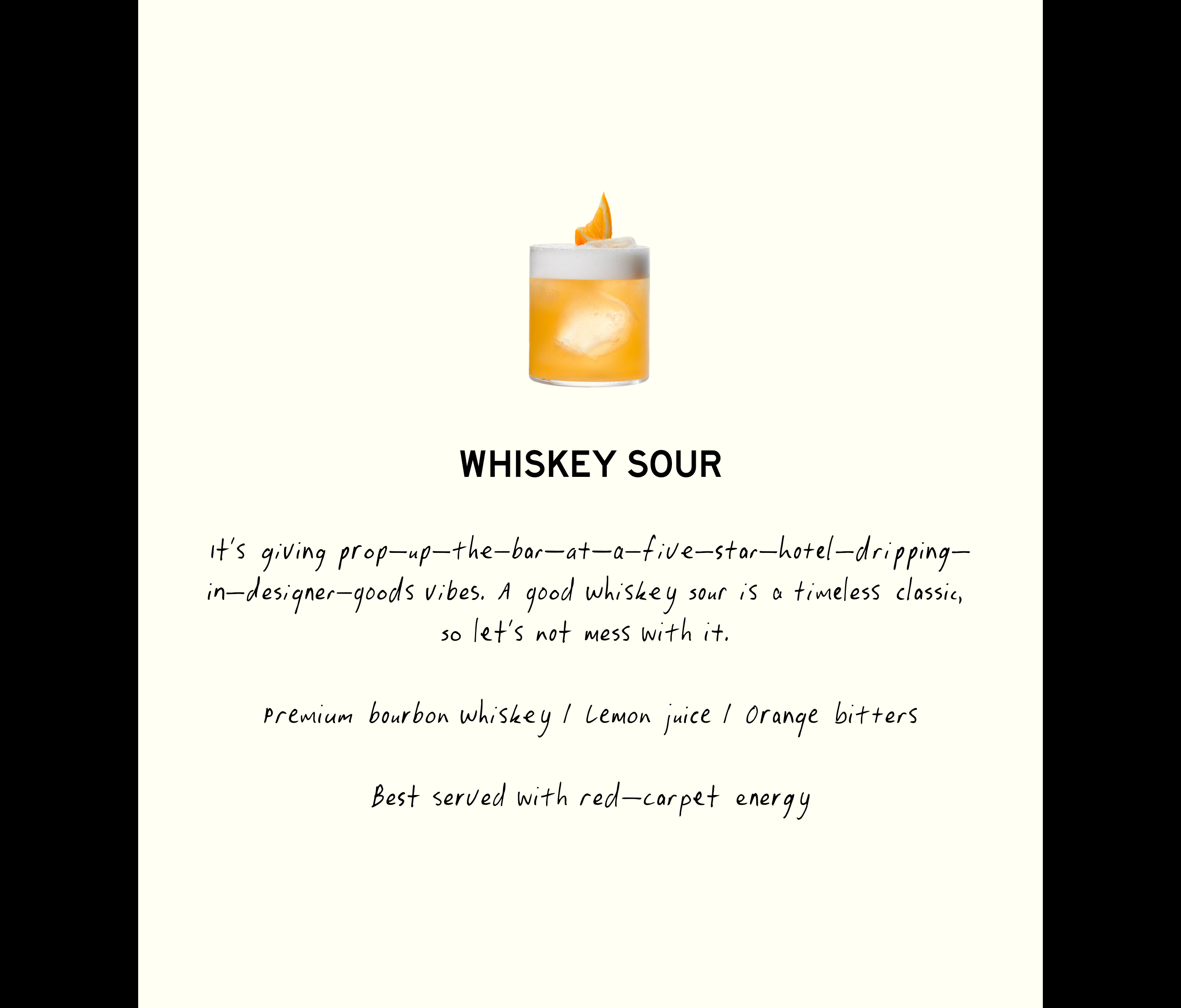
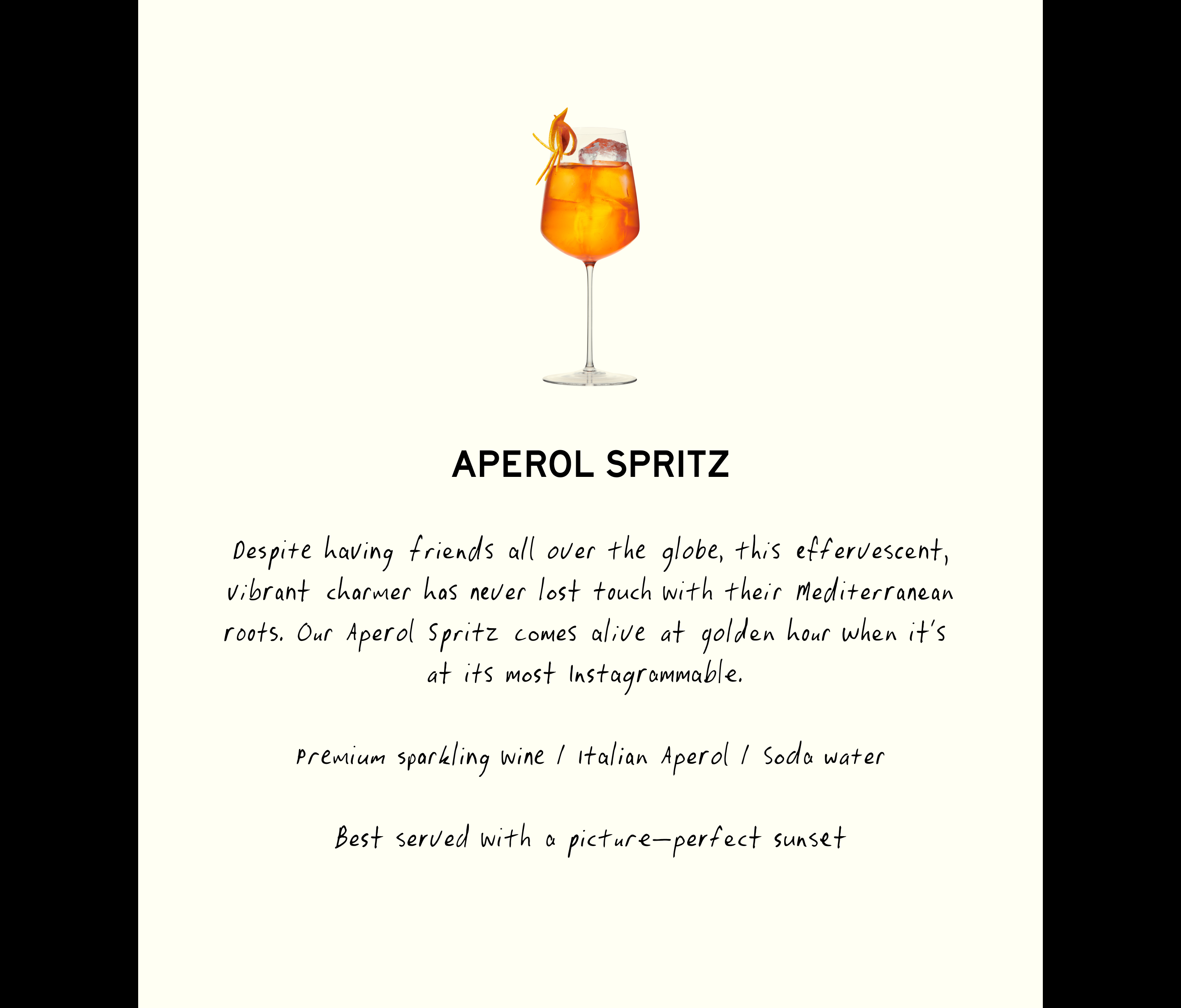
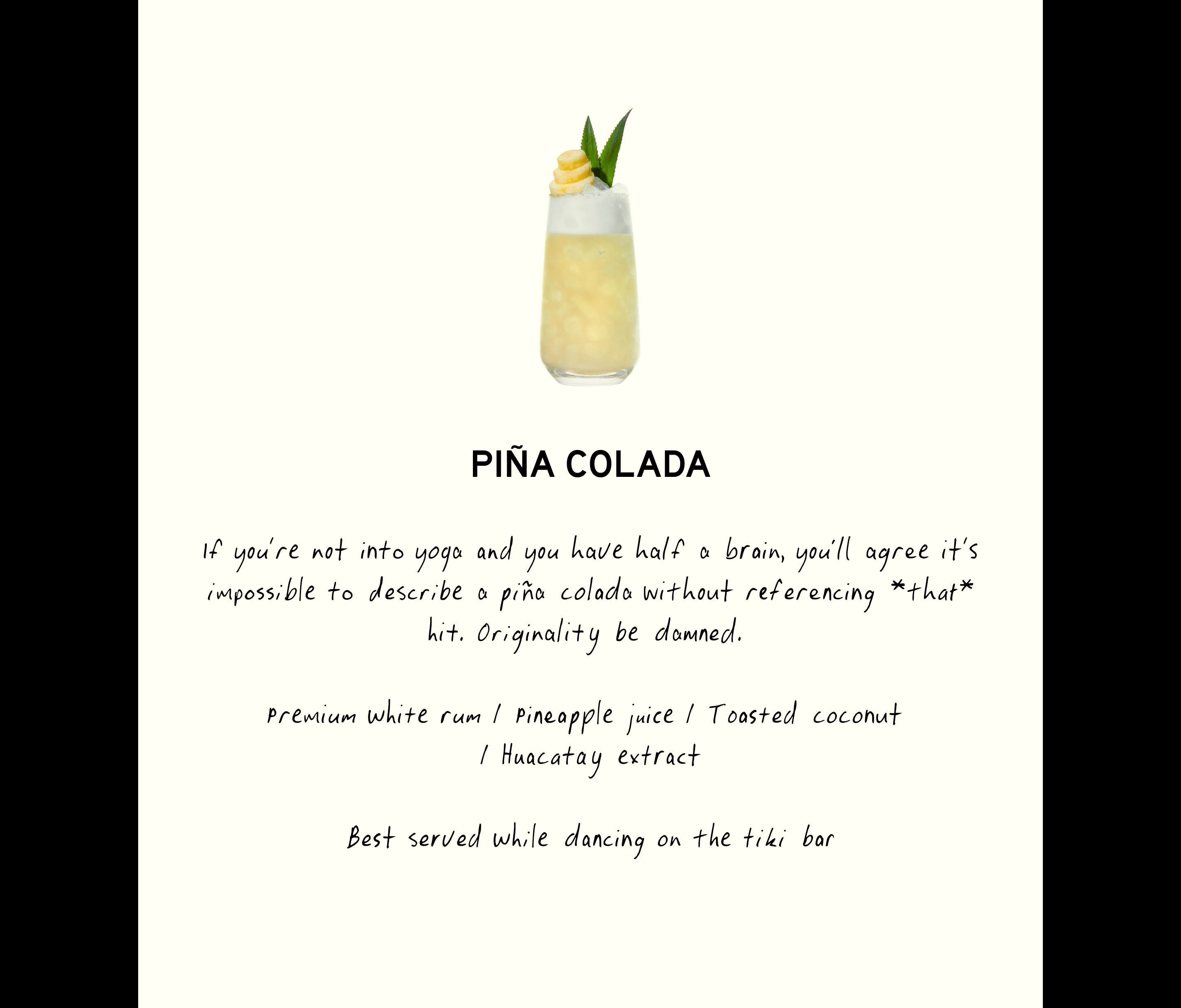
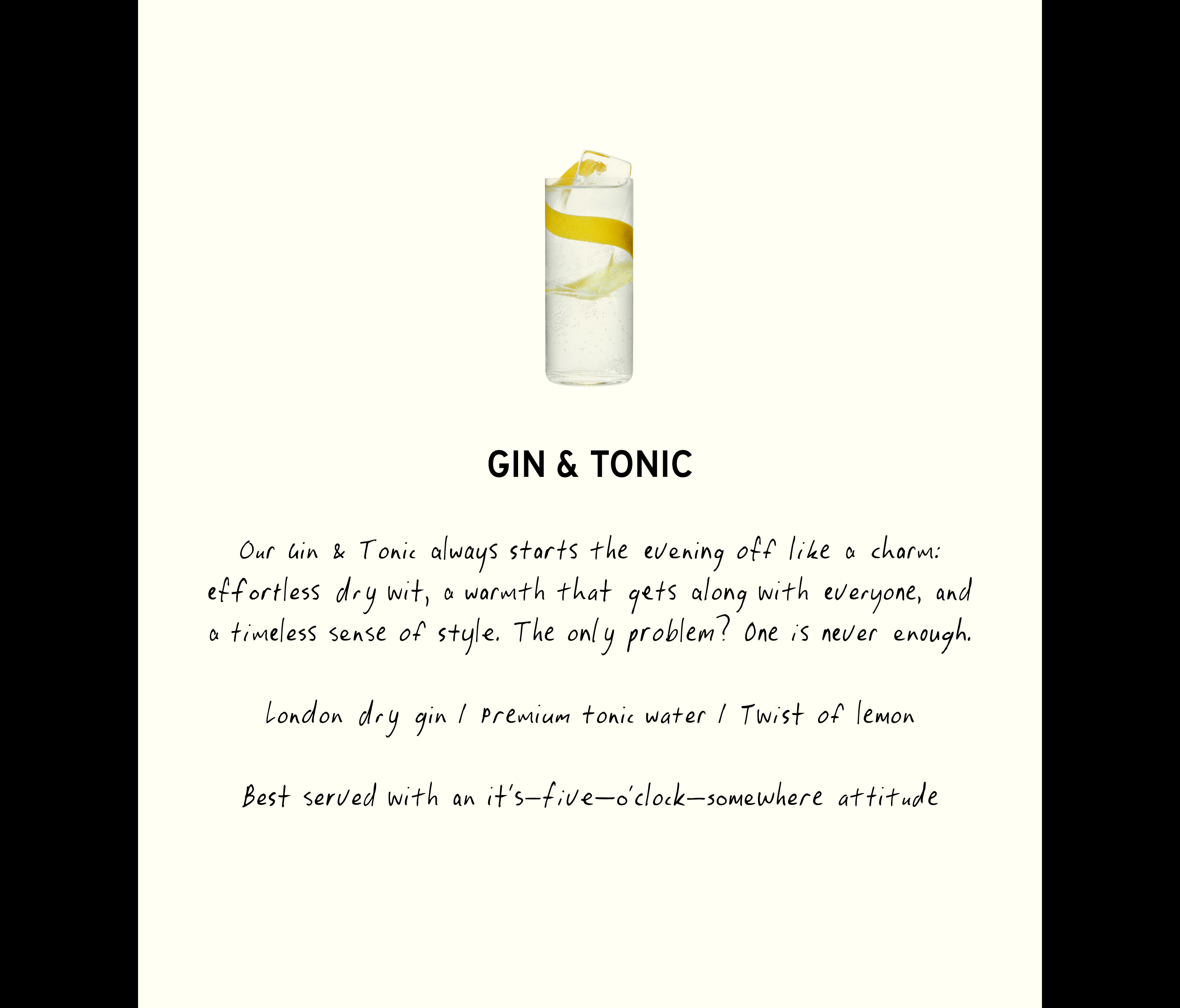
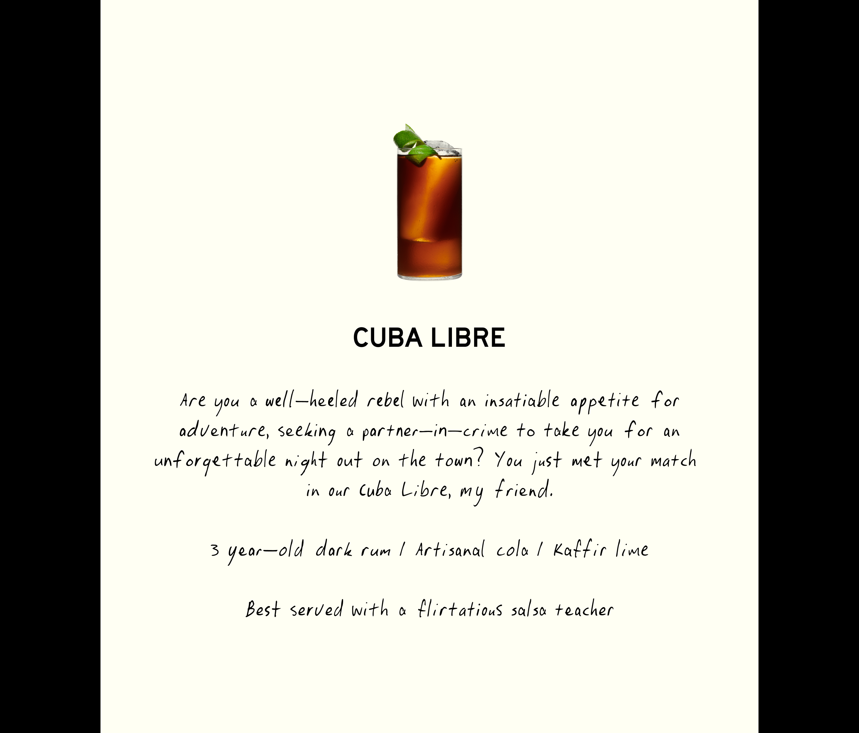
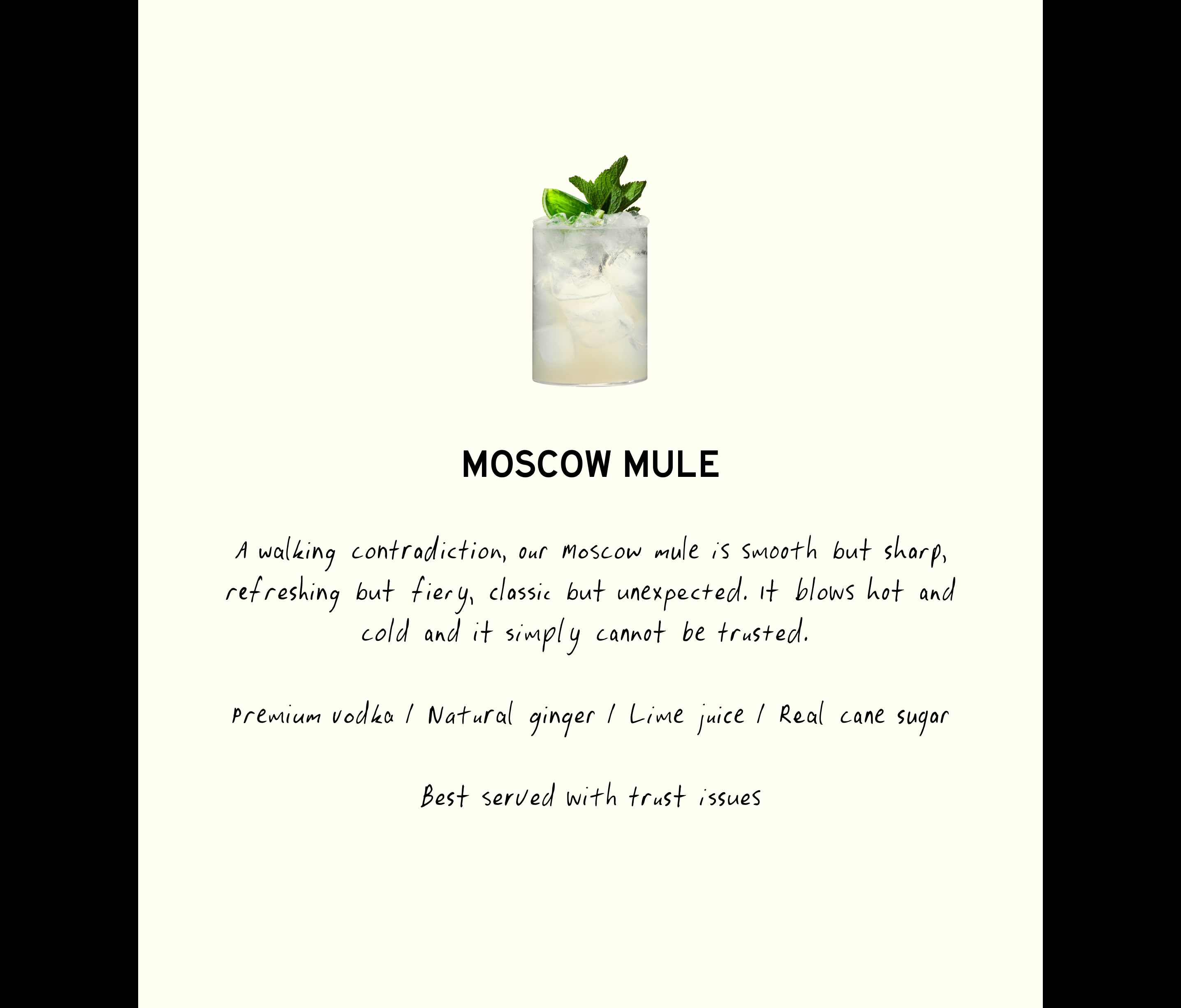
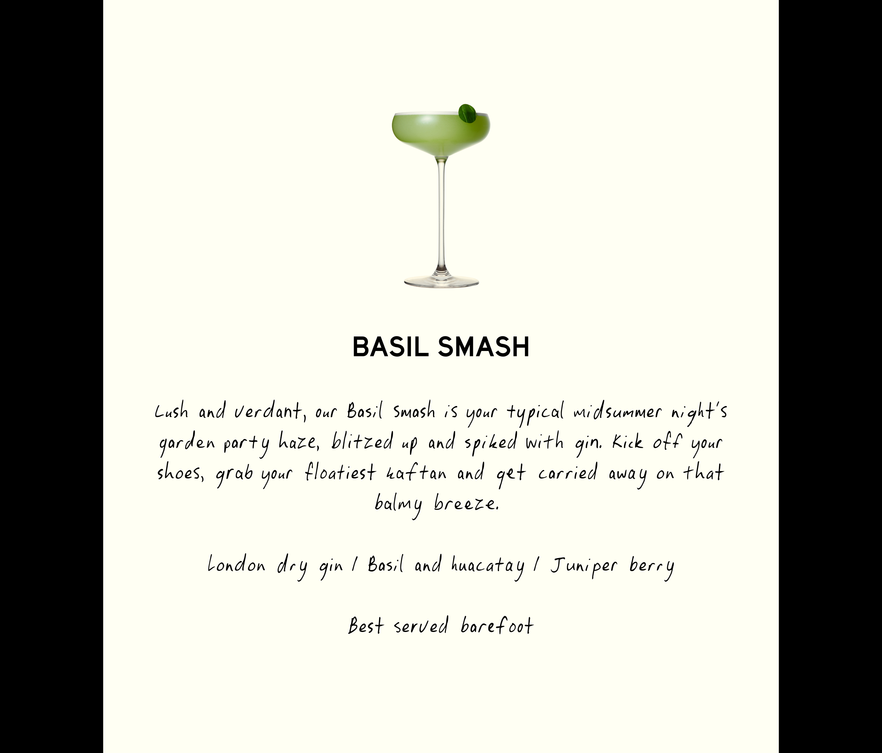
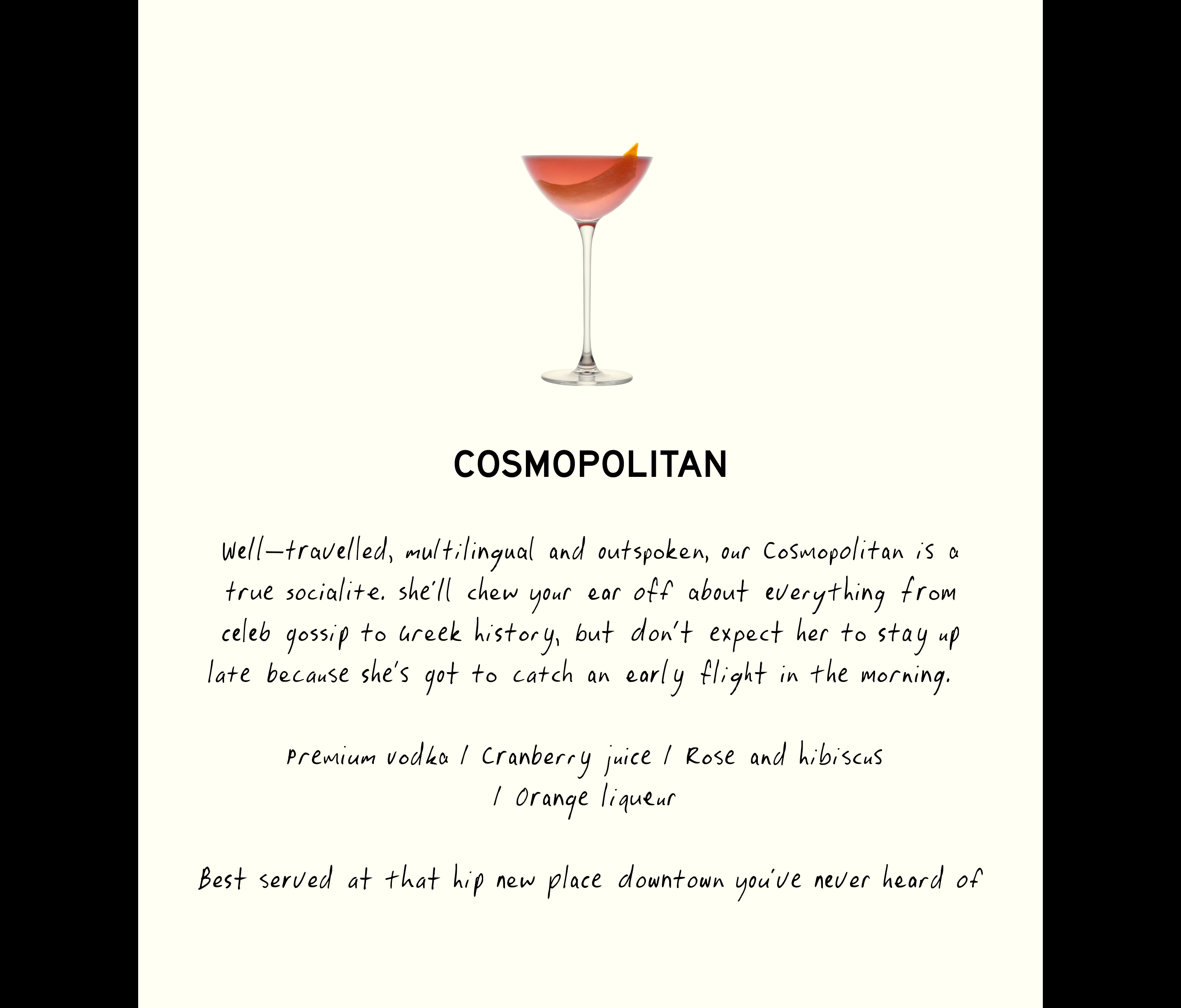
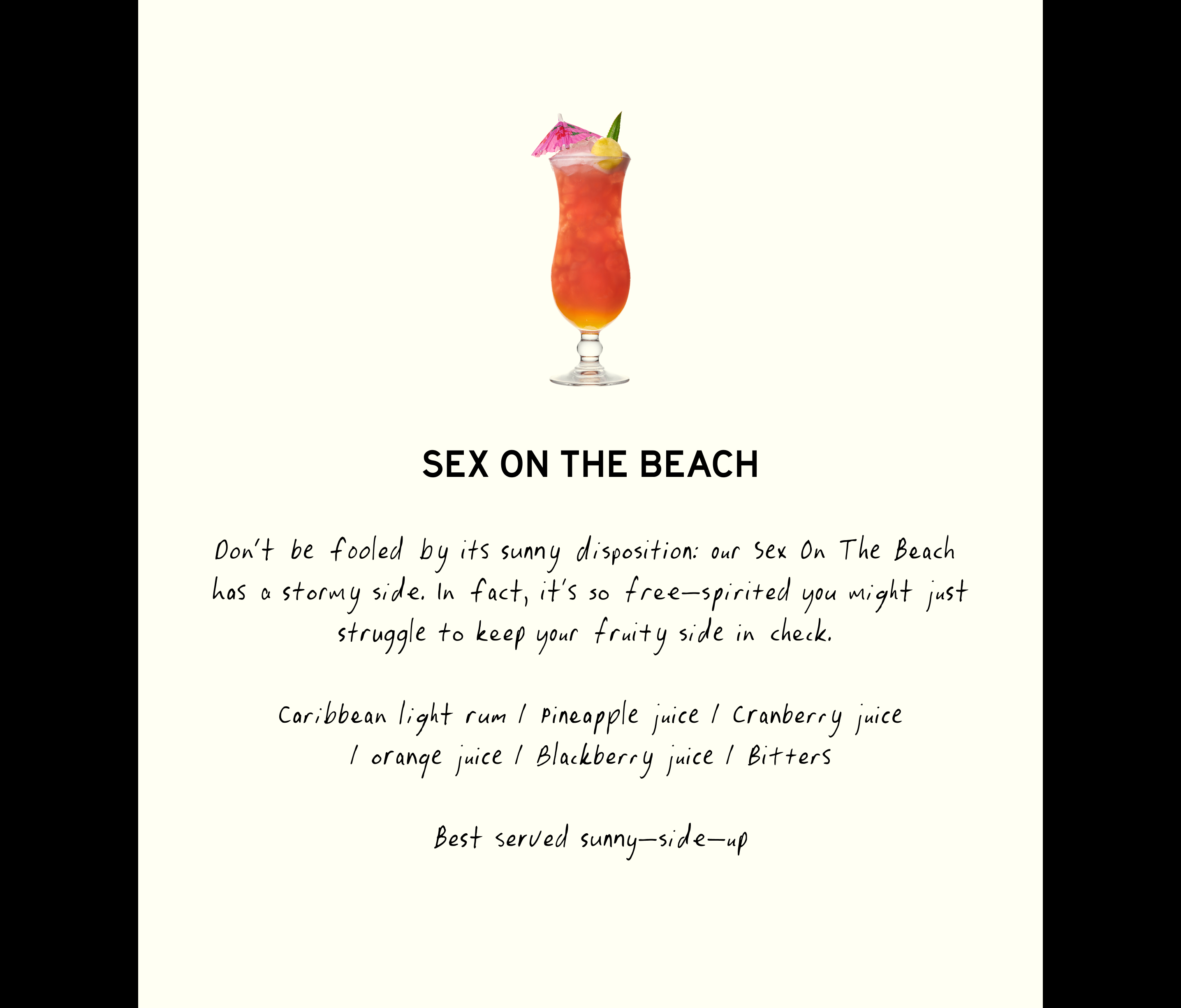
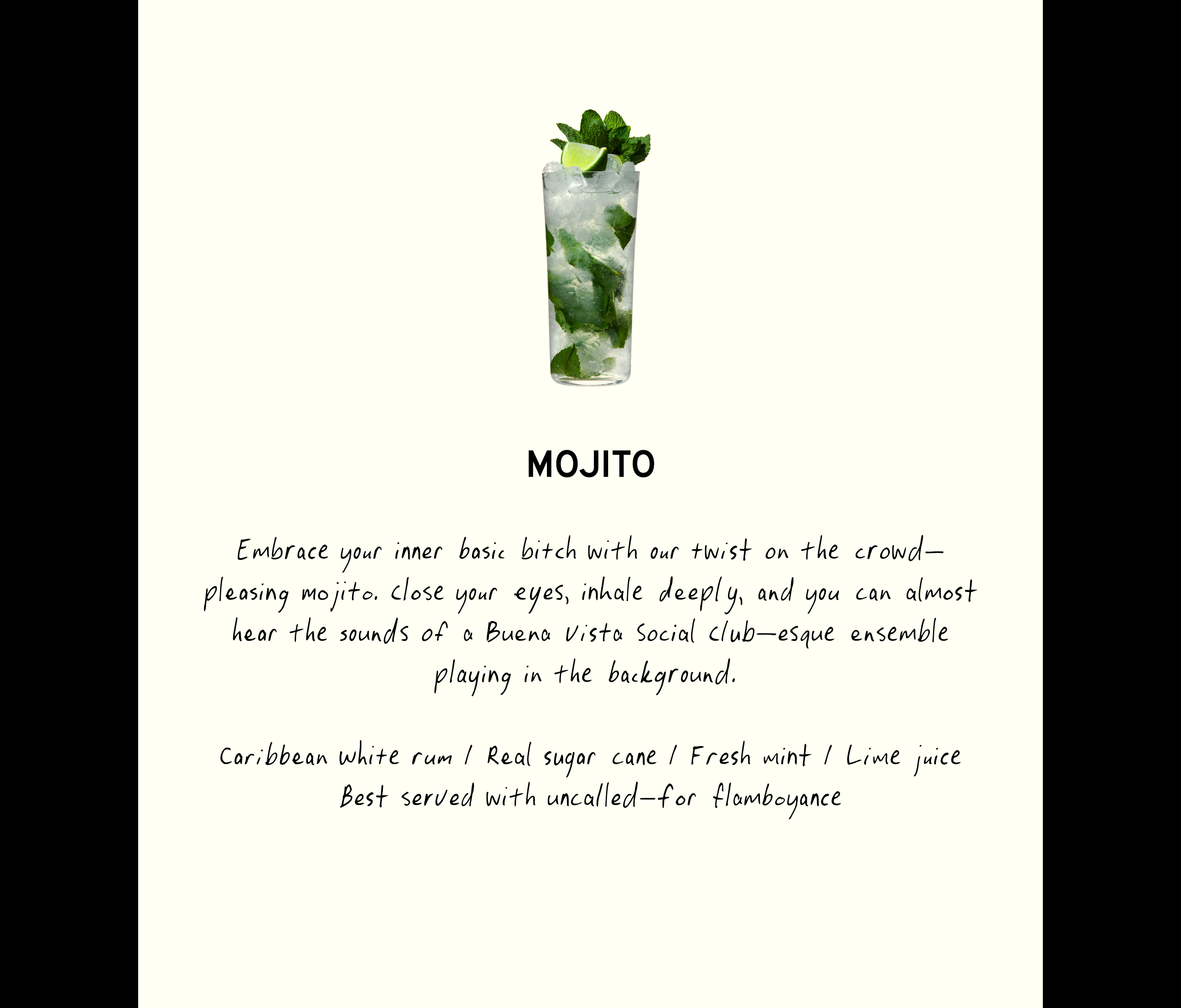
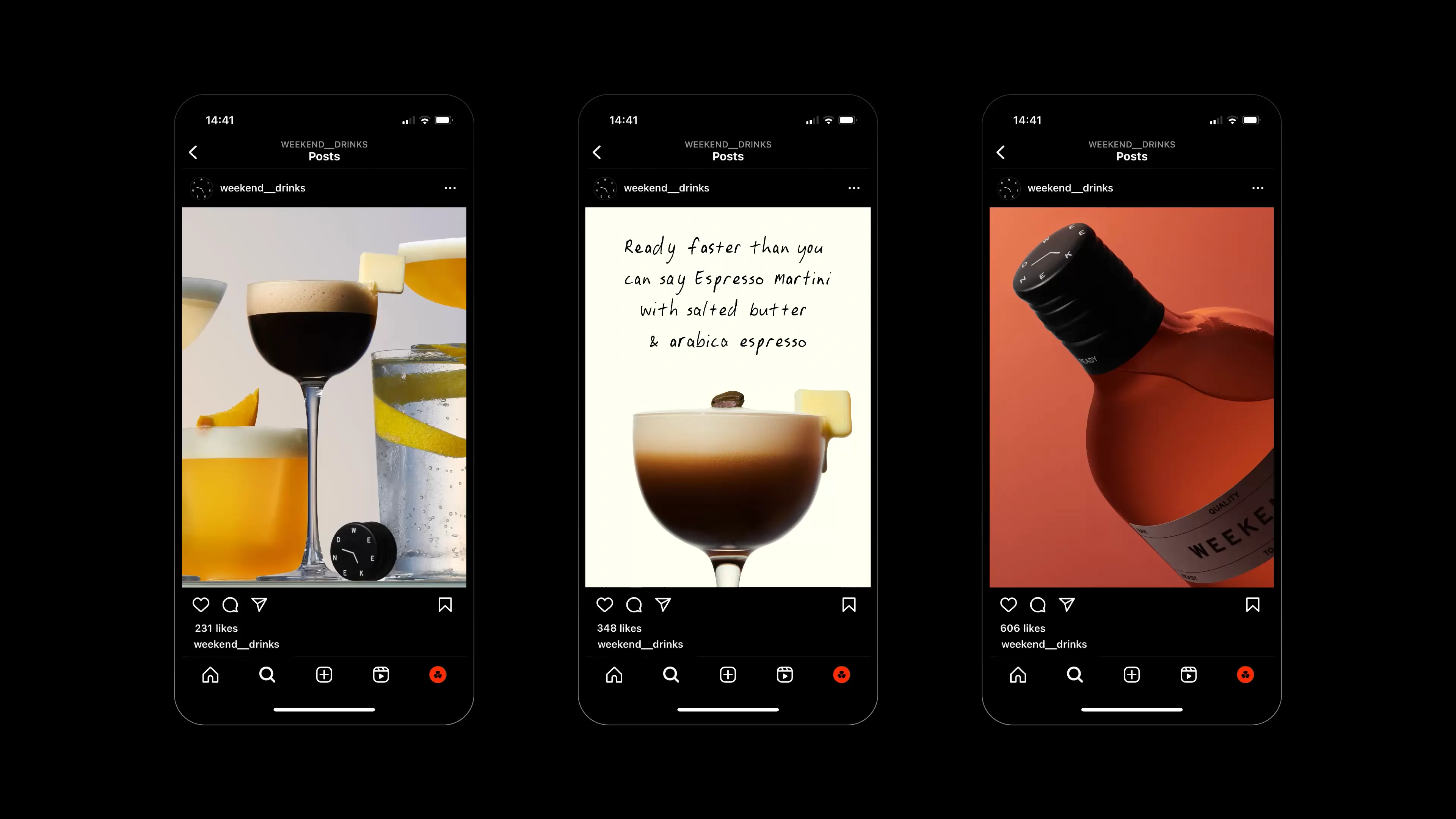
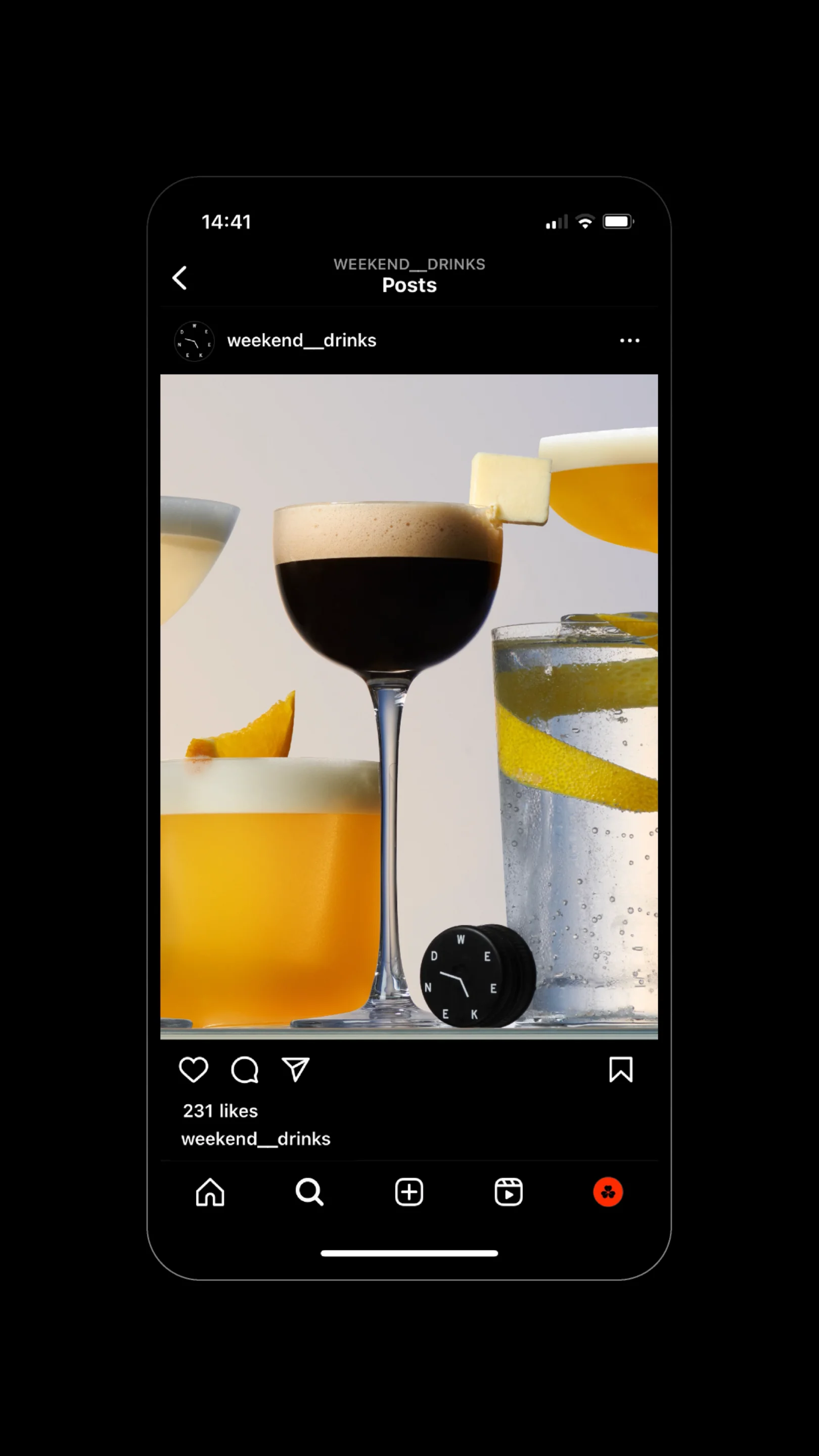
We also needed to overcome the quality perceptions of pre-batched cocktails - so we knew photography was going to play a key role. We wanted to make sure the bar quality nature of the drinks was brought to the foreground with photography as high-quality as the product. For this we partnered with Harel+Ocante (previously Studio Paris Se Quema) to create some of the most delicious-looking drink photography we’ve ever seen.