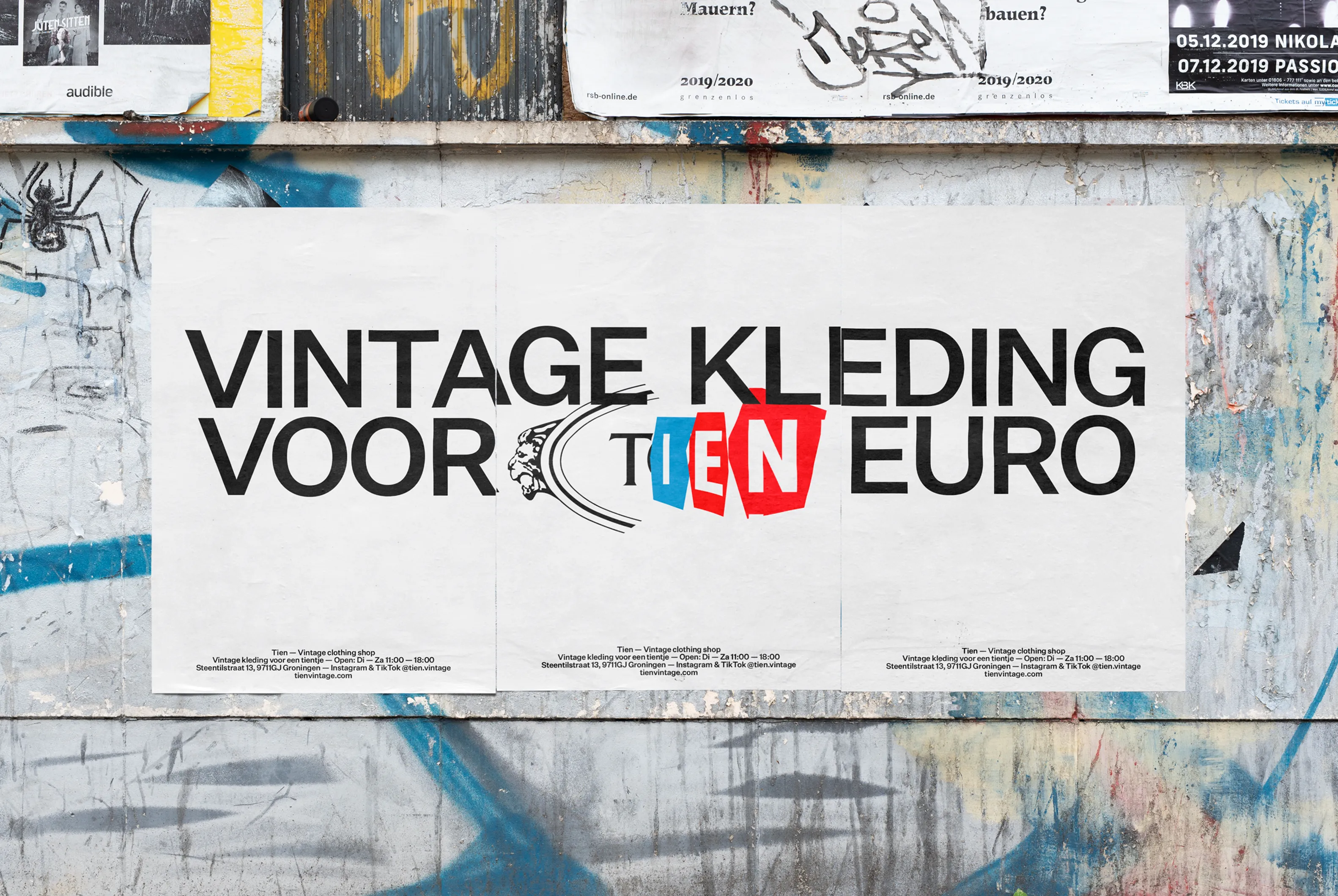
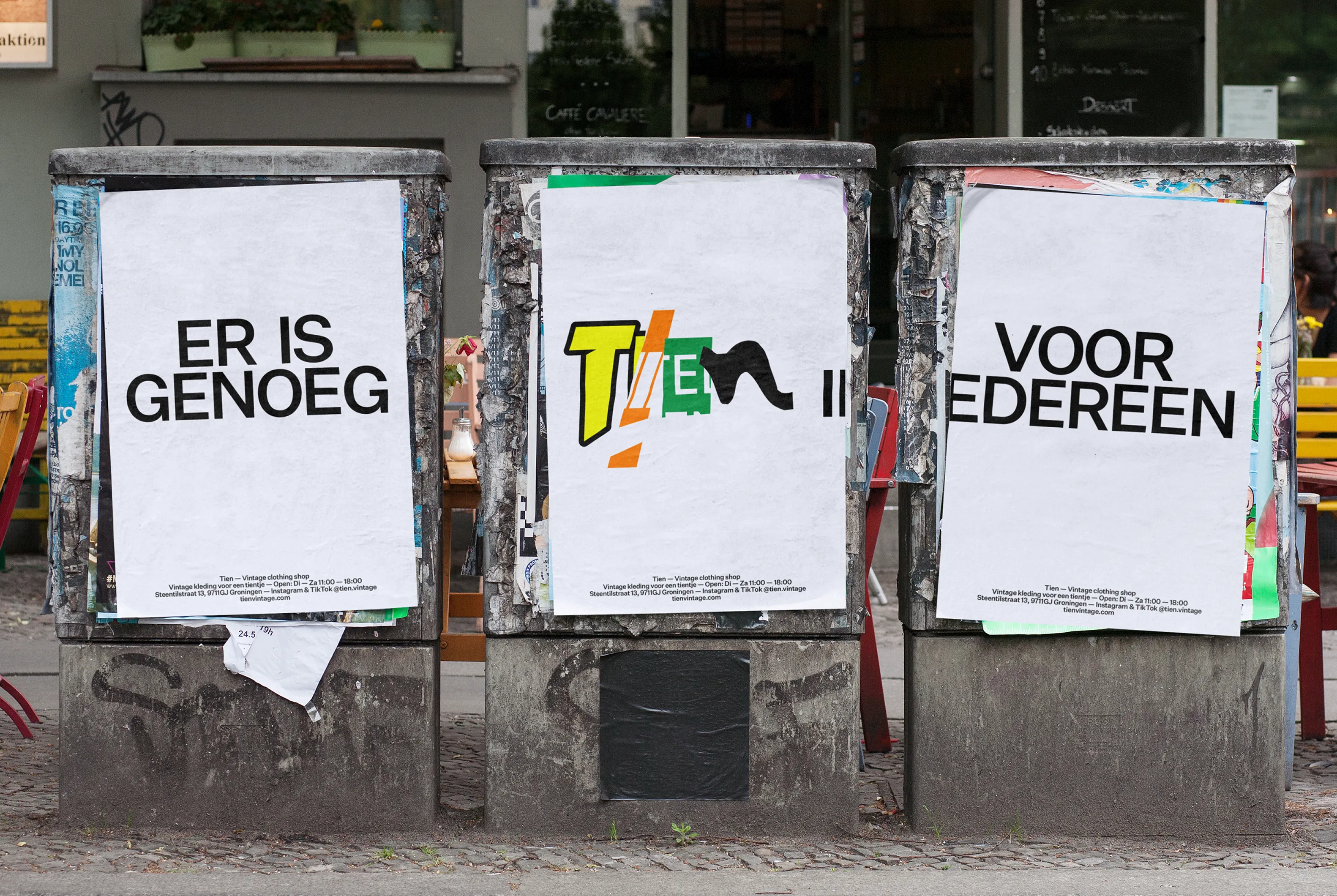
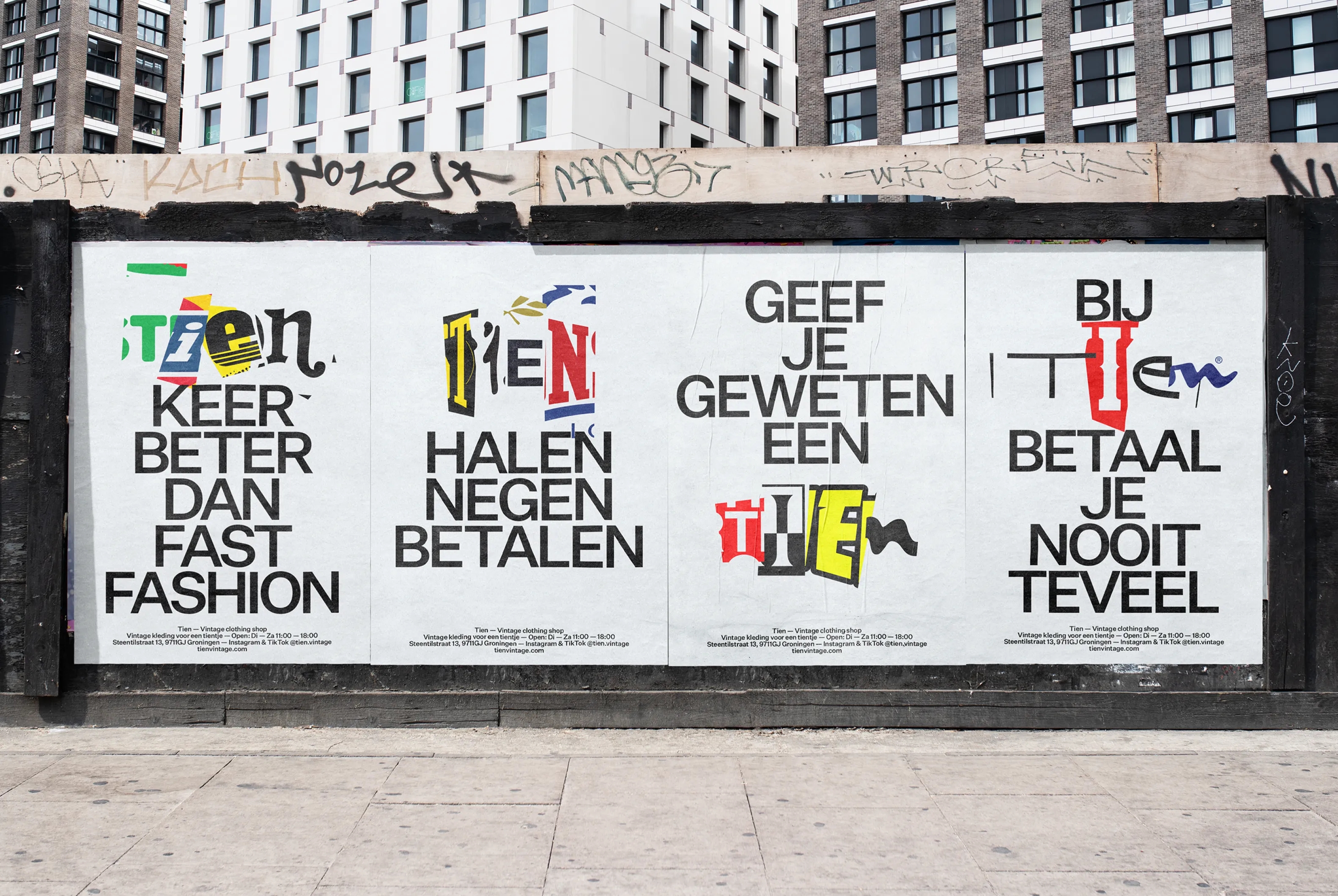
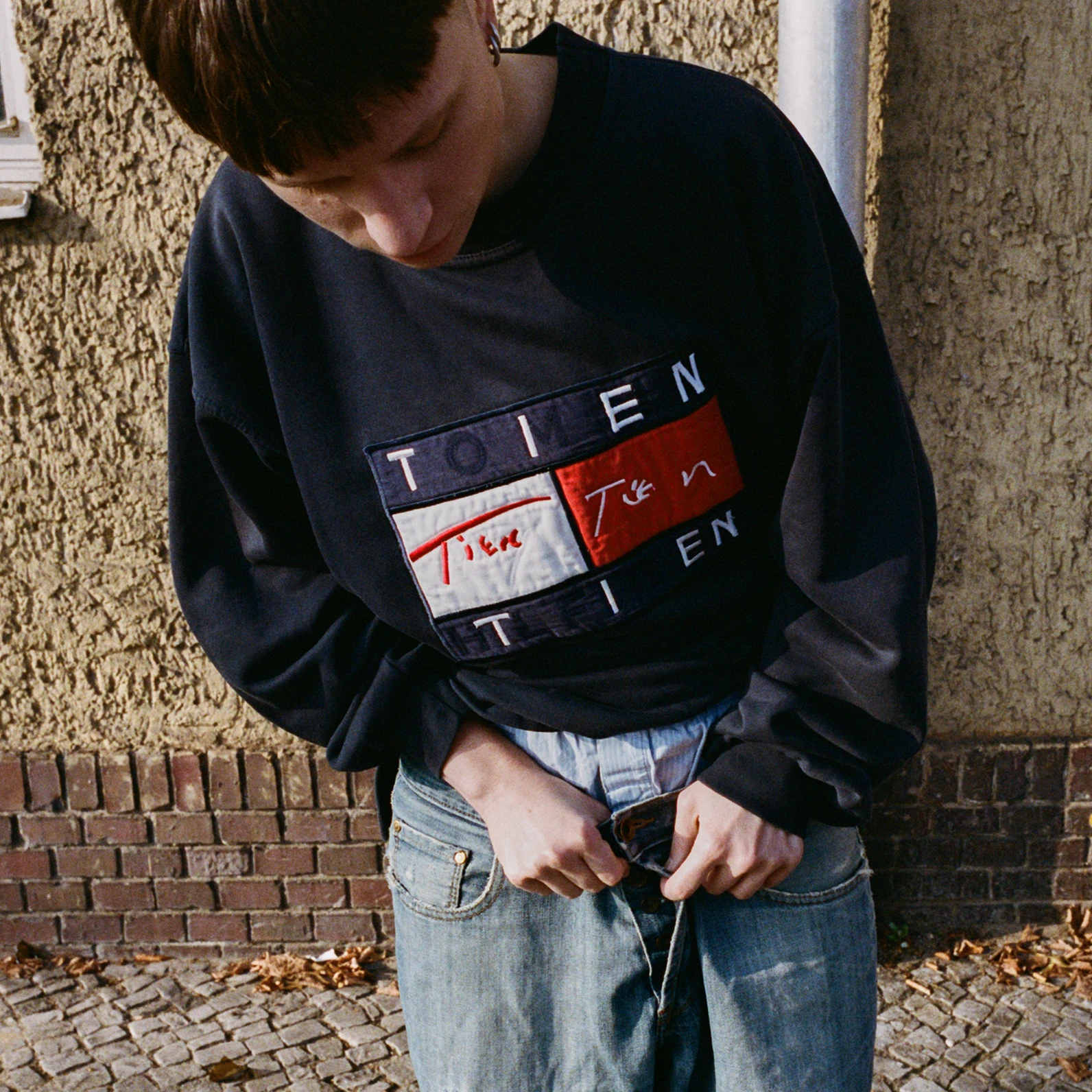
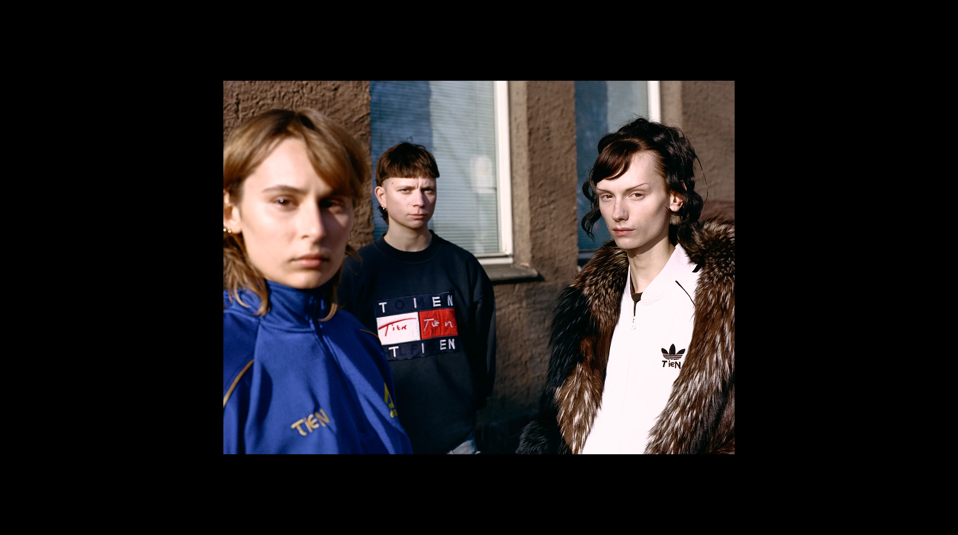
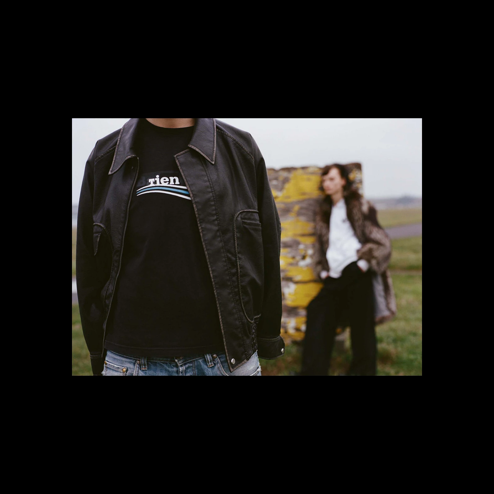
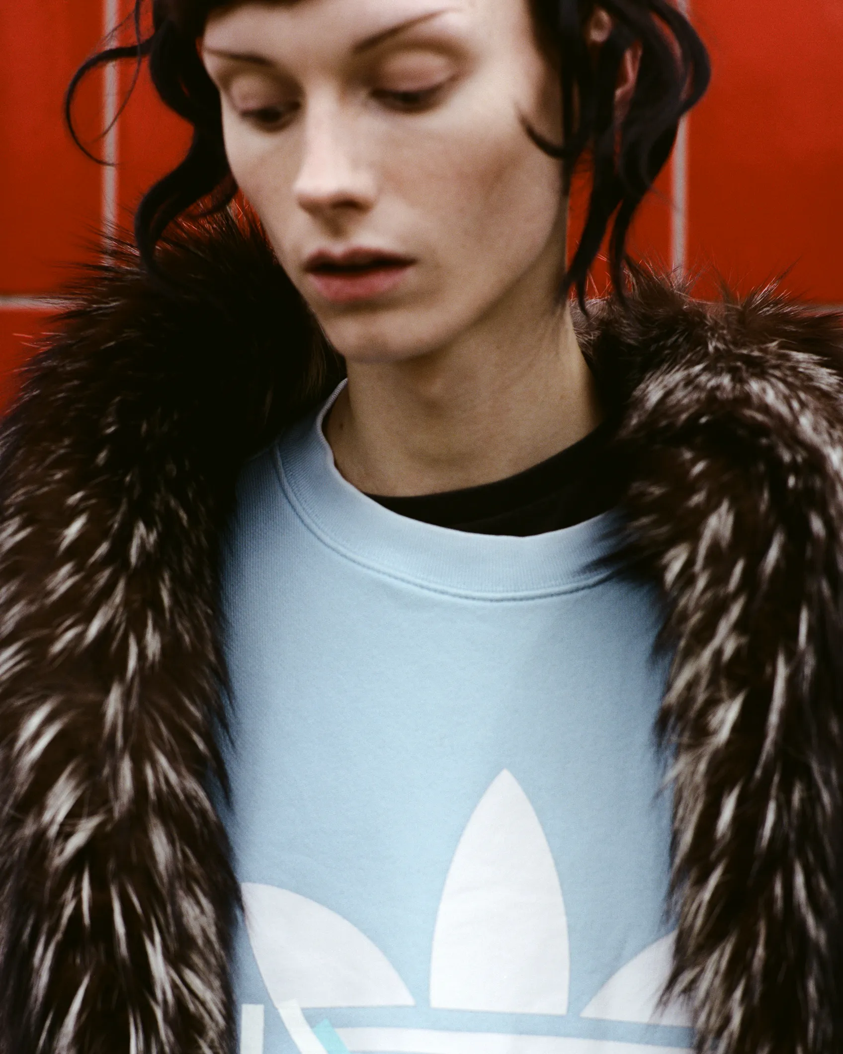
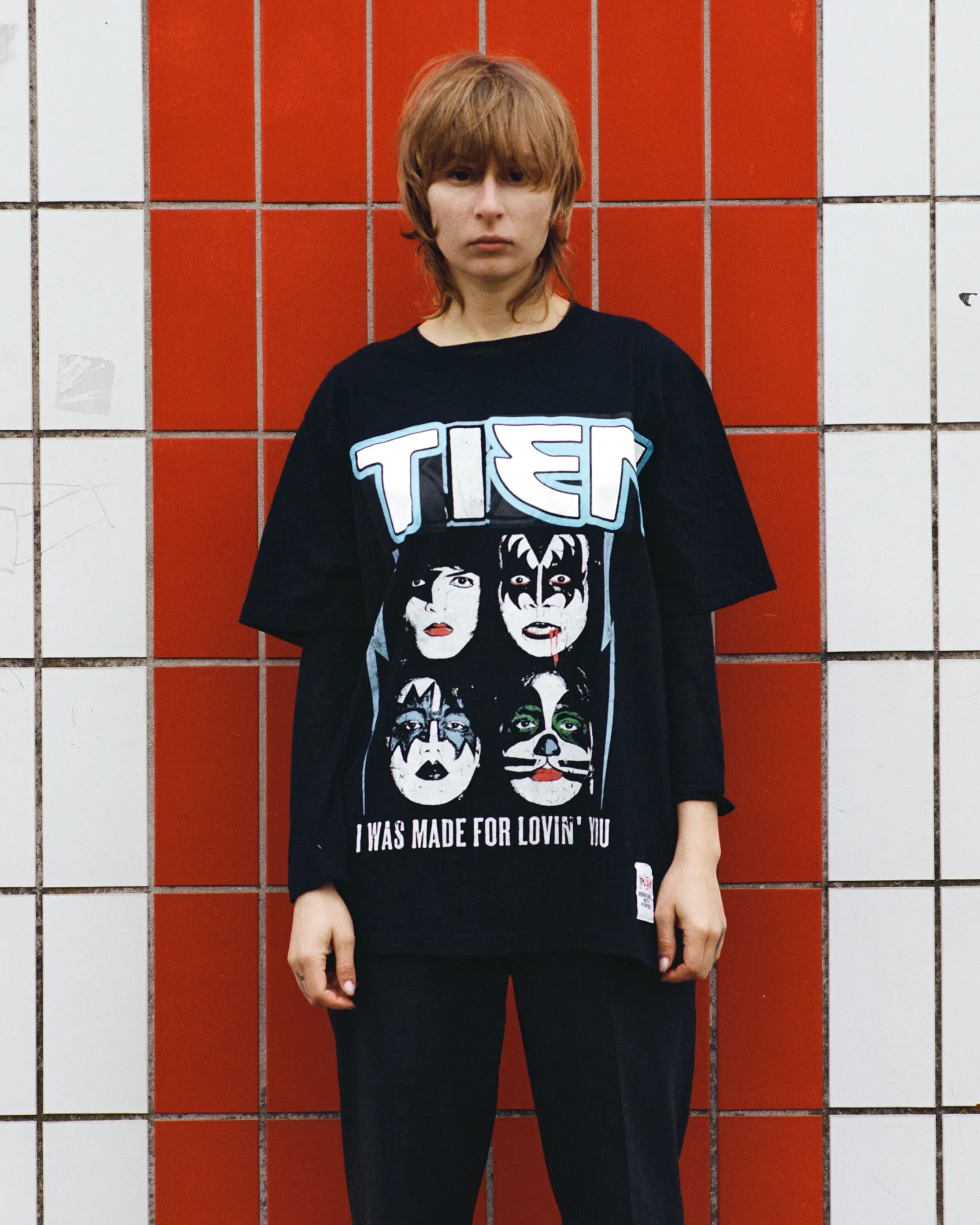
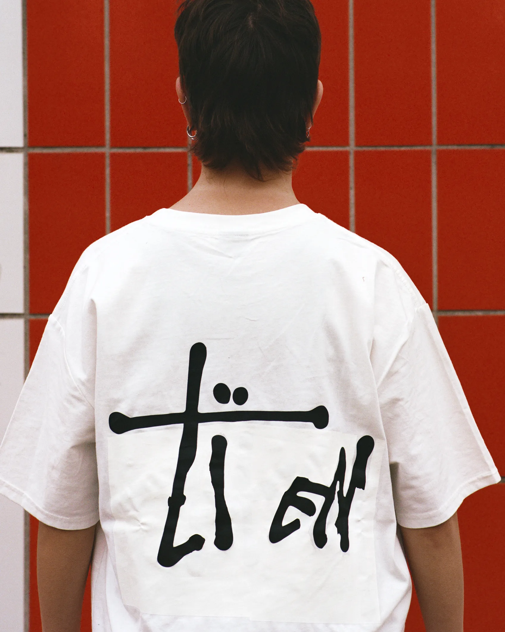
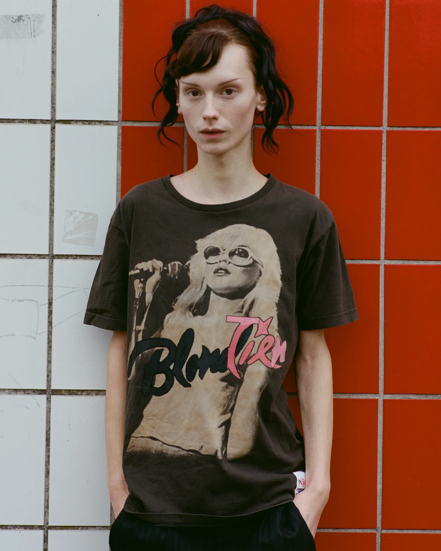
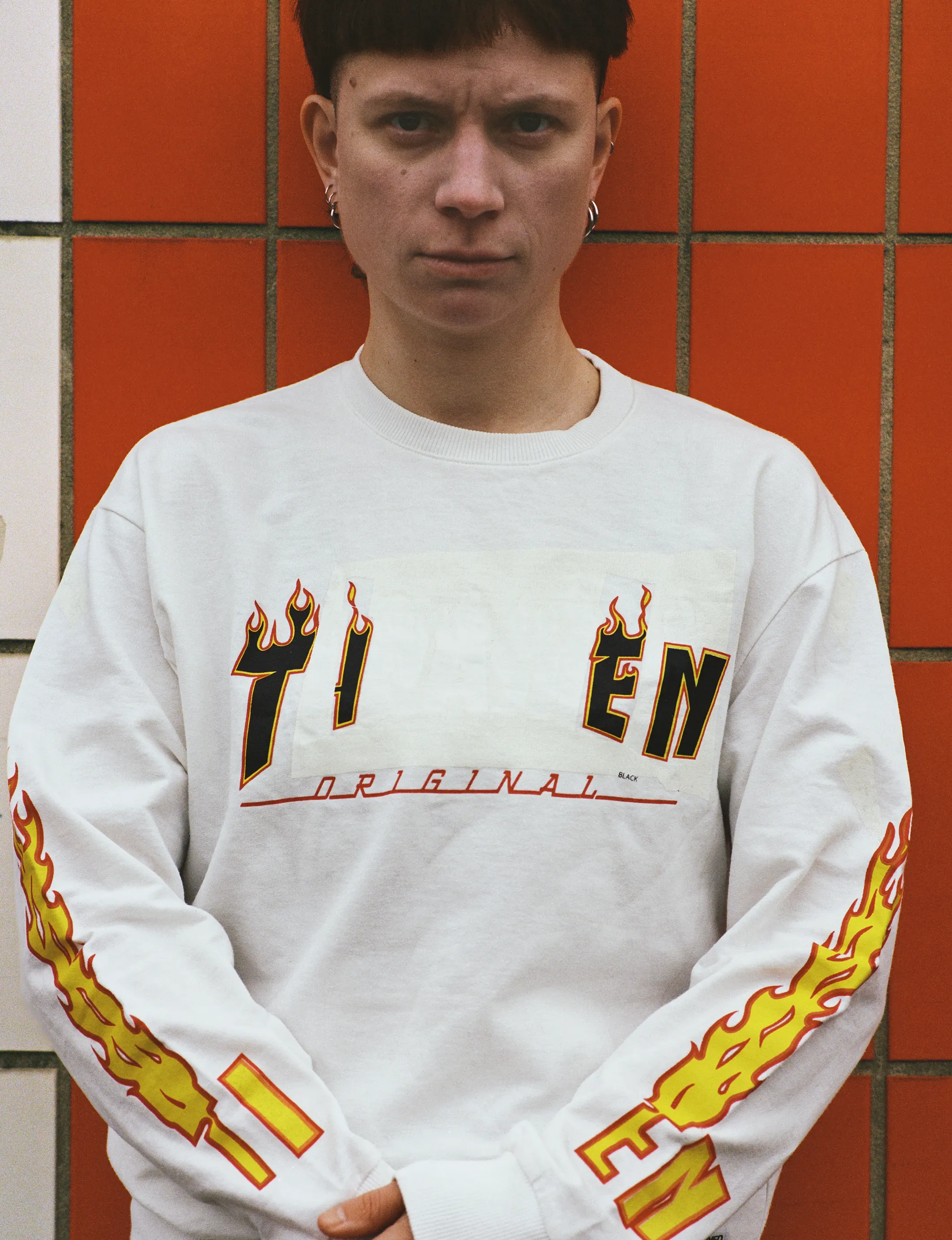
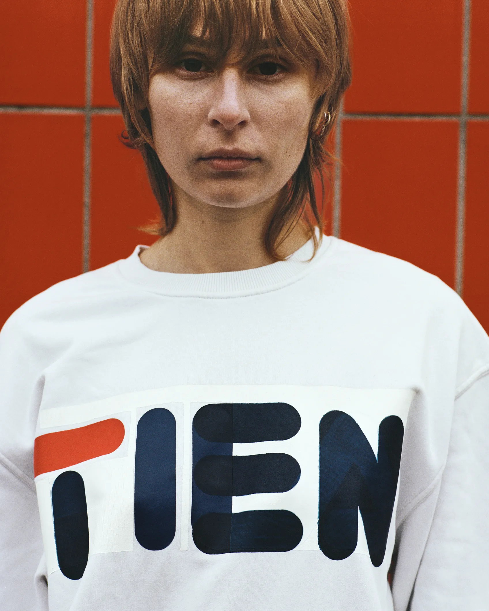
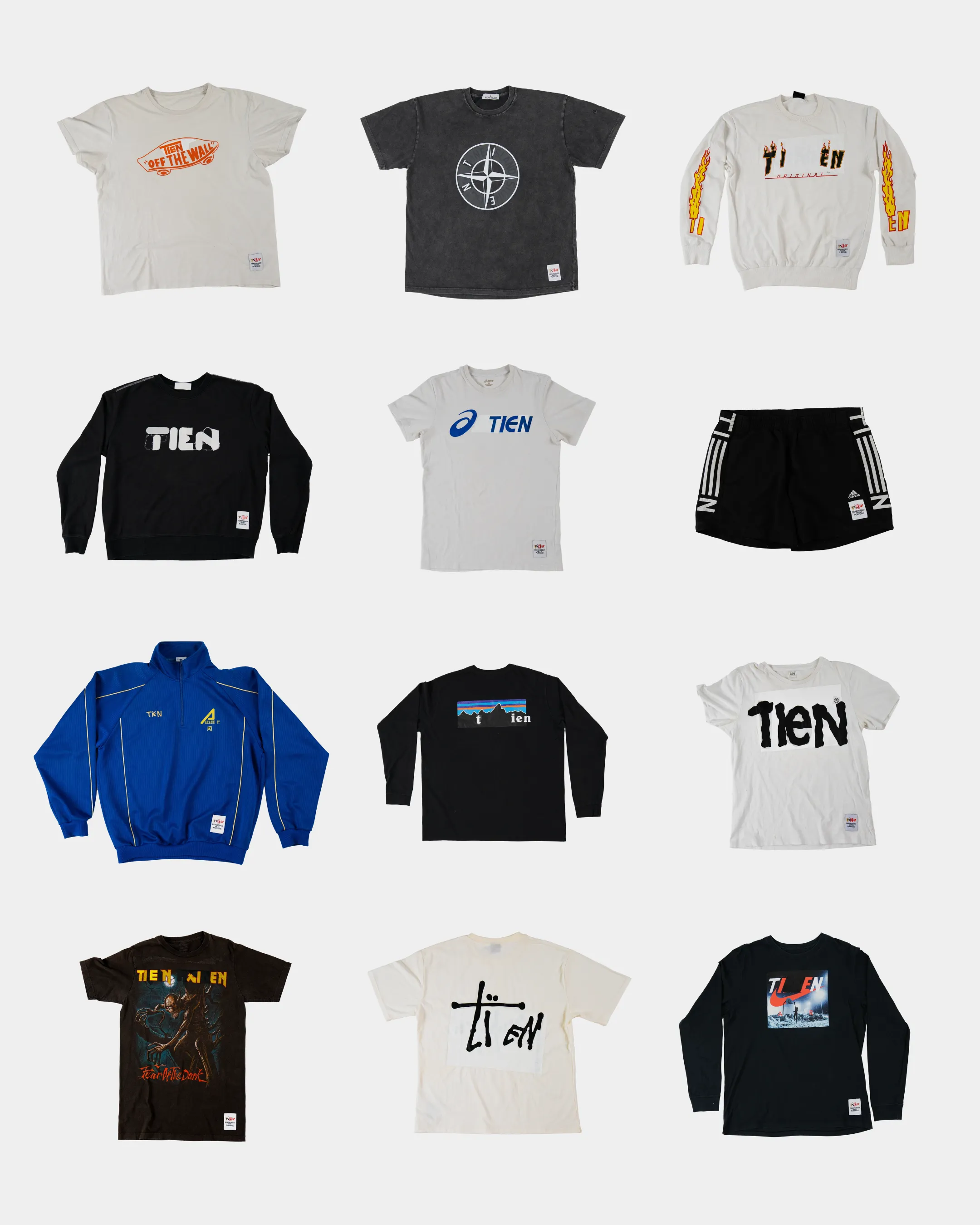
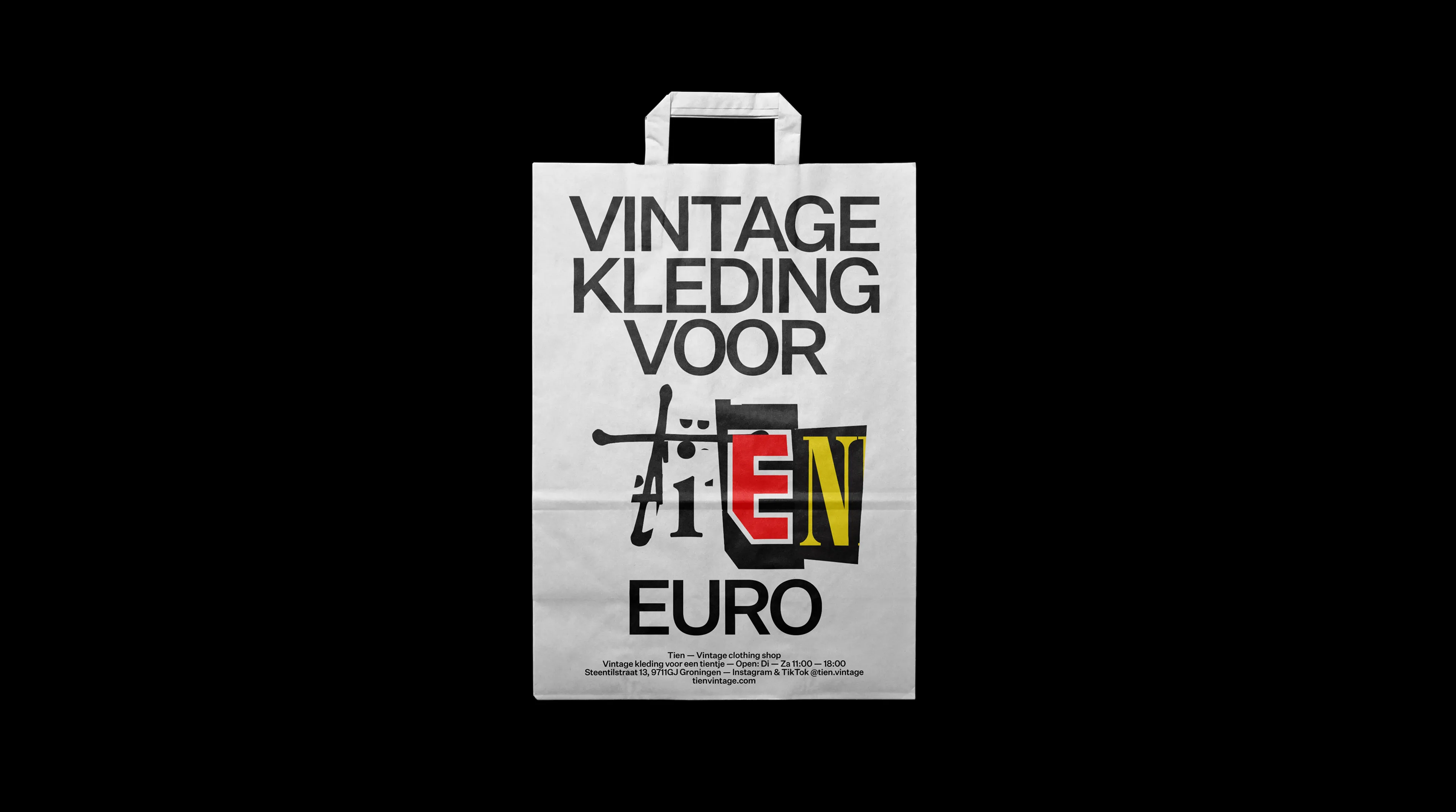
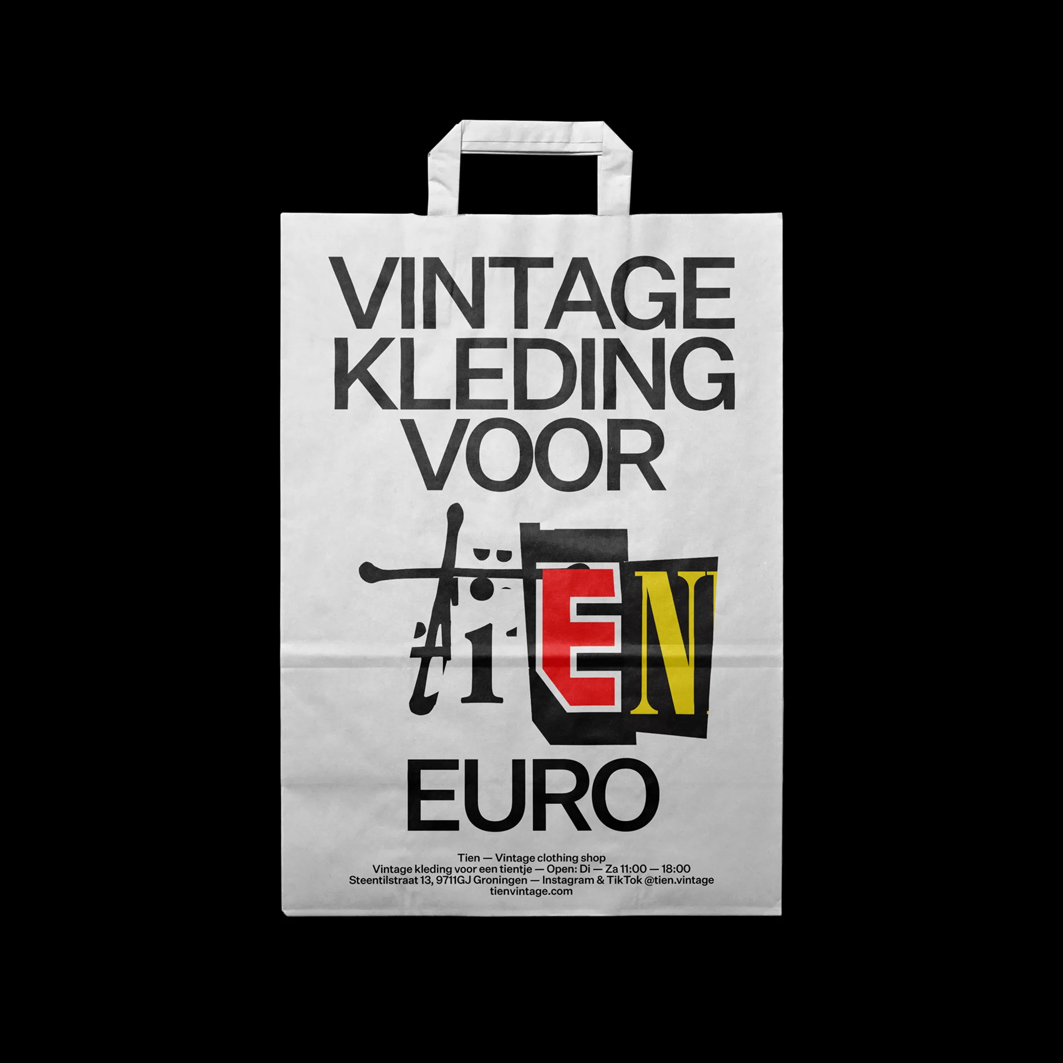
Tien (Ten) is a Dutch second-hand clothing store where every piece is cheekily priced at just ten euros. Our rebrand starts from the insight that the world doesn’t need more clothes, just better use of what’s already there. Then why buy new clothing if there’s already so many perfectly good pieces out there. Why design a new logo if there’s already so many logos out there.
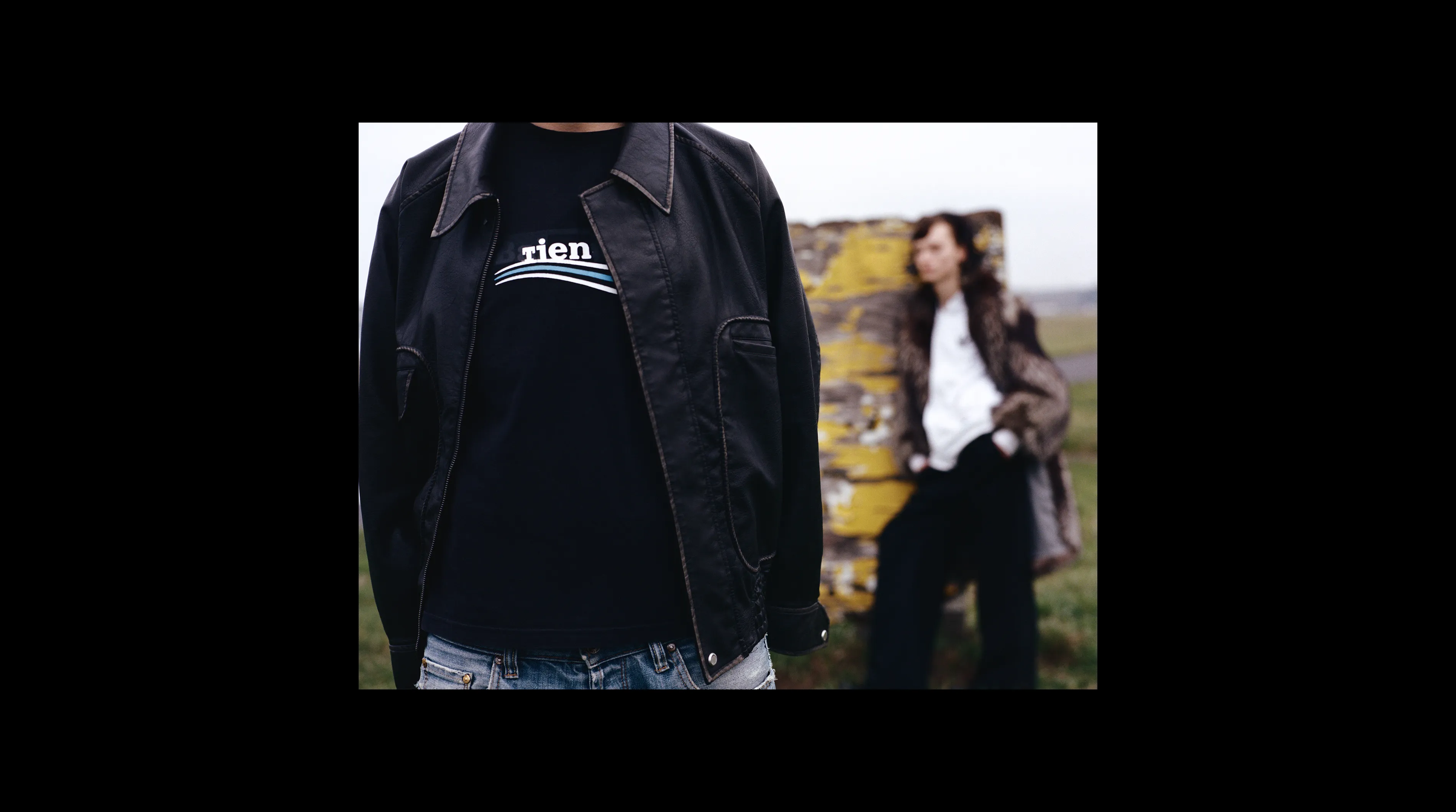
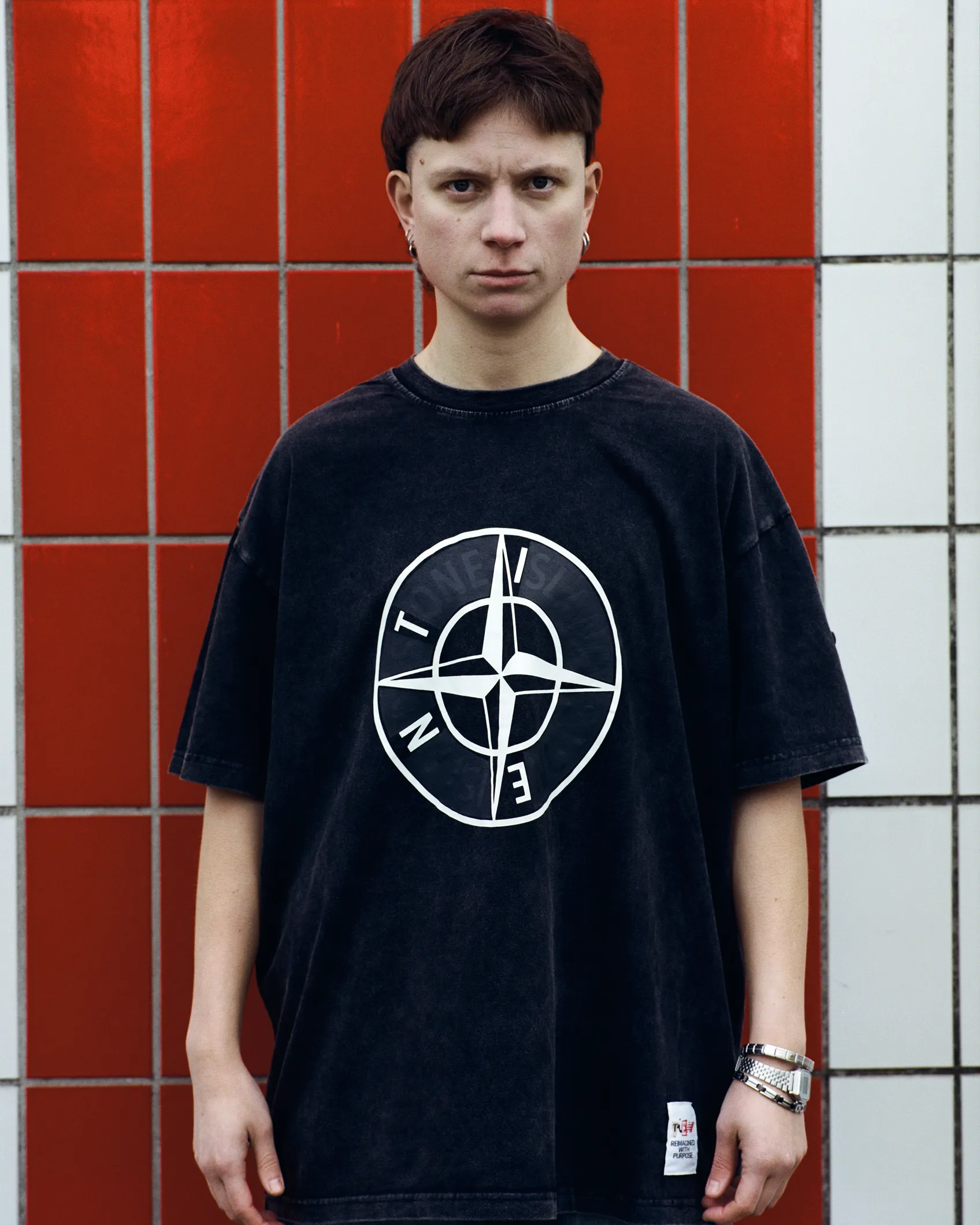
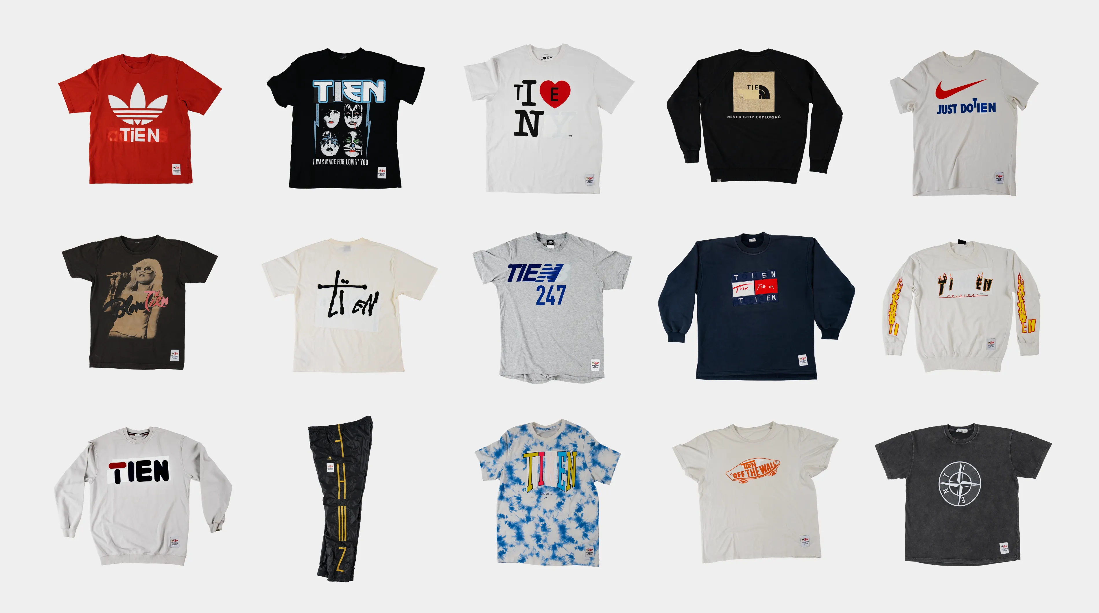
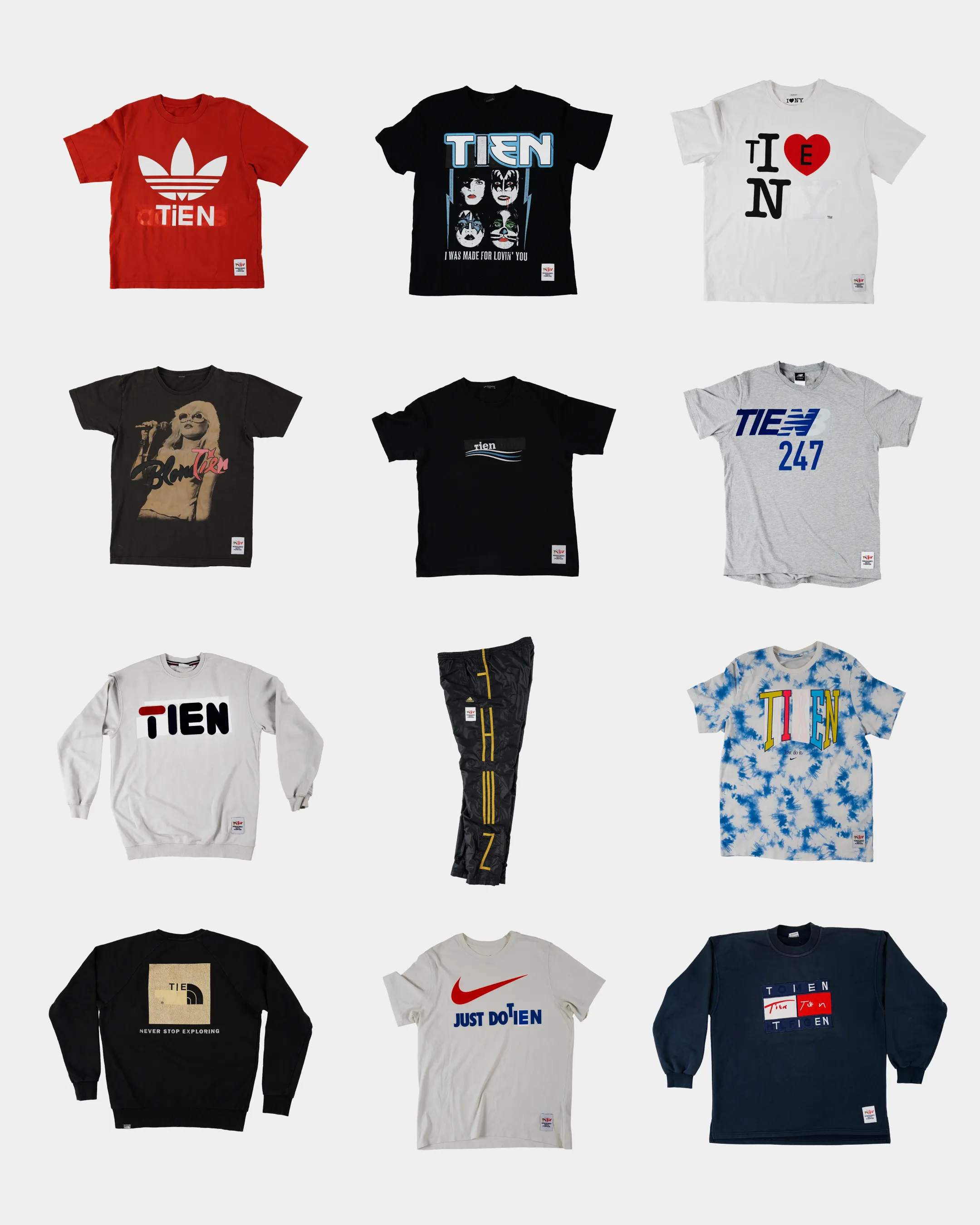
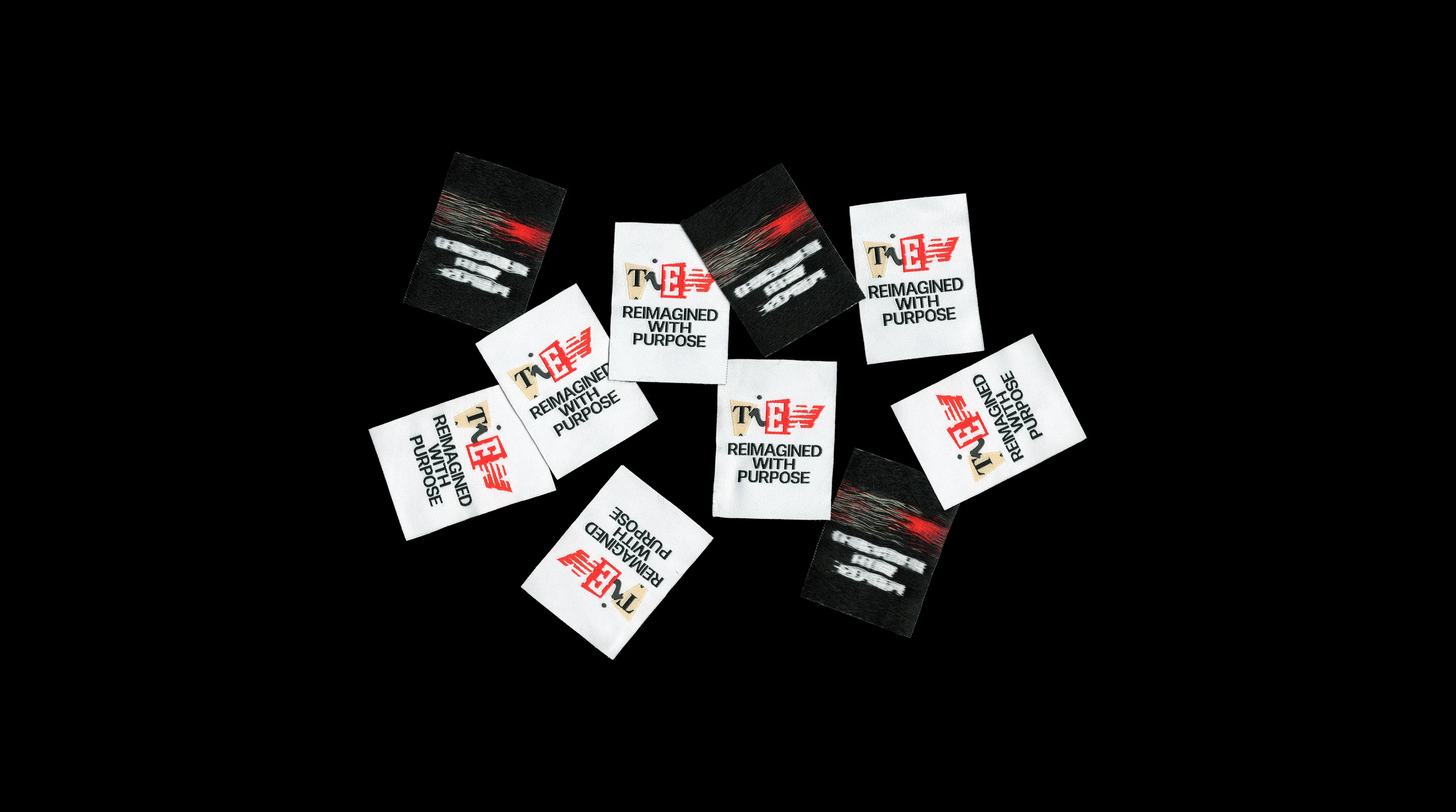
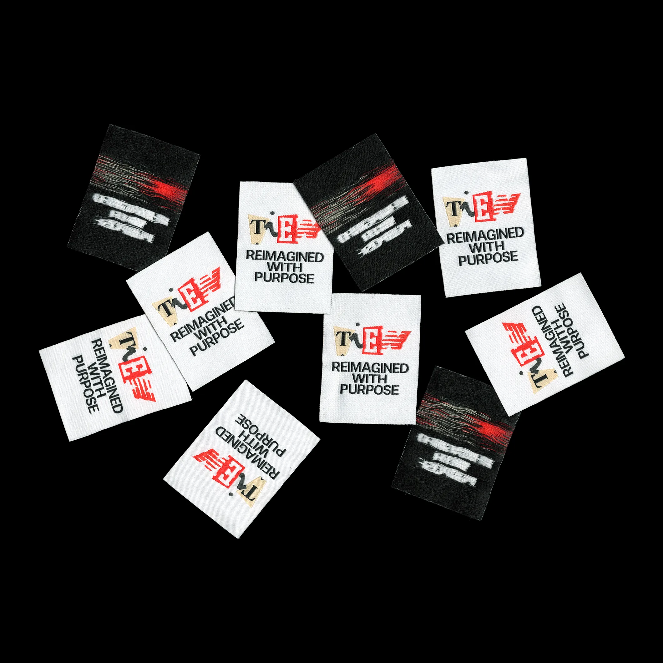
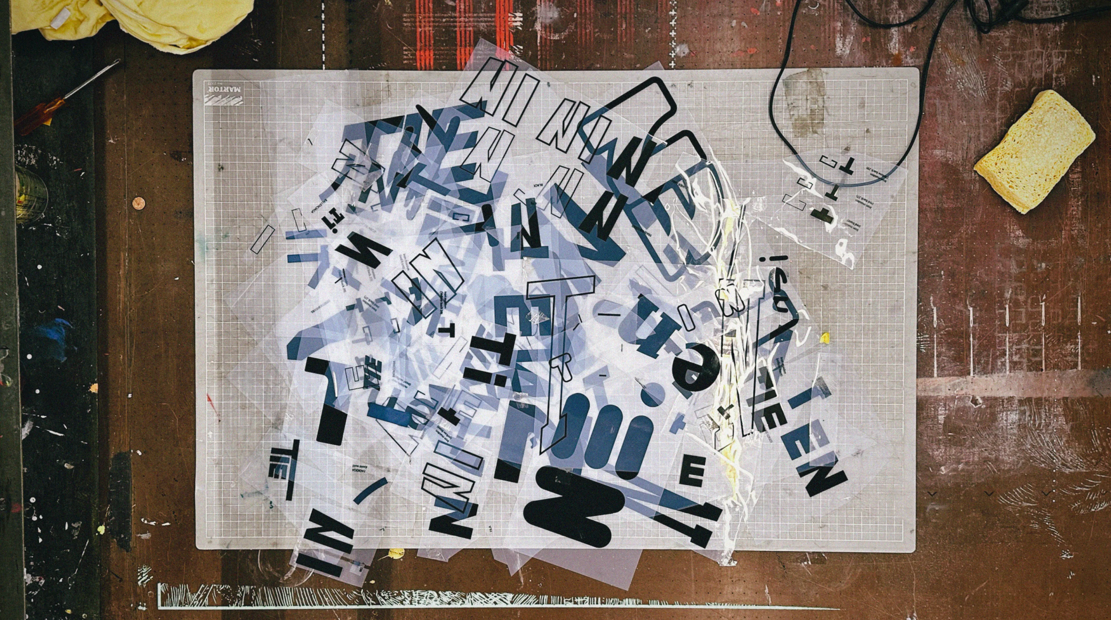
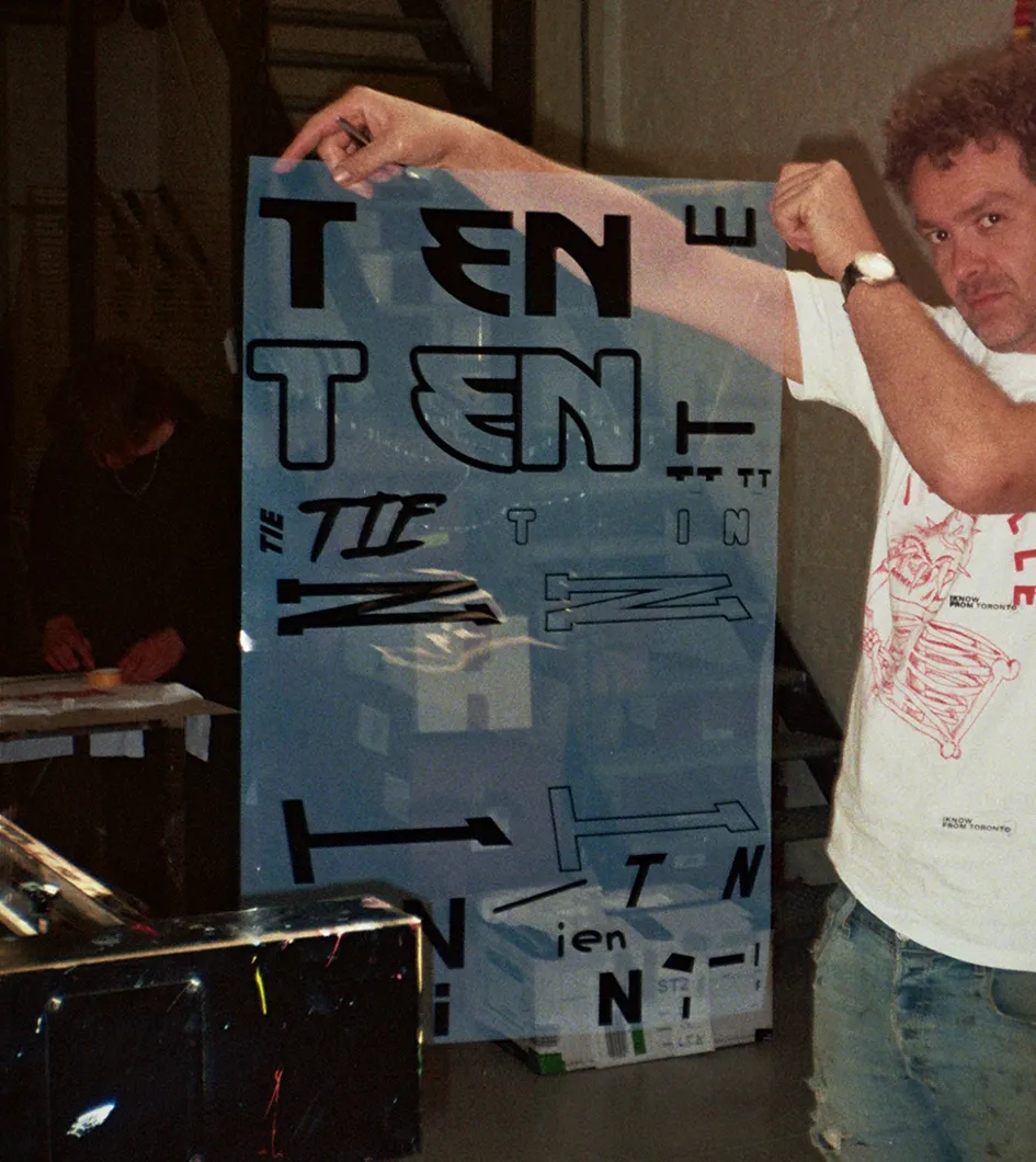
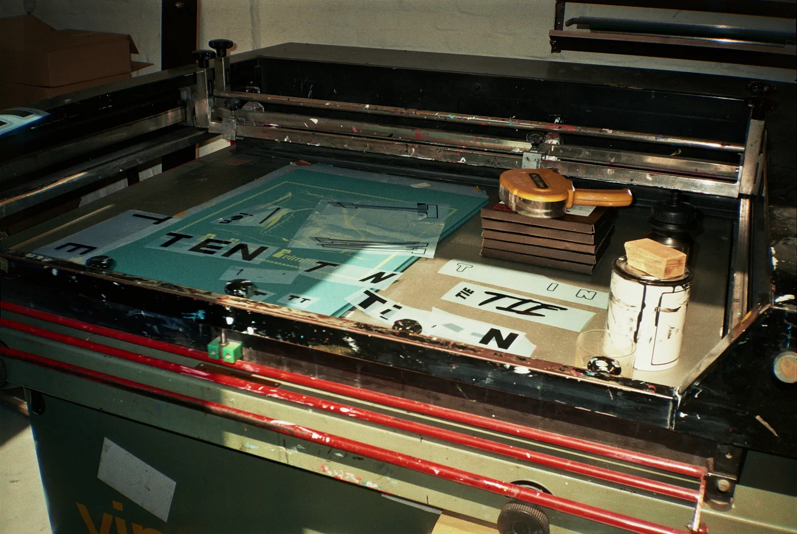
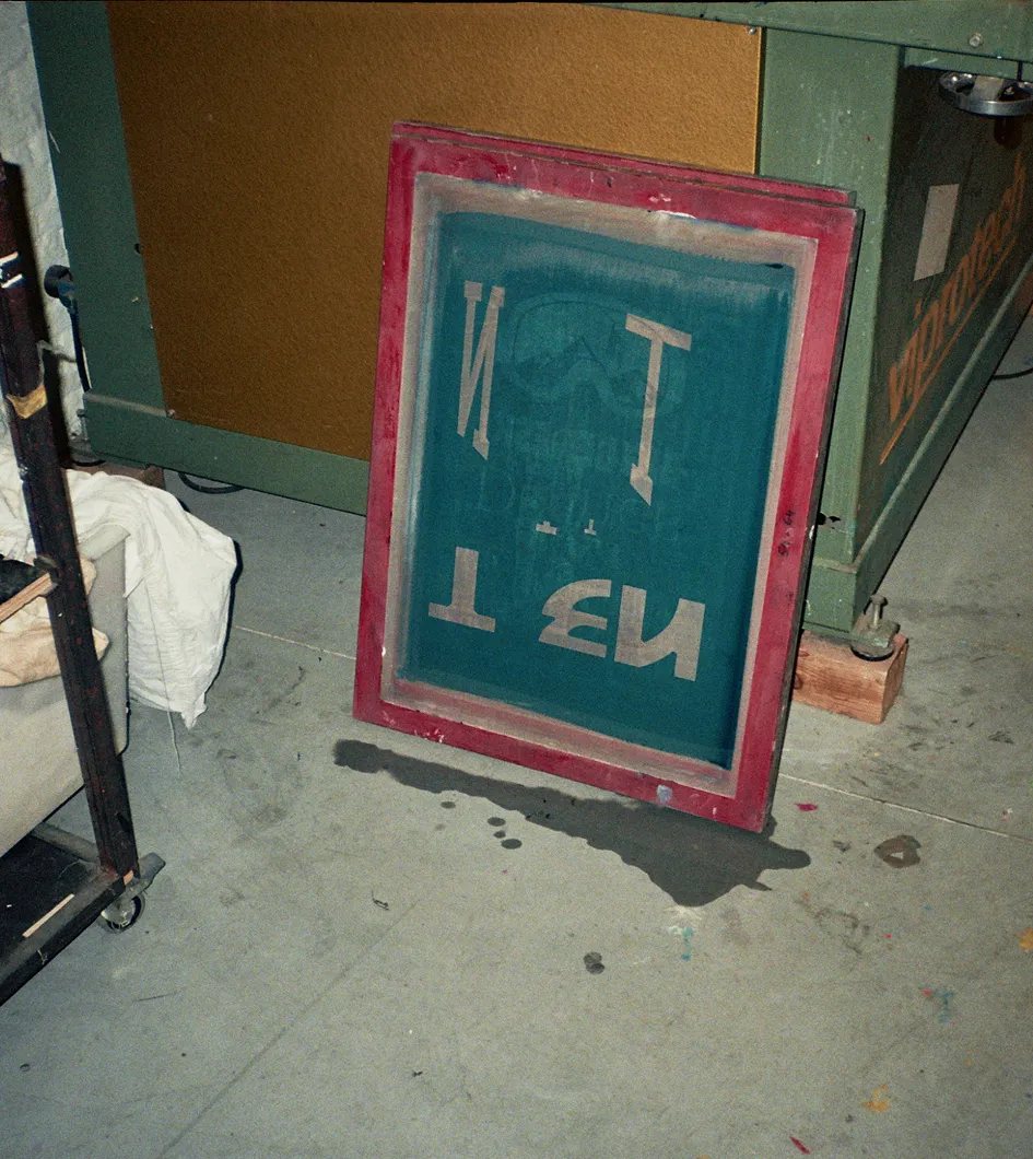
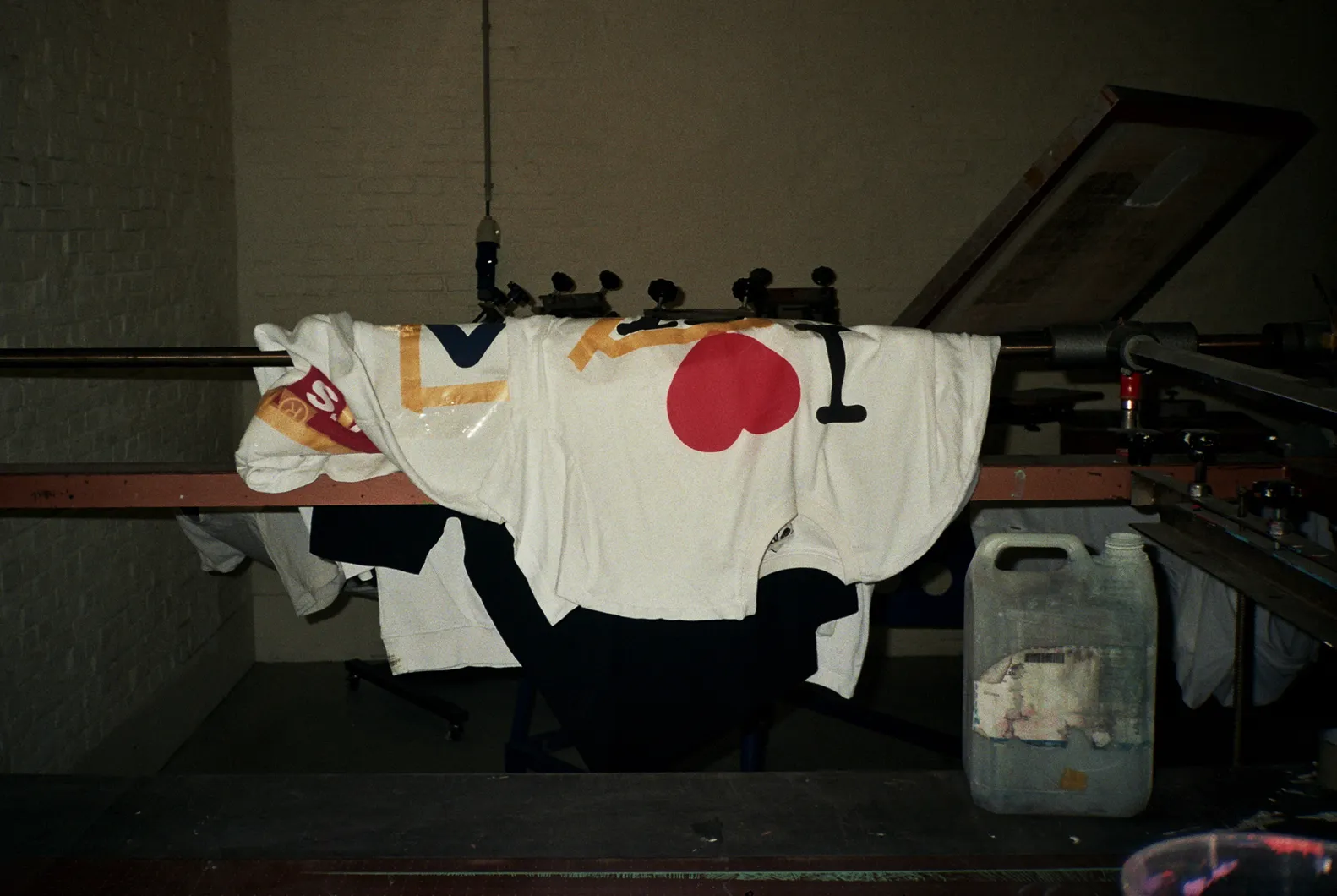
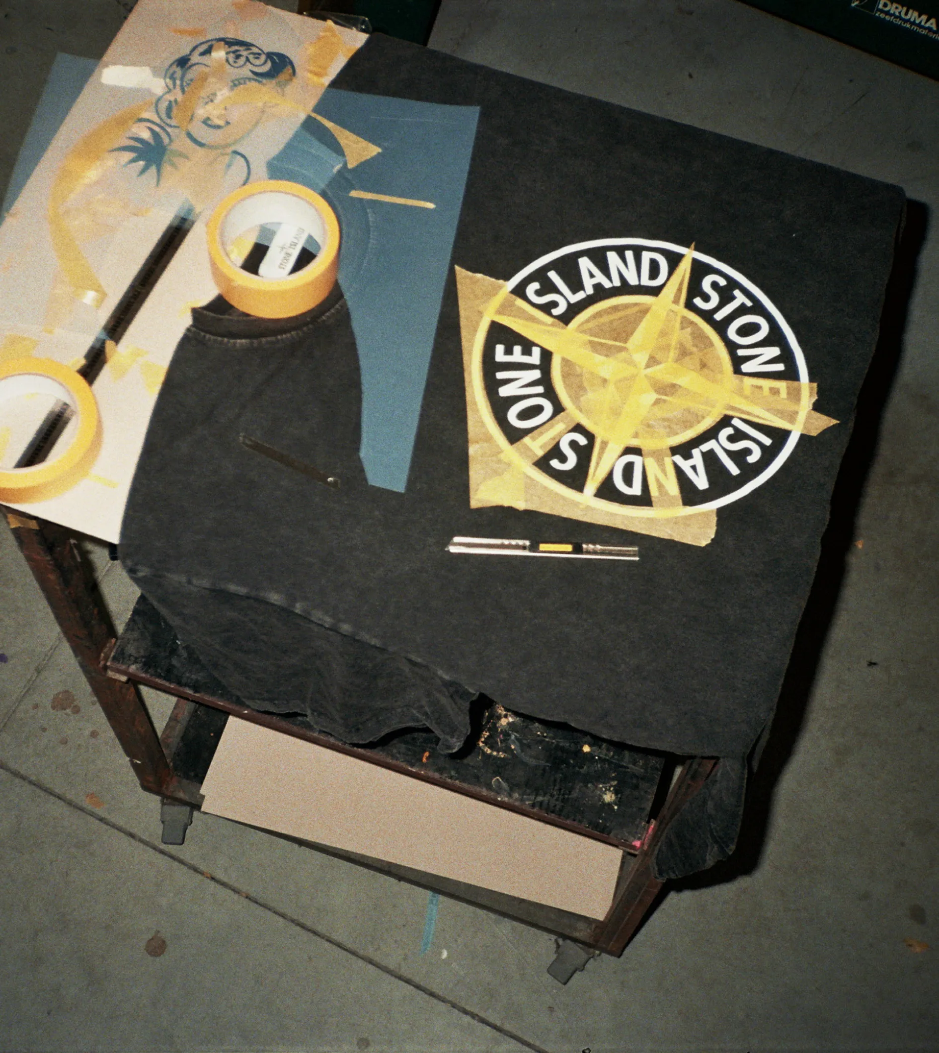
The direction was evident: reuse only what exists. An eclectic collage of letters, chaotically cut from brands found in the ever-growing mountains of discarded clothing, forms a logo that keeps evolving. For this reason, we intentionally kept the identity calm: the unapologetic logo is paired with Klim Type’s Untitled Sans Medium, set in rich black on white and light grey.
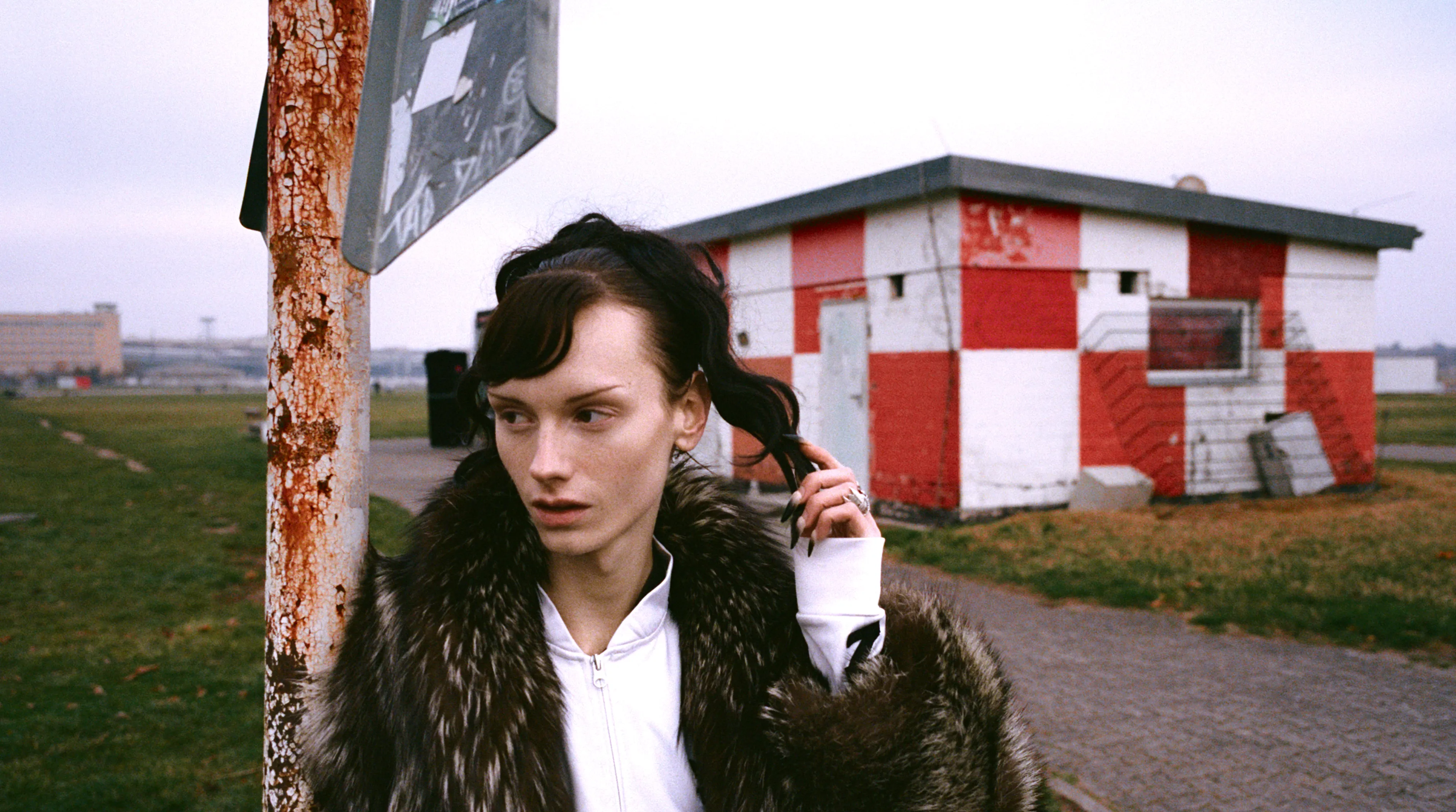
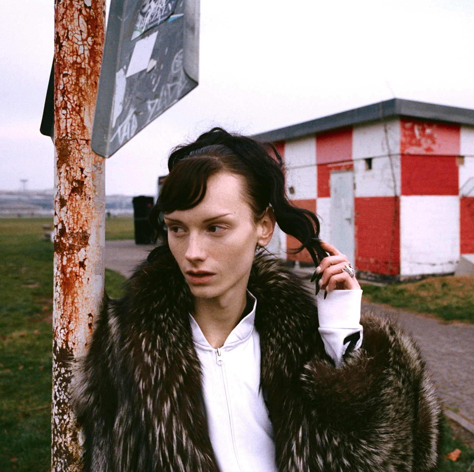
No decoration, no fluff, just activating design assembled from borrowed parts. This playful and witty communication nods to old-school Dutch functionalism, reminding us that the message is enough.
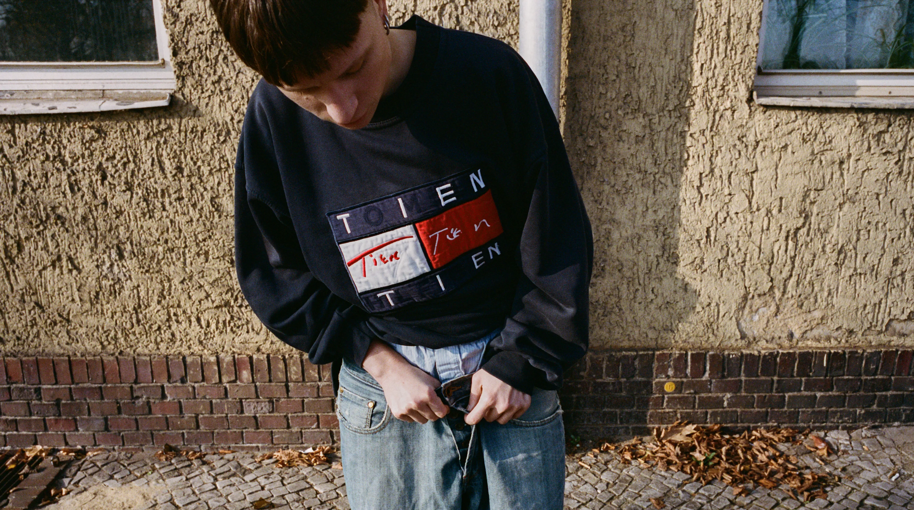
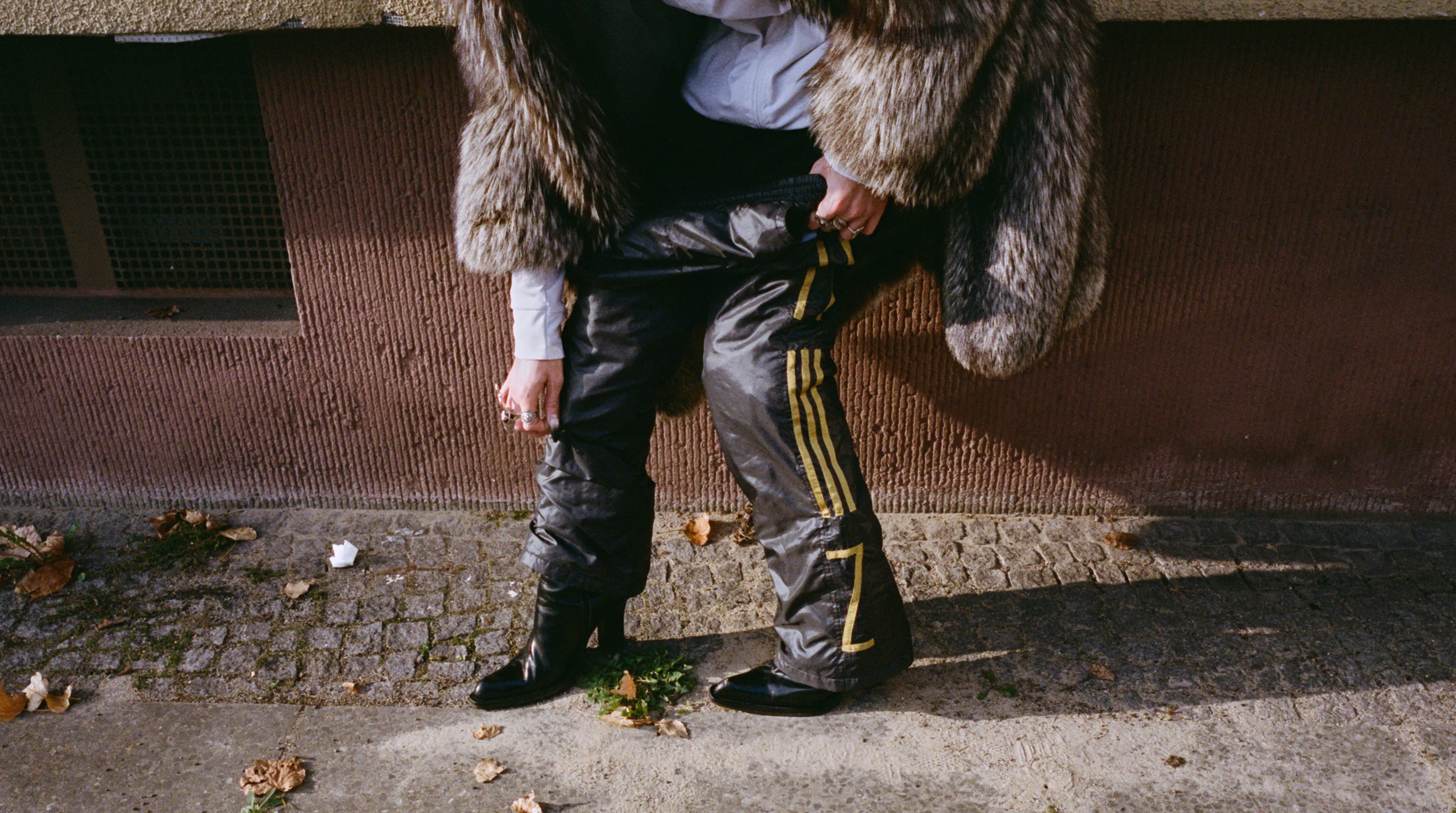
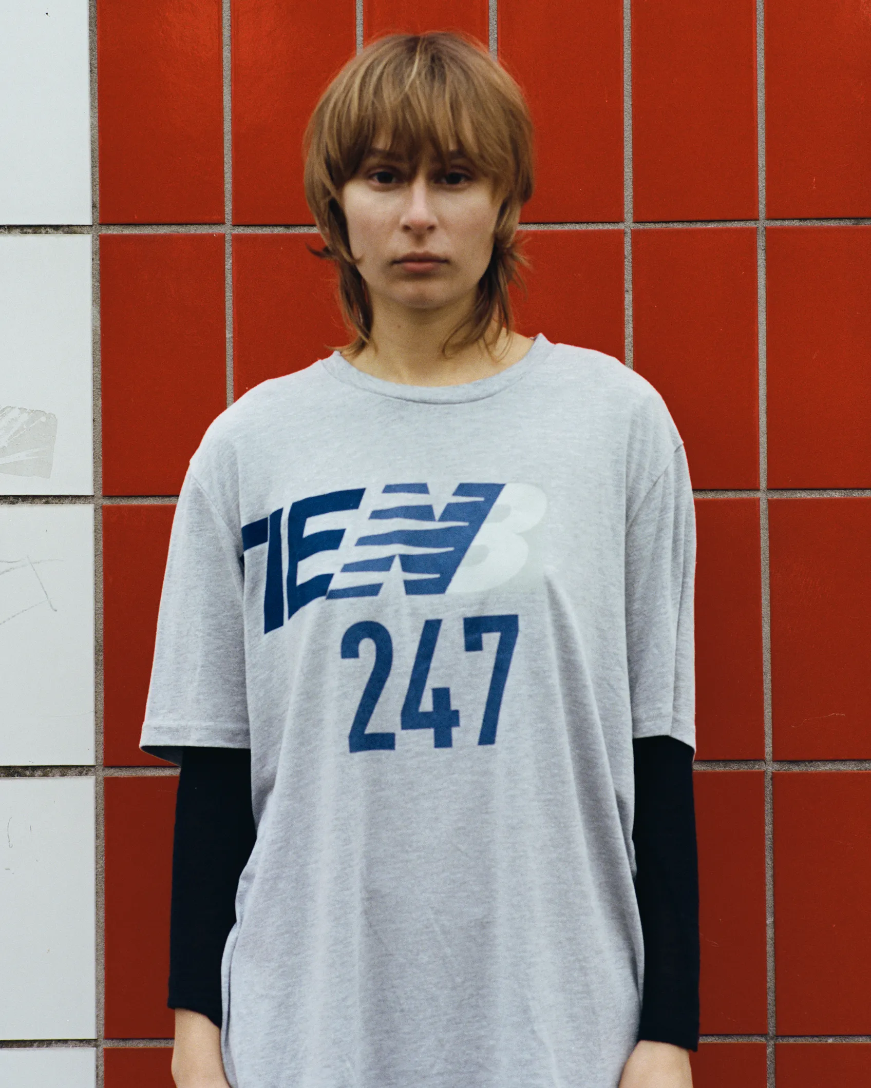
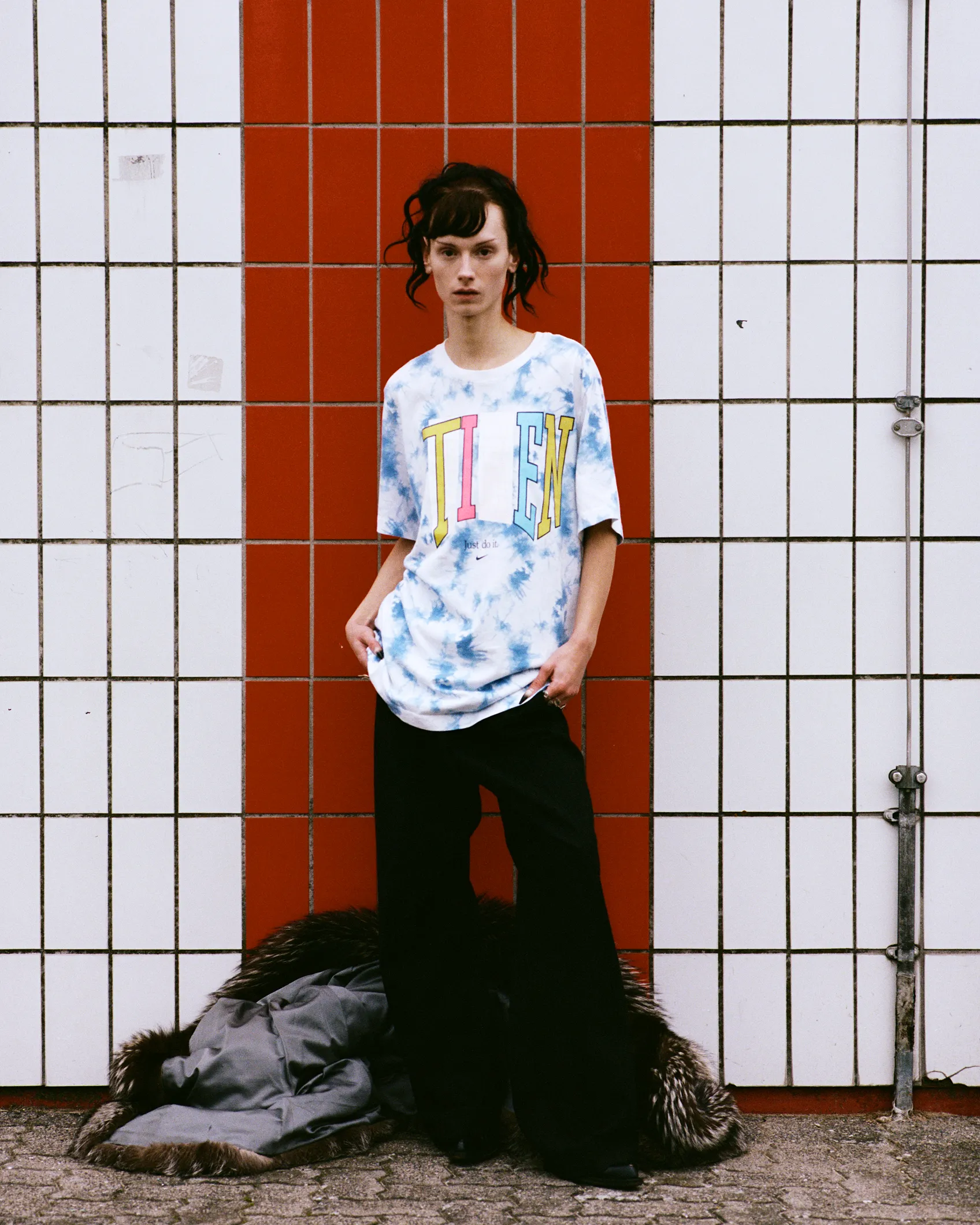
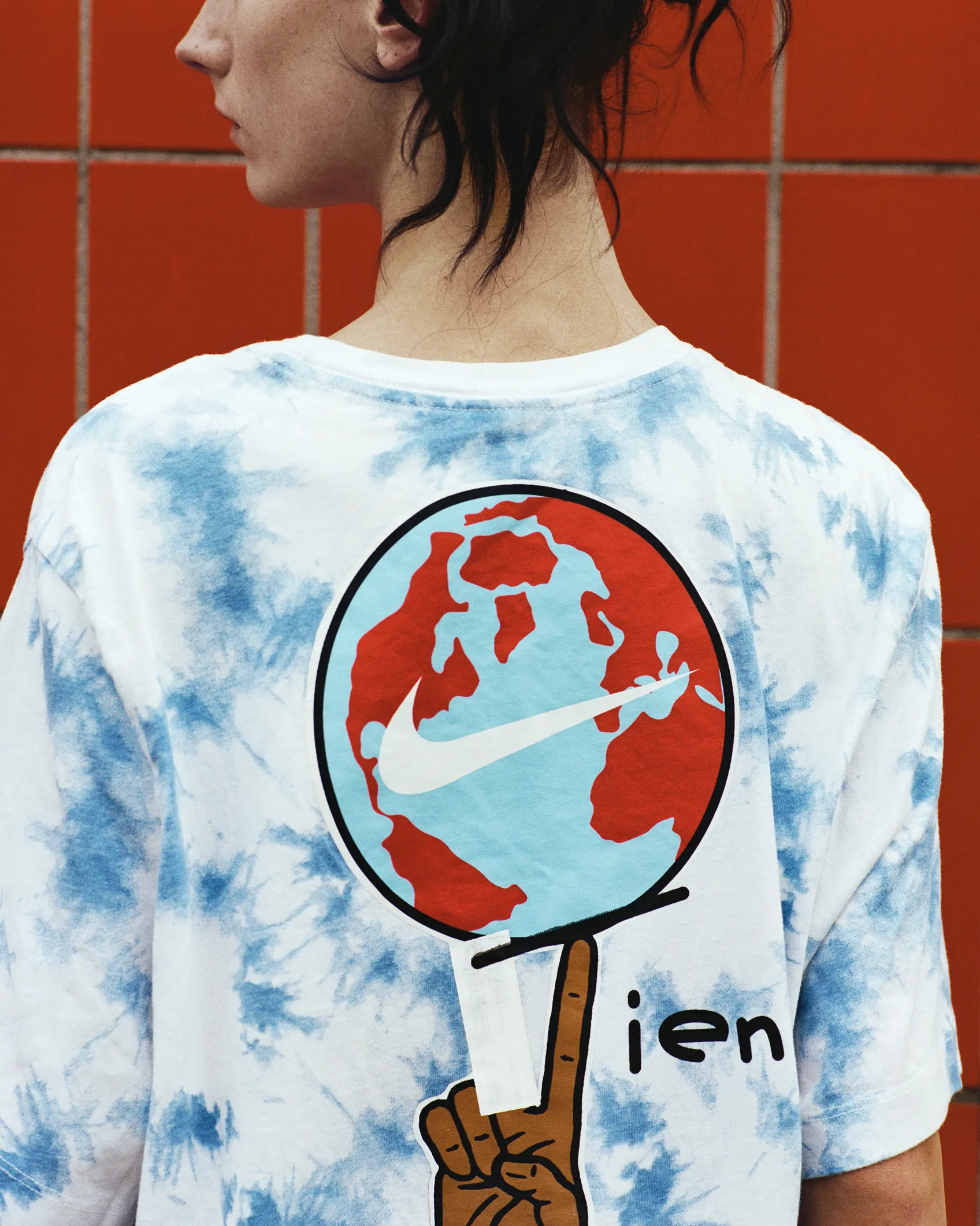
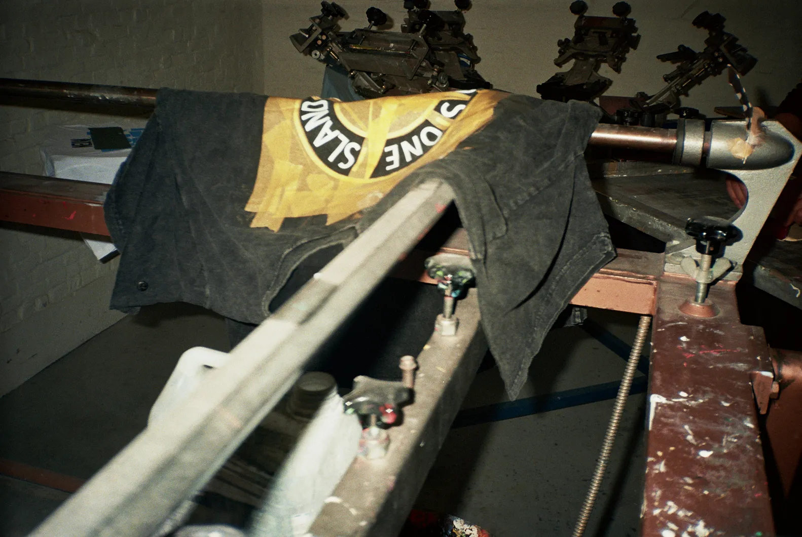
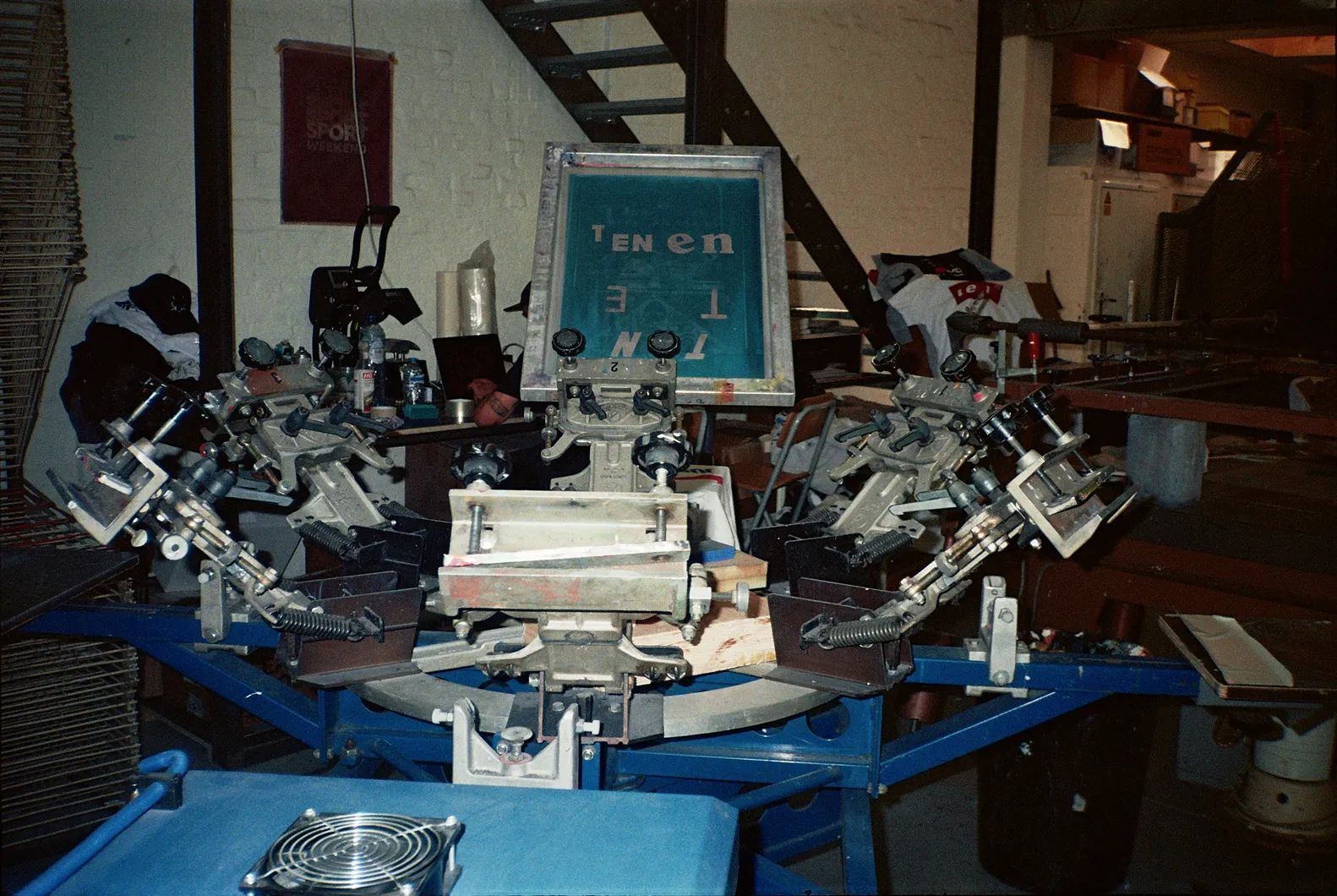
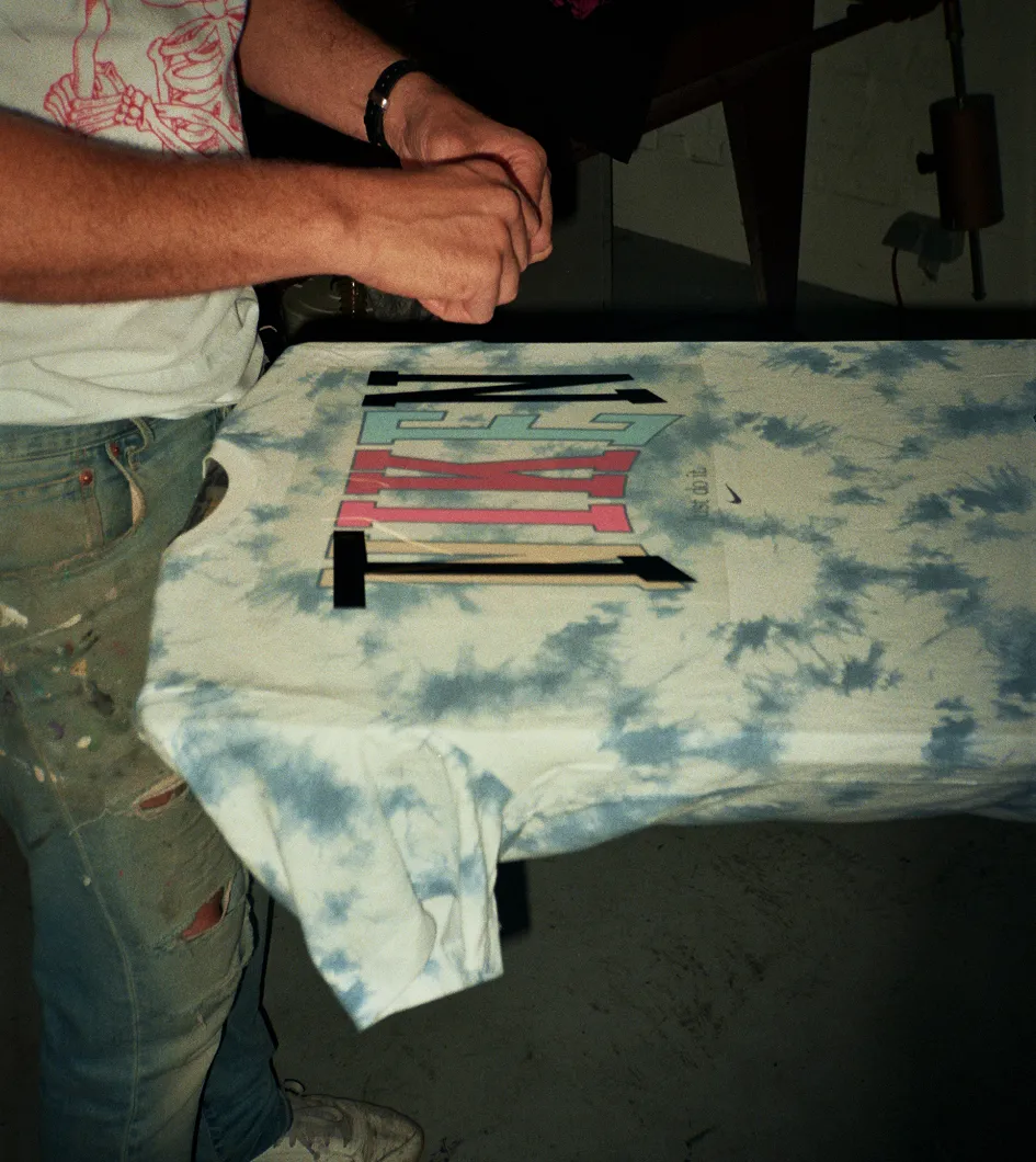
In application, we pushed even further, ensuring every physical intervention followed the same logic. From pre-owned garments with their branding Tien’ed, where even the borrowed slogans “Just do Tien” and “The Intelligent Choice. Tien” unintentionally reinforce Tien’s position on reuse, to the signage of LED screens deemed commercially unfit due to a few defective pixels. In the end, value doesn’t disappear if it’s reimagined with purpose the second time around.