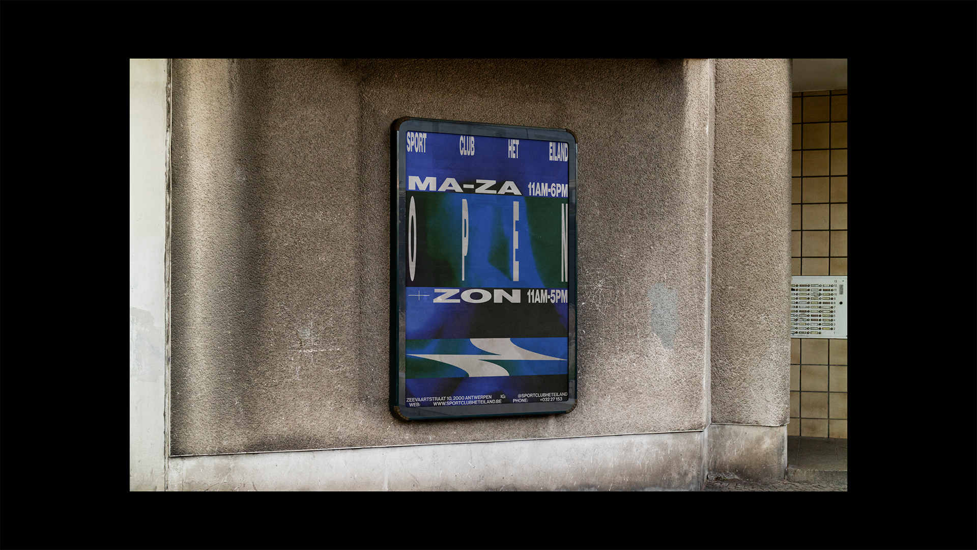
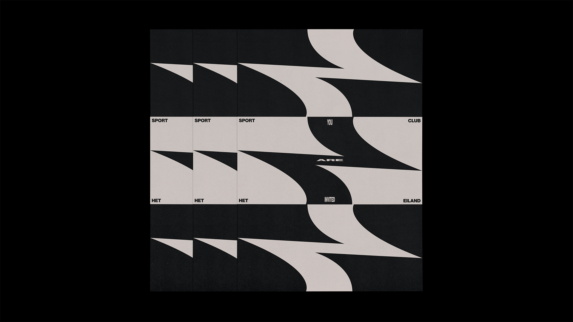
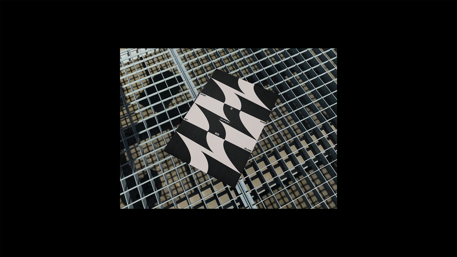
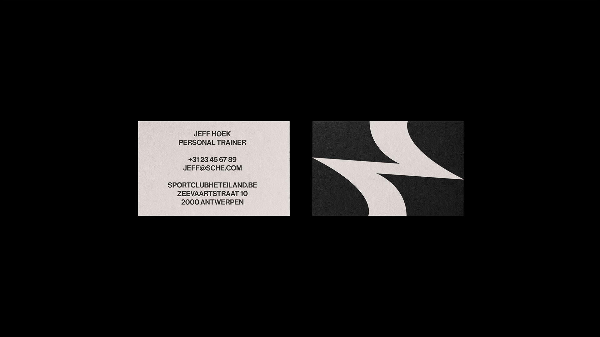
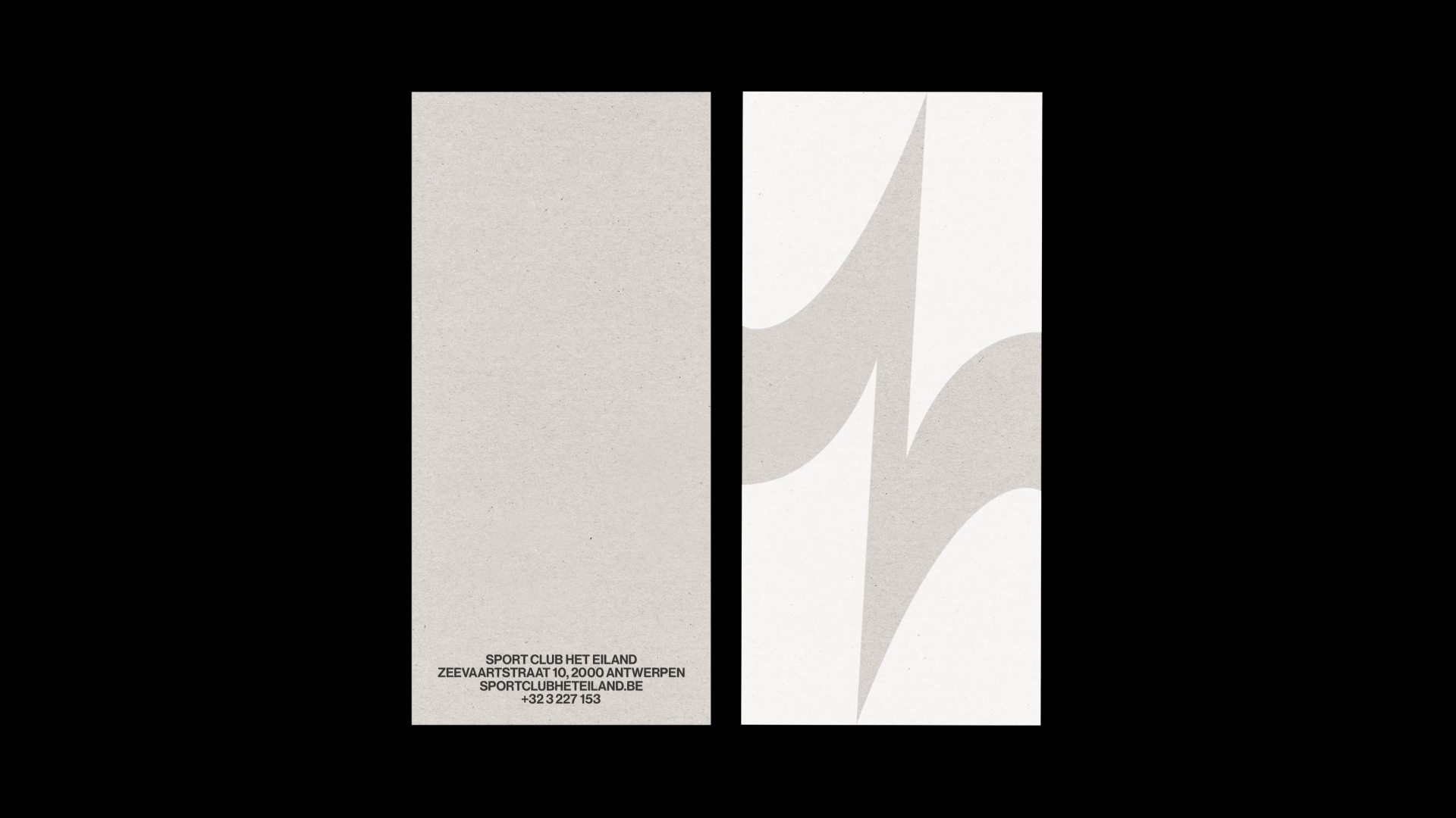
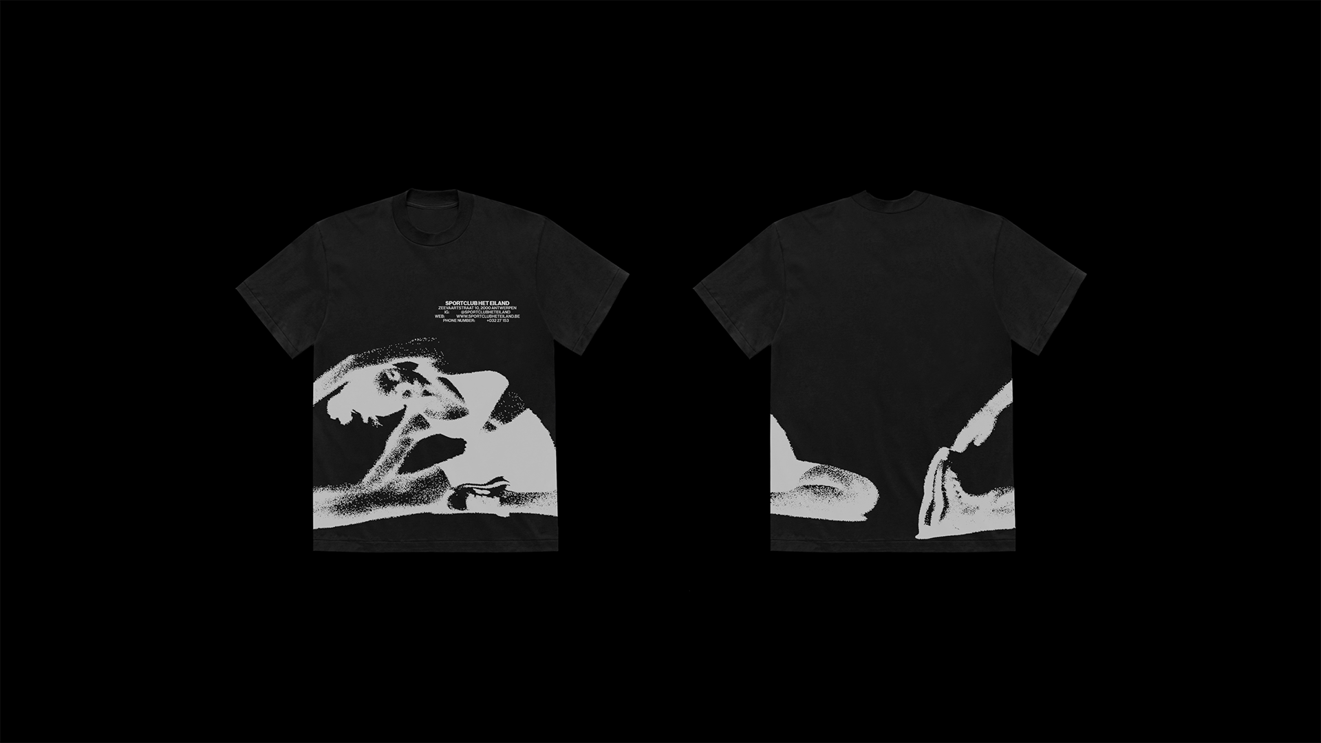
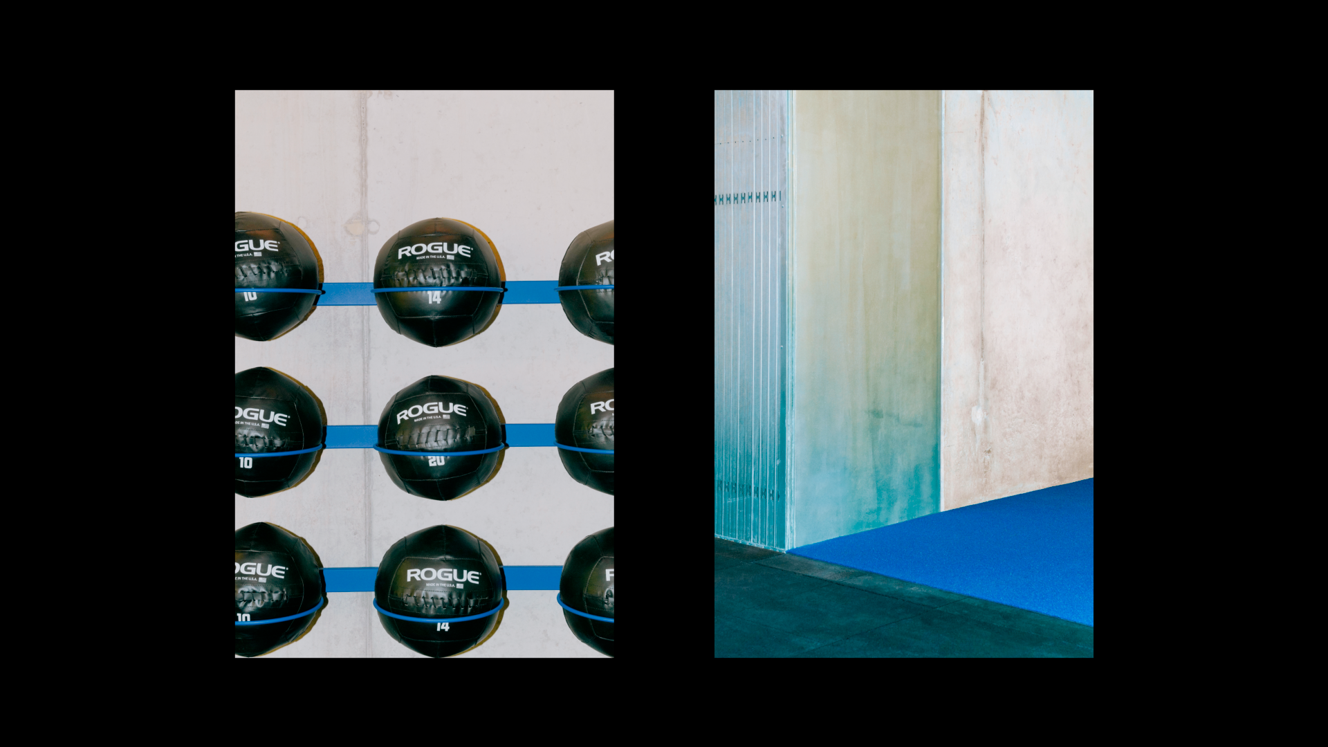
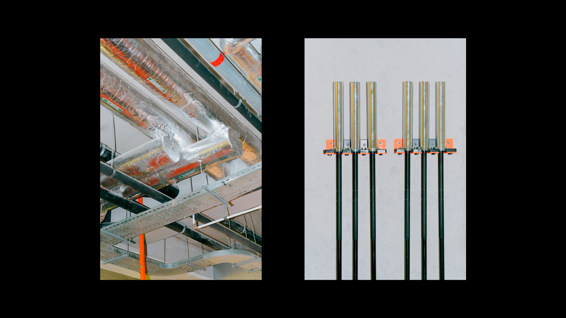
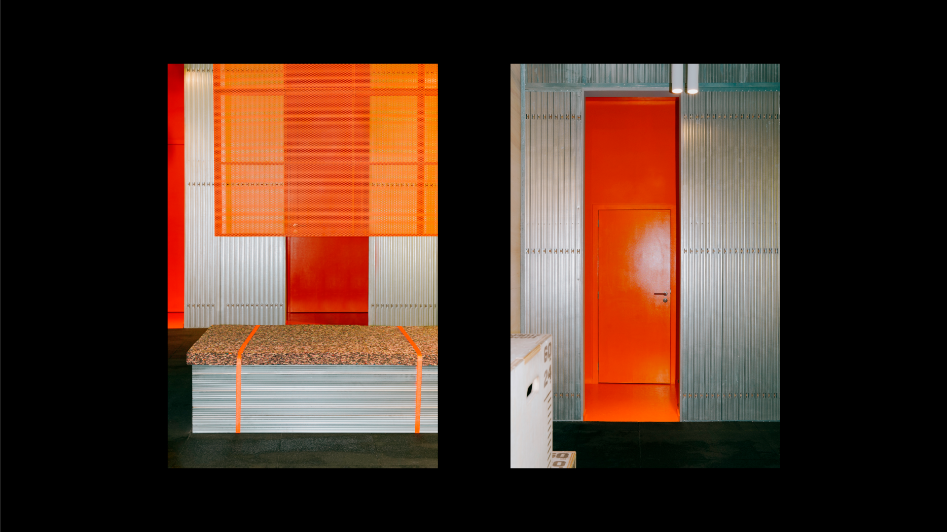
S.C.H.E. wanted to move away from the traditional look and feel of a gym to create a visual identity that is more inclusive and reflective of both their clients and the wider community in Antwerp. For this work, we were tasked to deliver a new brand identity, spatial design, social content & merchandise.
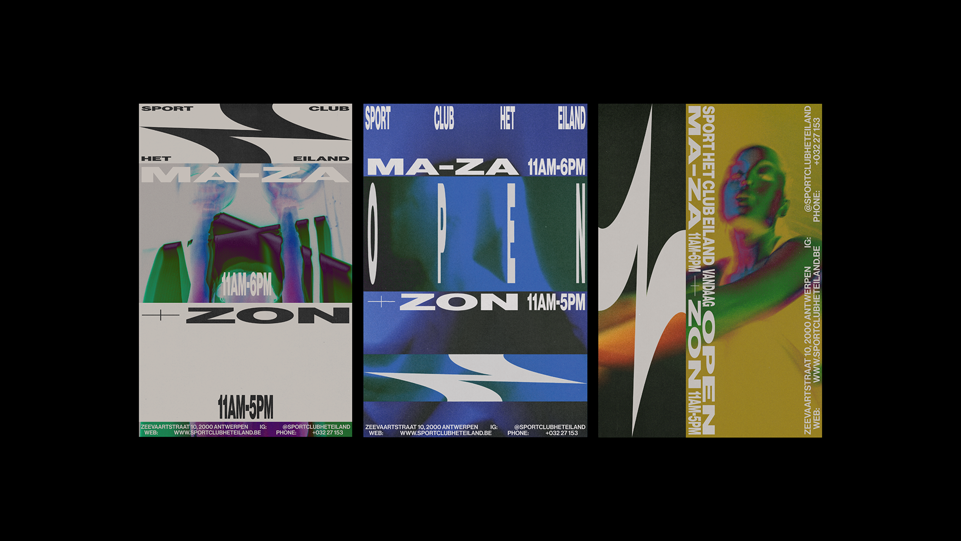
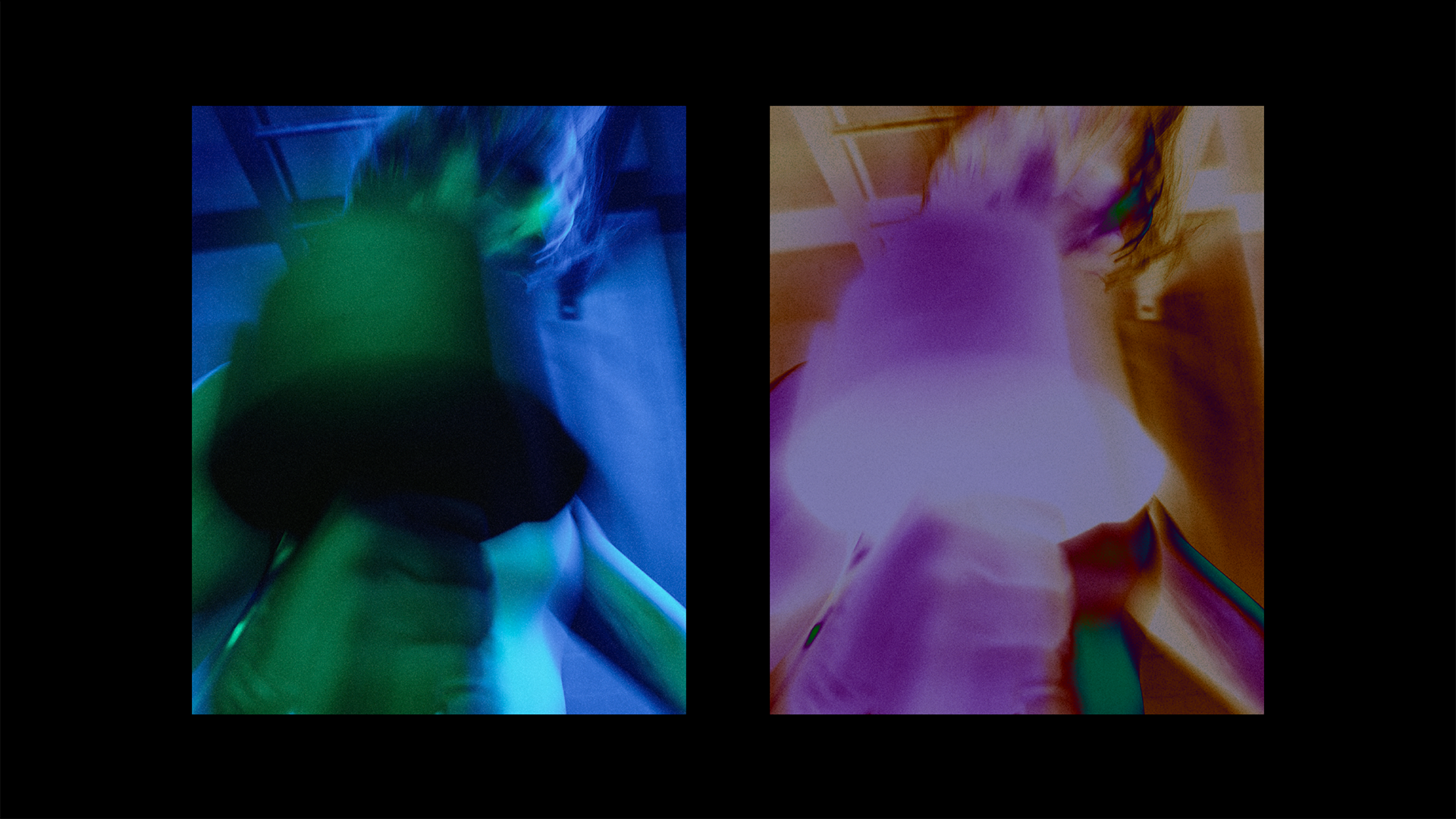
What started as a local gym in 2010, has in the last decade grown into a household name in Antwerp, Sportclub Het Eiland. In a city where culture is constantly changing and developing, S.C.H.E. wants to move with it. This is where we came in. We decided on a look that is conceptual - with a focus on photography, graphic design, colour and of course, movement. This is used as a framework in which to depict and shoot our models. The photography mainly emphasises movement in itself, without focusing too much on a physical outcome, but rather on the dynamism of movement and the feeling of energy that working out brings.
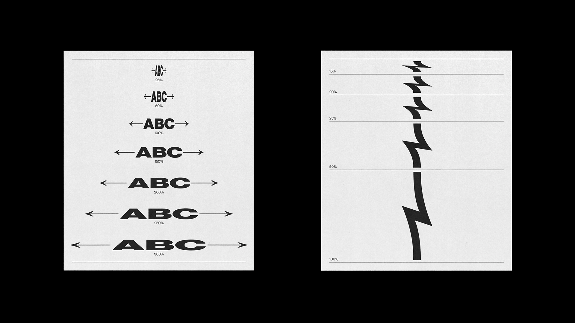
The identity tries to provide space for possibilities and offers users the liberty to play and give their own touch to each design. This is achieved by offering both a logo and typefaces that are flexible and capable of stretching in every direction.
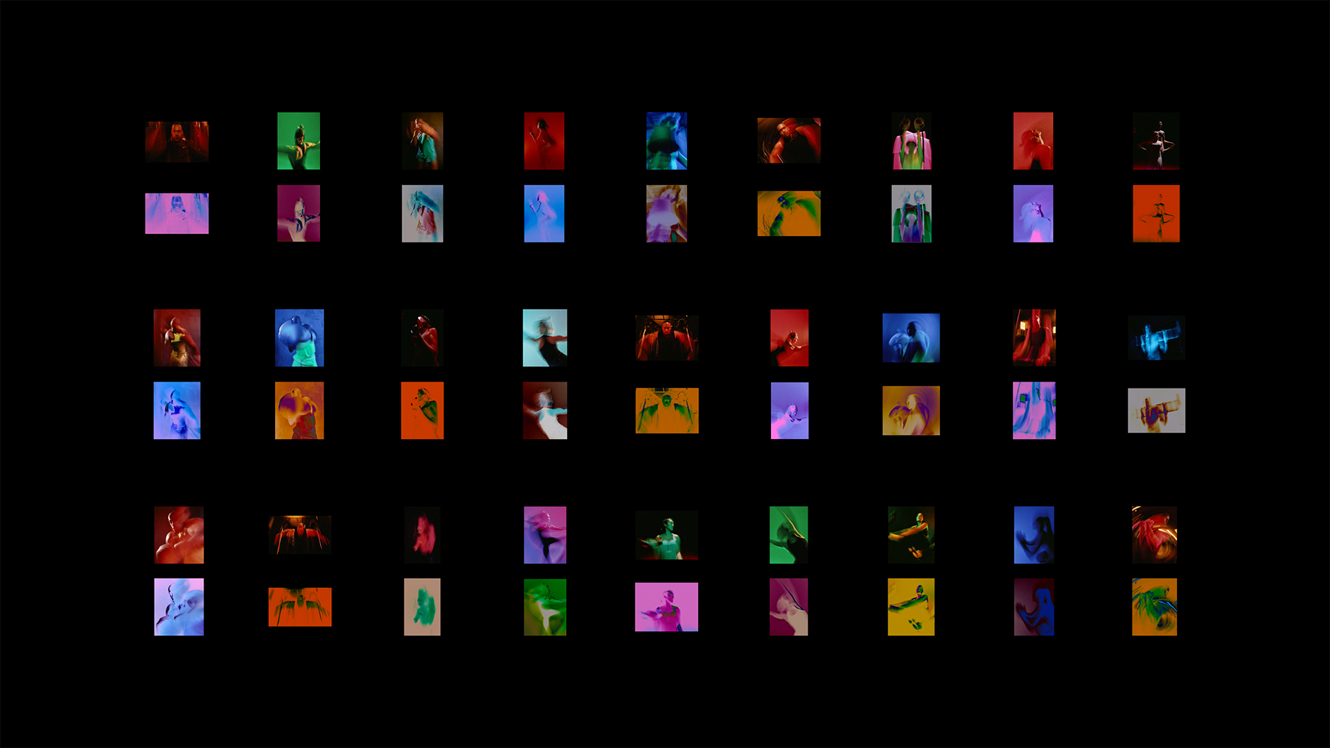
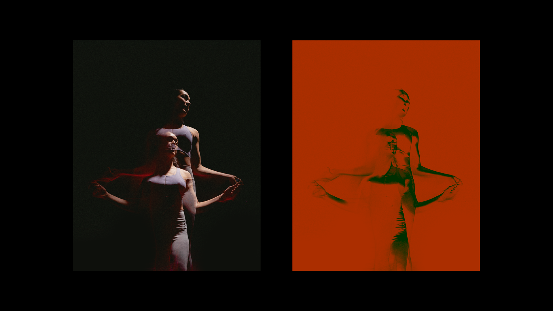
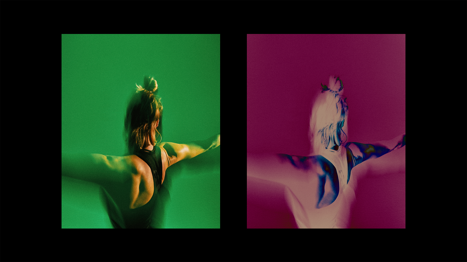
In cooperation with photographer Daniil Lavrovski, we chose to shoot colourful and abstract photography of models with a low shutter-speed, to create an energetic image that seems to be in constant movement.
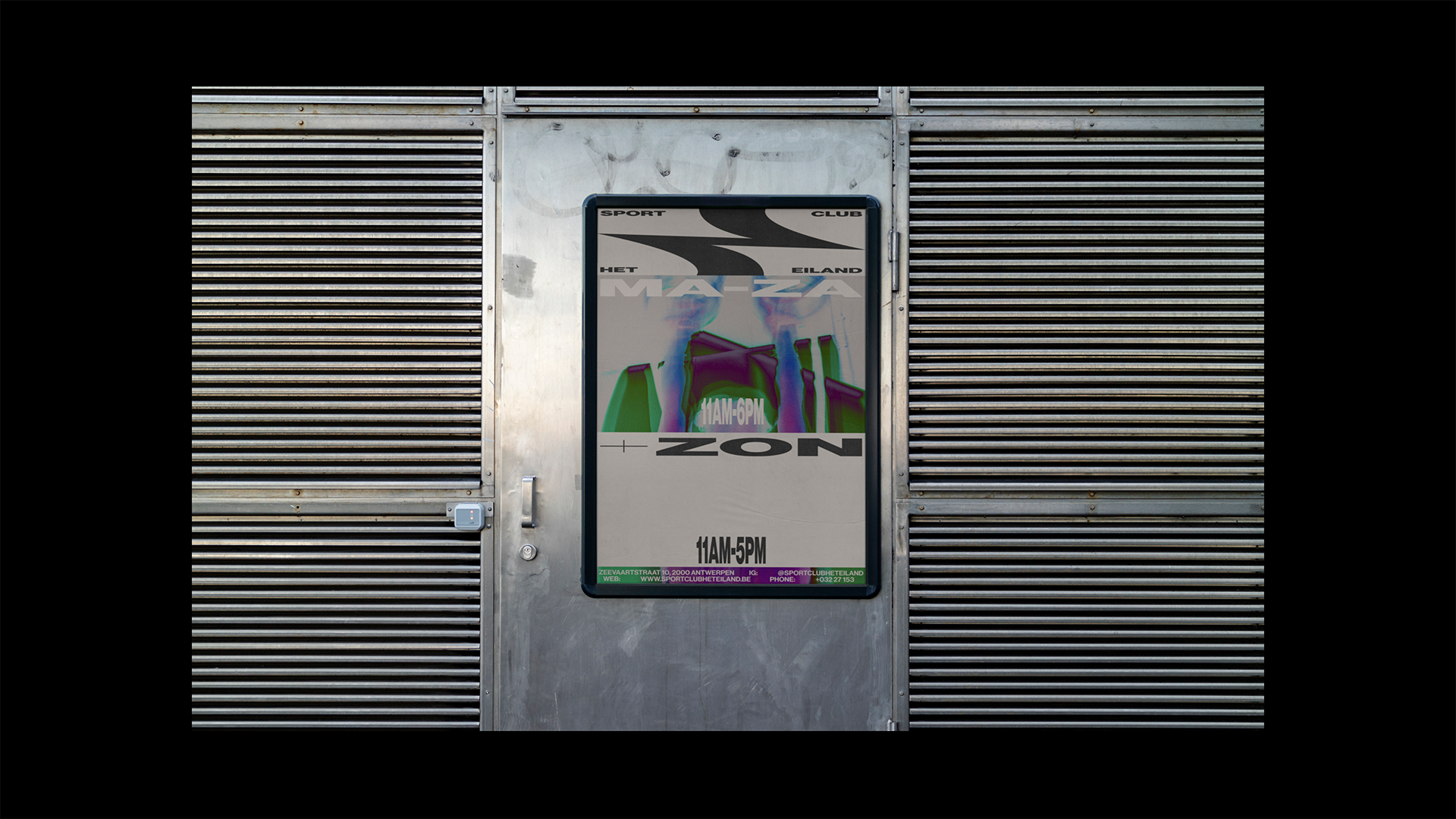
In addition to the photography and graphics, we implemented various filter frames that can be positioned on top of the imagery and identity to create a negative-photo effect. This gives a ‘heat-wave’ effect that is able to create unique colour schemes. The combination of these different facets creates a modern, dynamic and energetic look perfect for Antwerp’s favourite gym.
