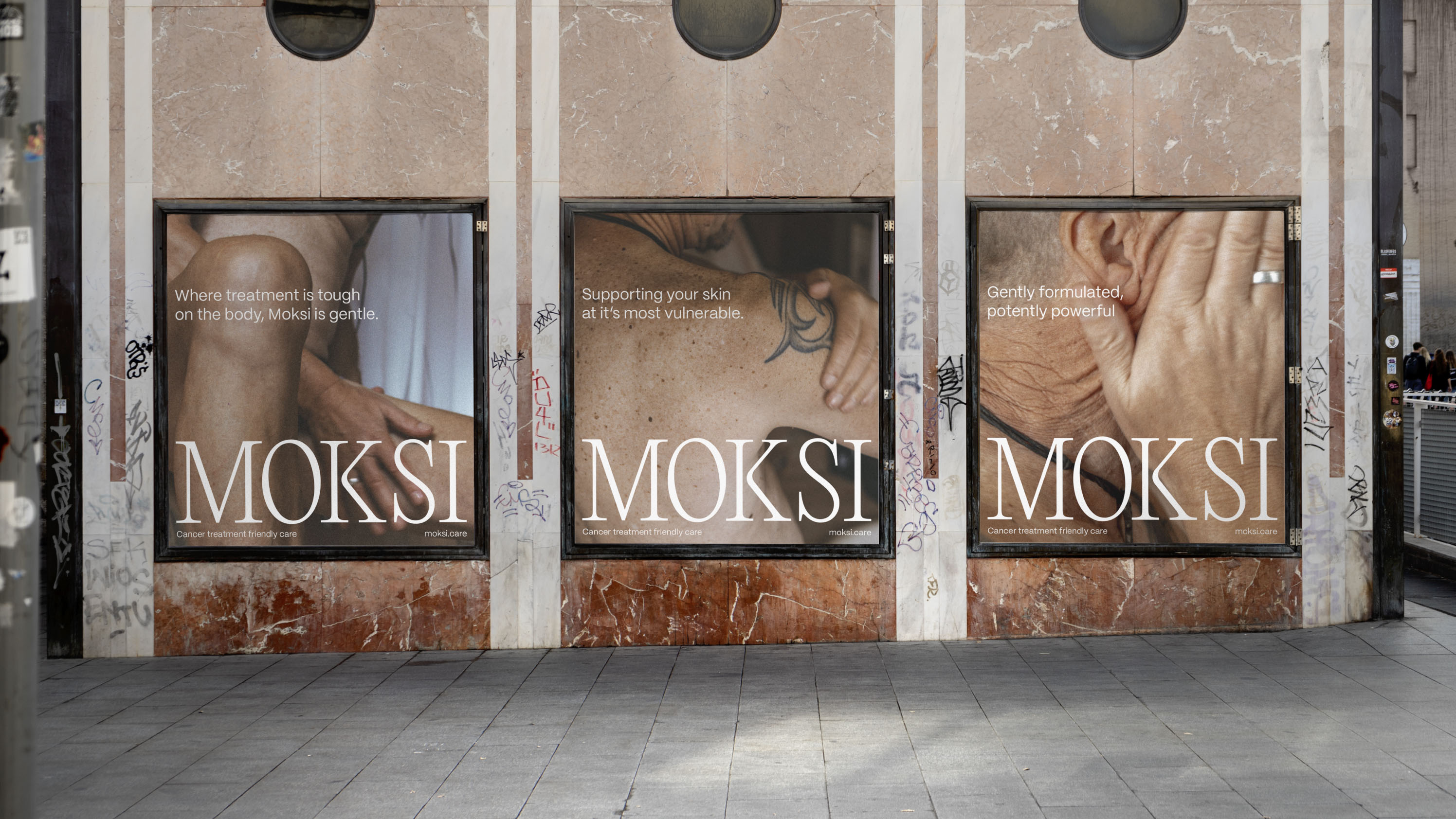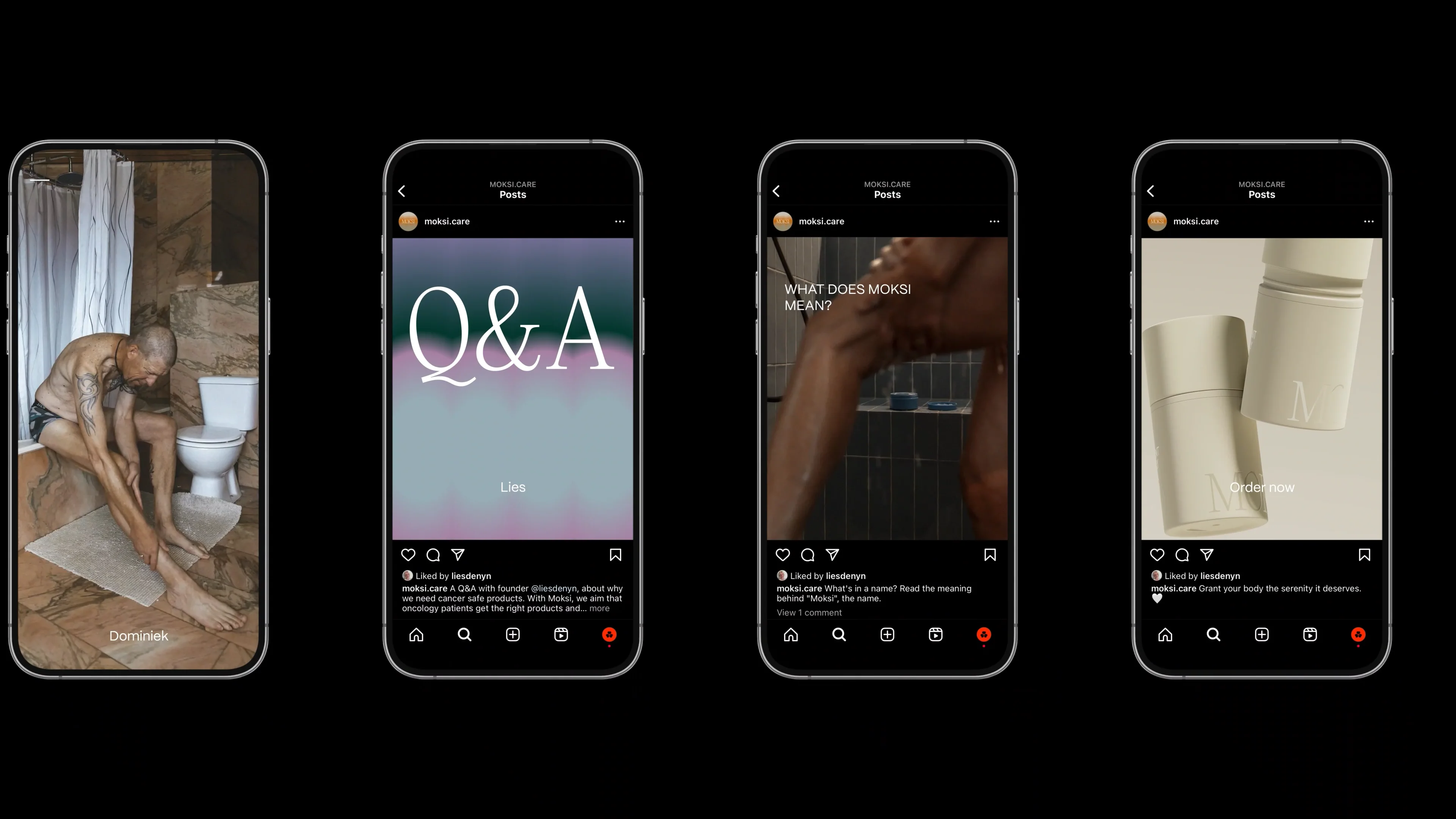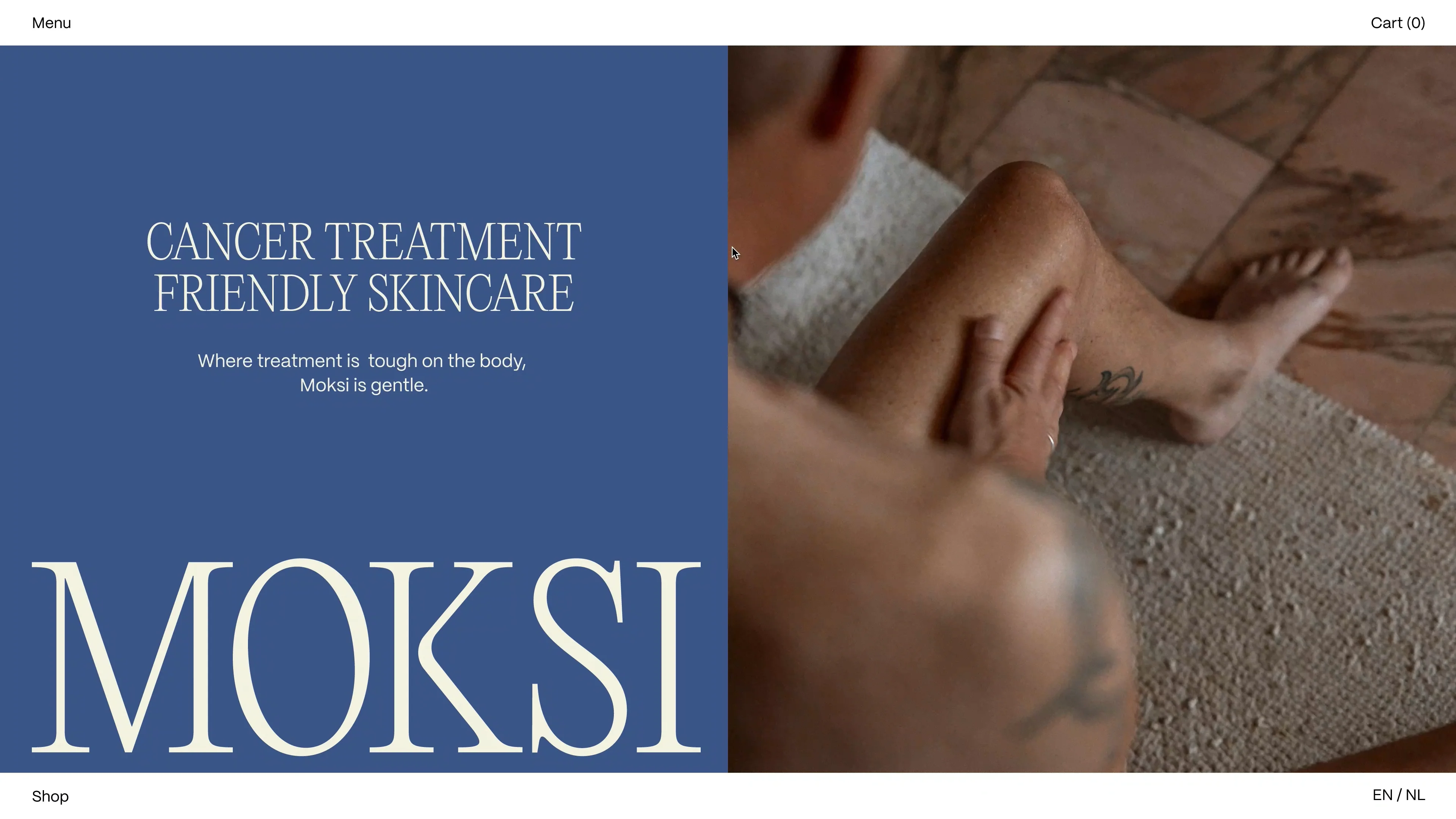
In late 2022, aspiring entrepreneur Lies De Nyn approached us with a vision to launch a unisex skincare line. Having recently overcome breast cancer, Lies experienced firsthand the challenges of sourcing and evaluating skincare products compatible with radiotherapy, chemotherapy, and other cancer treatments.
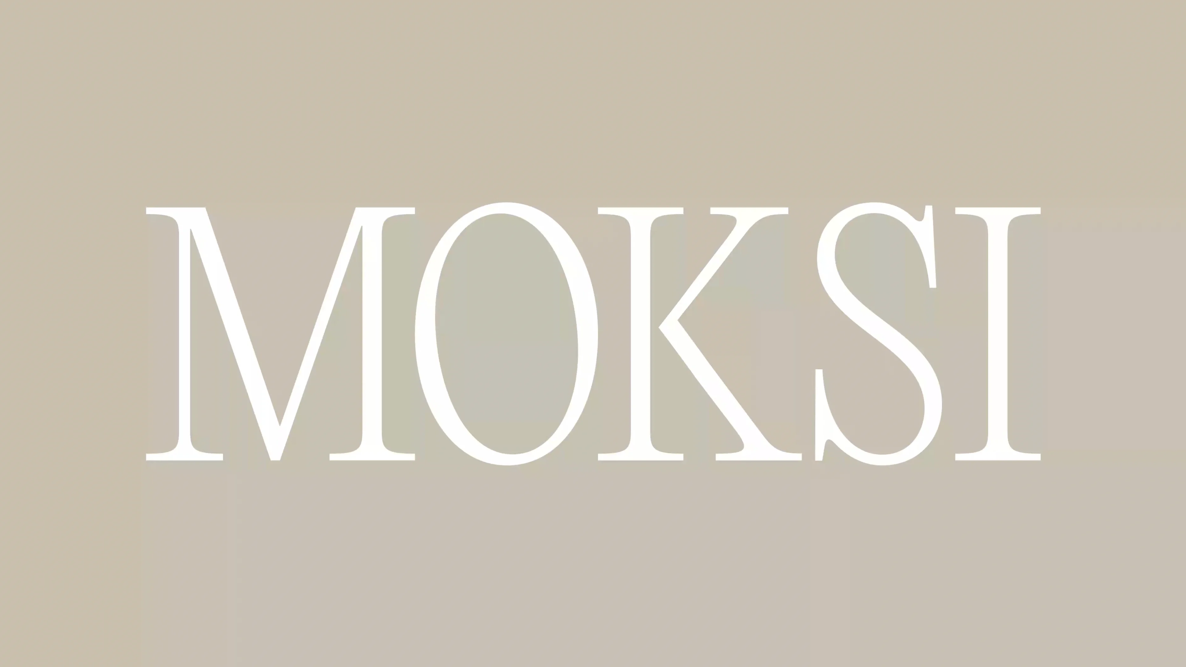
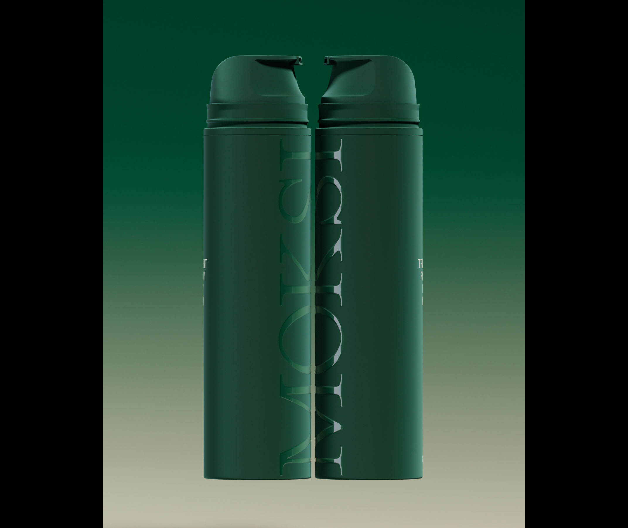
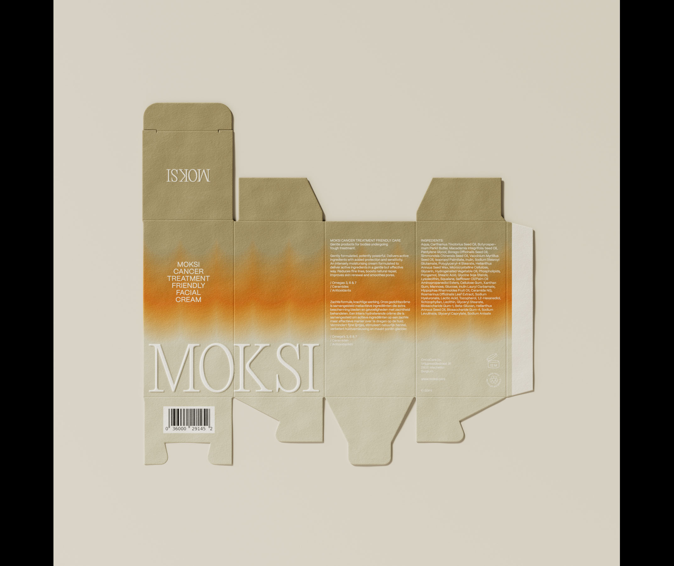
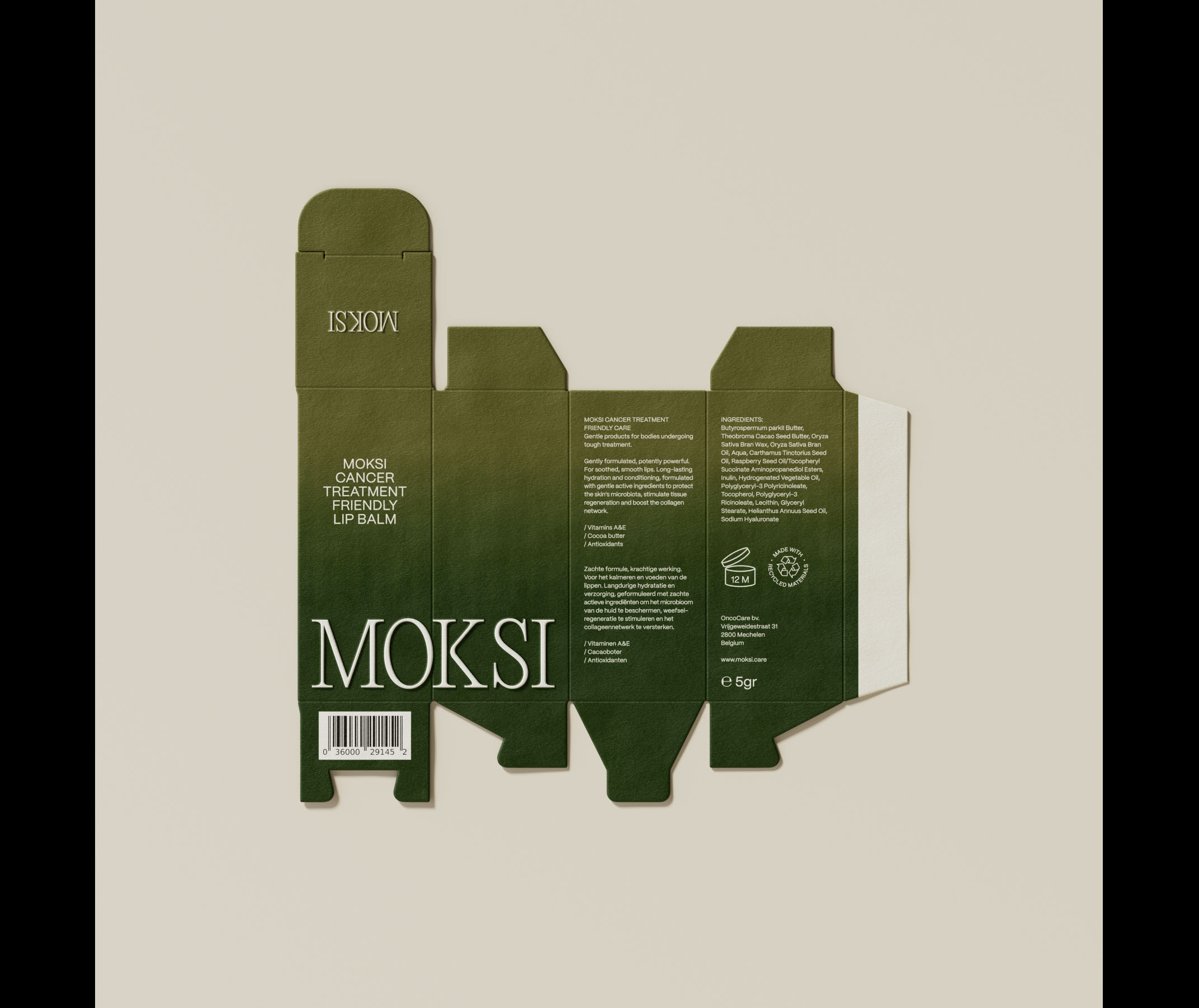
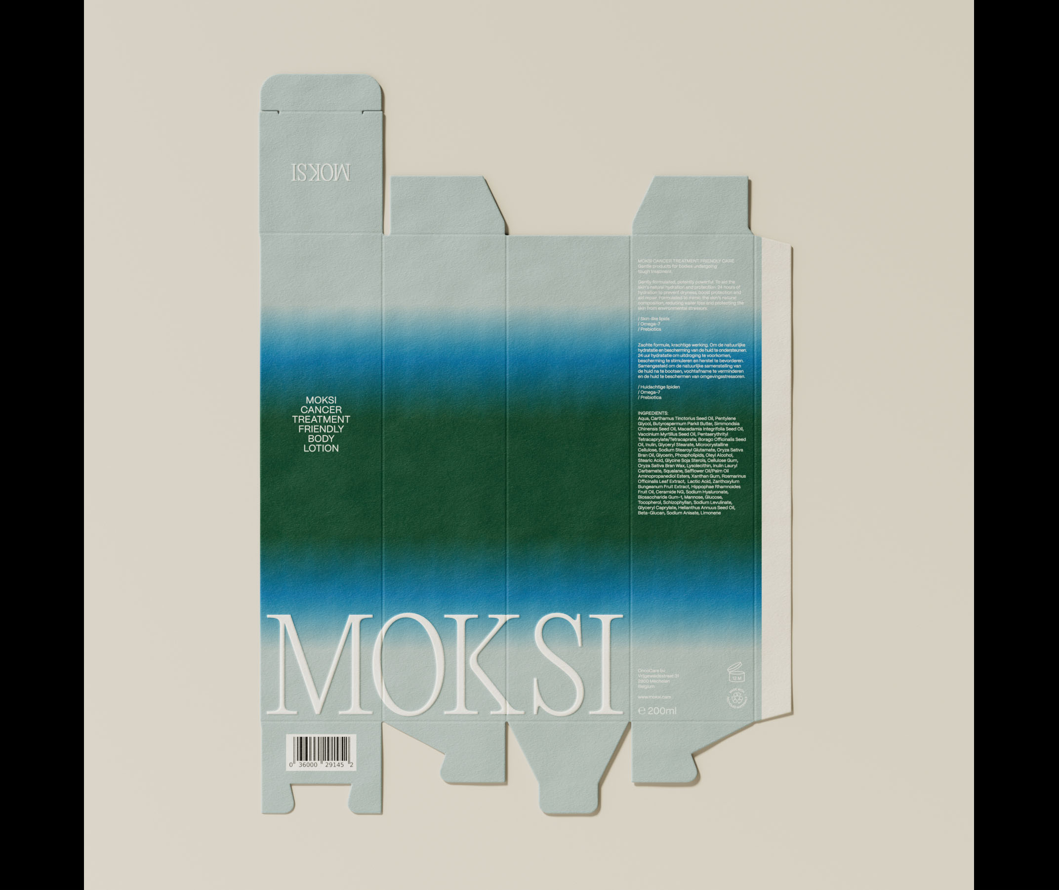
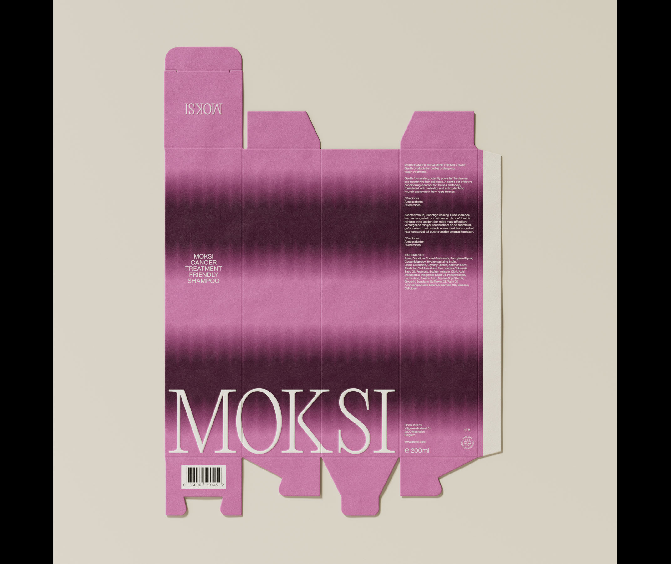
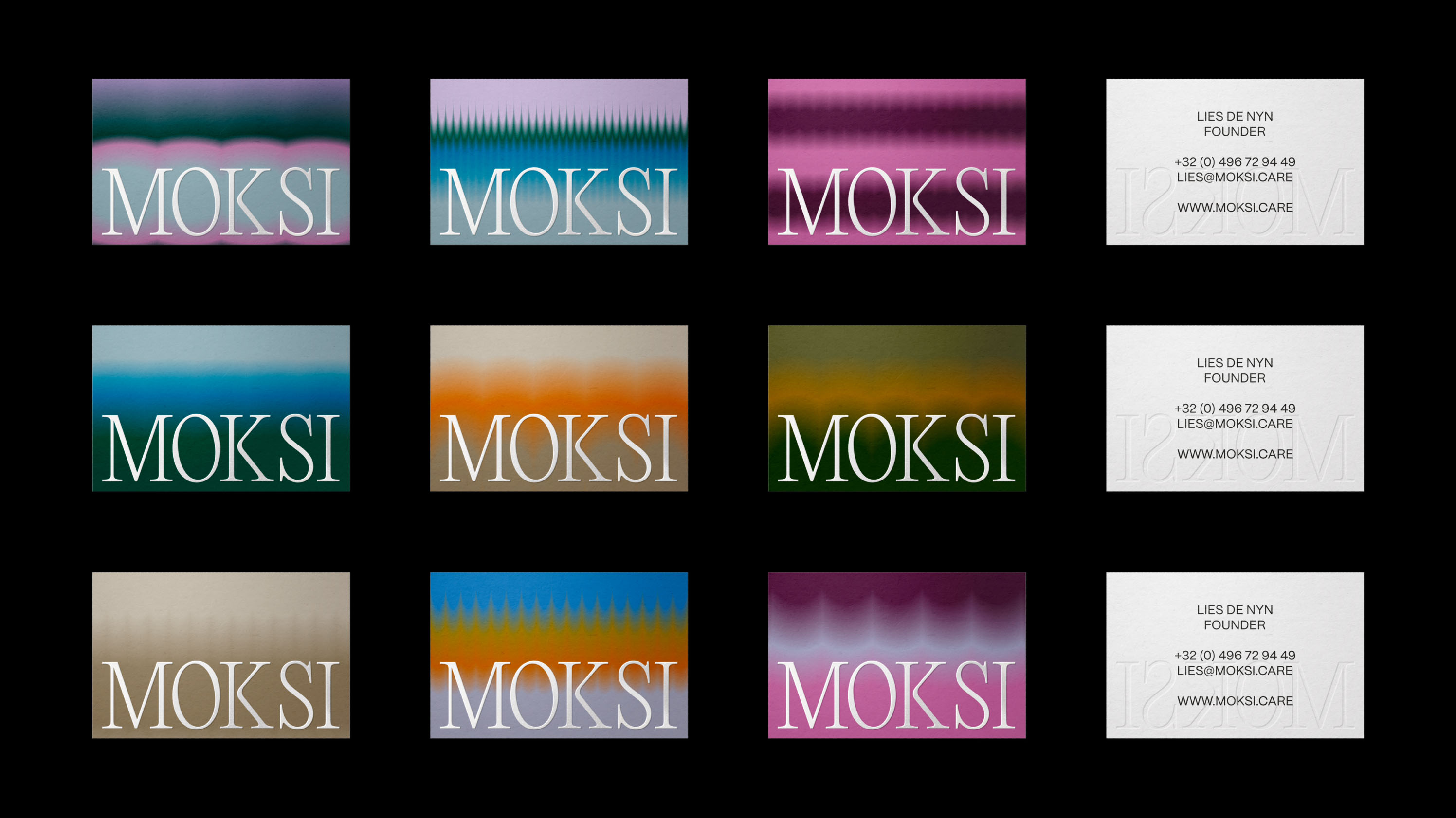
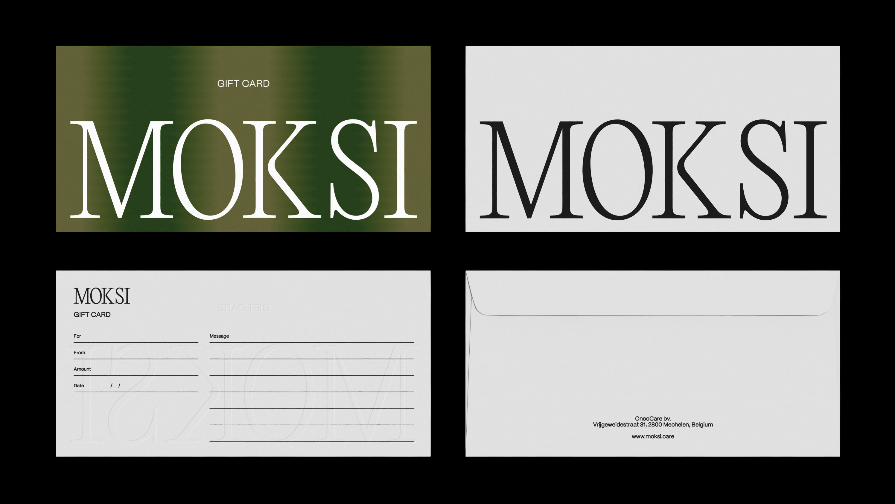
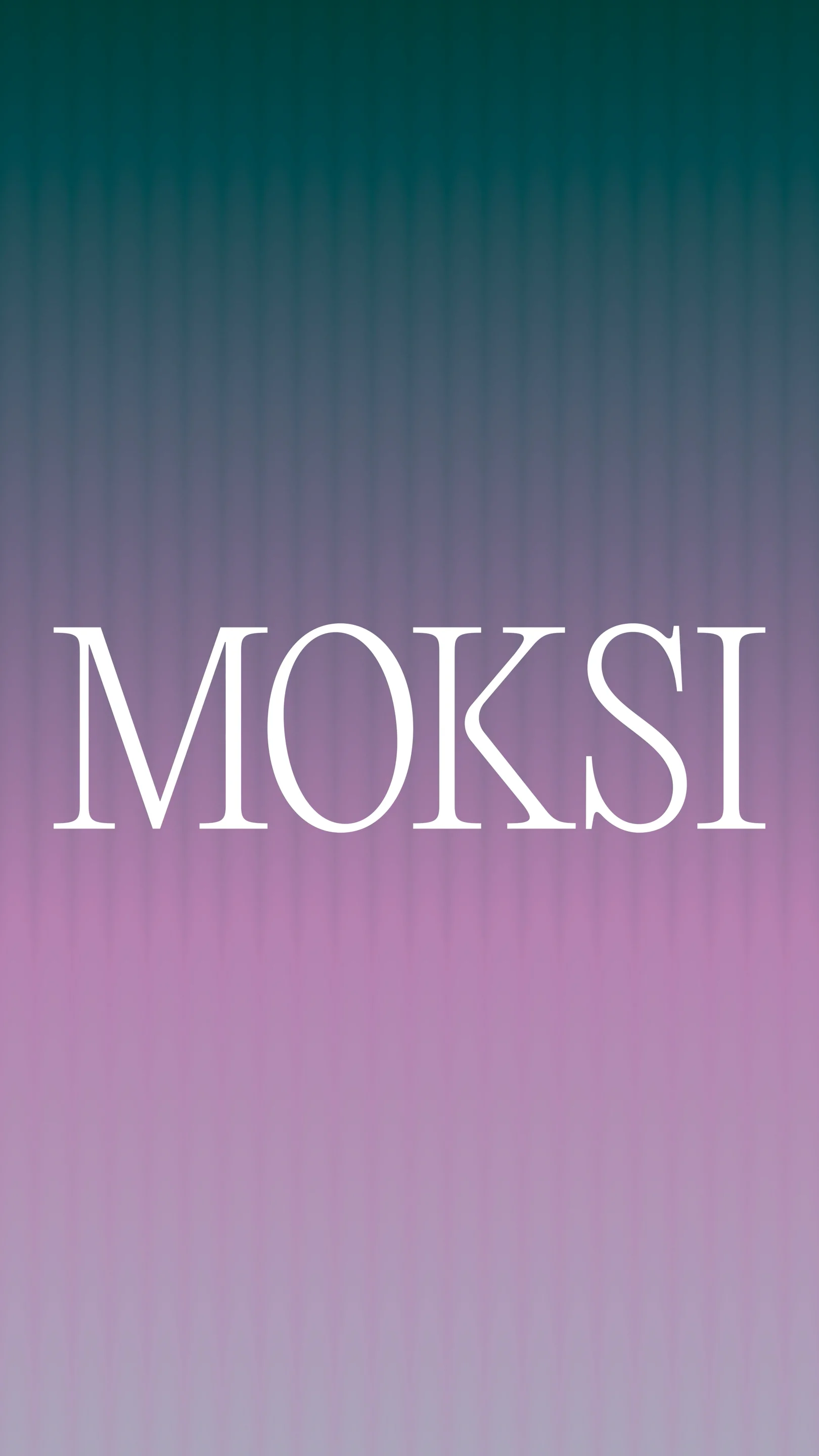
Our collaboration with Lies began at the inception of this venture. The choice of the brand name was instinctive—upon meeting Lies, the word "moxie" immediately resonated. To amplify its impact, we opted for a unique spelling, incorporating a robust 'K' that became a pivotal element in the logo design. This adjustment aimed to imbue the brand with a sense of neutrality, moving beyond traditional feminine associations.
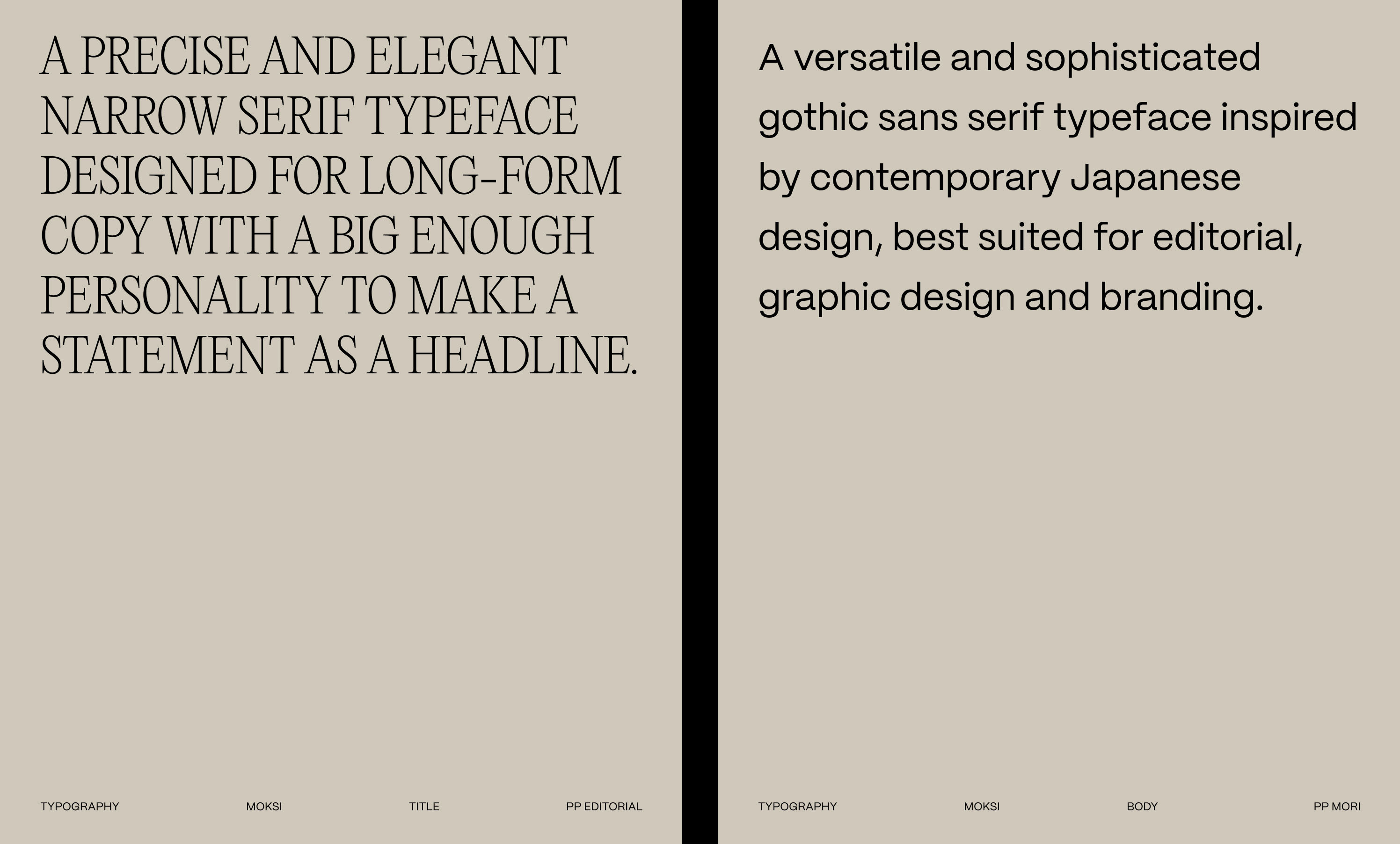
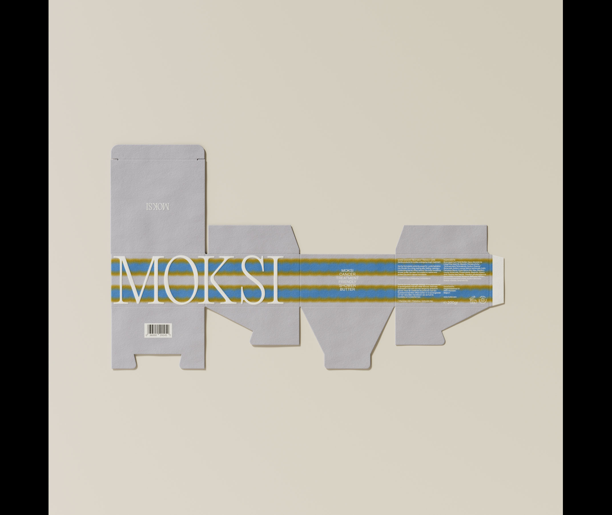
In selecting fonts, we turned to PP Editorial New Ultralight and PP Mori Regular from the esteemed type foundry Pangram Pangram. The logo seamlessly blends the modern twist of Editorial New Ultralight, a classic serif with a contemporary flair,
while the slight modifications to the 'K' enhance its distinctiveness. The use of Mori Regular contributes sophistication and clarity, ensuring that informative text remains legible and tranquil.
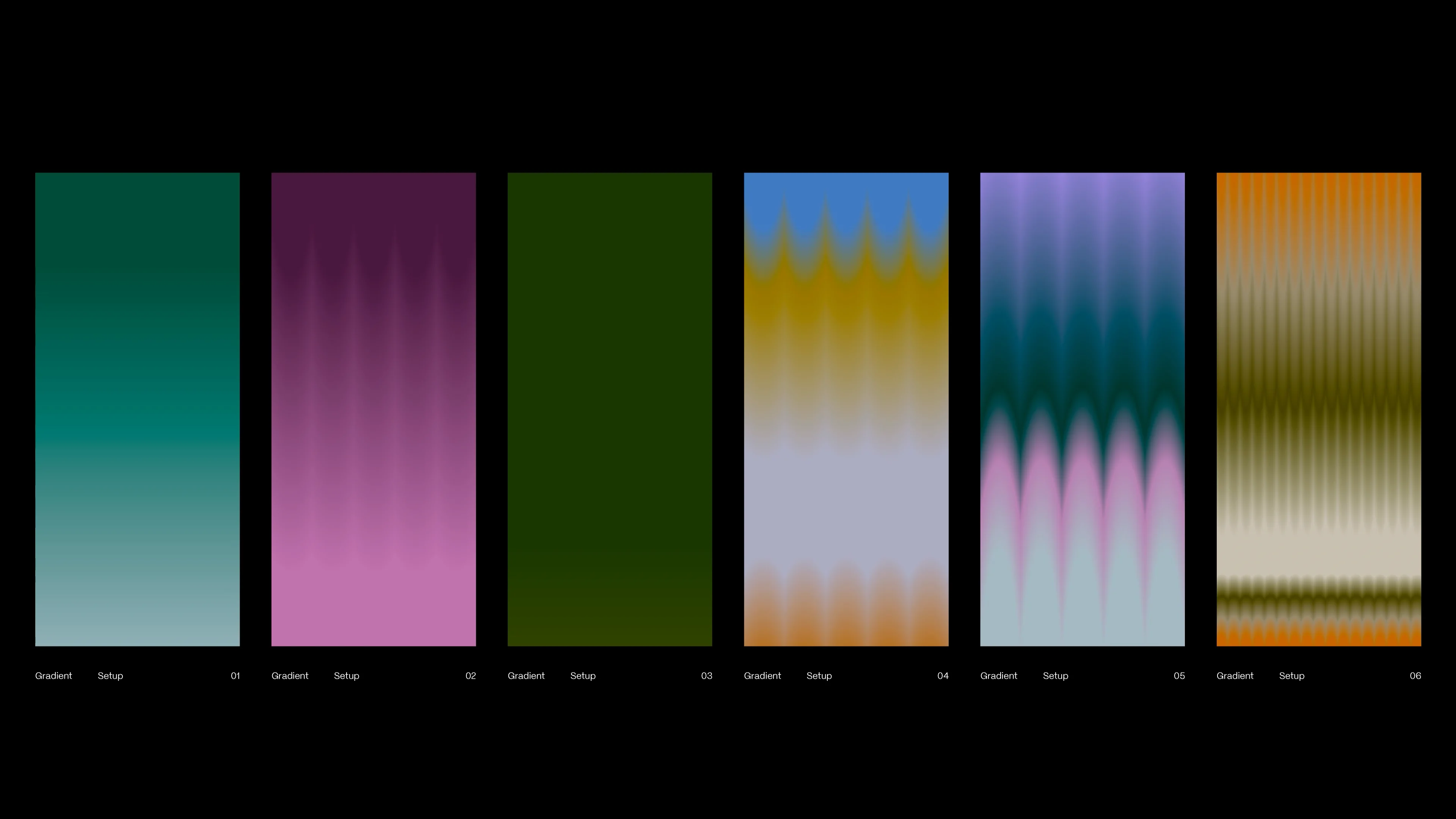
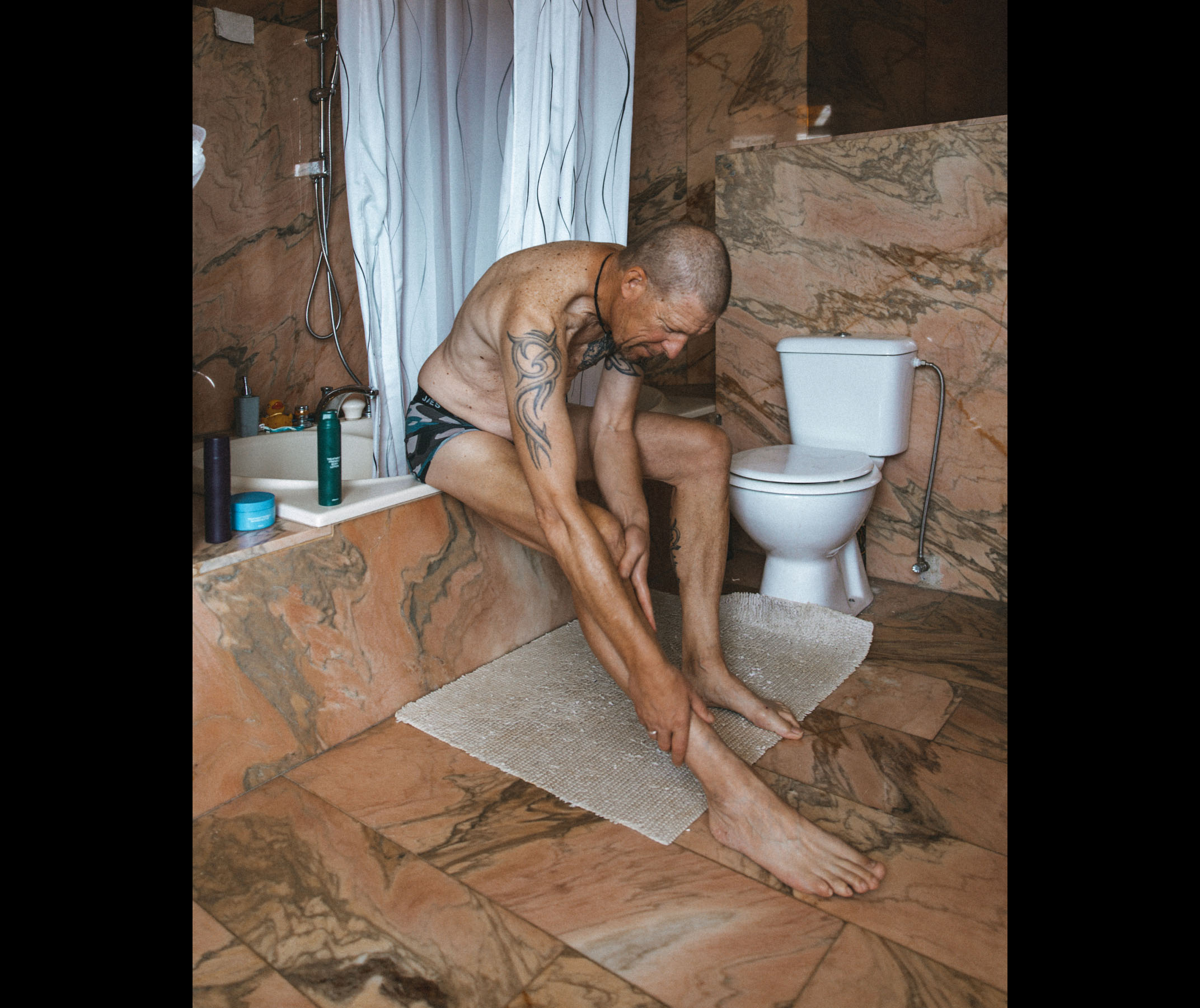
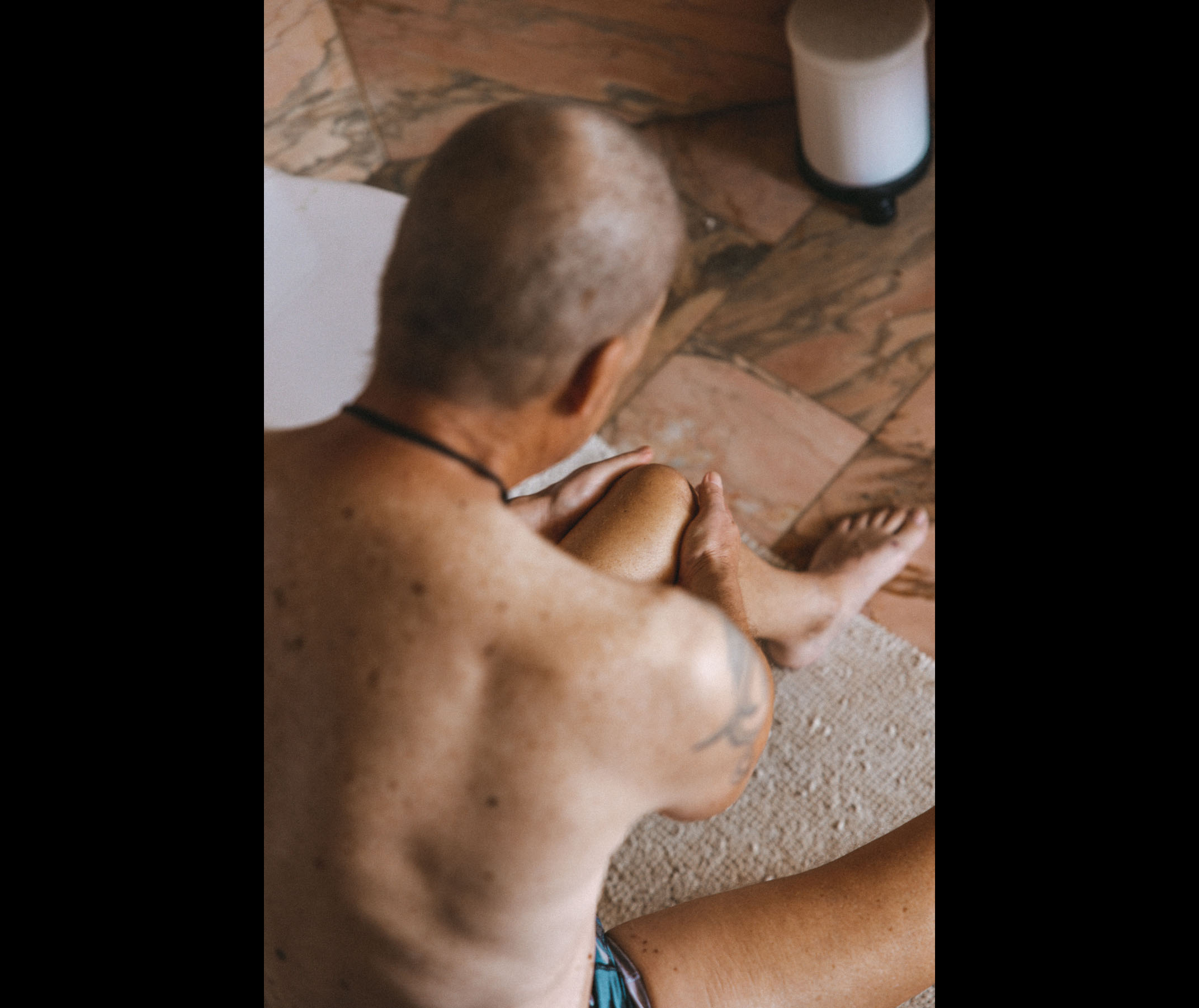
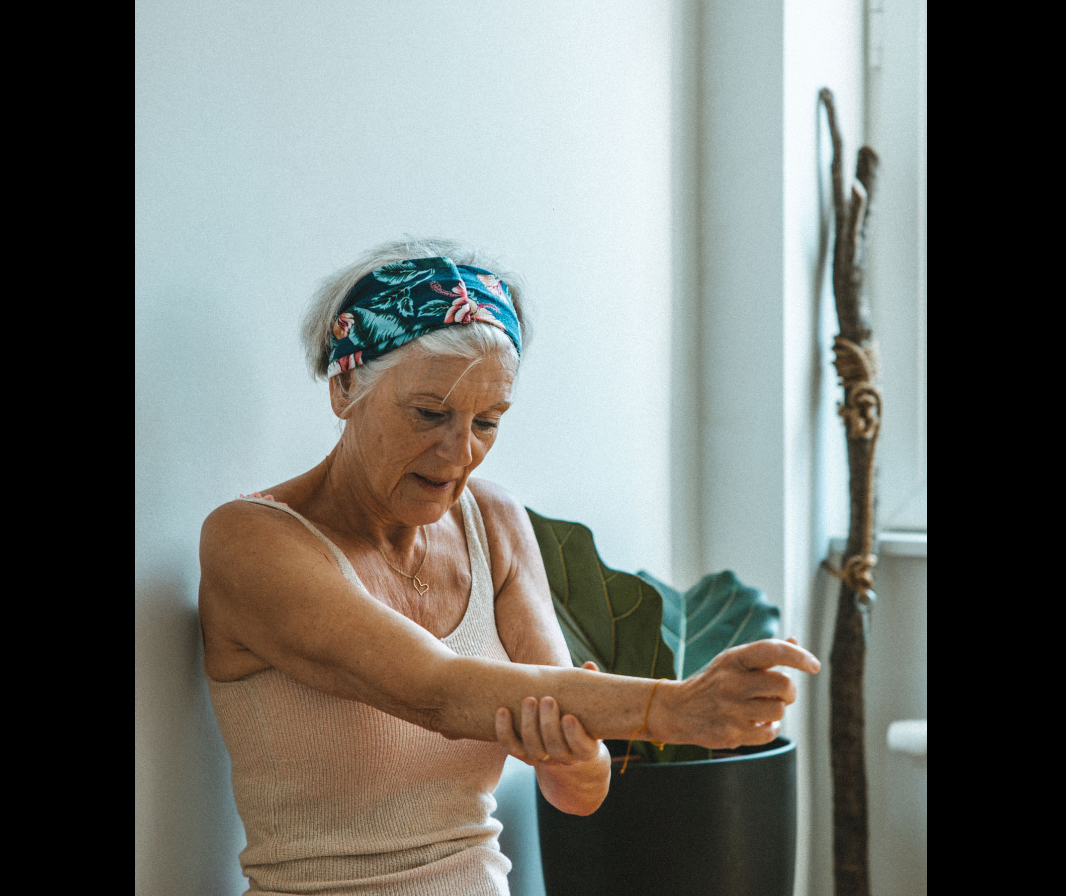
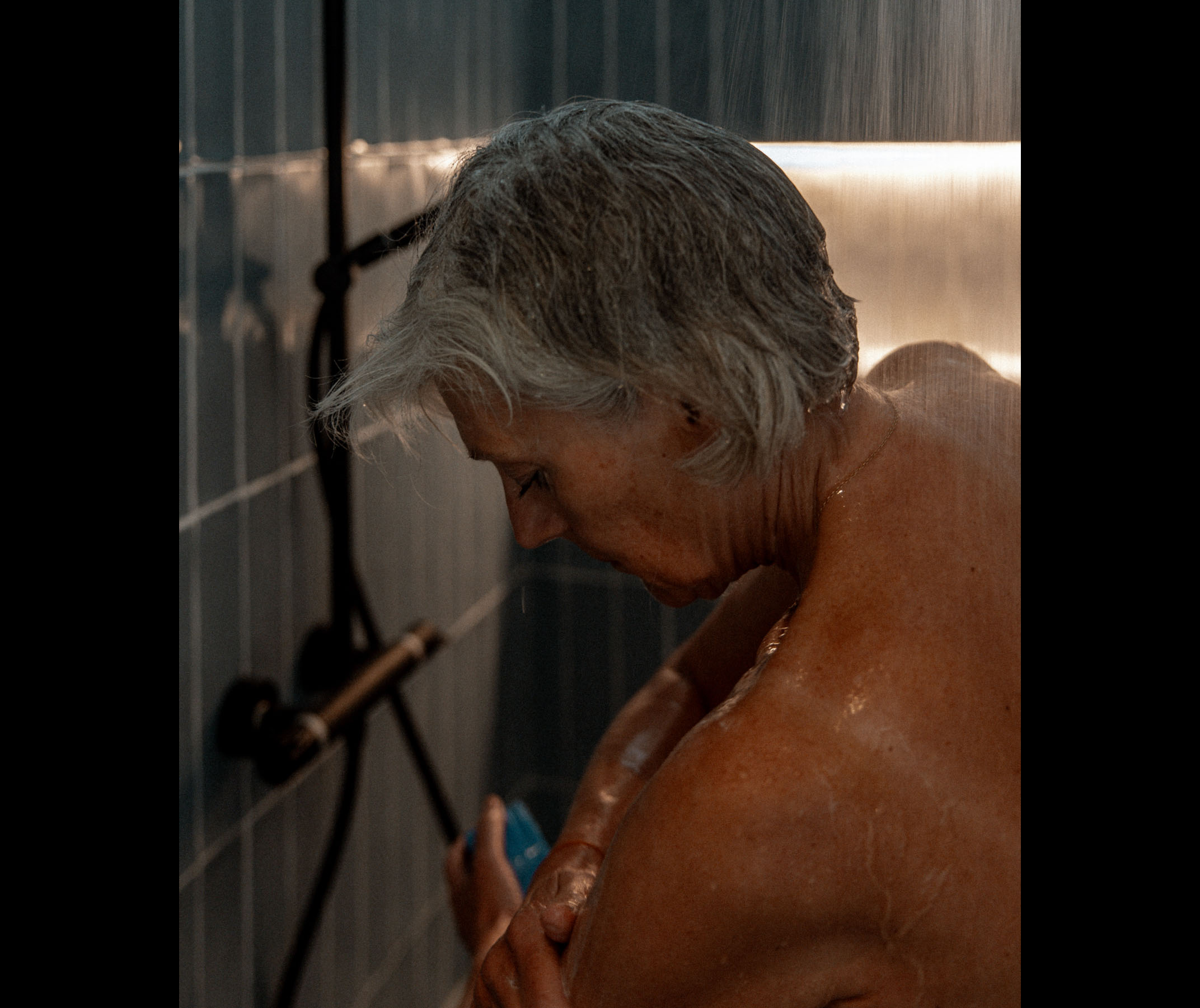
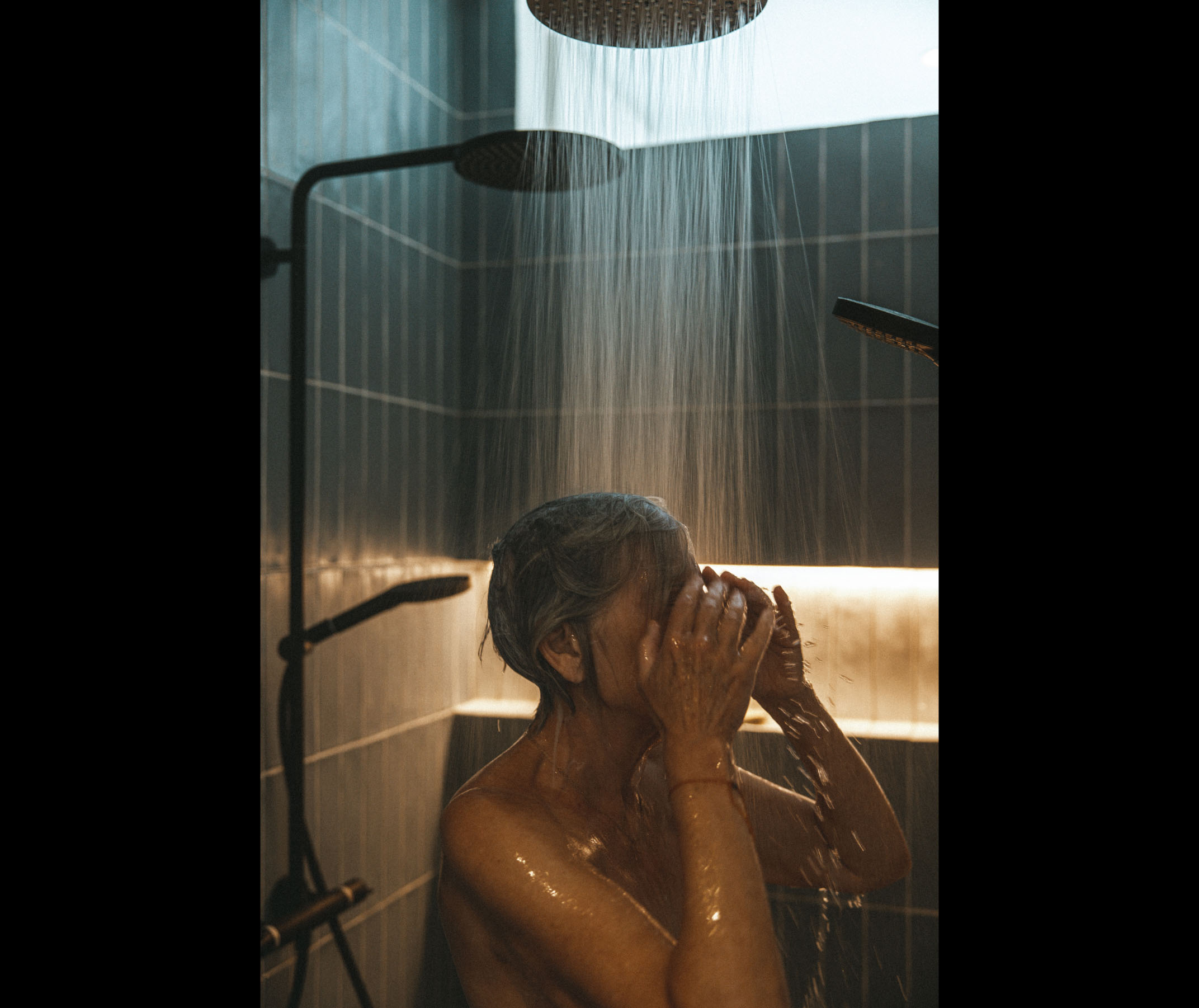
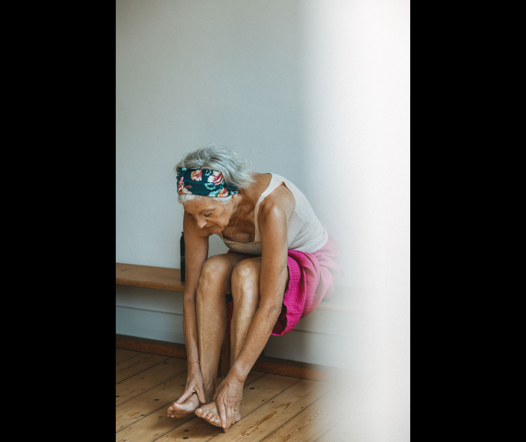
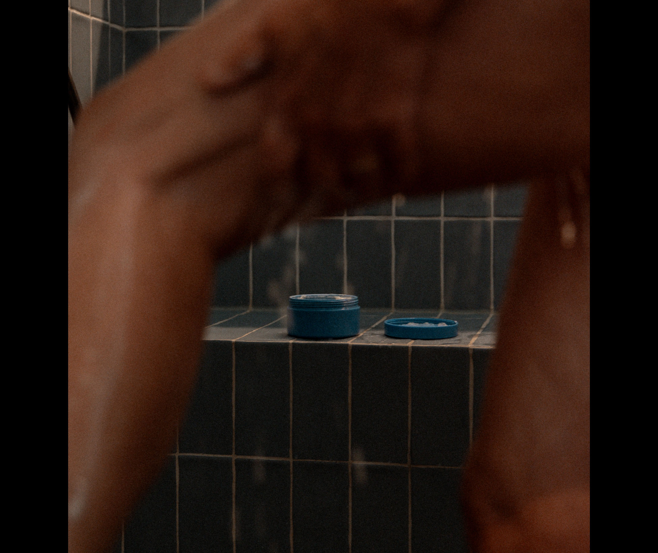
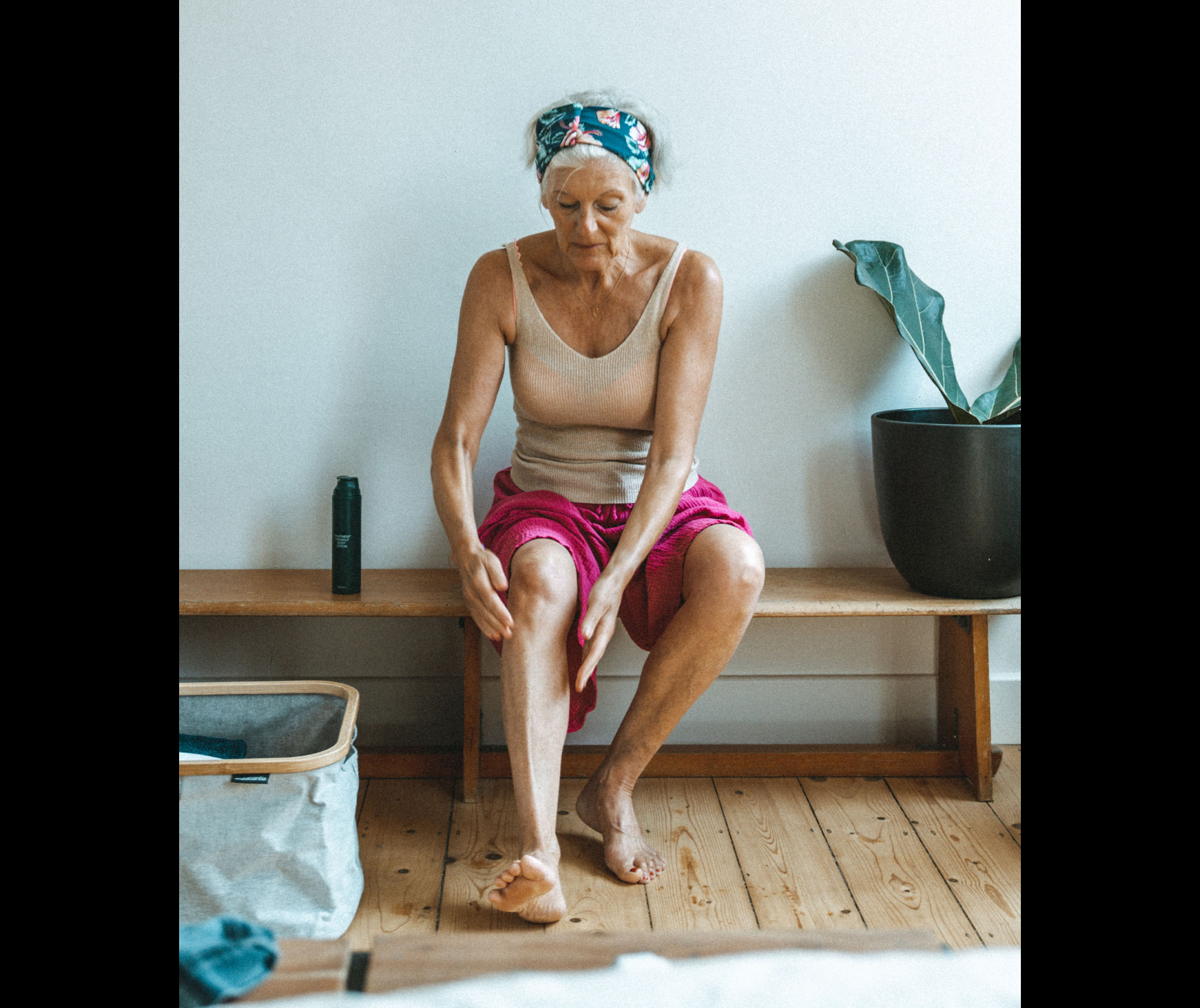
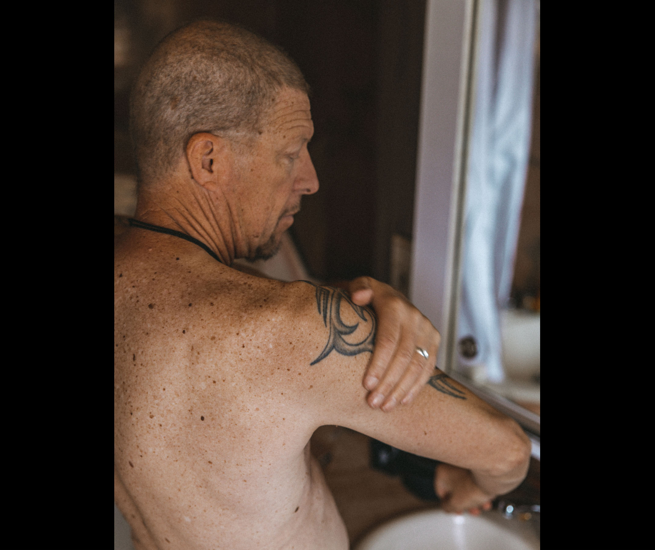
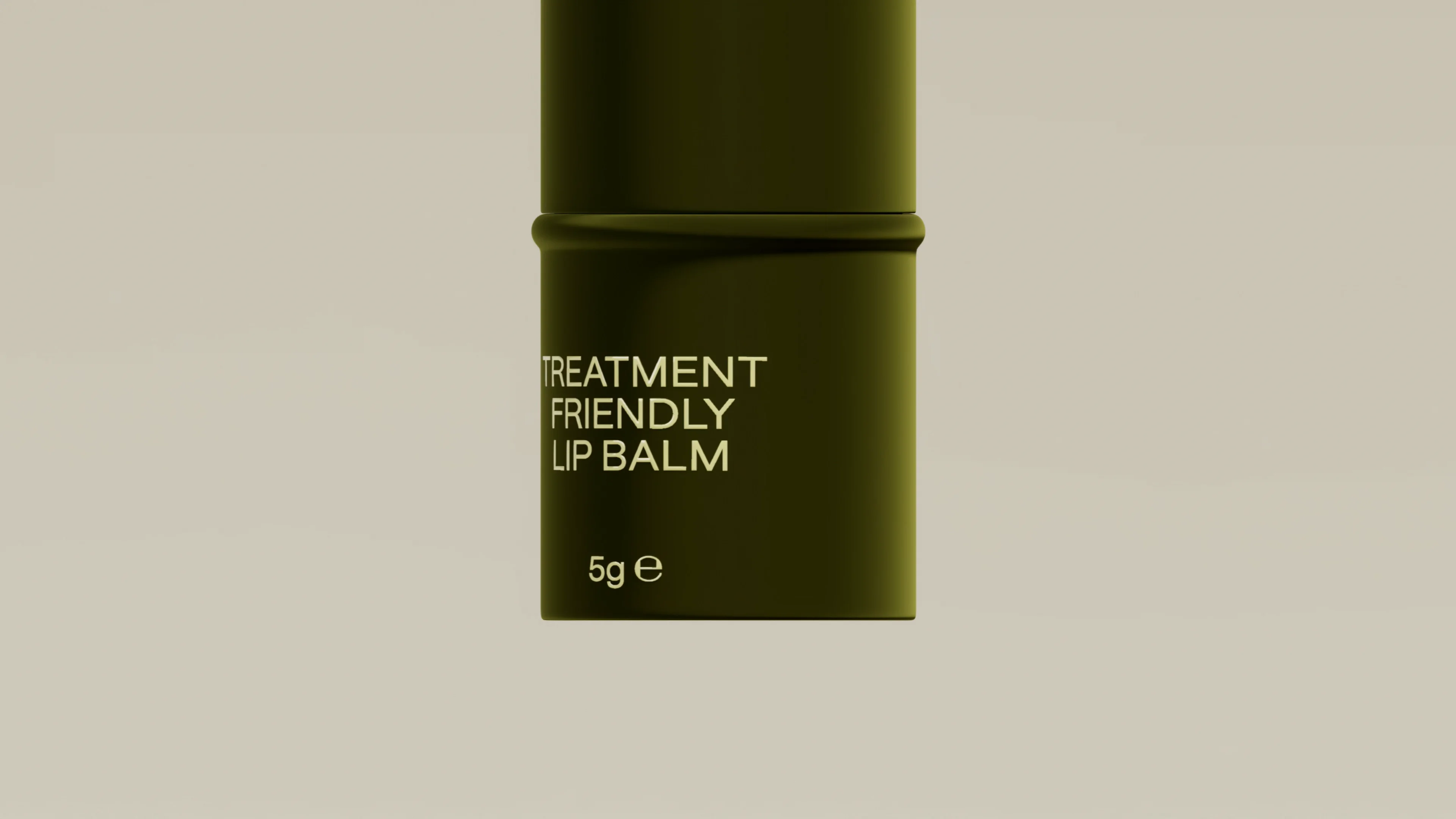
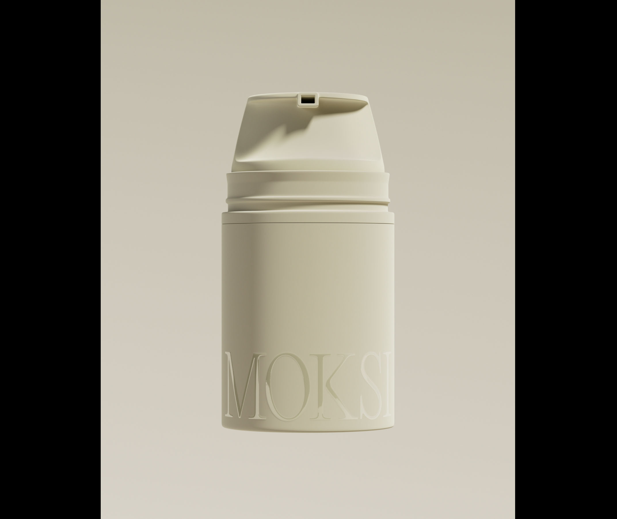
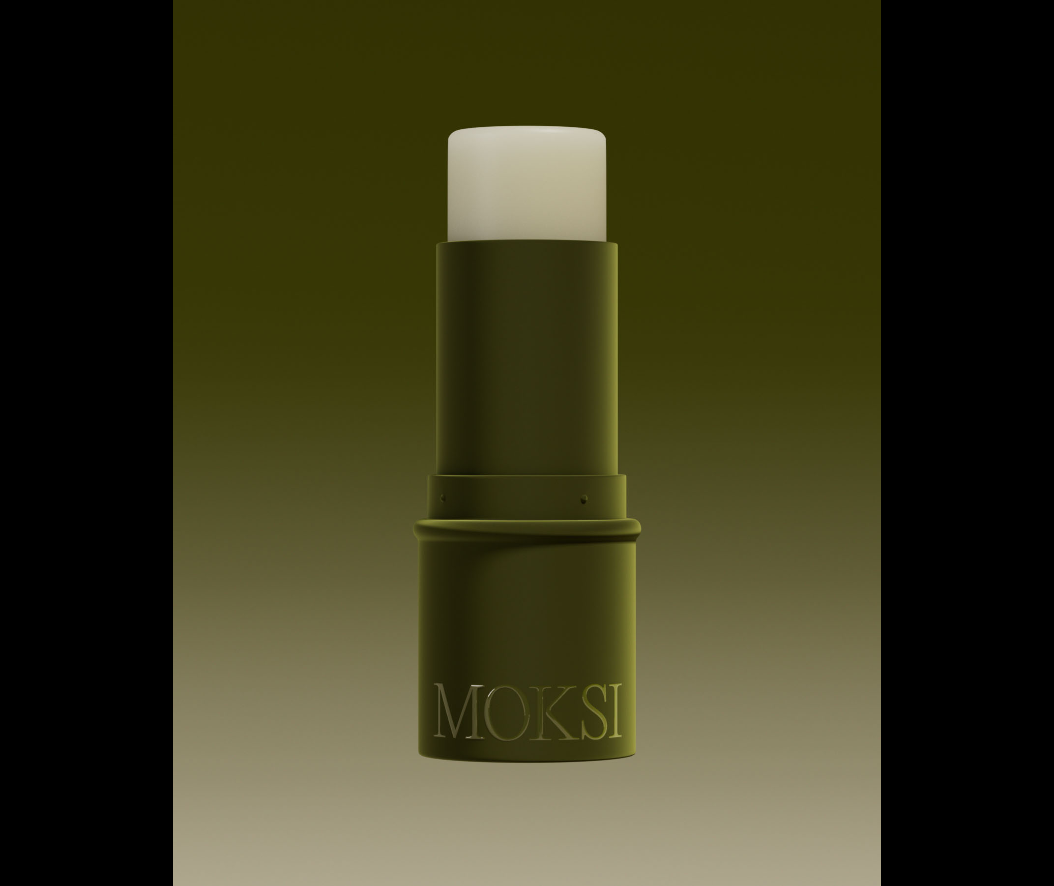
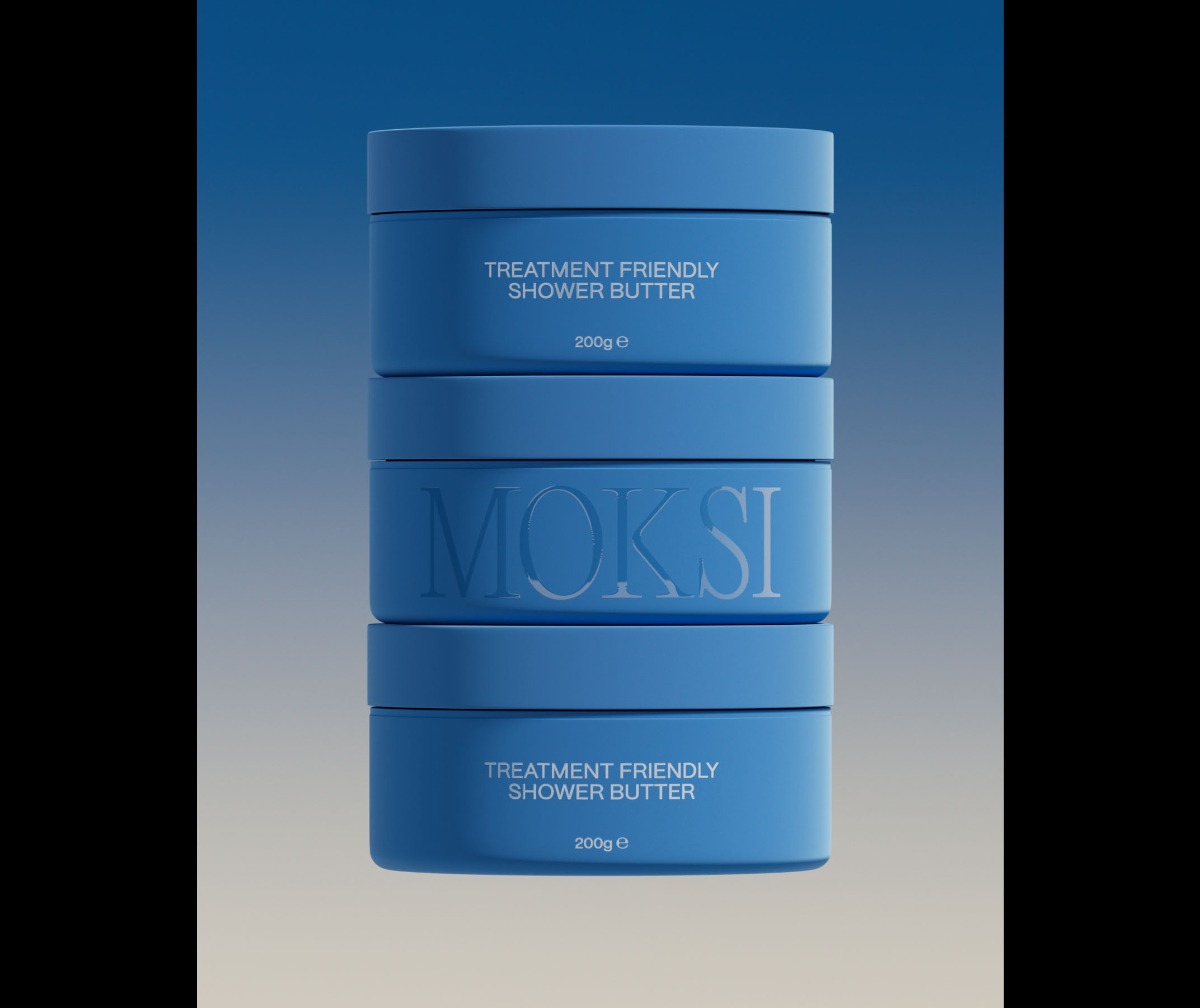
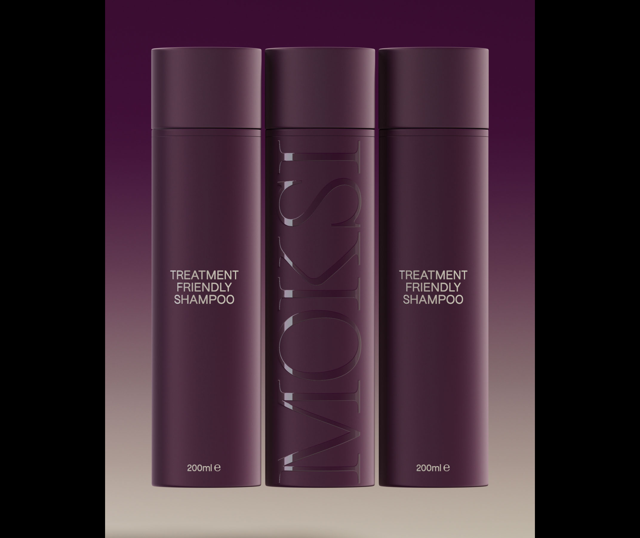
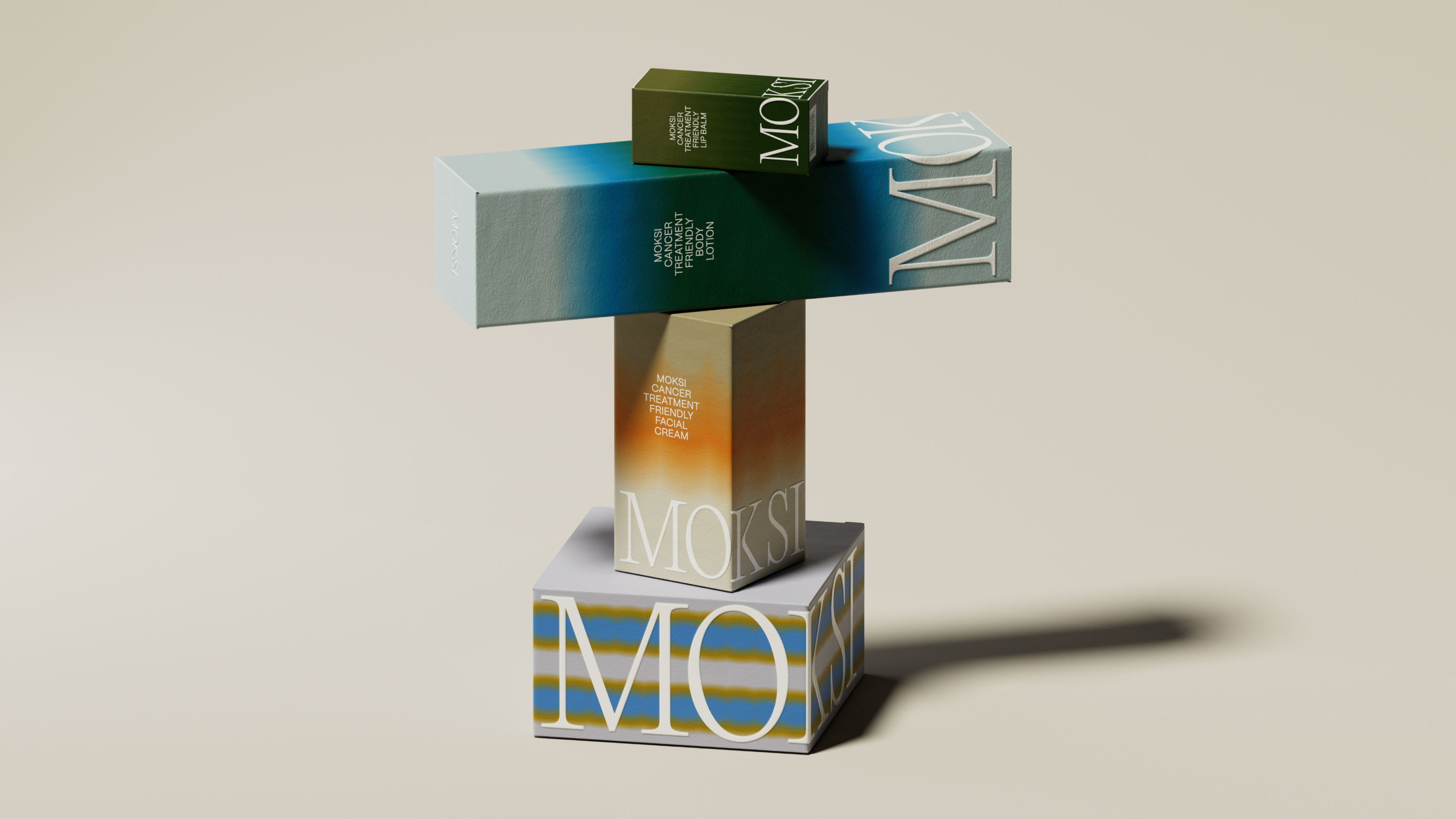
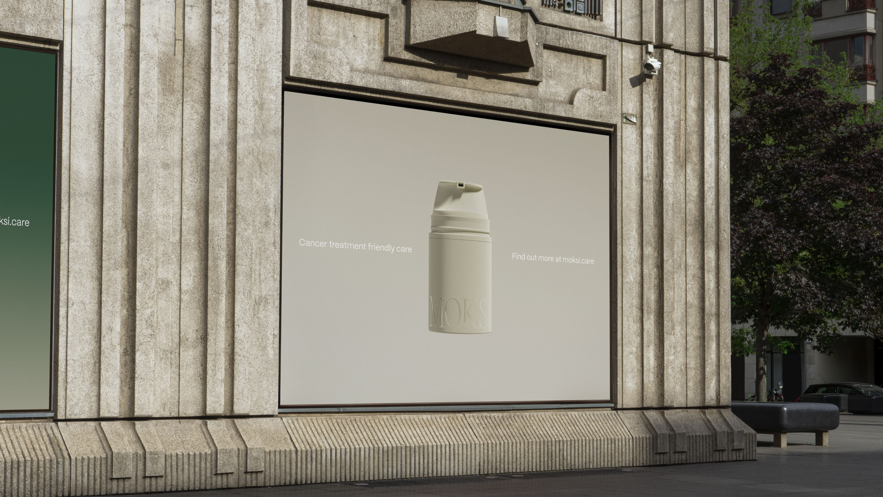
Our colour palette draws inspiration from natural tones and gradients reminiscent of the dawn sky—a symbolic representation of new beginnings and an optimistic approach to taking each day as it comes. The clean product design enhances accessibility and comprehension, with each colour assigned a unique shade for easy differentiation when purchasing multiple items. The gradient tones, derived from the base colour of each product, distinguish each box on the shelf, ensuring visibility in a predominantly white segment. Embracing authenticity, our photography employs natural lighting to capture real people in genuine environments, reinforcing the brand's commitment to transparency and connection.