Antwerp-based innovation and design agency, Absintt, was getting ready to expand its offering, adding a Mergers & Acquisition division to complement its existing innovation services. The Absintt team wanted a modern, clean, bold identity, which we created for them under the new agency name, Equals Three. The identity needed to embody the combination of these two industries and convey maturity & professionalism, without becoming inaccessible or ‘boutique’.
The Name:
We felt this new name accurately reflected what the team want to achieve. They strive to have every action, whether internal or external, result in a greater value than the sum of its parts. They do this through strong collaboration and partnerships - which makes them your ideal plus one for growth.
The Visual System:
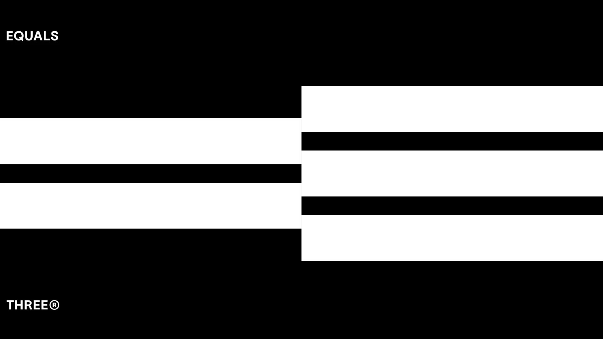
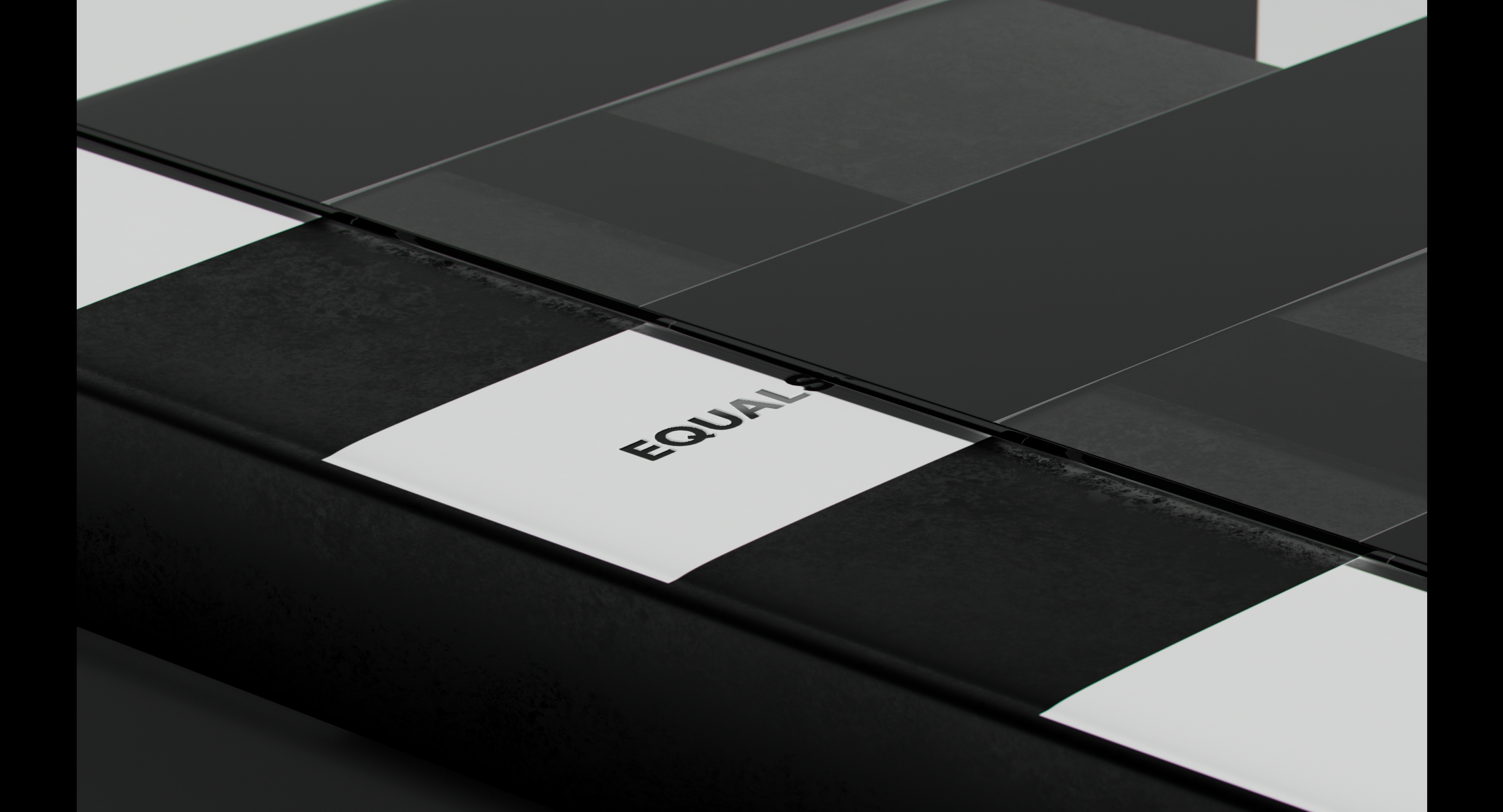
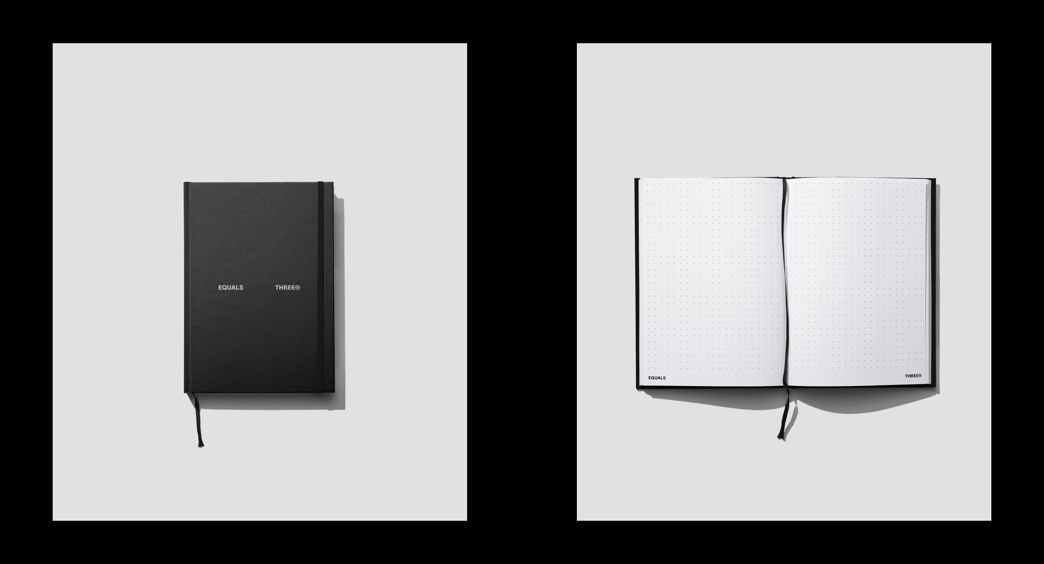
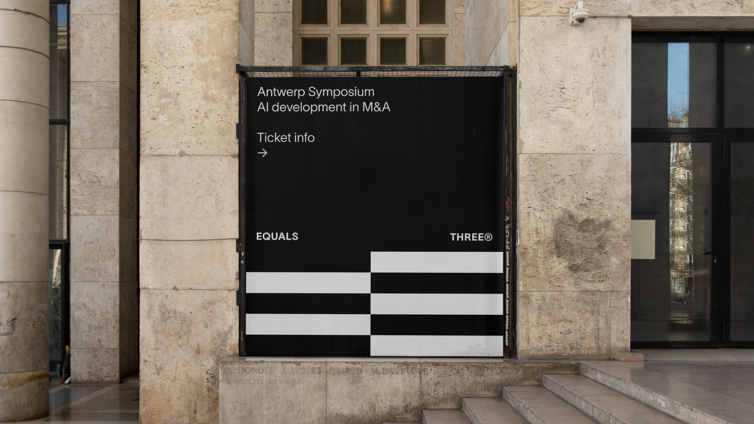
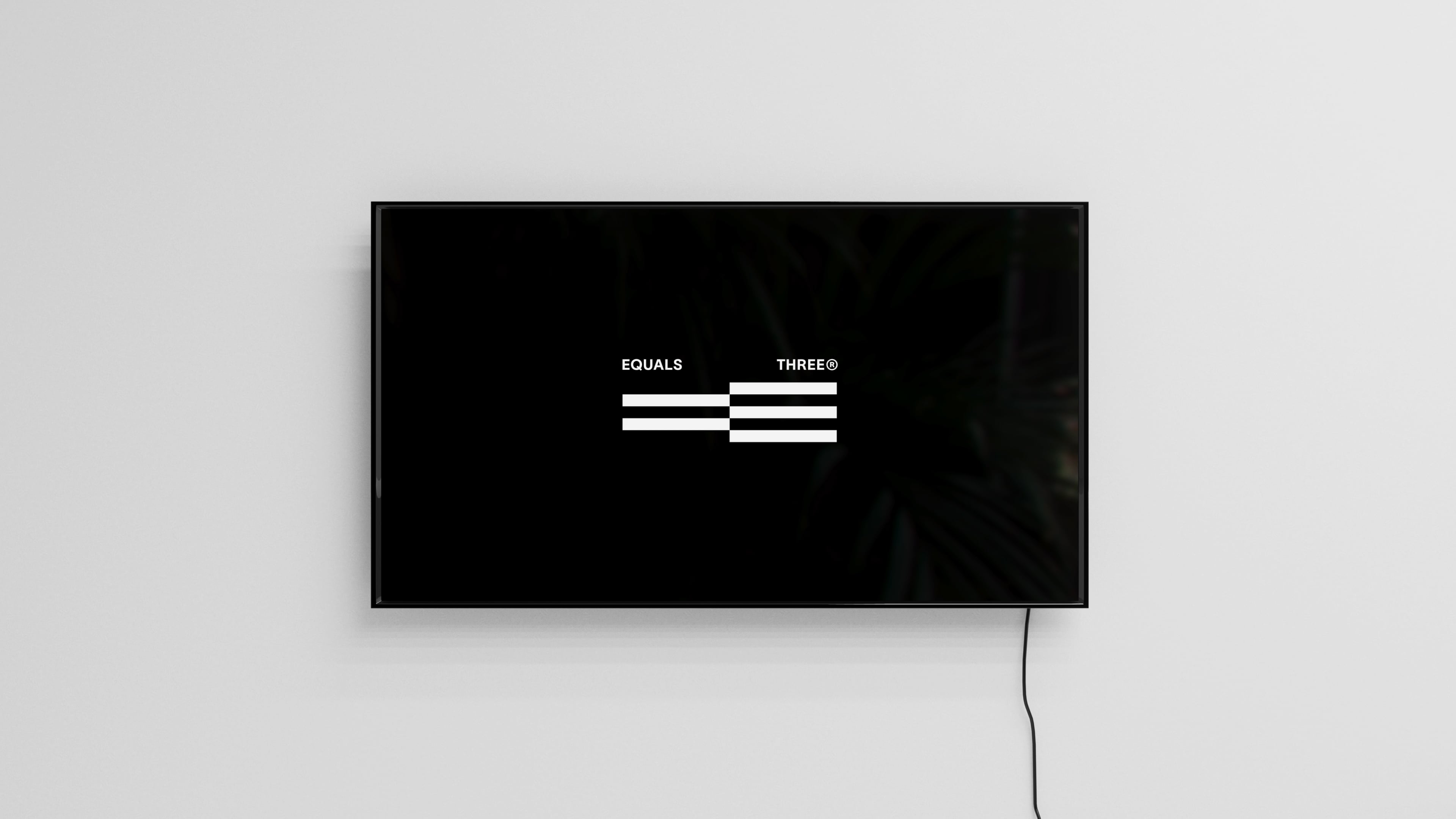
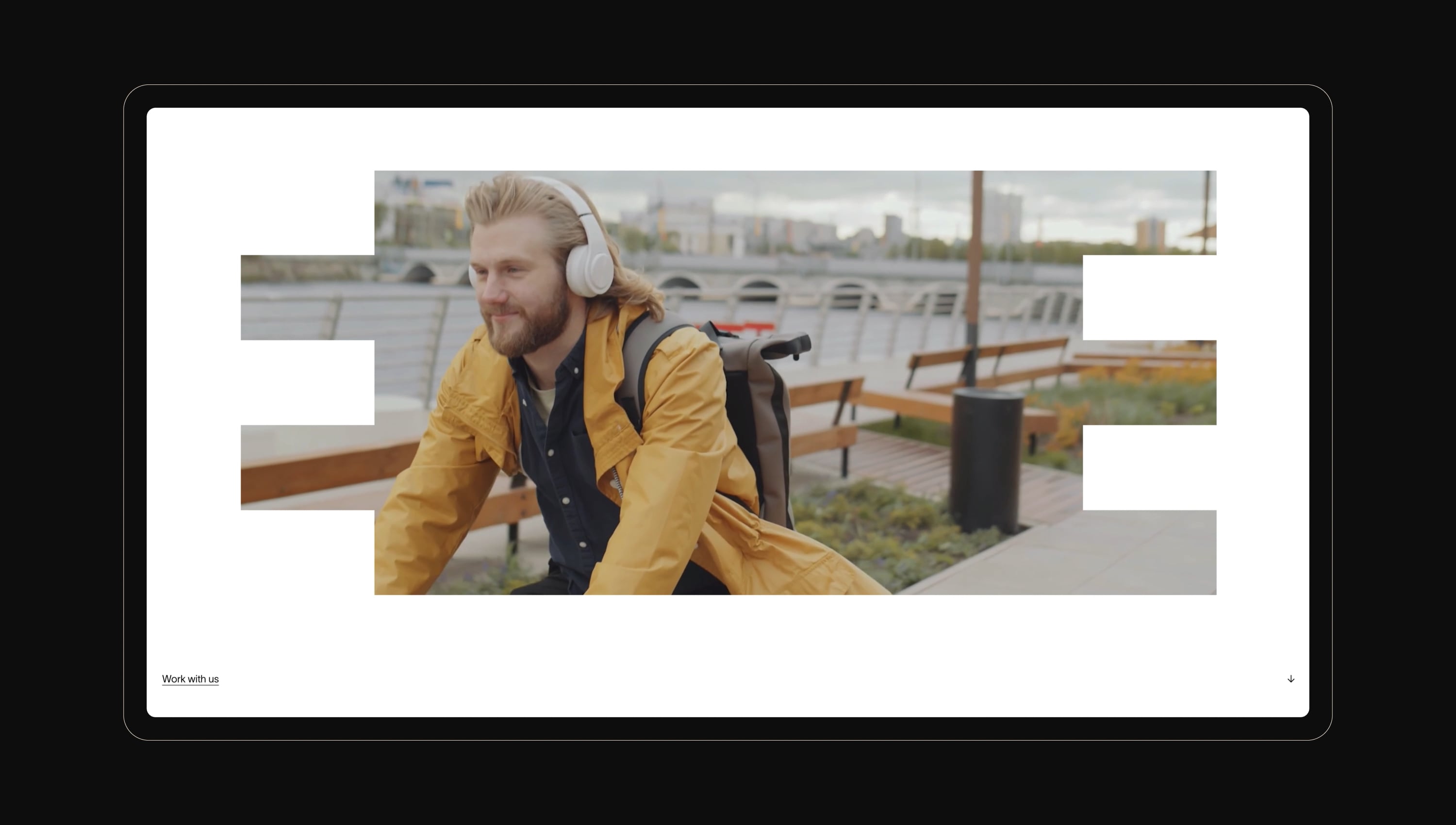
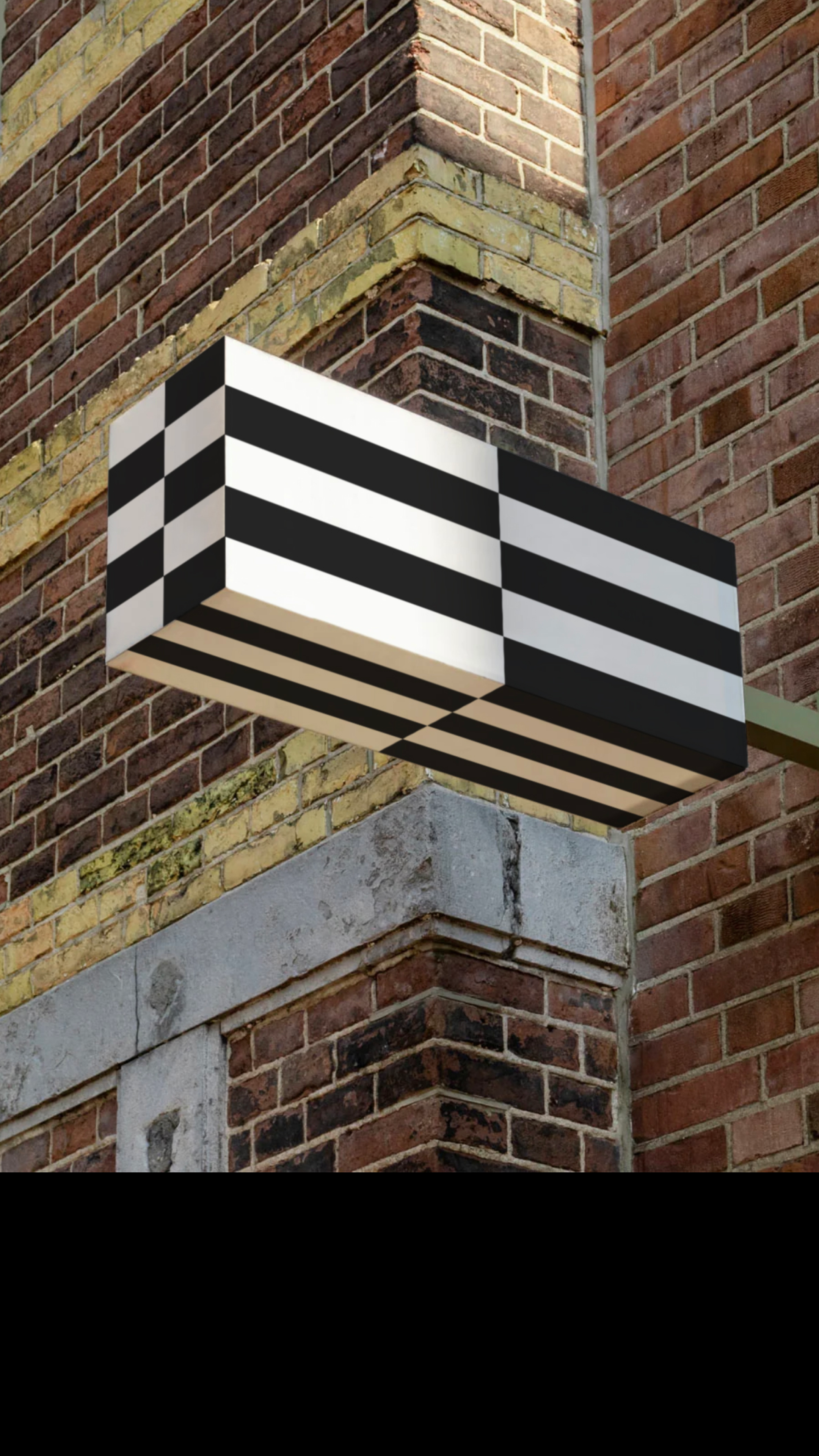
The identity we created flows directly from the logo, which is an emblematic translation of the name. Linking the two stripes of the = sign directly to three stripes creates a unique image that can speak for itself. It’s highly recognisable due to its simple, yet surprising shape.
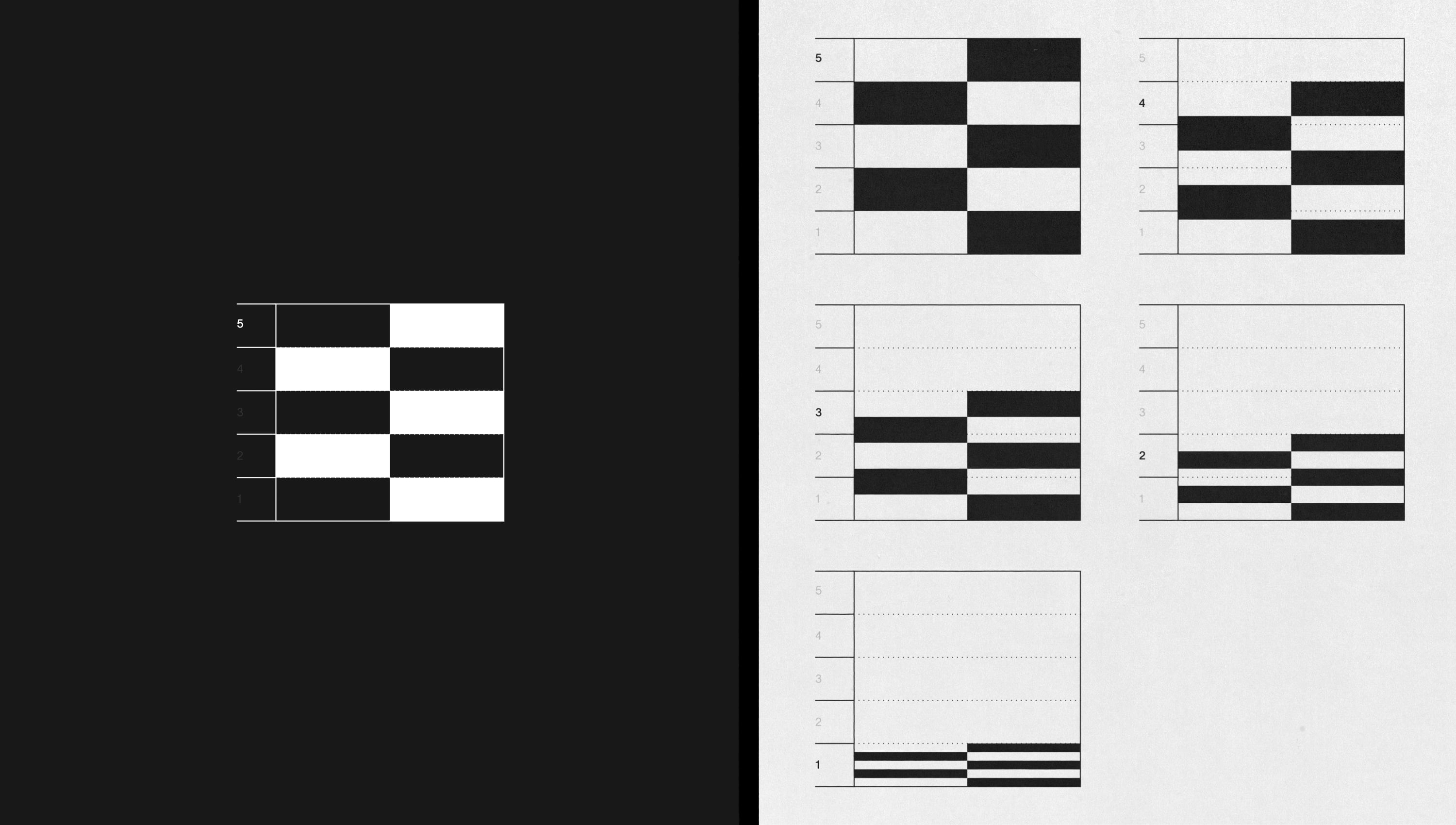
The identity is also modular - we wanted the internal design teams at the agency to have the ability to design new concepts, while still working with the identity’s foundational building blocks. This way, they can continue to show their dynamic and progressive design skills within their own brand activation.
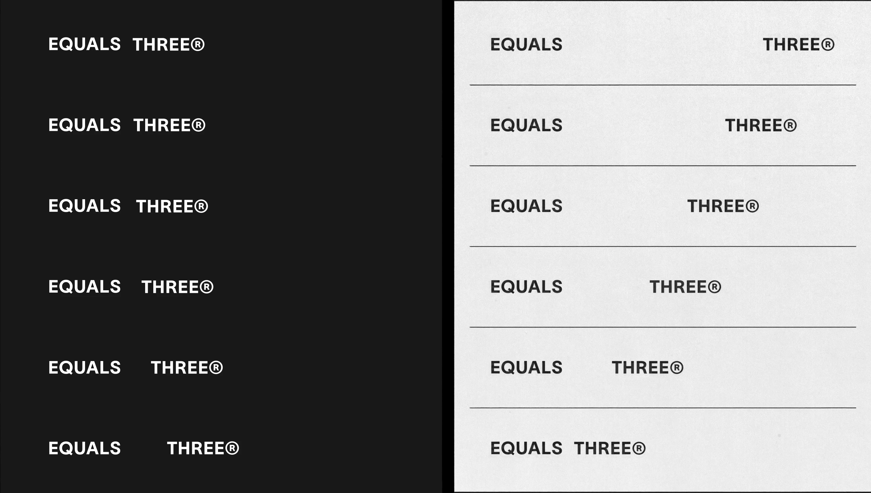
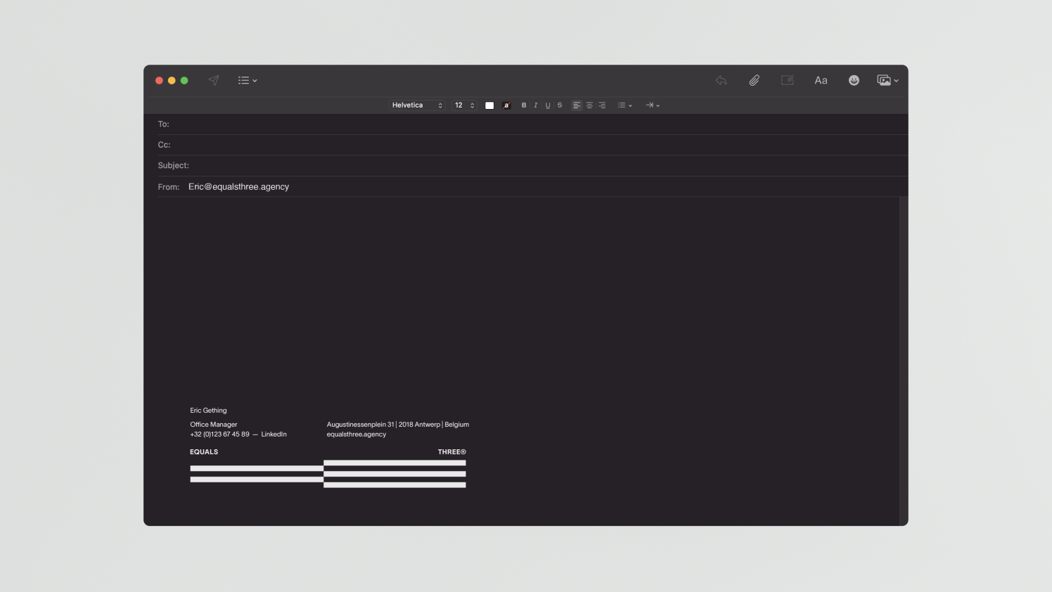
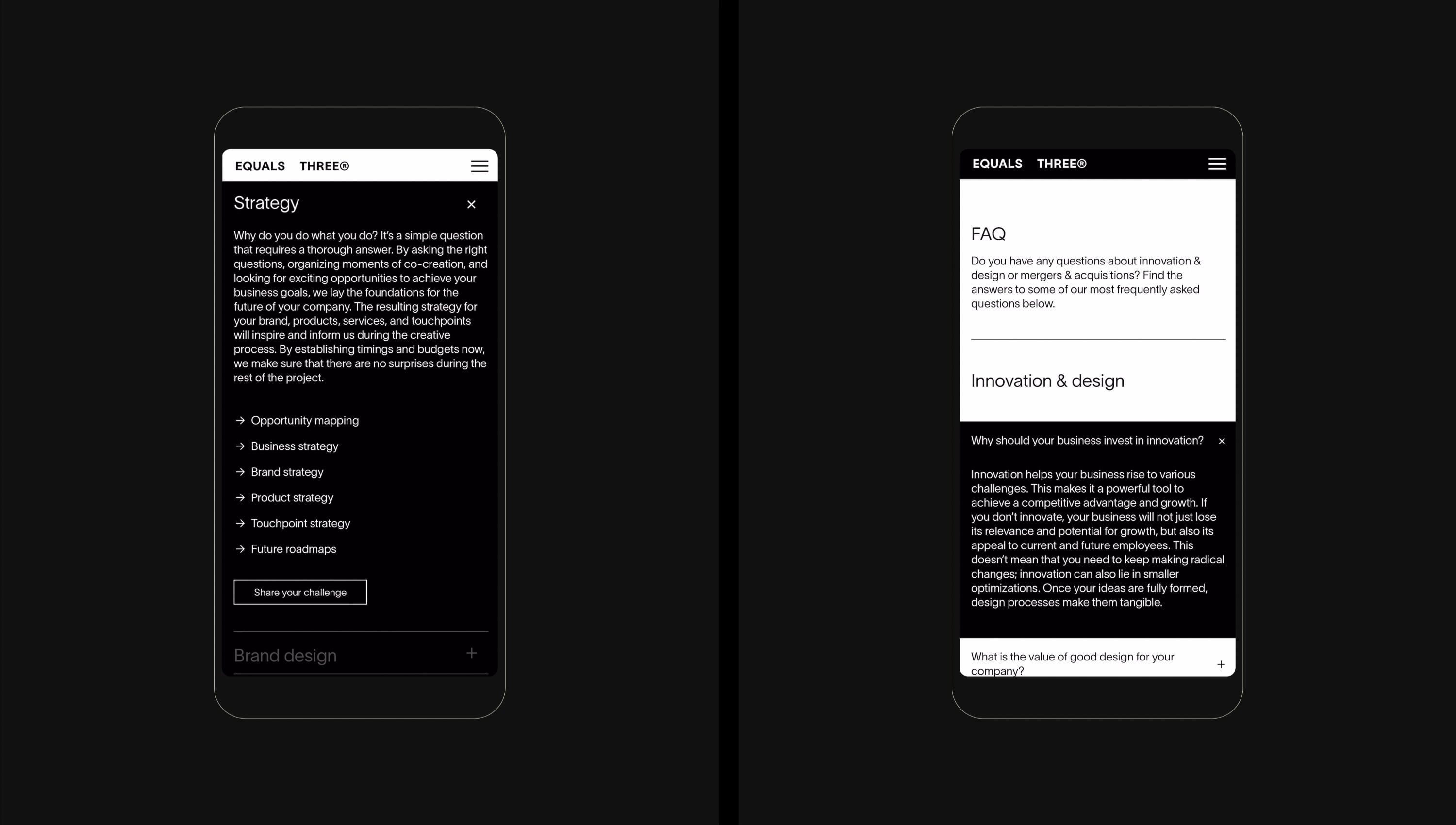
The logo itself can vary in width and height using a grid. This adds differentiation when needed but also flexibility across mediums without losing the distinctive look. The logo can also be used as a pattern that can be deployed graphically across different mediums. By doing this, we move away from simply repeating a logo and create an opportunity for the identity to form itself according to the respective carrier. For fonts, we only use TWKLausanne 250, to keep it simple, minimalist and professional.
The Colours:
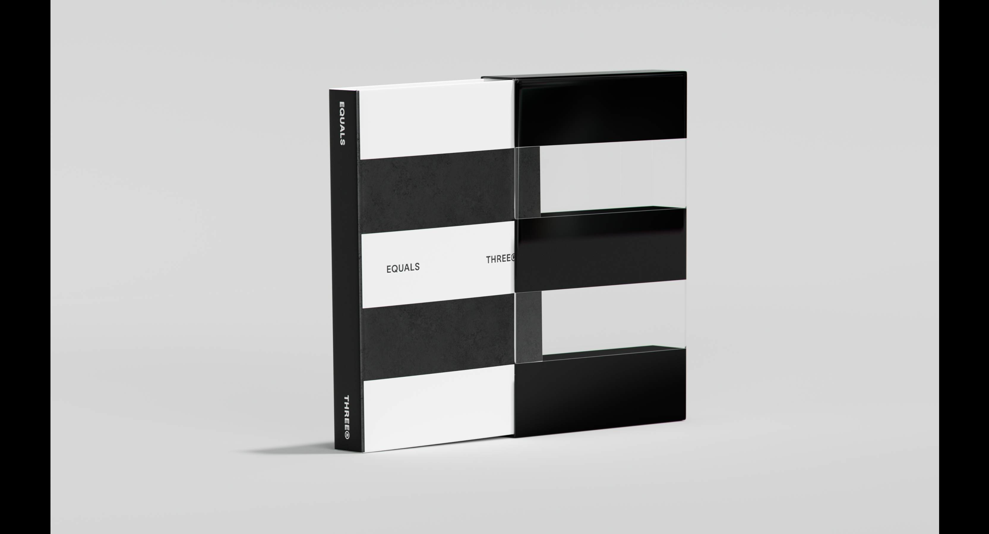
The team at Equals Three places huge value on their ability to create deep collaborations with clients, and across the TOV and values, there is a big emphasis on the collective - always “we”, never “I”. Visually, we have reinforced this through our use of colour (or lack thereof). We chose a stripped-back black & white identity - with additional colours coming directly from their clients’ colour palettes when and where relevant.