

Antwerp-based innovation agency Absintt approached us for a rebrand following a strategic expansion into Mergers & Acquisitions. The pivot required a new strategy, name, and identity that felt modern, confident, and professional without becoming overly corporate. Under the new name Equals Three, we developed a brand that reflects their belief that collaboration creates greater value than the sum of its parts.
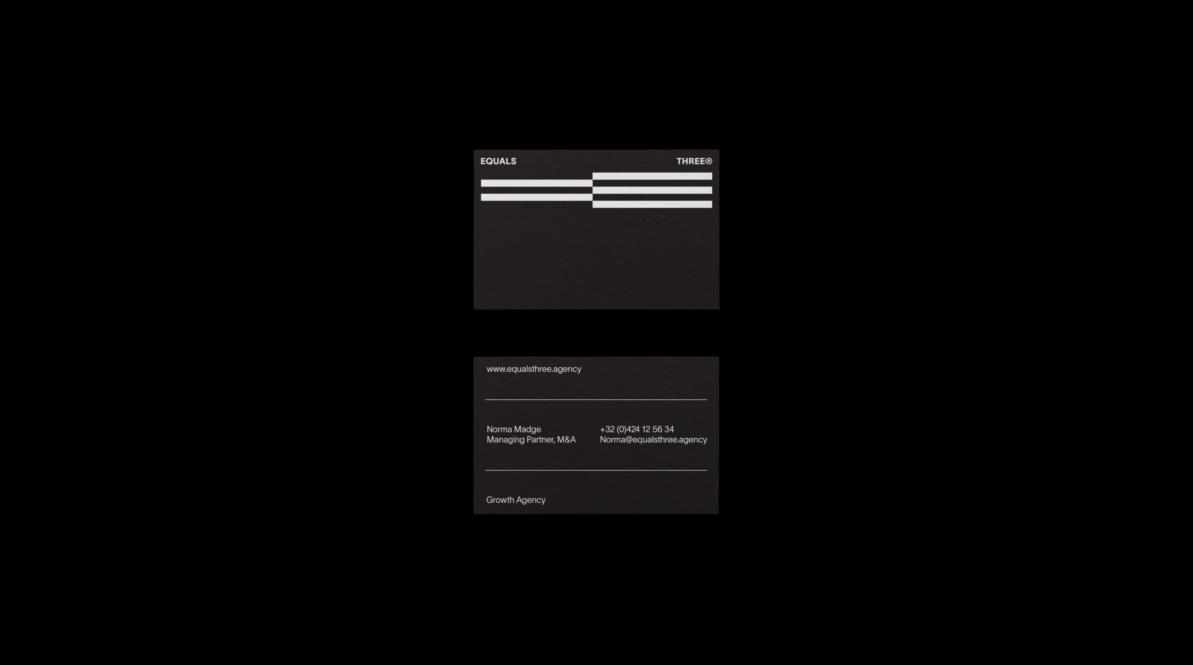
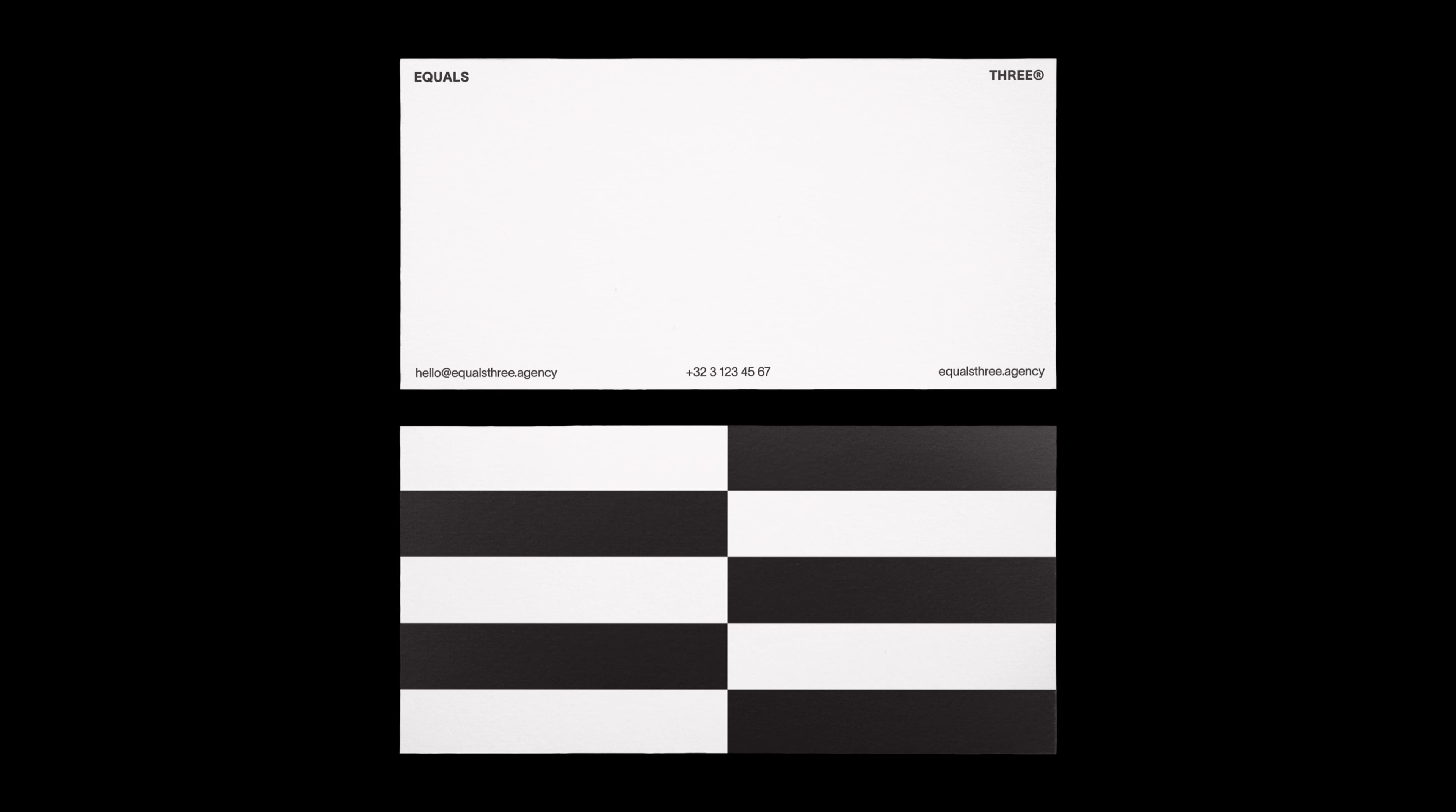
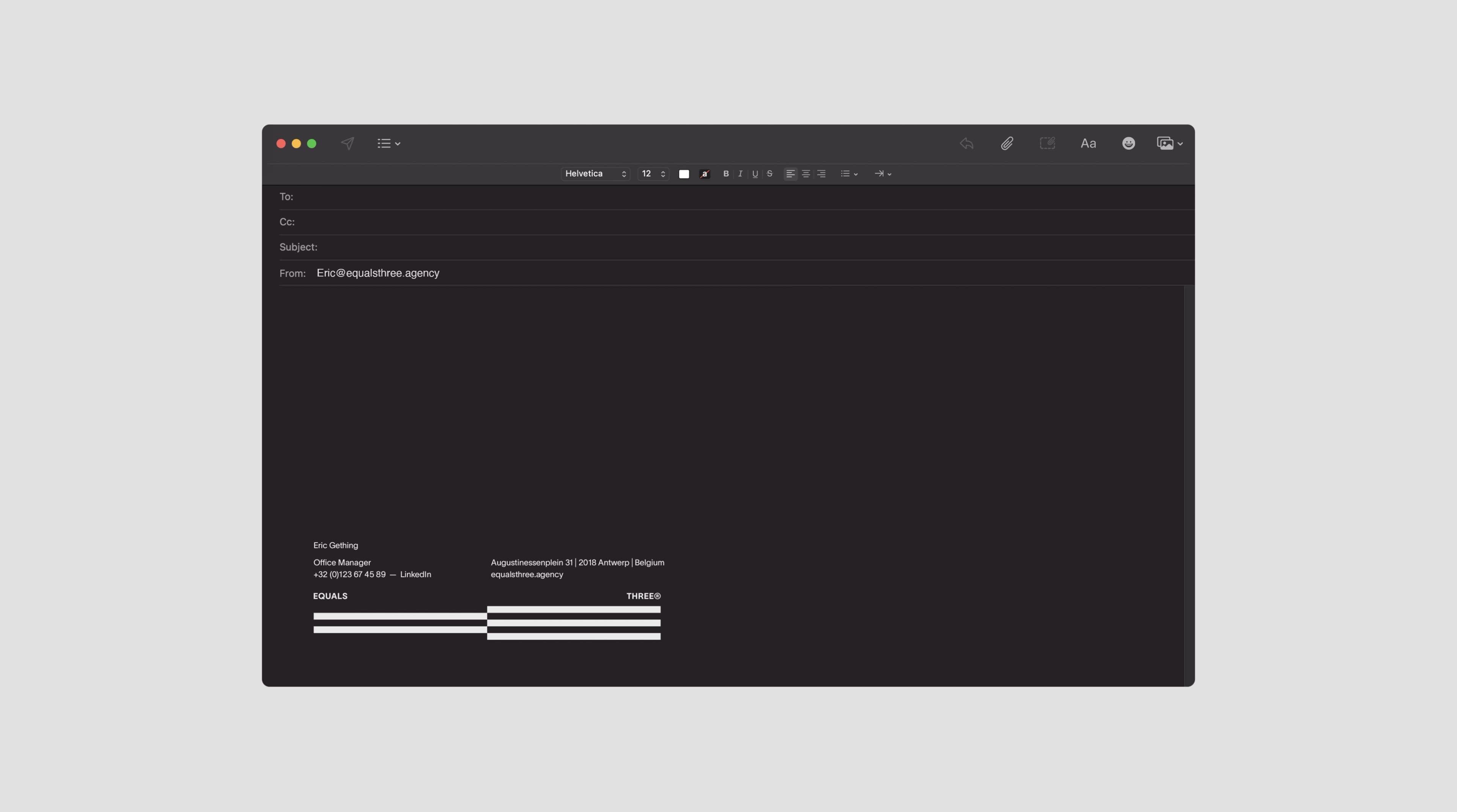
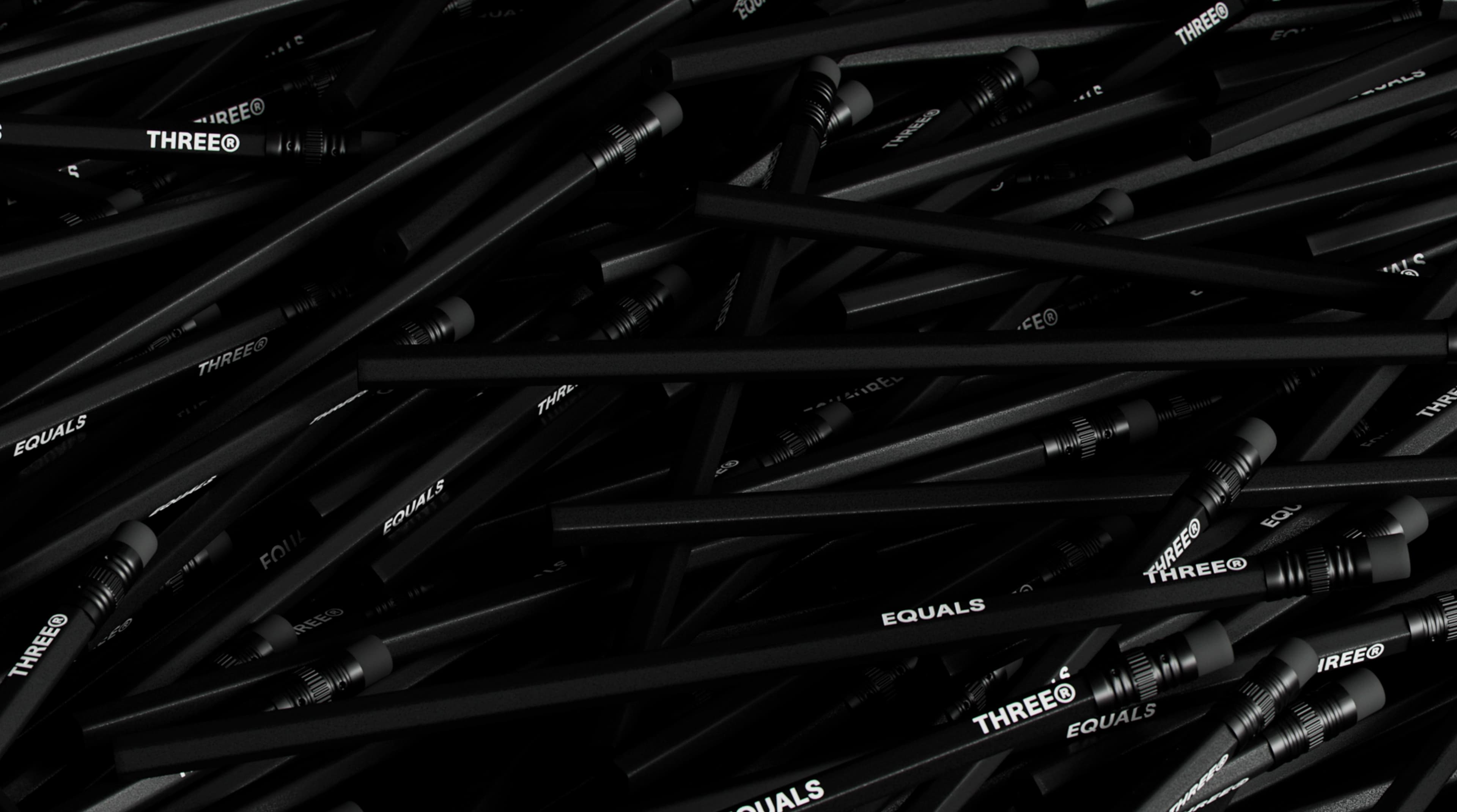
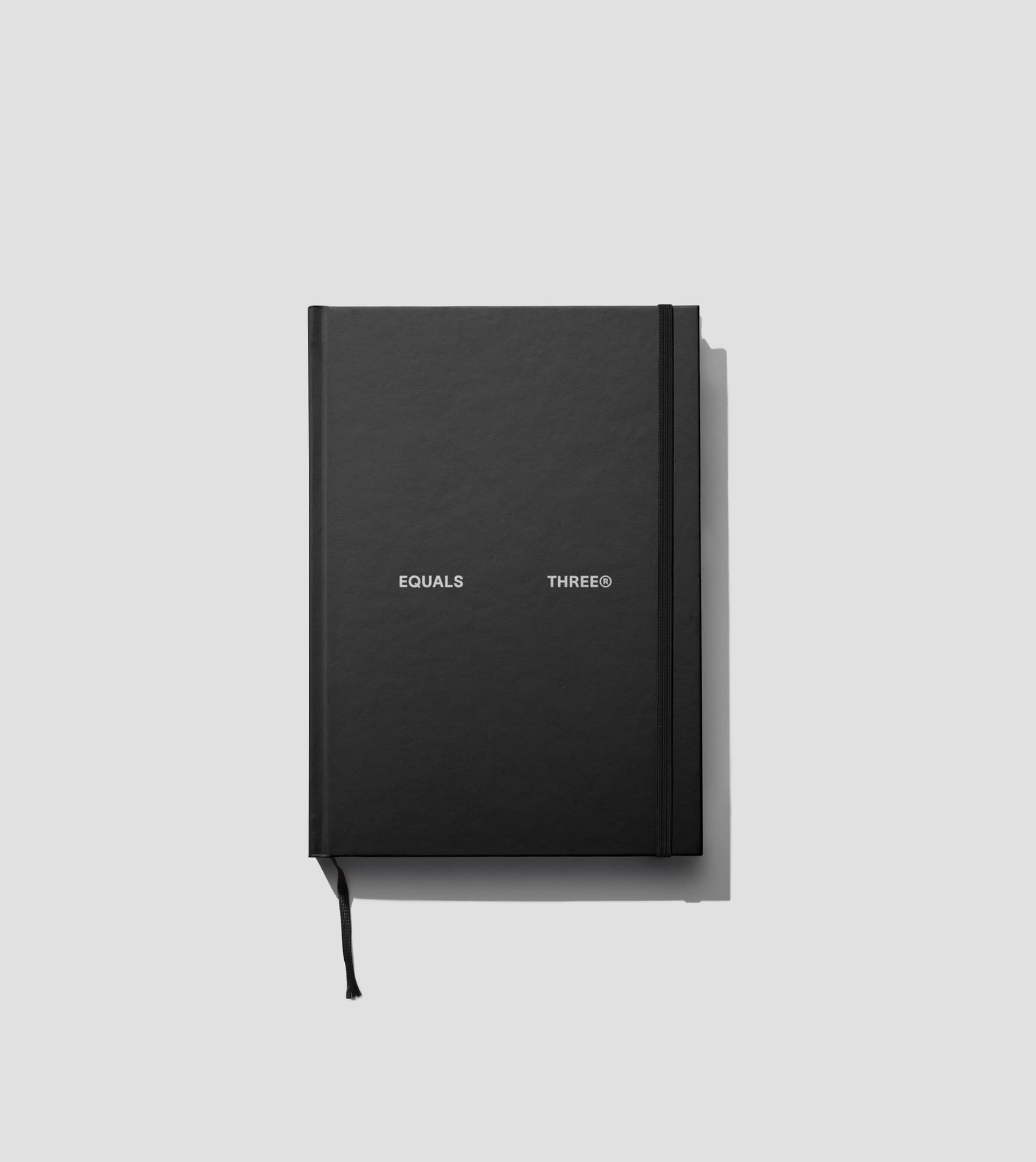
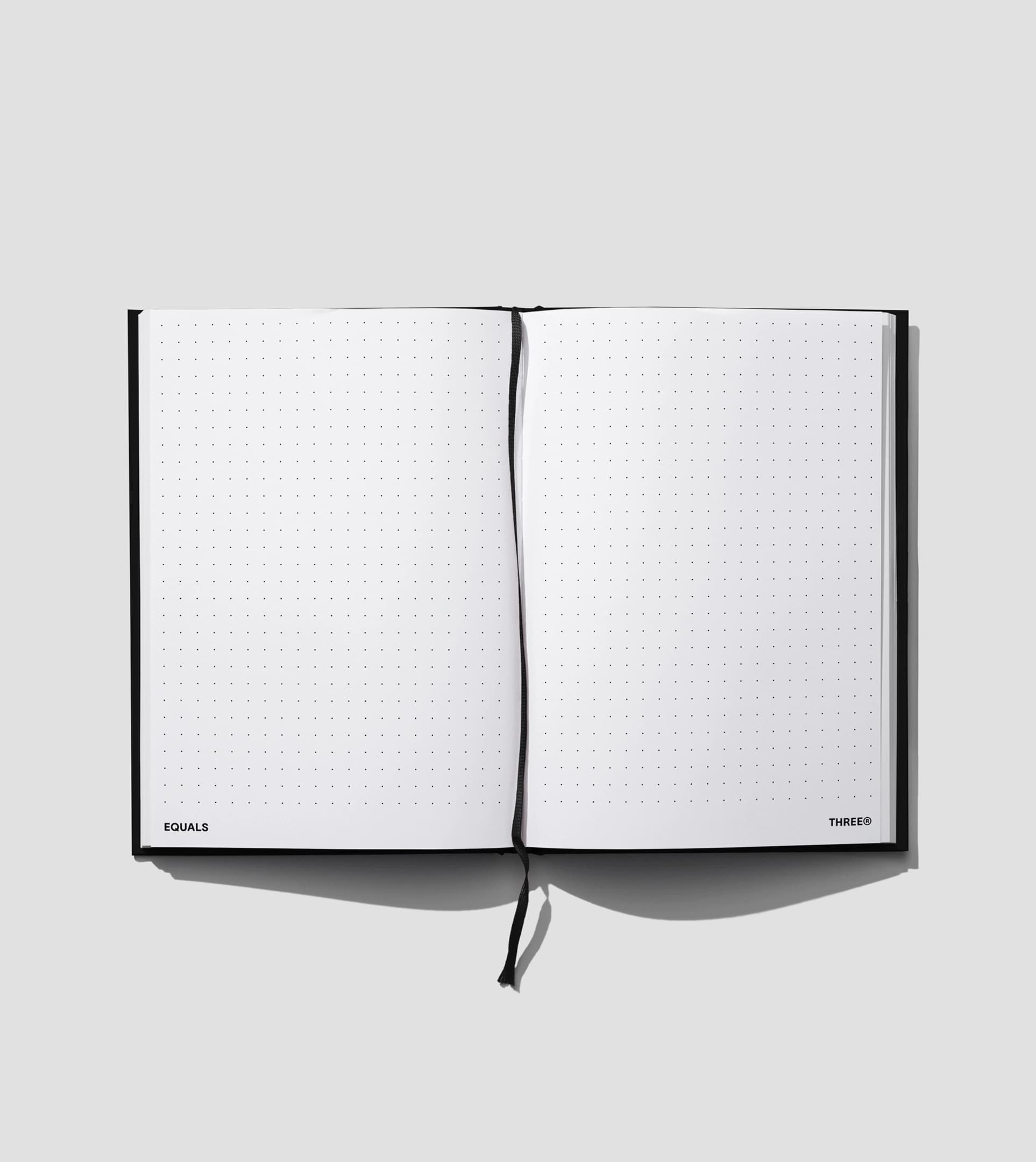
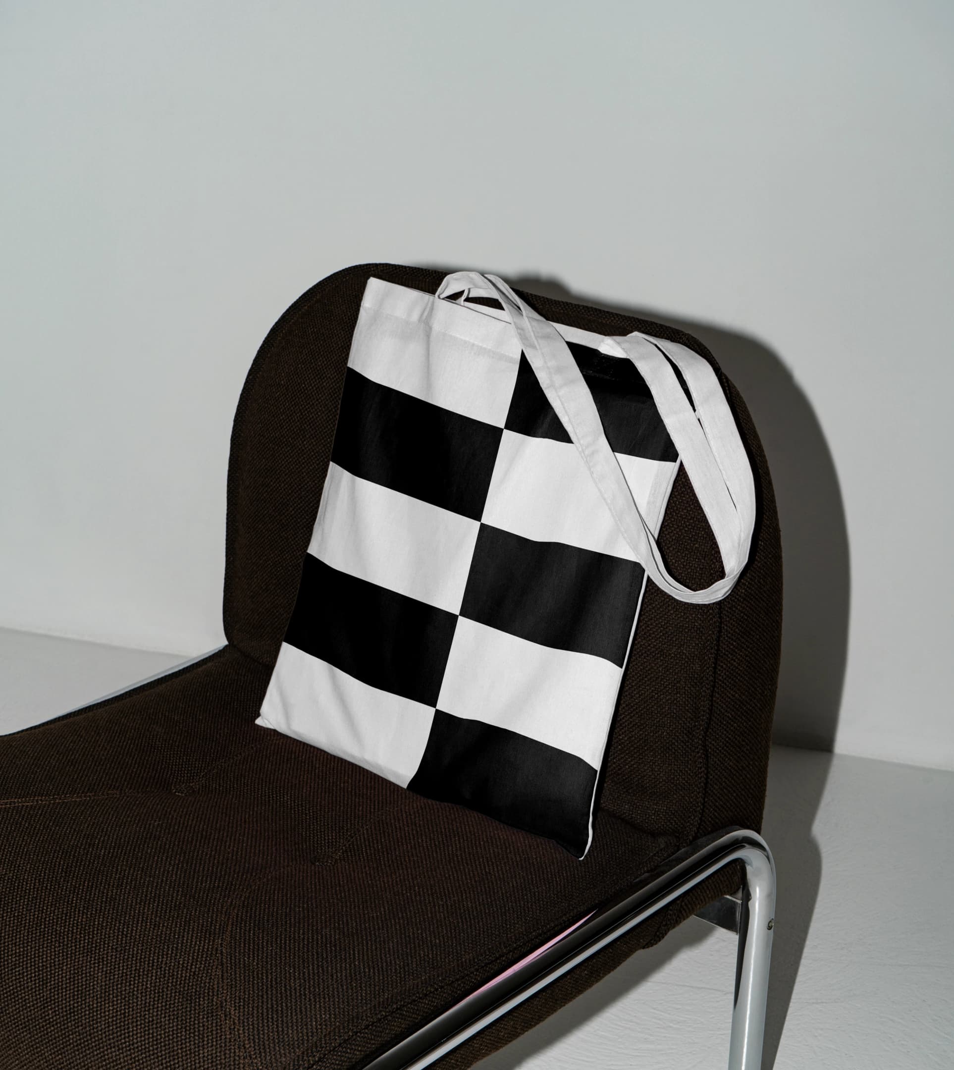
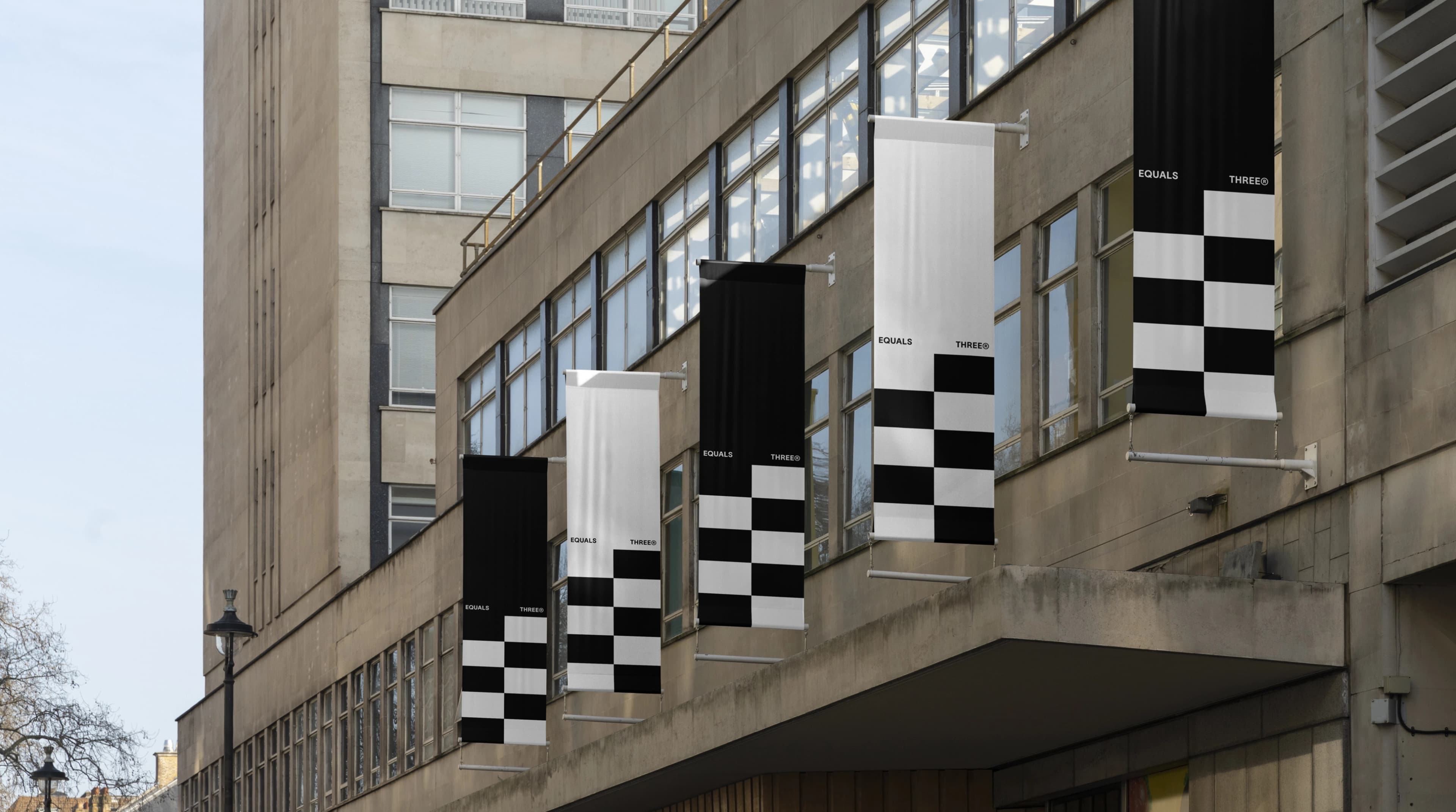
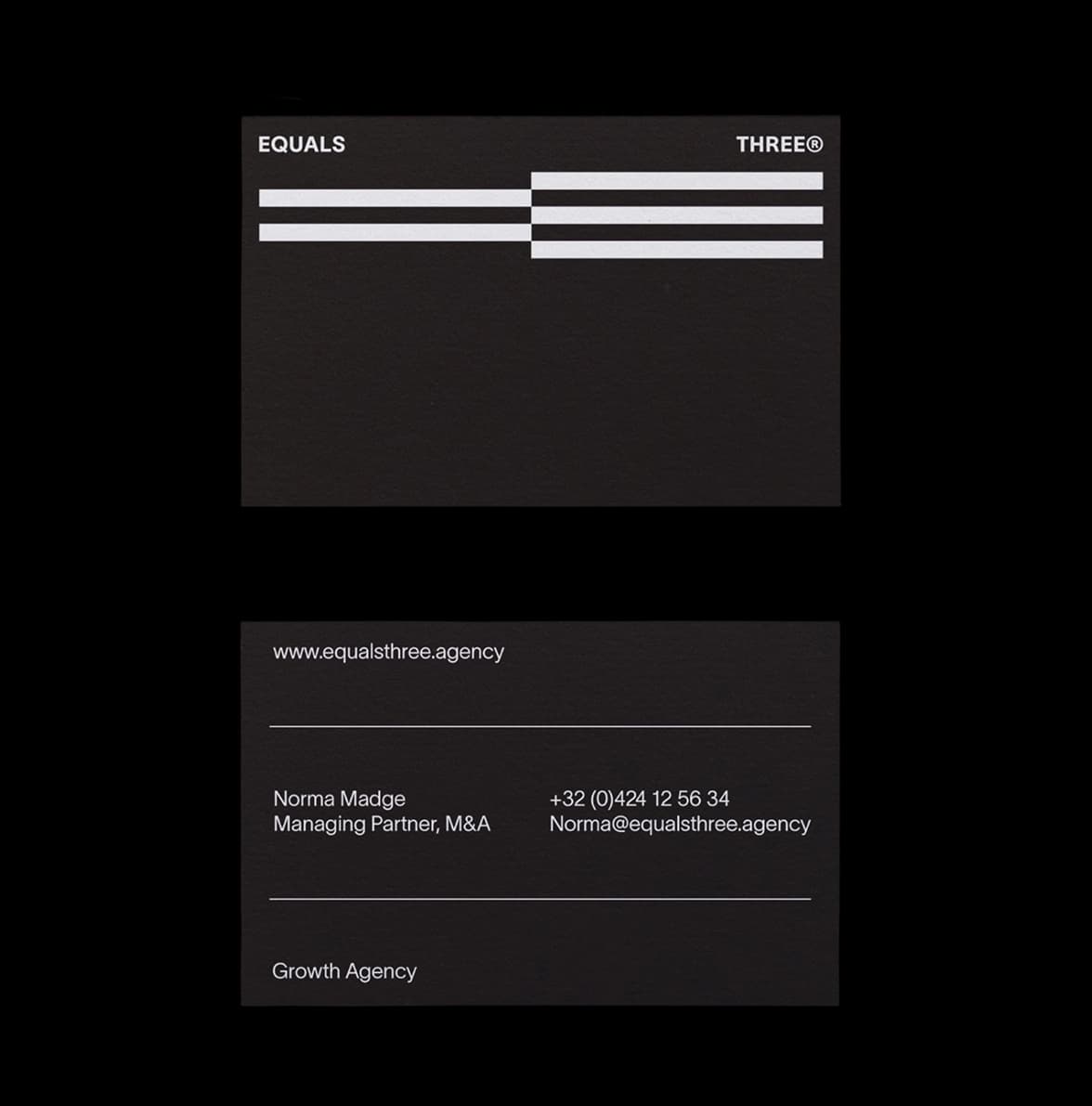
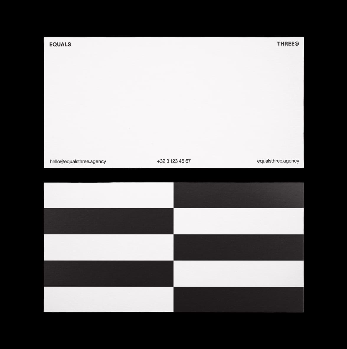
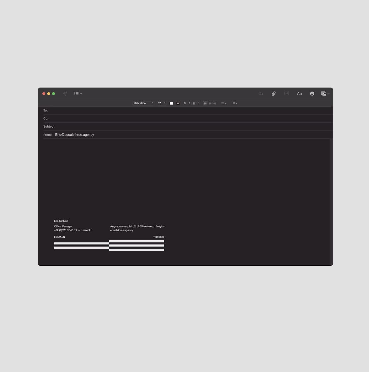
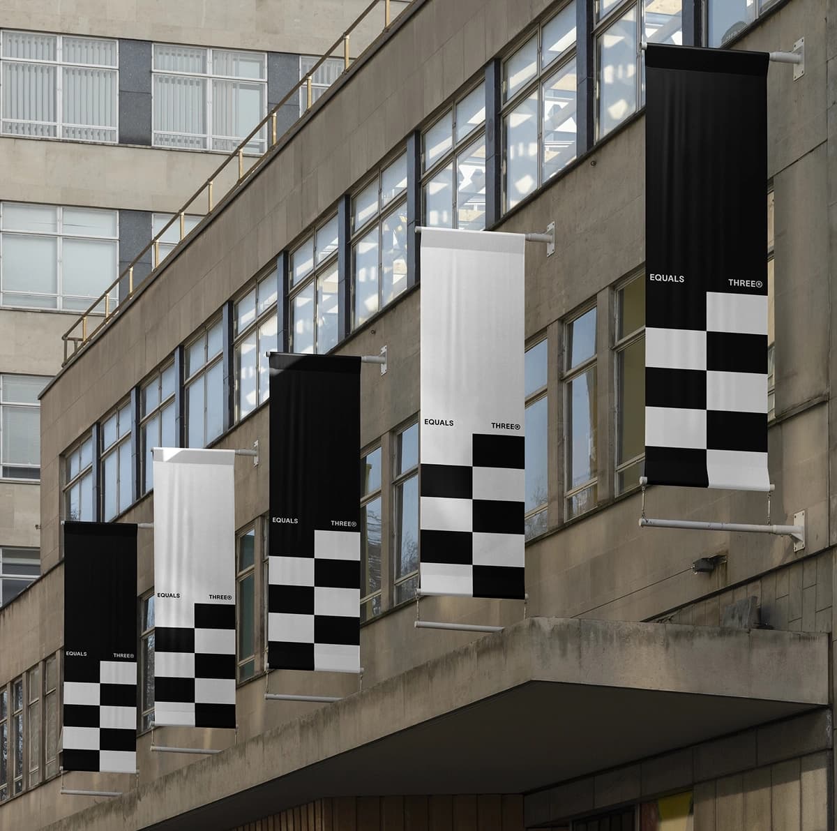
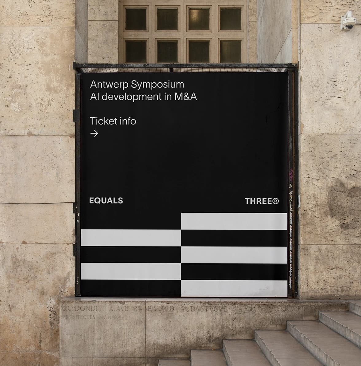
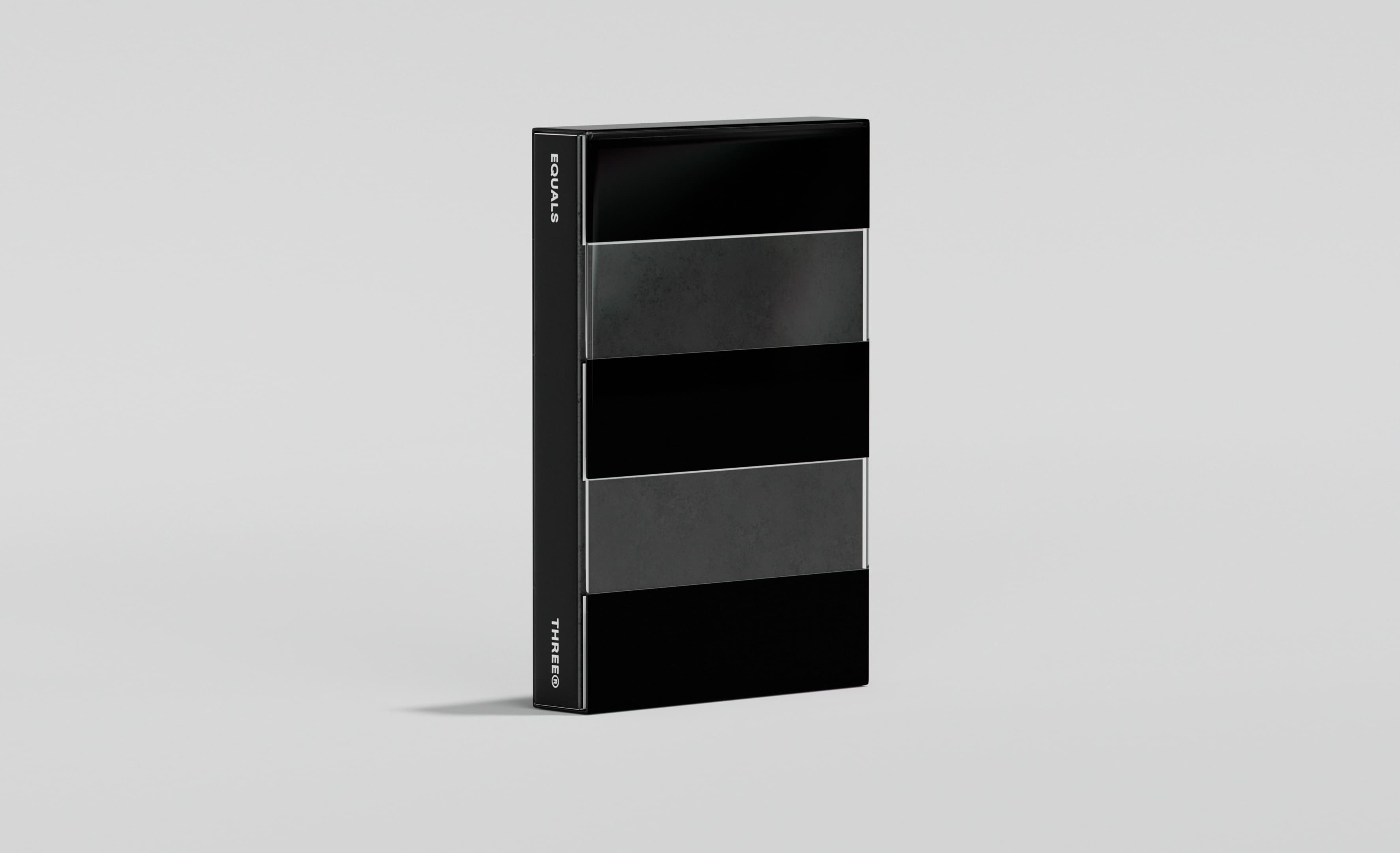
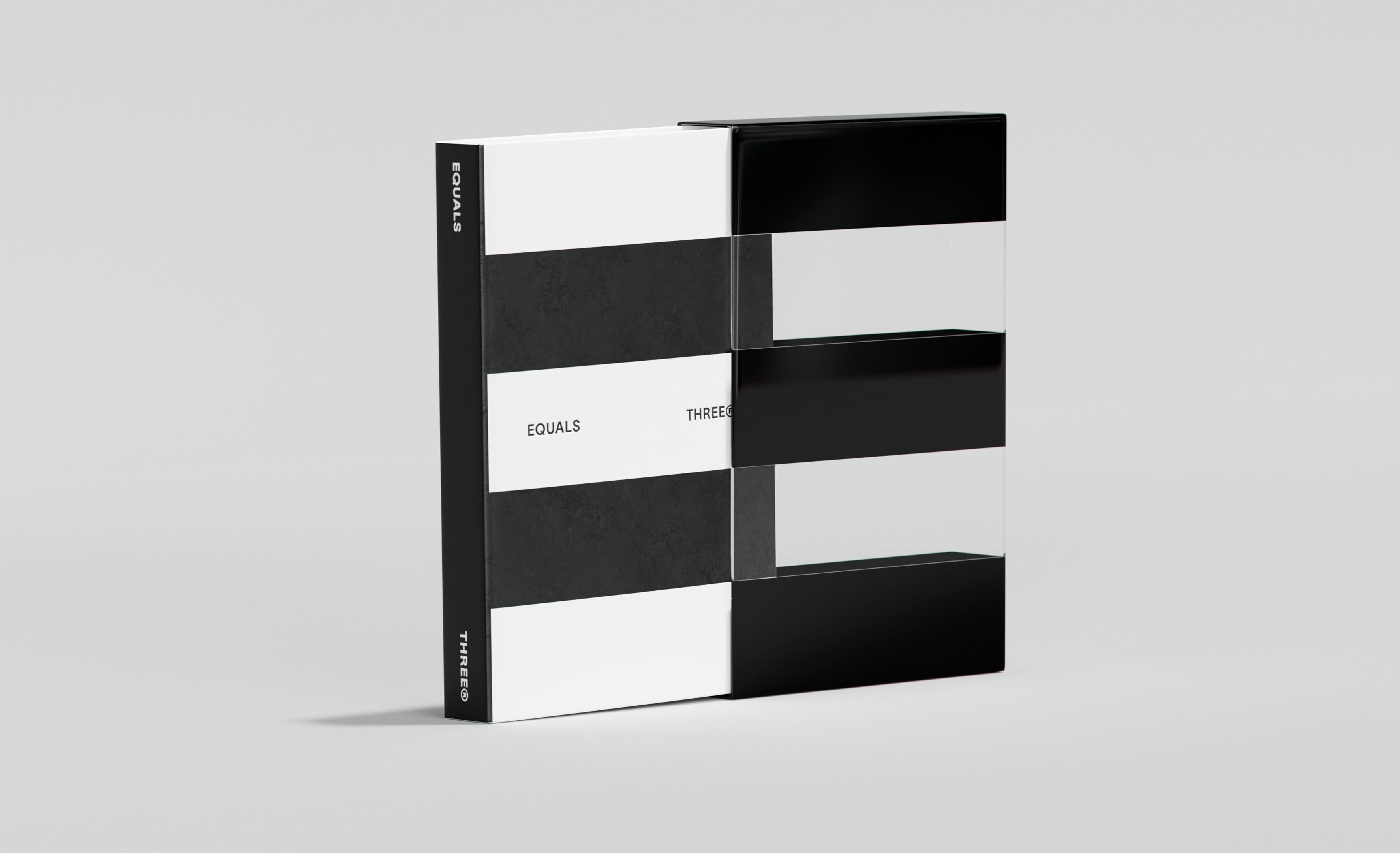
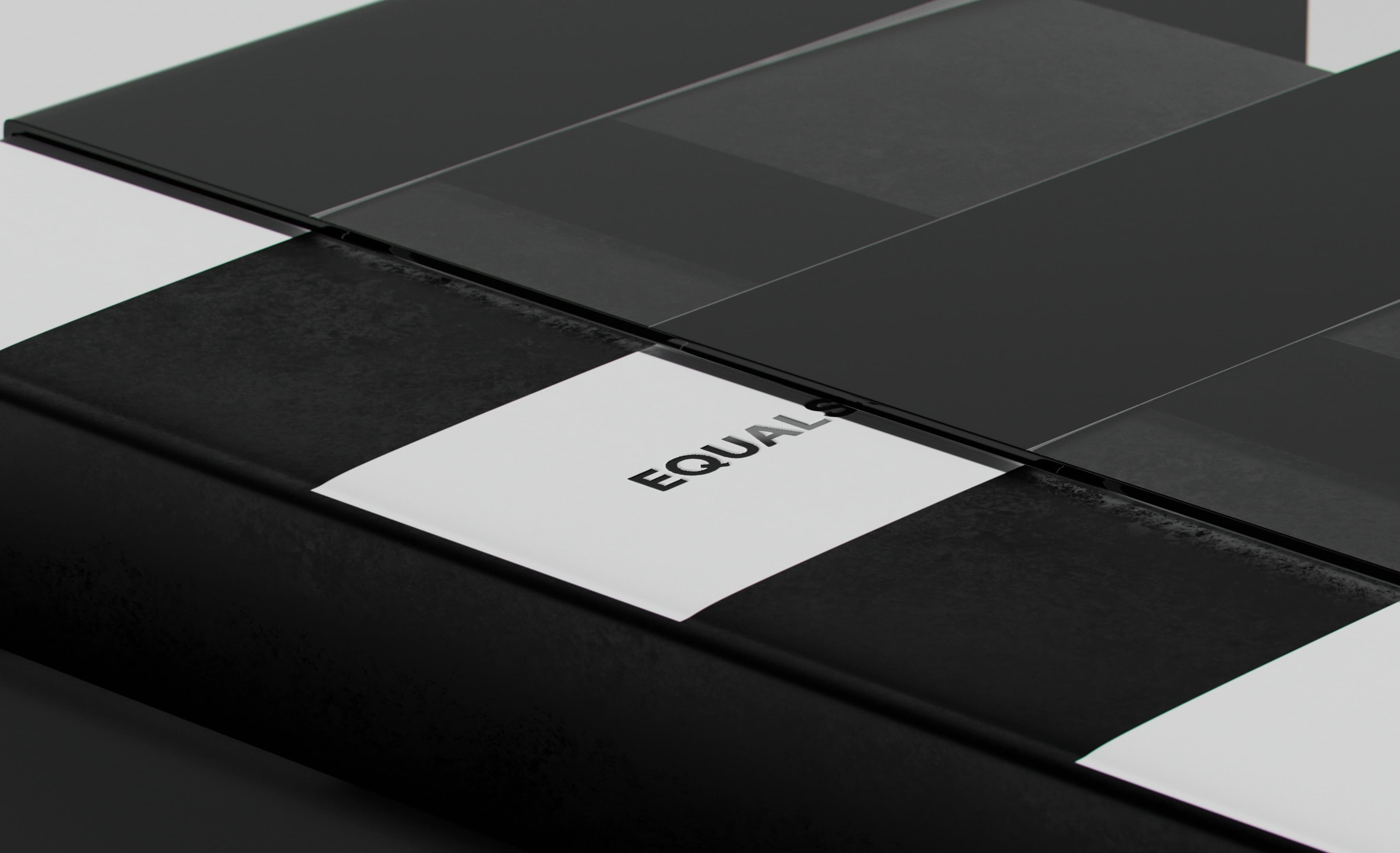
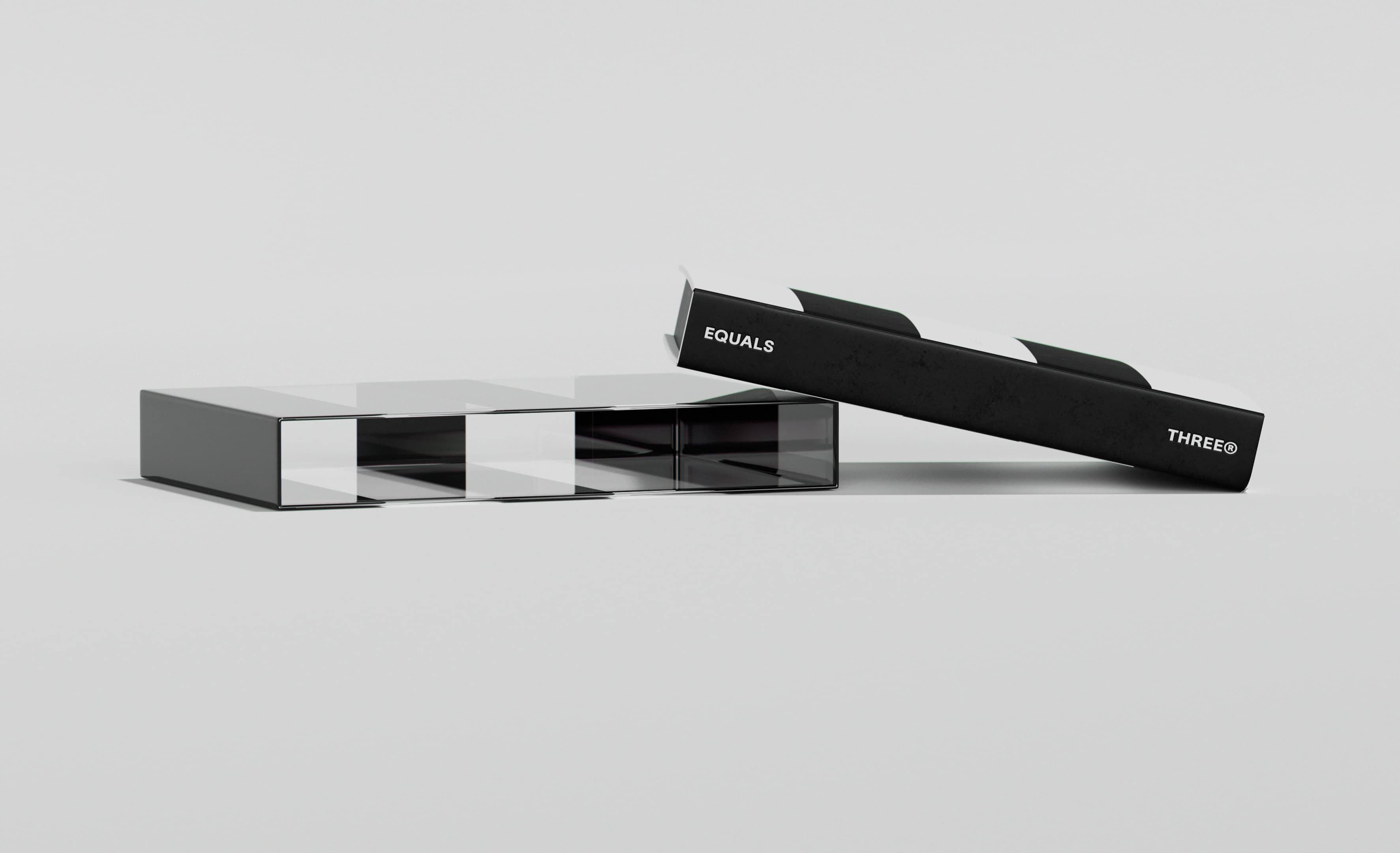
The logo stems directly from the name: the equal sign joined by three stripes. The result is a distinctive mark that embodies partnership and progress. Built as a modular system, it extends beyond the logo to define the entire visual identity system, from grids and layouts to patterns and motion. Its adaptive structure allows the internal team to create new concepts from shared building blocks while maintaining cohesion.
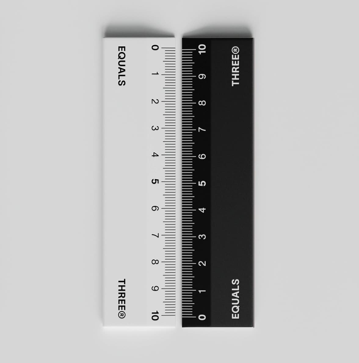
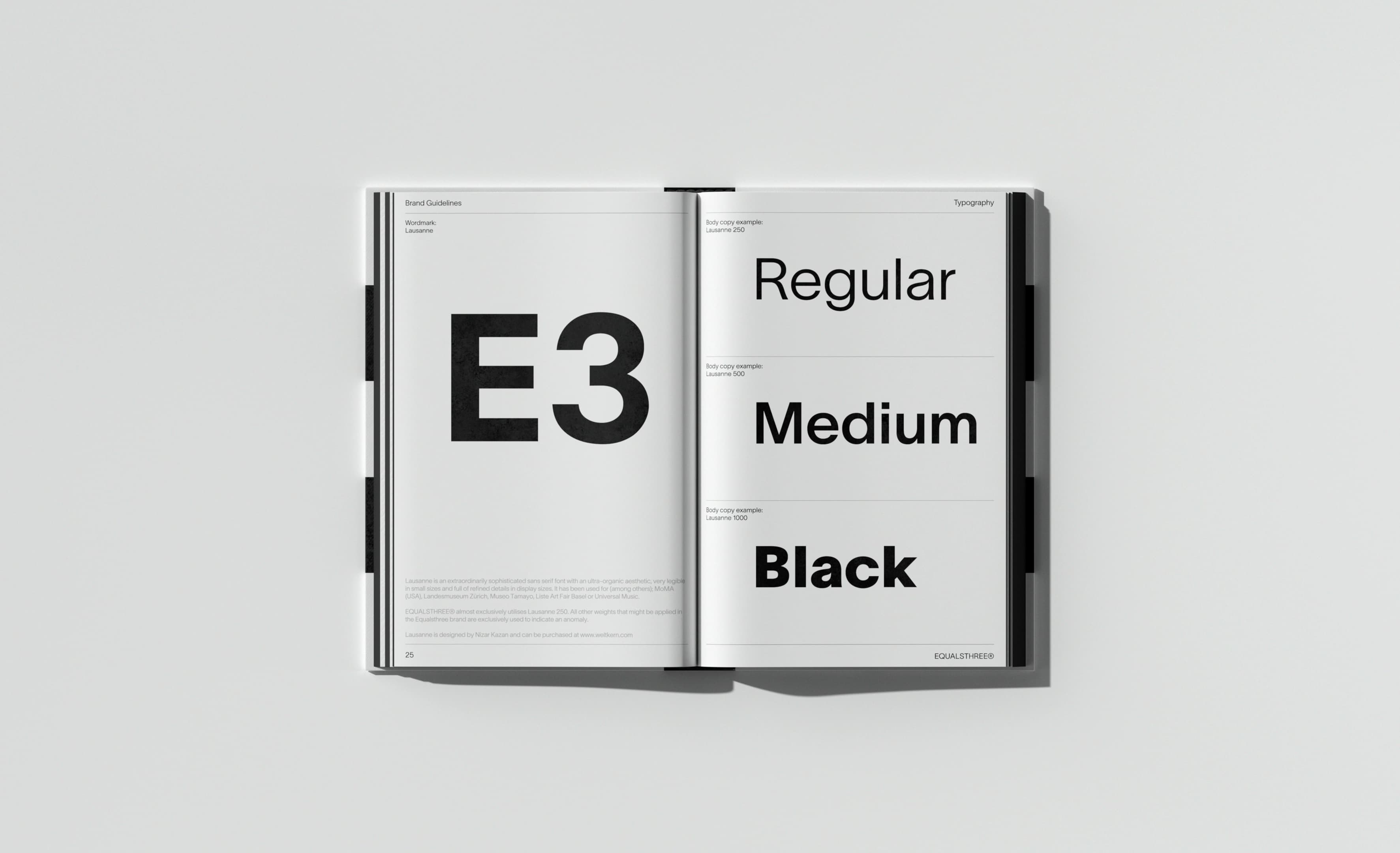
The identity is anchored by the neo-grotesque typeface TWK Lausanne 250, chosen for its minimalist yet organic aesthetic. A stripped-back black-and-white palette reinforces their modular mindset, allowing colour from clients’ brands and products to take centre stage when relevant.