


We were asked to rebrand Belgian-based Dorst into a more culturally relevant and impactful brand. Previously positioned as a B2B company offering high-quality pre-batched cocktails on tap, Dorst was expanding into D2C and retail, requiring a more emotional and lifestyle-driven identity.
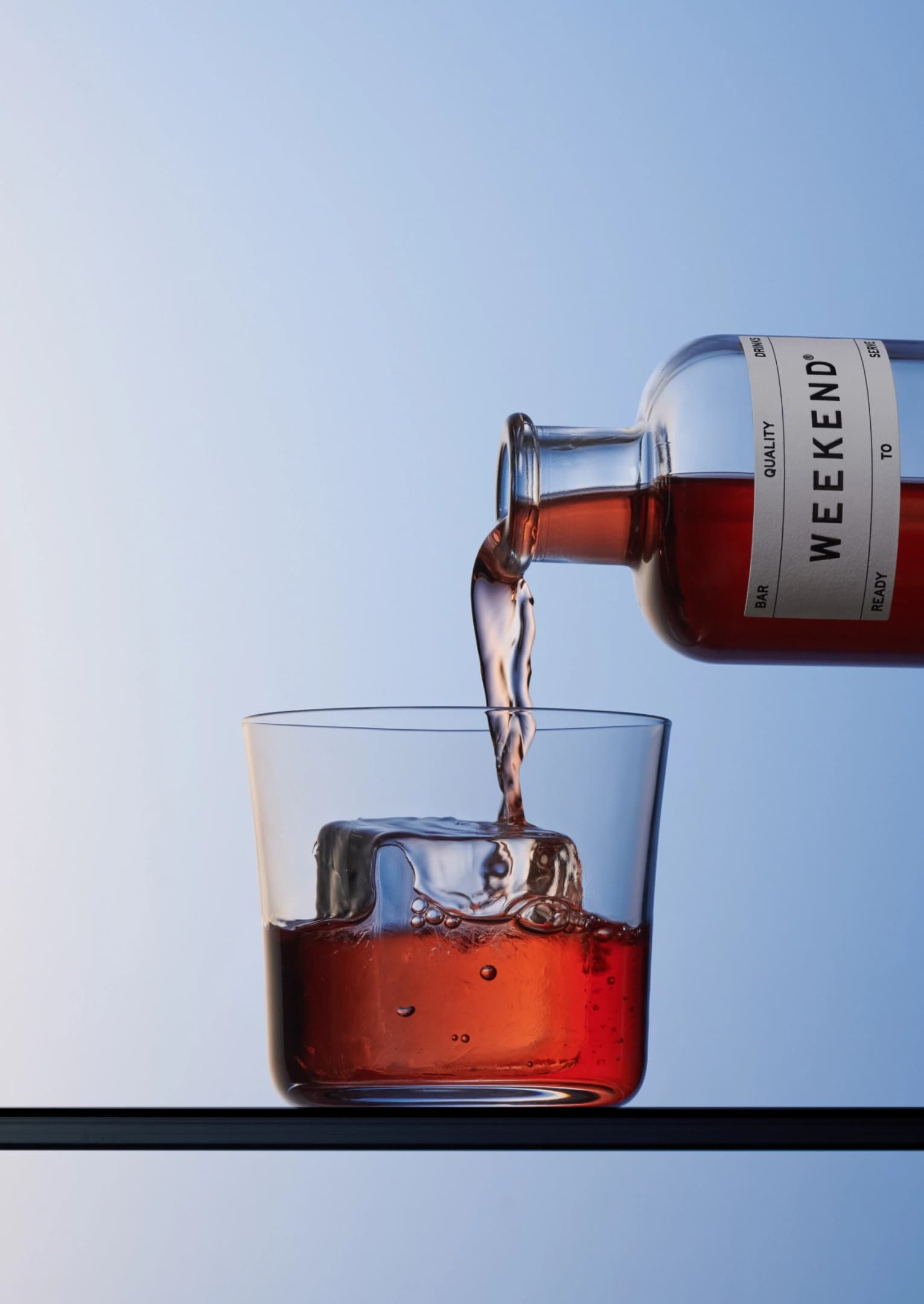
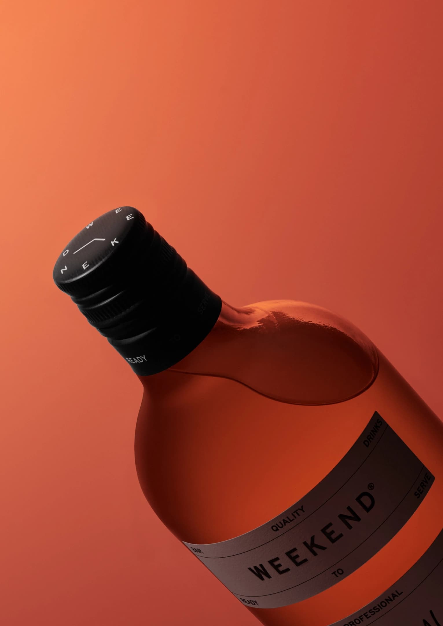
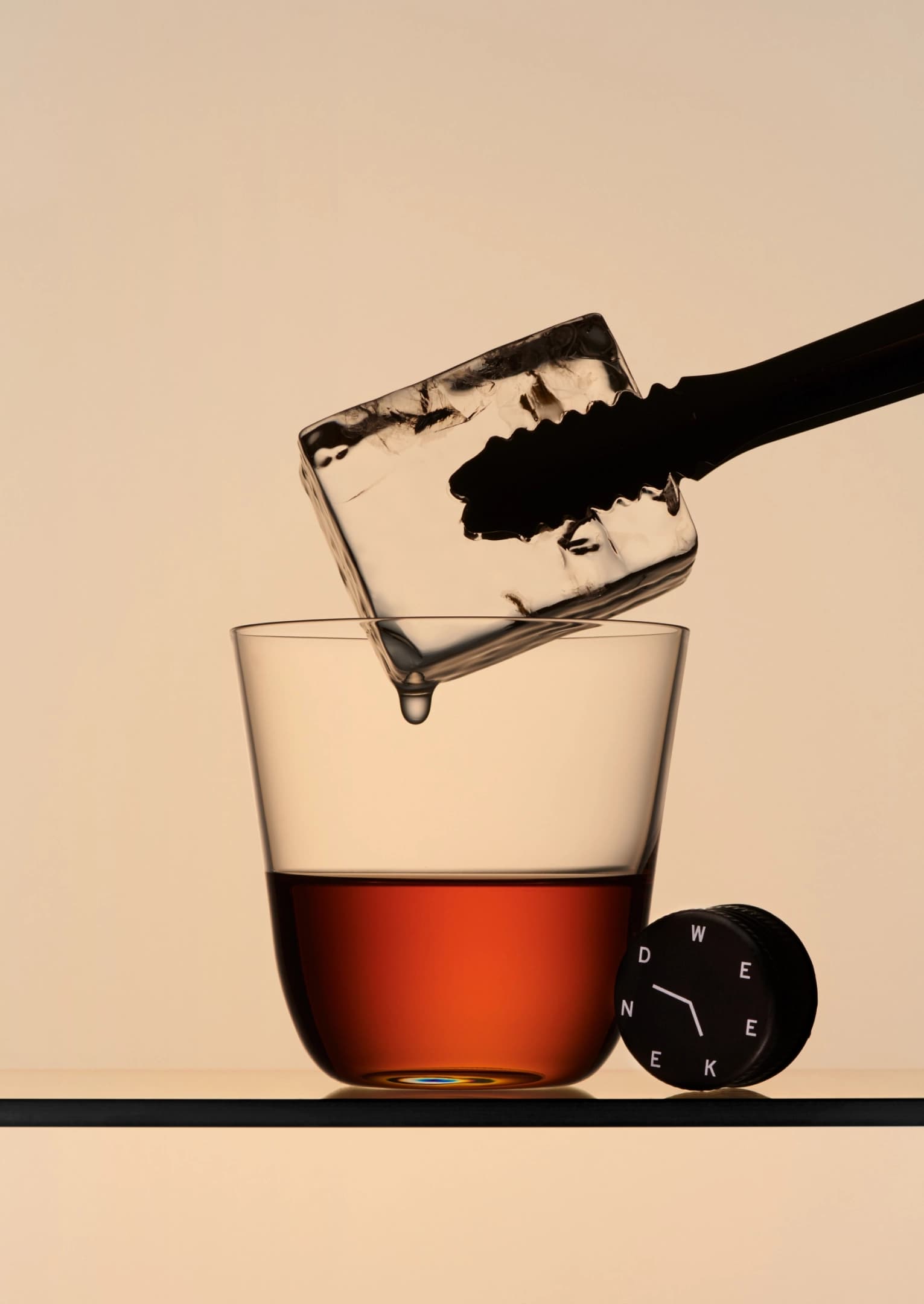
We took a feeling-first approach to naming, focusing on ease and enjoyment rather than the drinks themselves. After exploring “every drink is a journey,” we shifted towards something that captured effortlessness and good times. The result was Weekend Drinks, supported by the descriptor “Bar quality drinks, ready to serve,” highlighting craftsmanship, convenience and room for growth. The design direction played on the contrast between weekday and weekend: weekdays are mundane, structured and rigid, while weekends are easy-going, carefree and effortless. Imagine a bar napkin had a baby with a Google calendar and you’re in the right zone. Using Highway VAR – 6 by Otherwhere Collective alongside our custom handwritten font Weekend By Hand, the identity balances order and spontaneity through a mix of grid precision and casual scribbles.
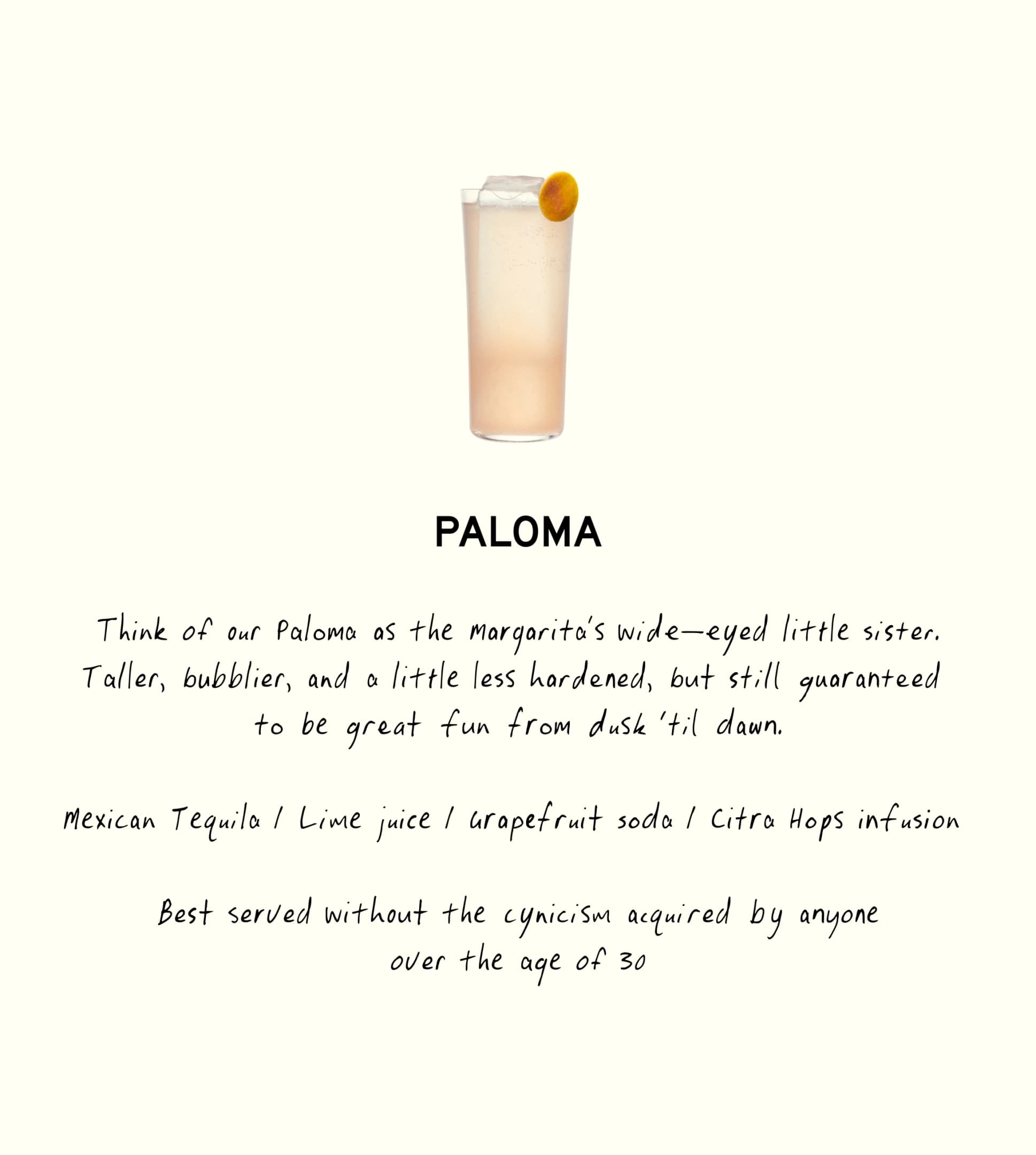
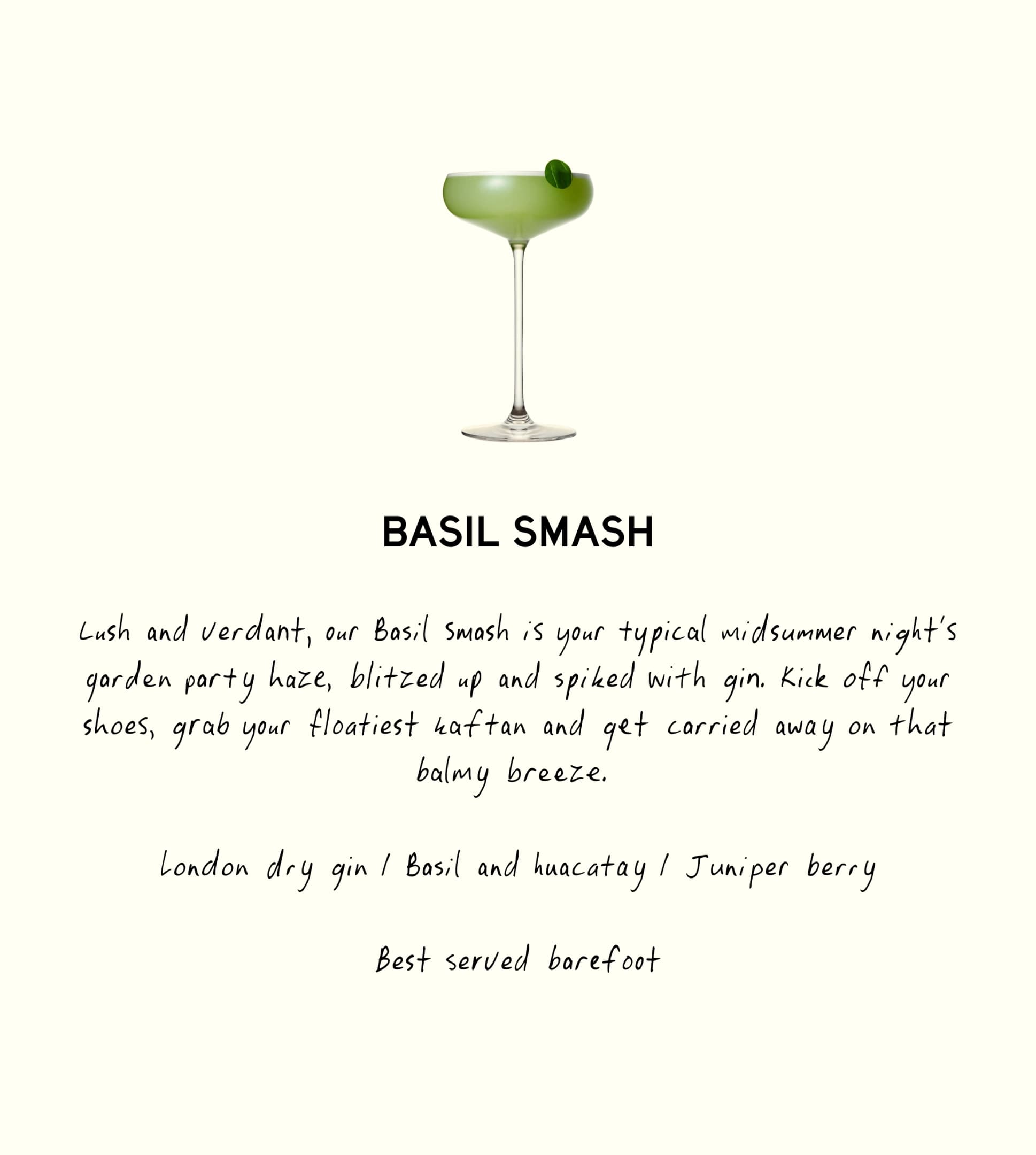
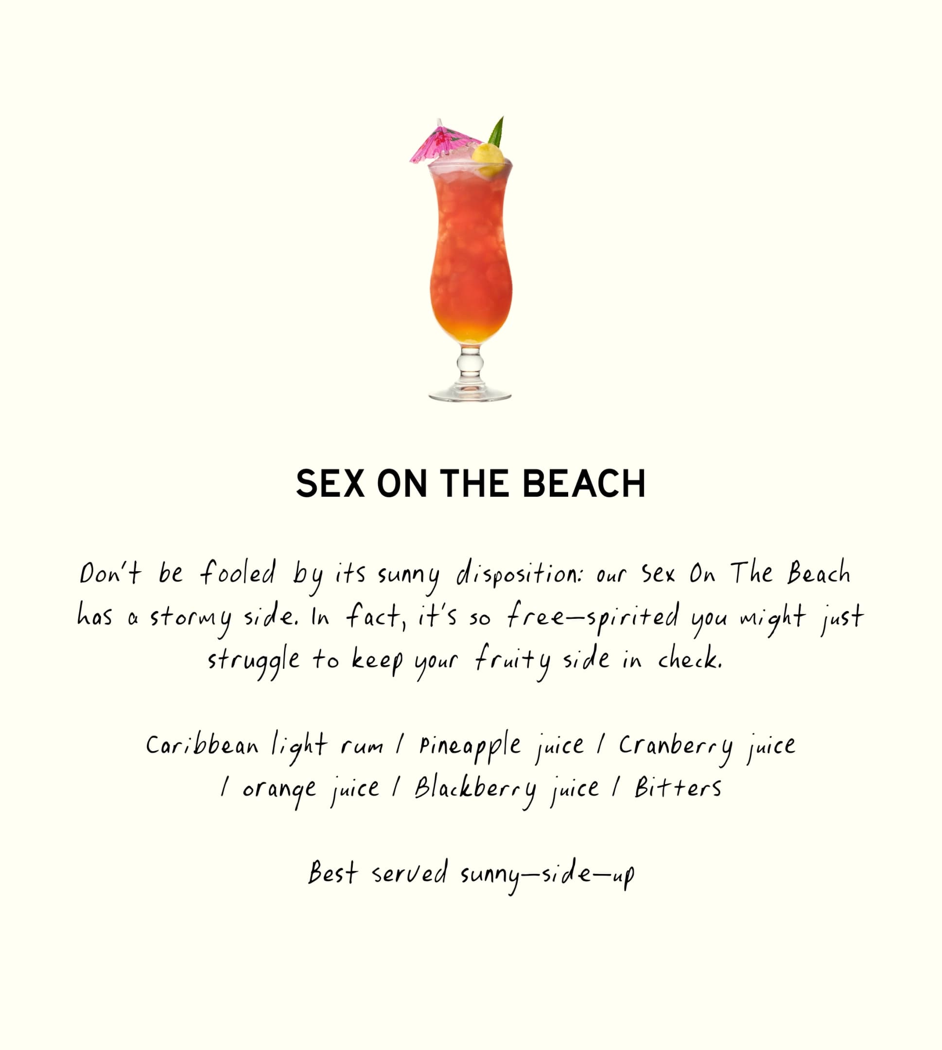
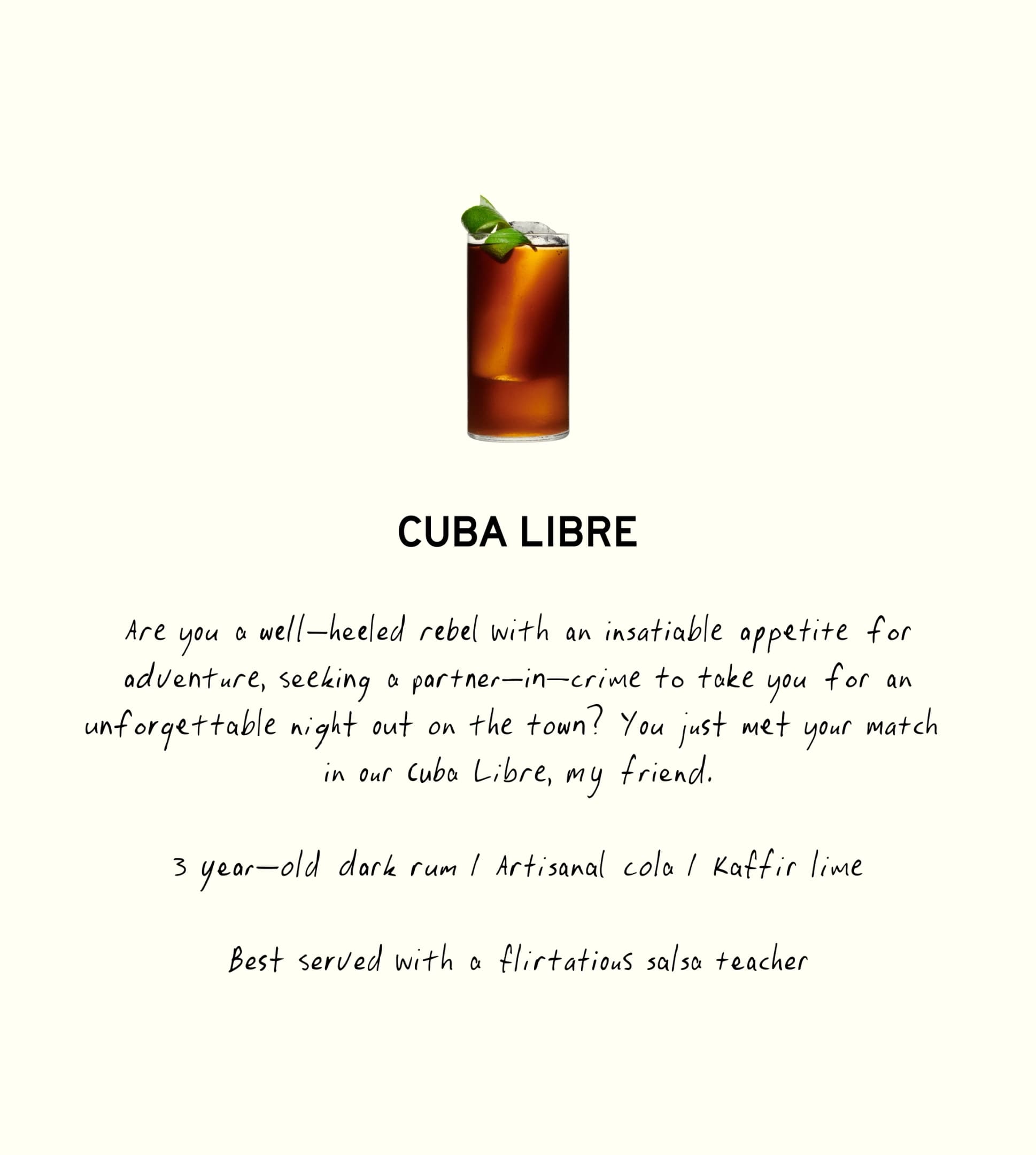
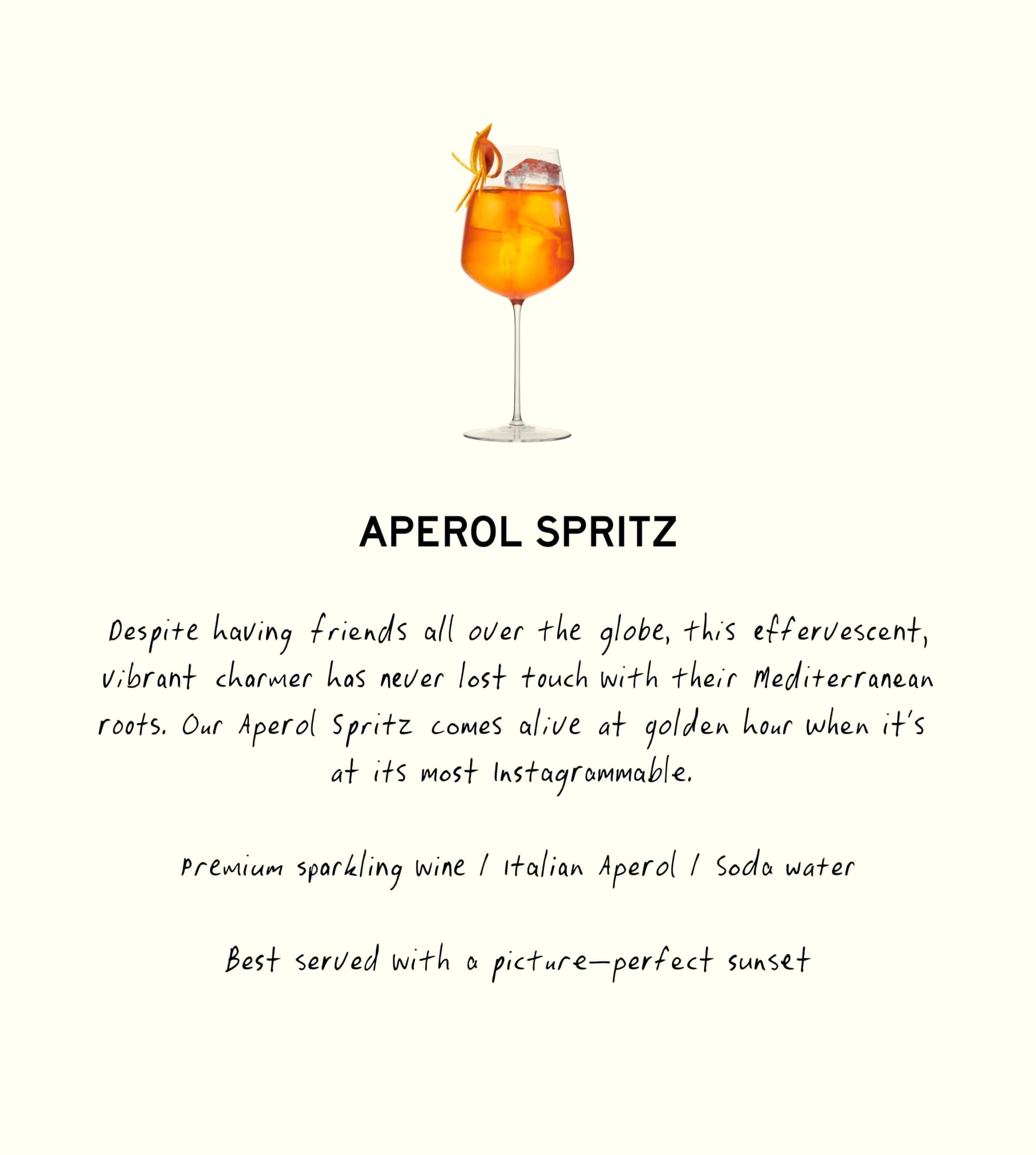
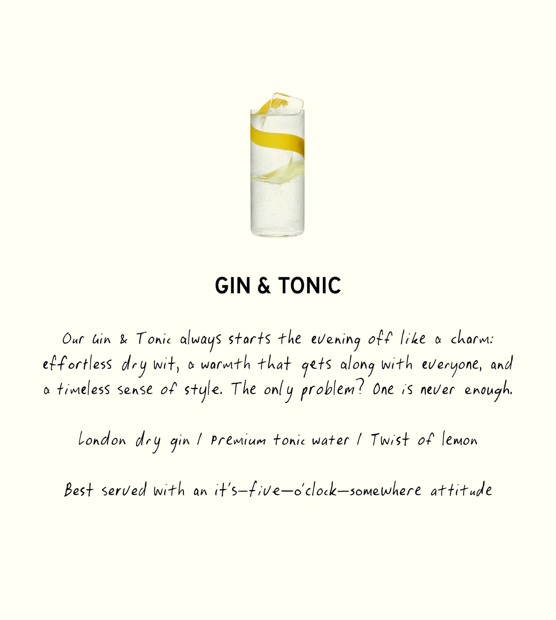
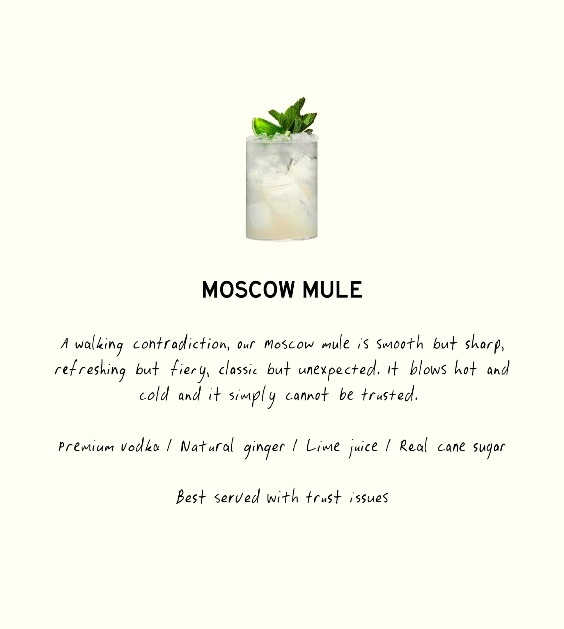
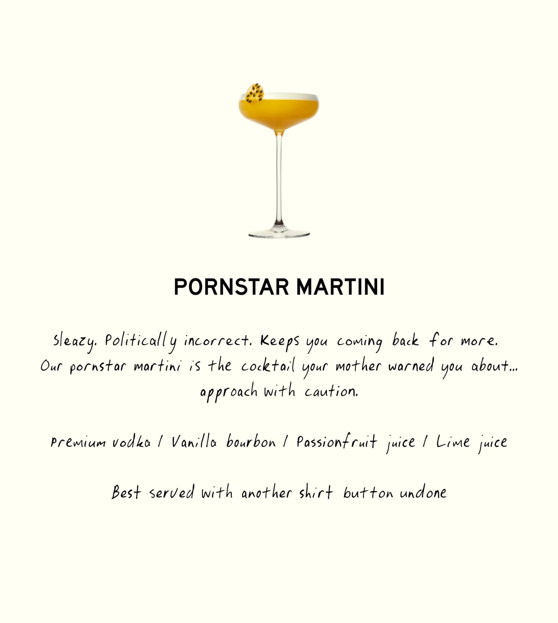
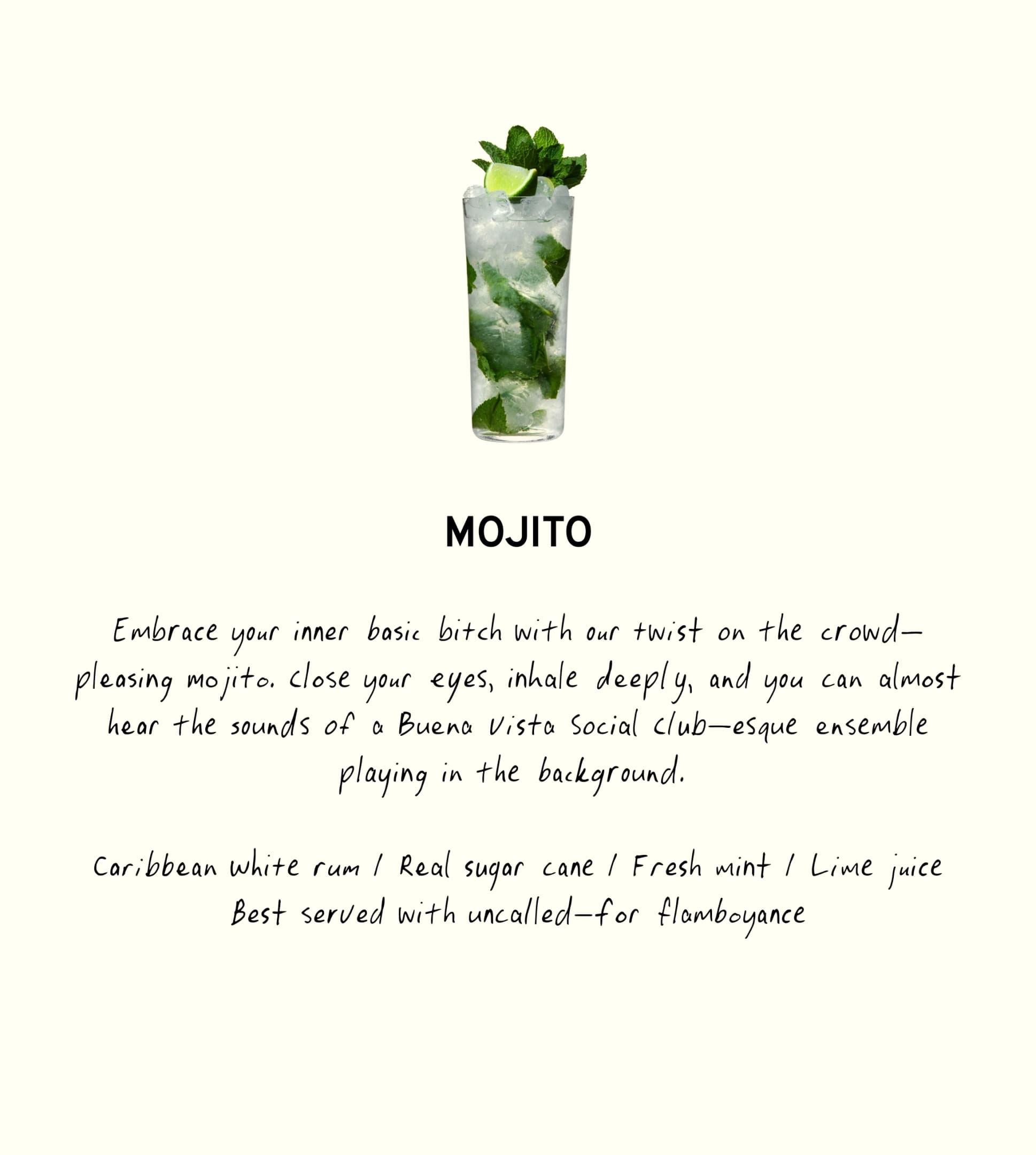
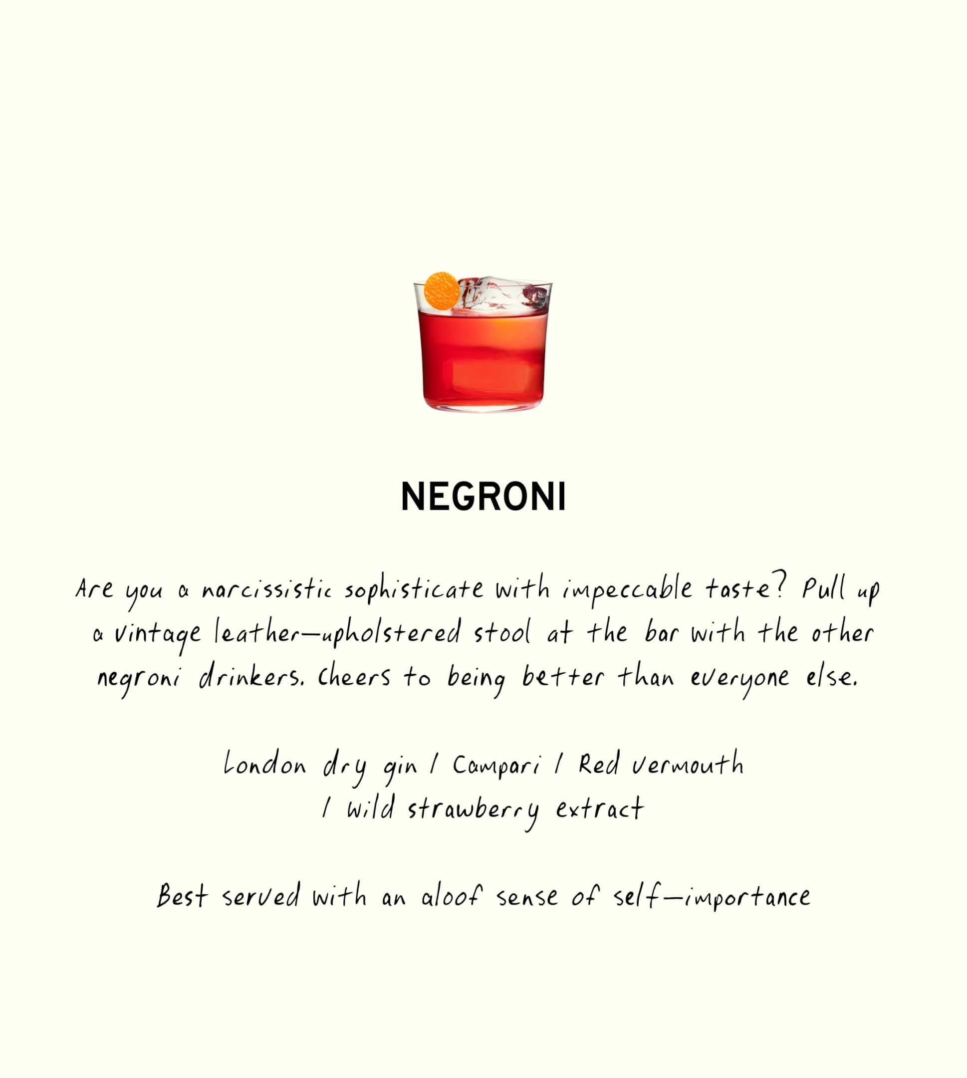
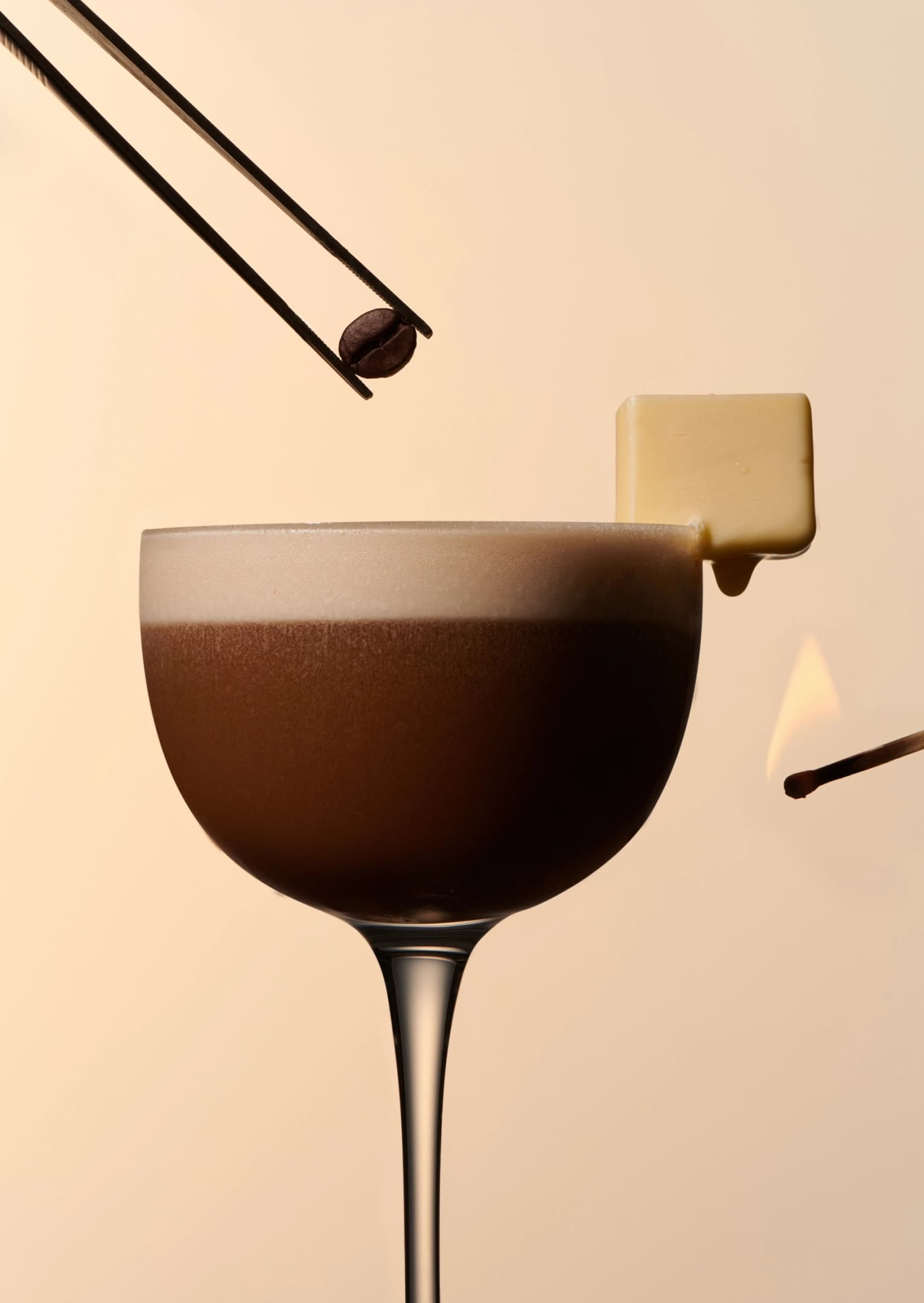
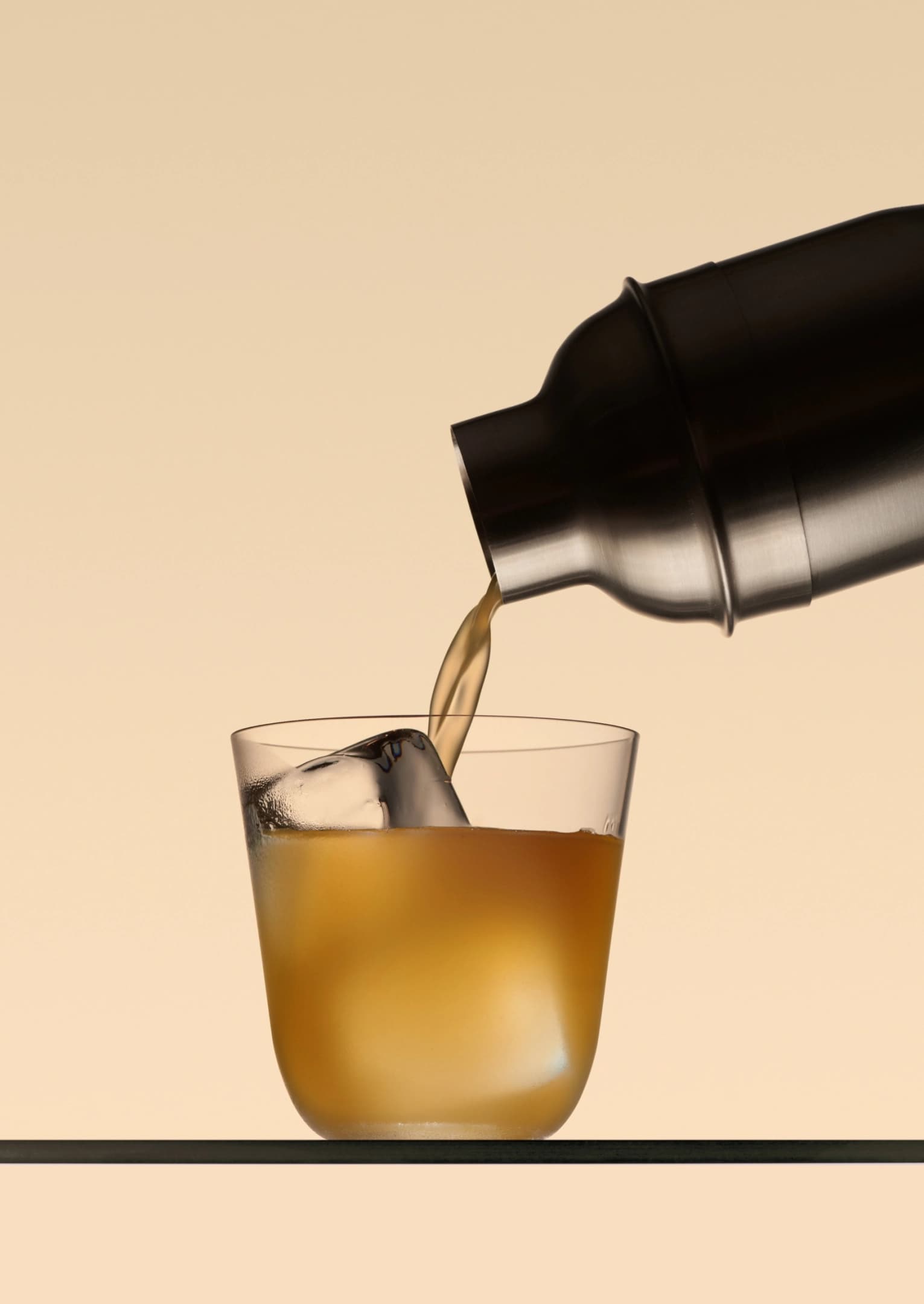
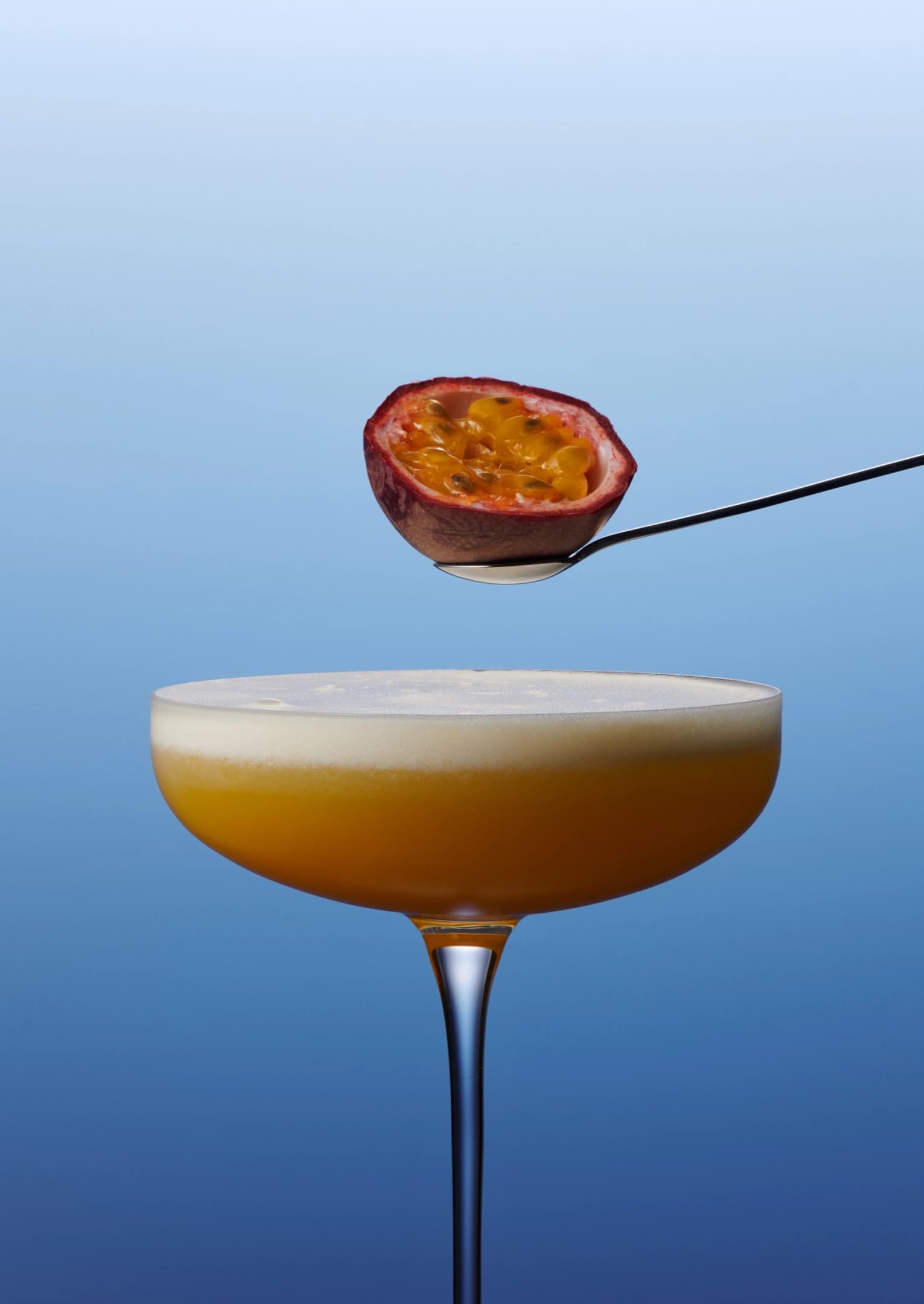
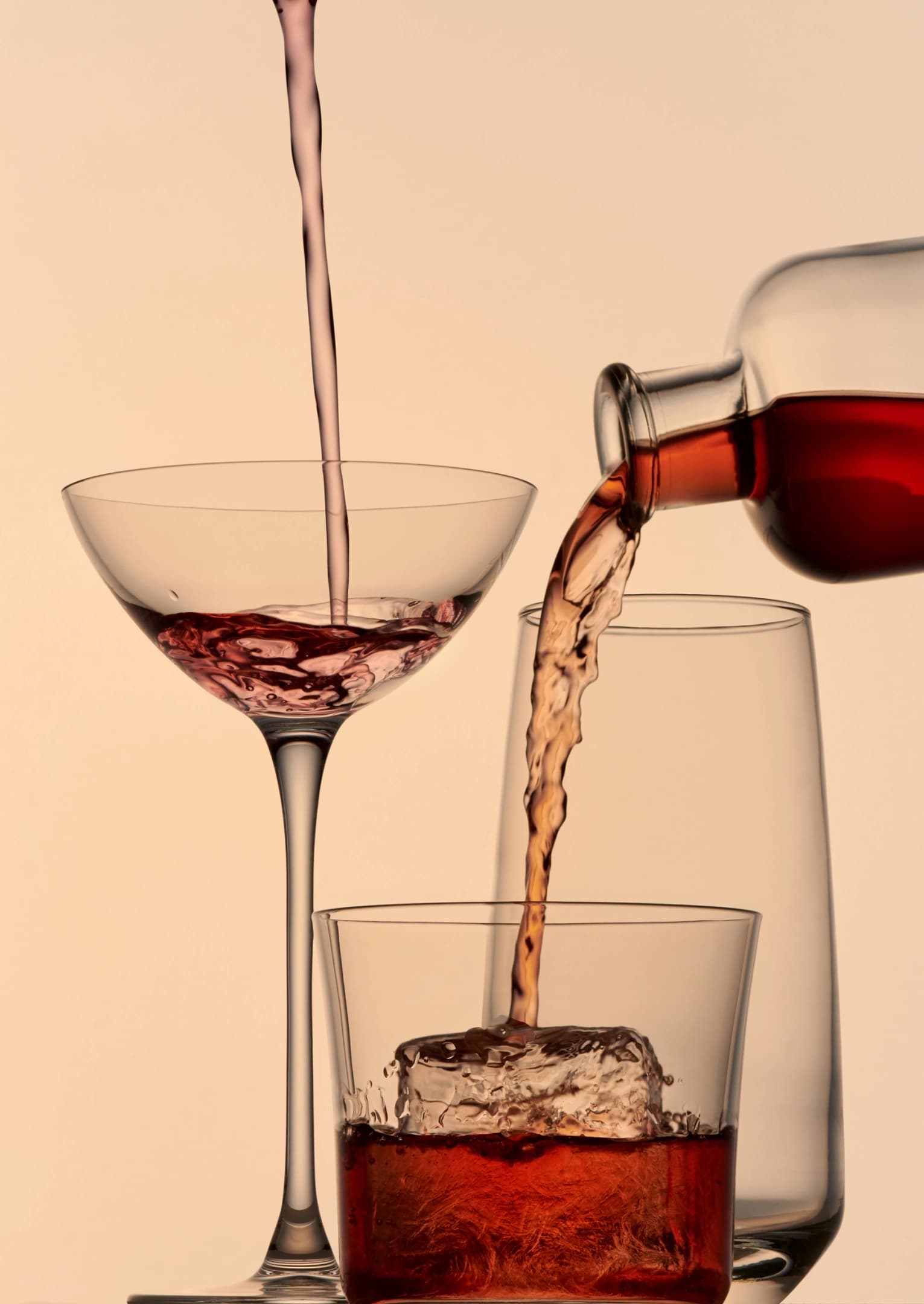
A minimal palette of black, white and off-white forms the foundation, adaptable to each drink’s tone. To elevate perceptions of pre-batched cocktails, we collaborated with Harel+Ocante to create some of the most delicious-looking drink photography we’ve ever seen.