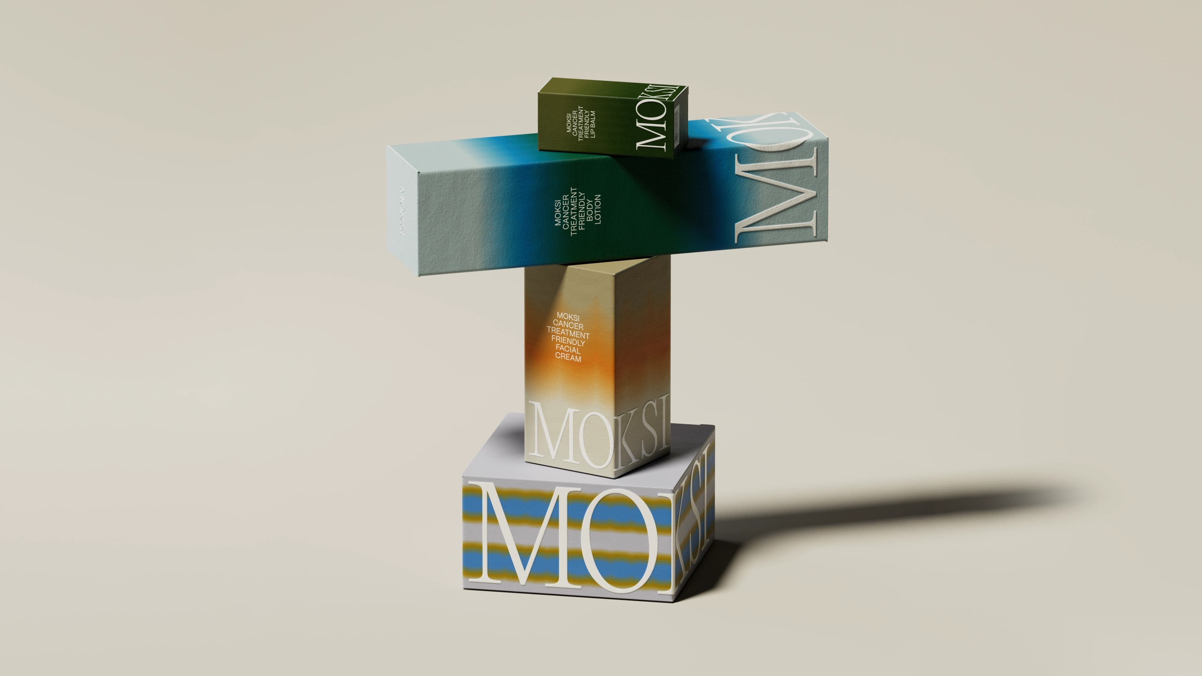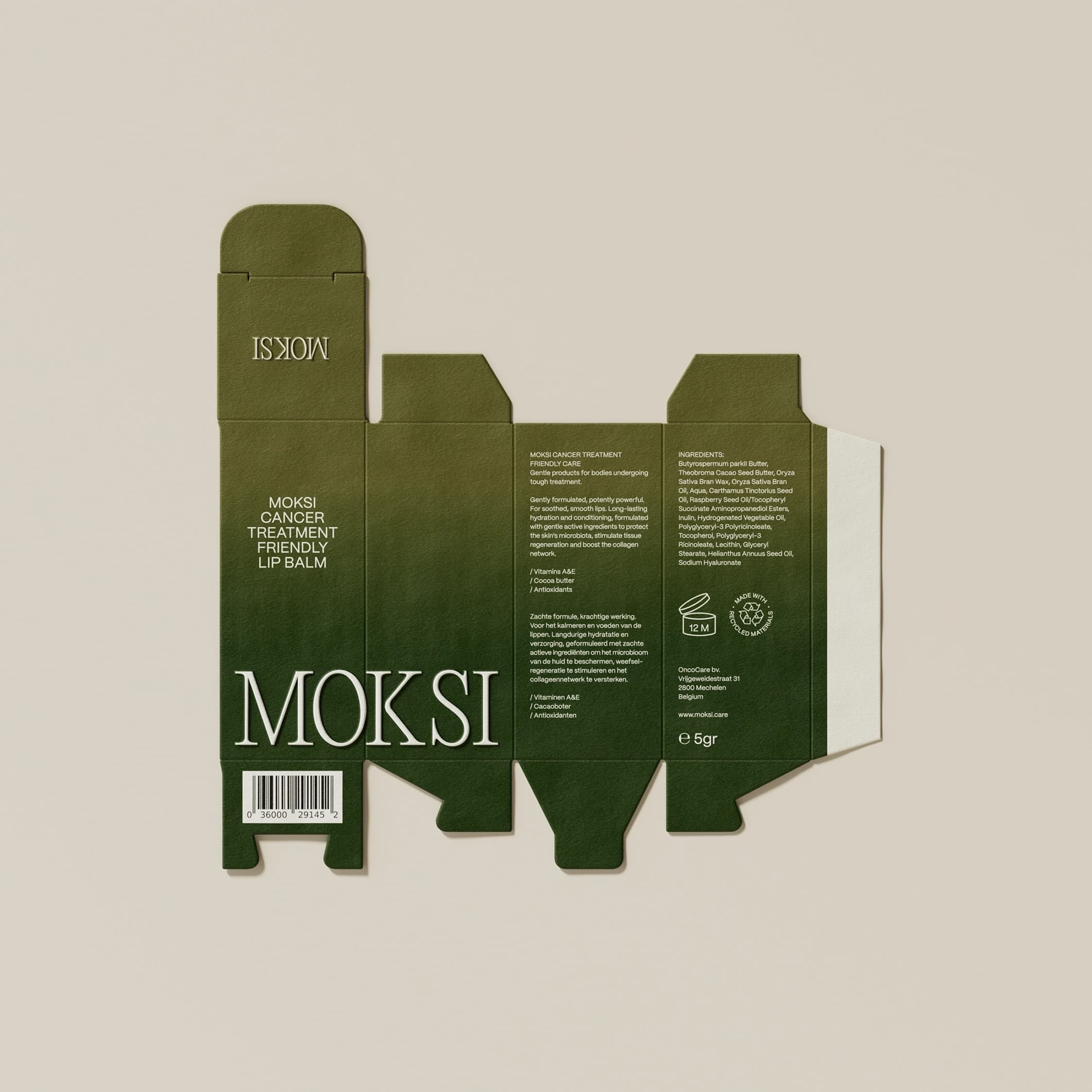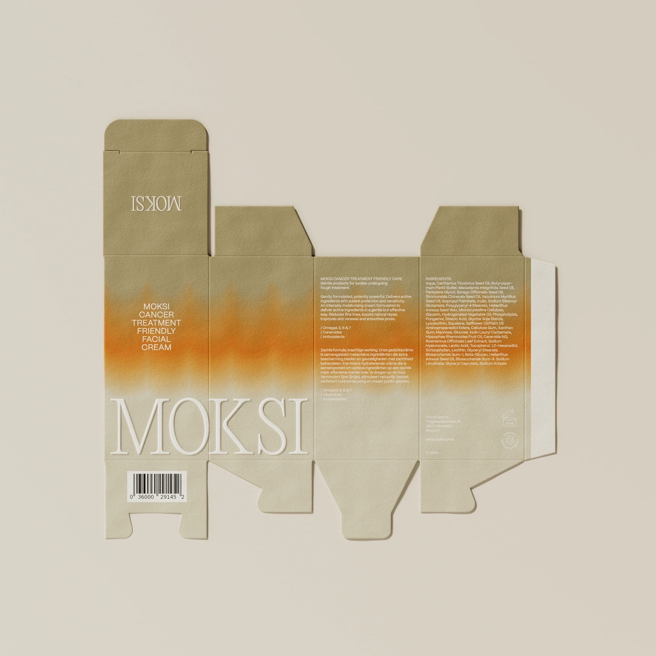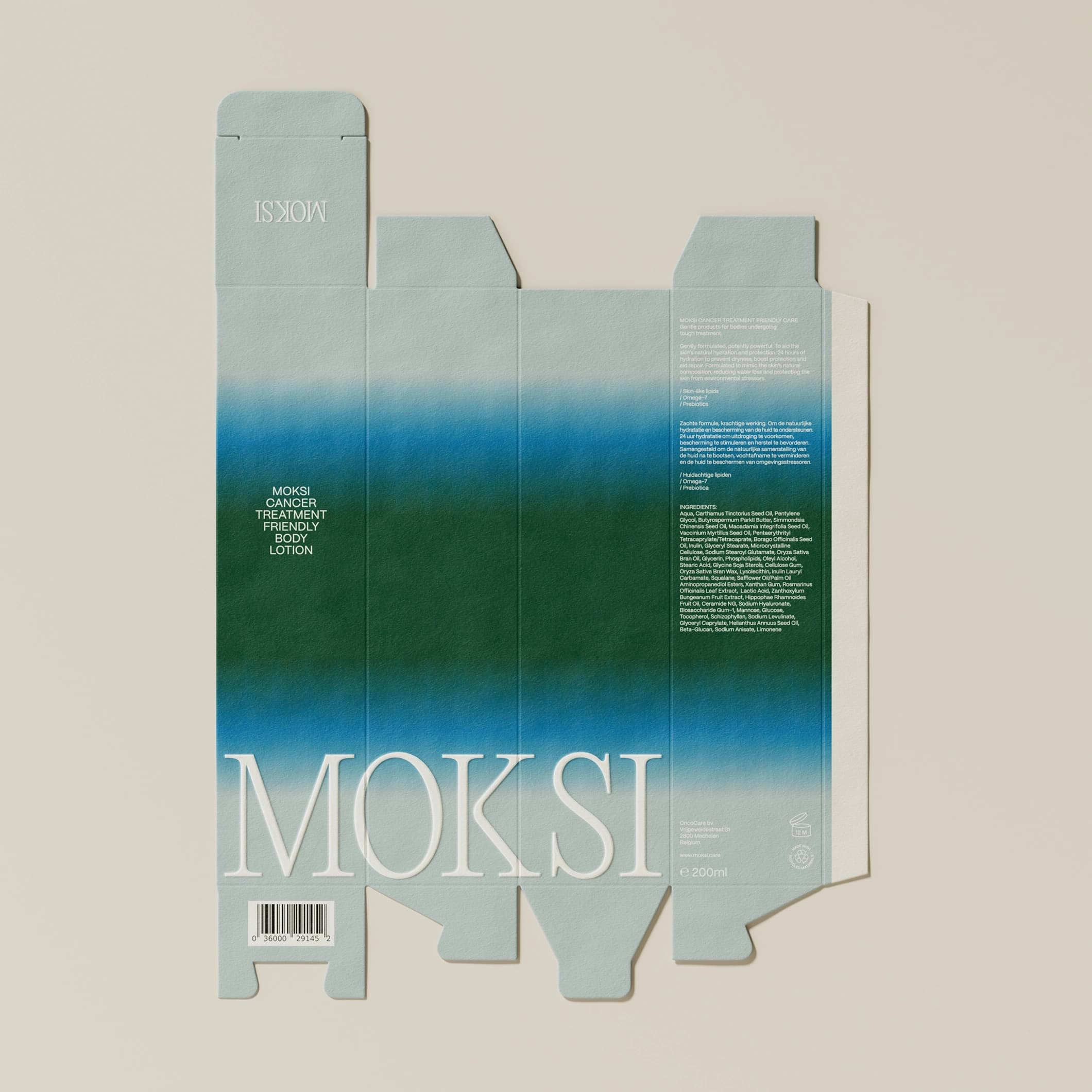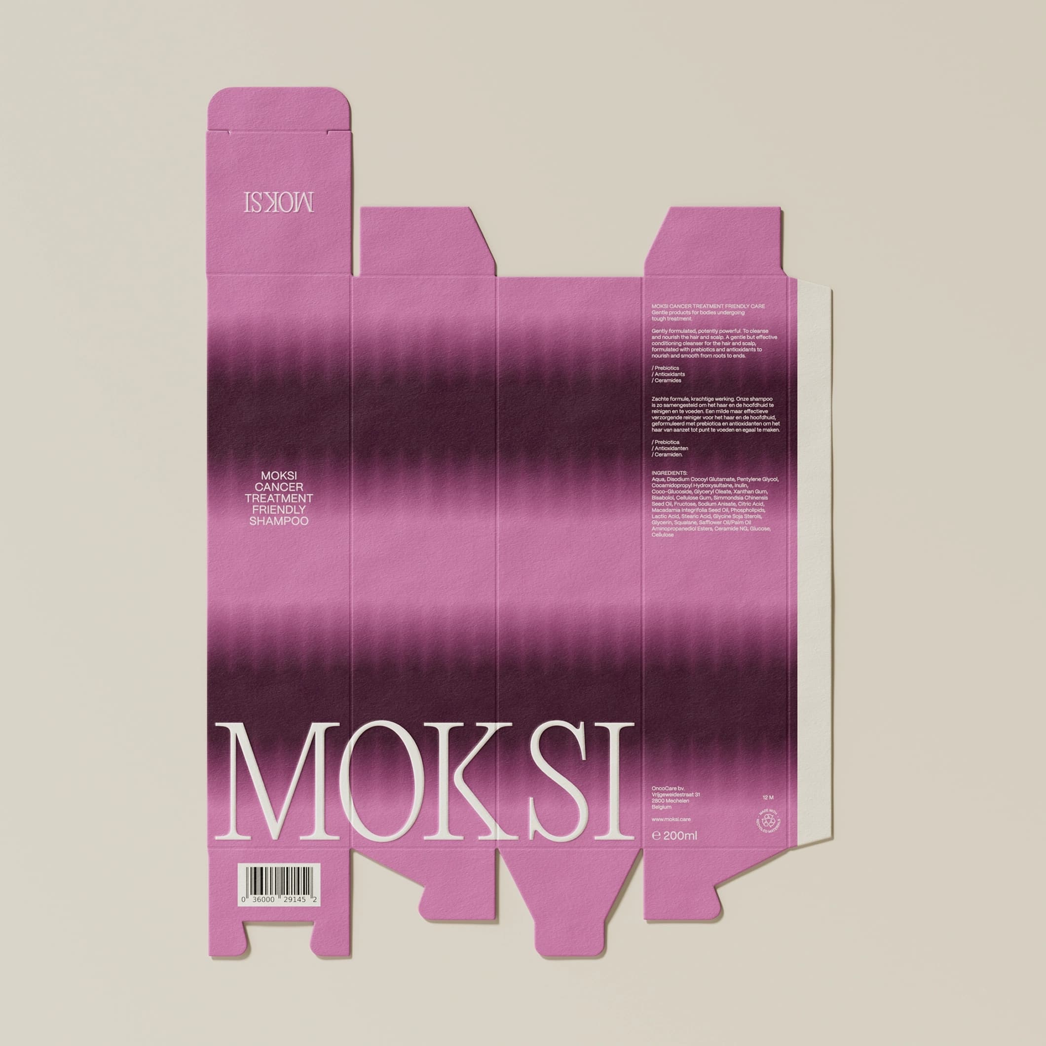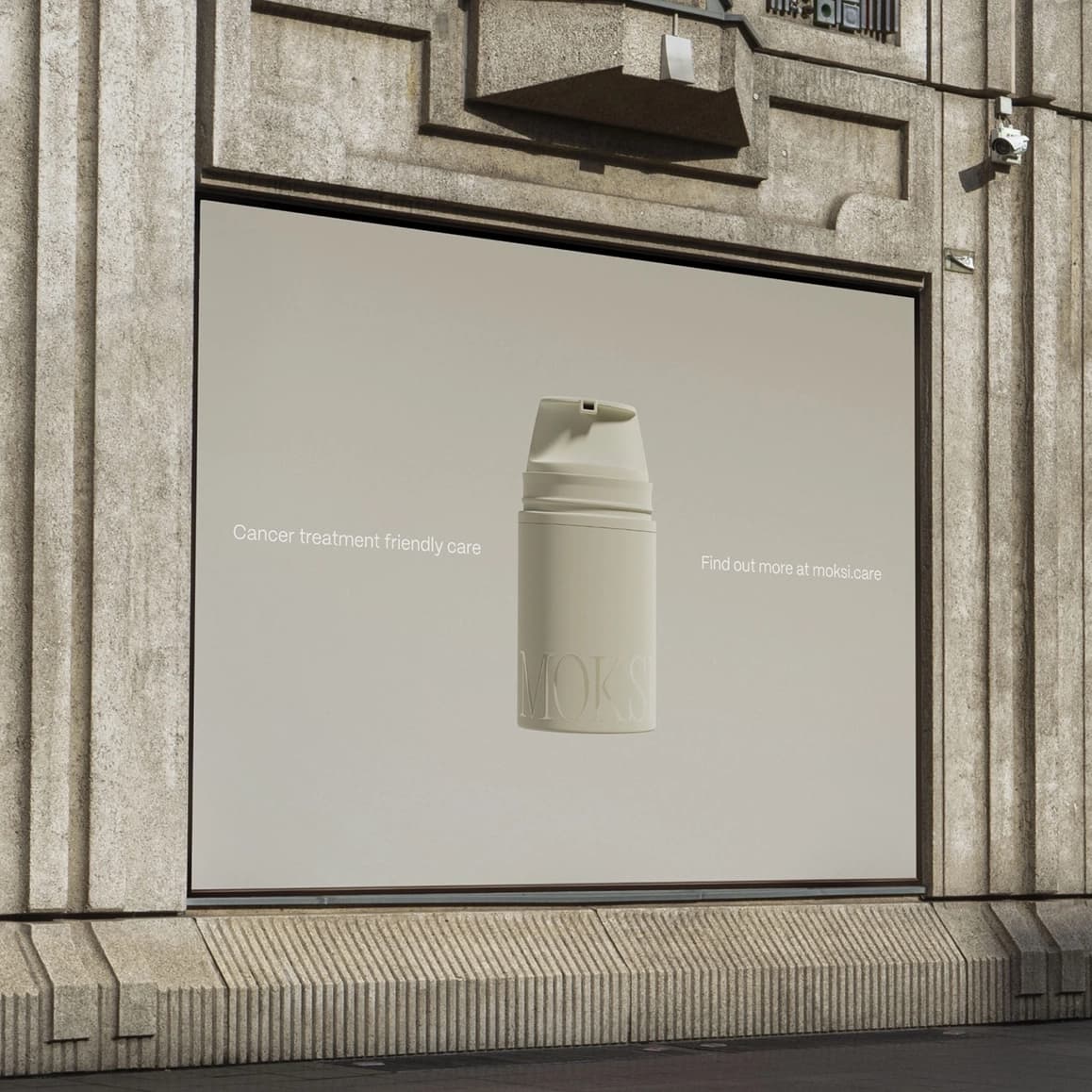
In late 2022, entrepreneur Lies De Nyn approached us to launch a unisex skincare line. Having overcome breast cancer, Lies had firsthand experience sourcing skincare compatible with cancer treatments, a challenge that inspired her venture.
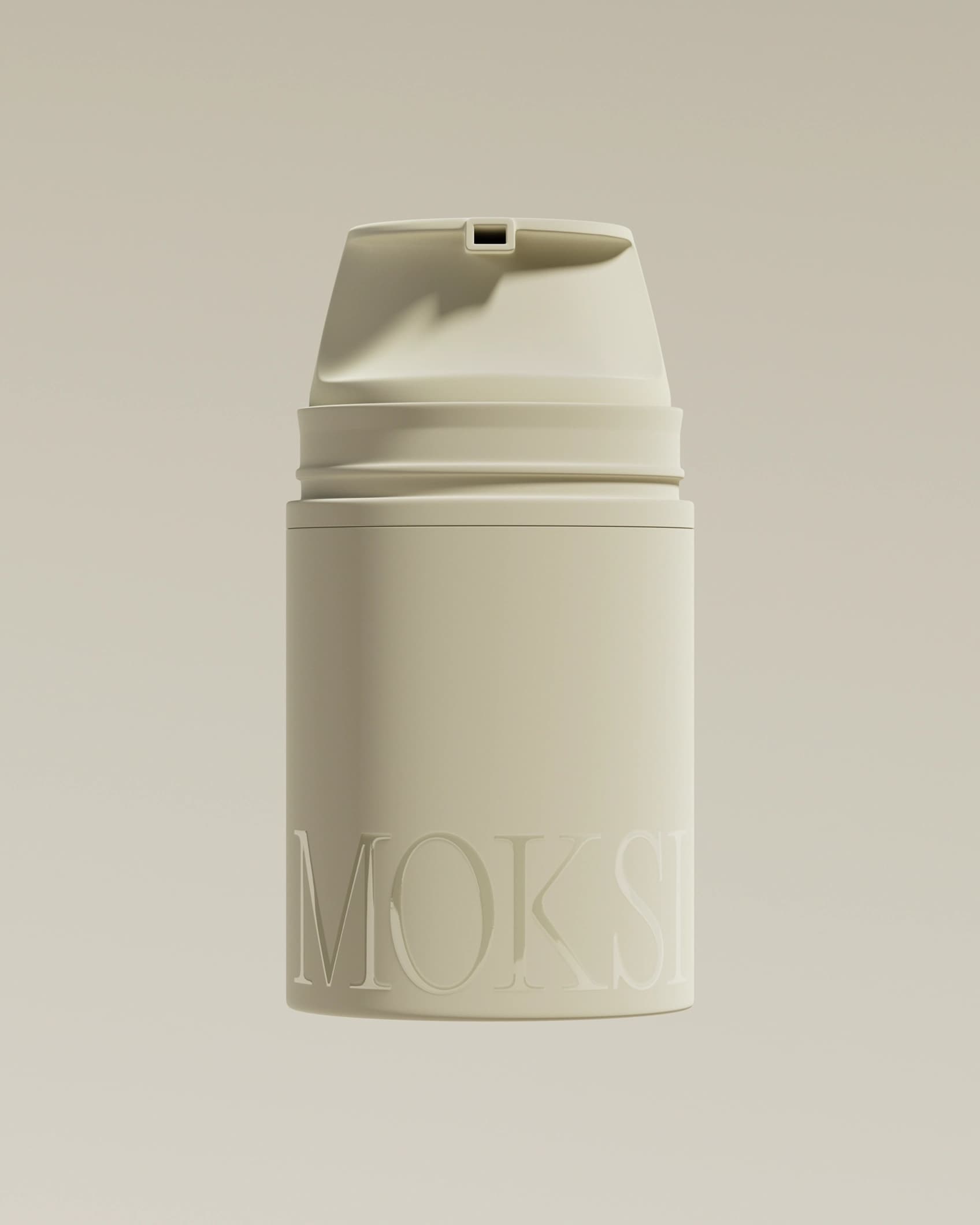
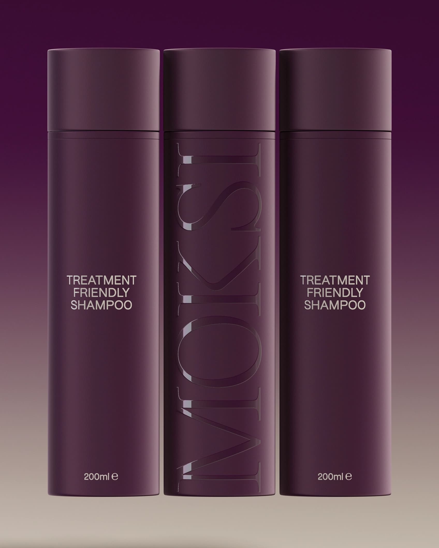
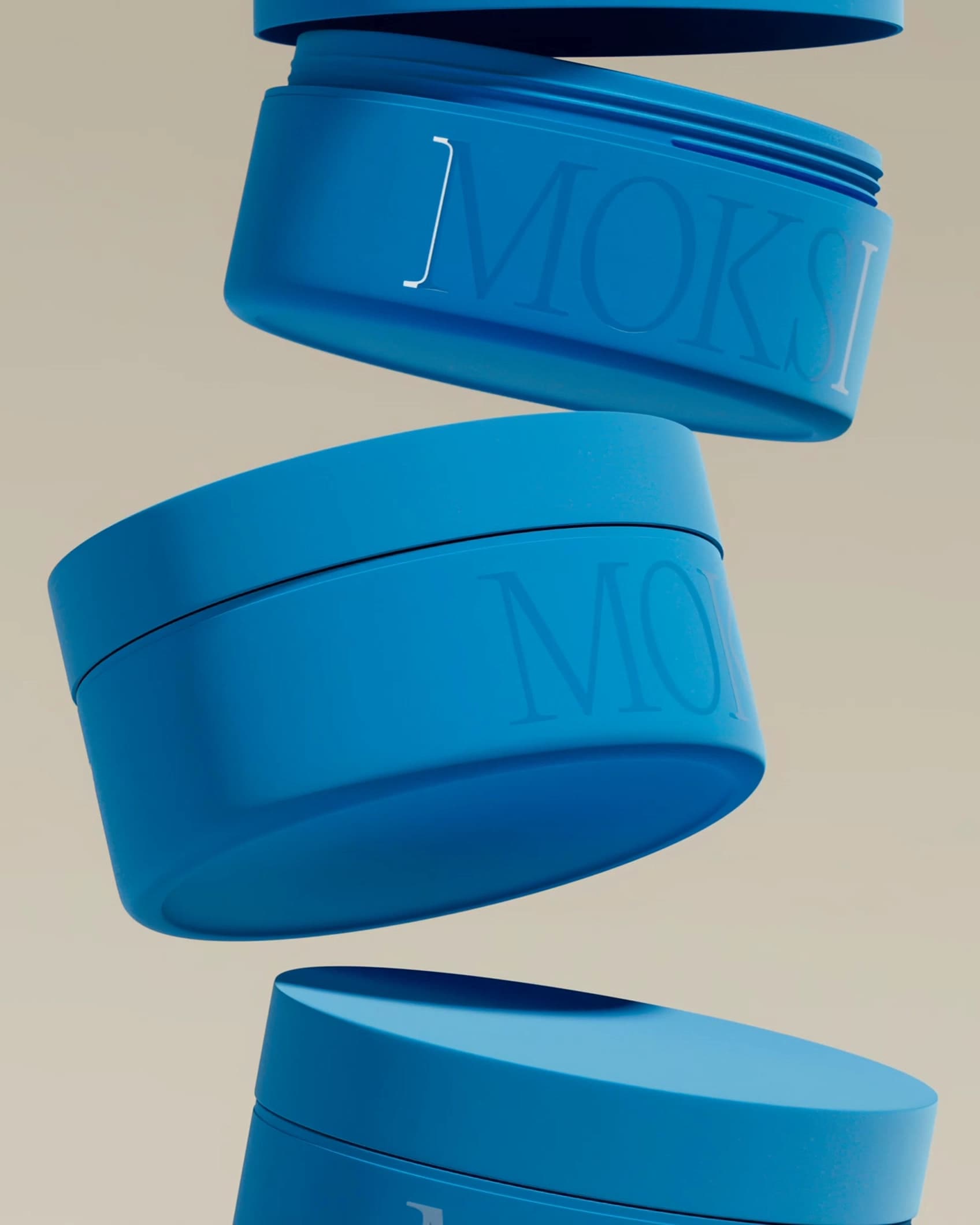
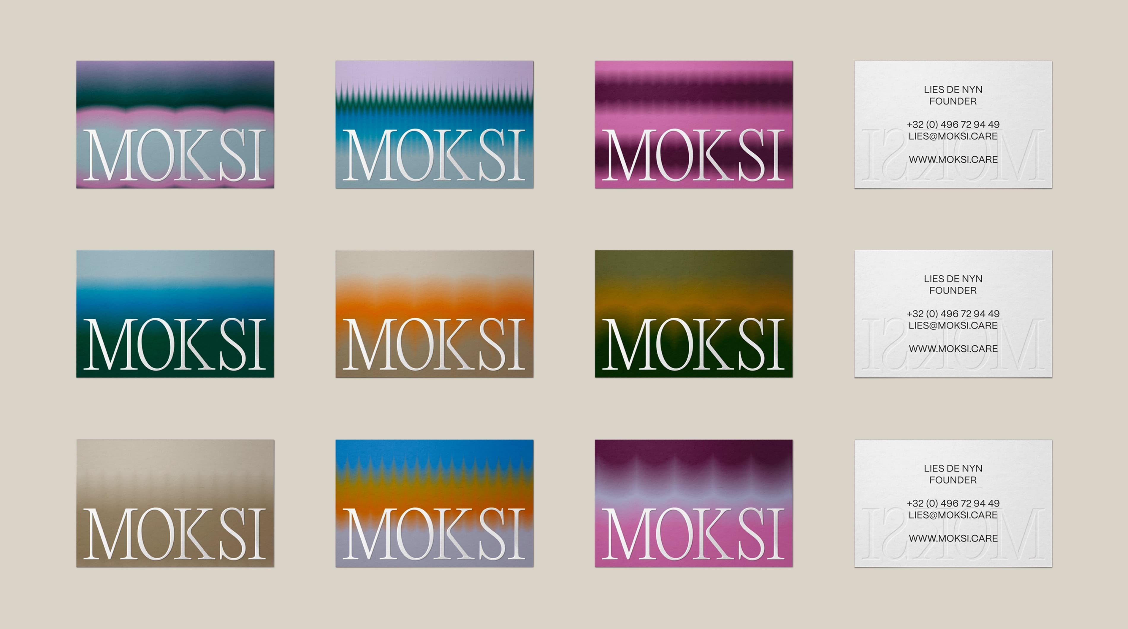
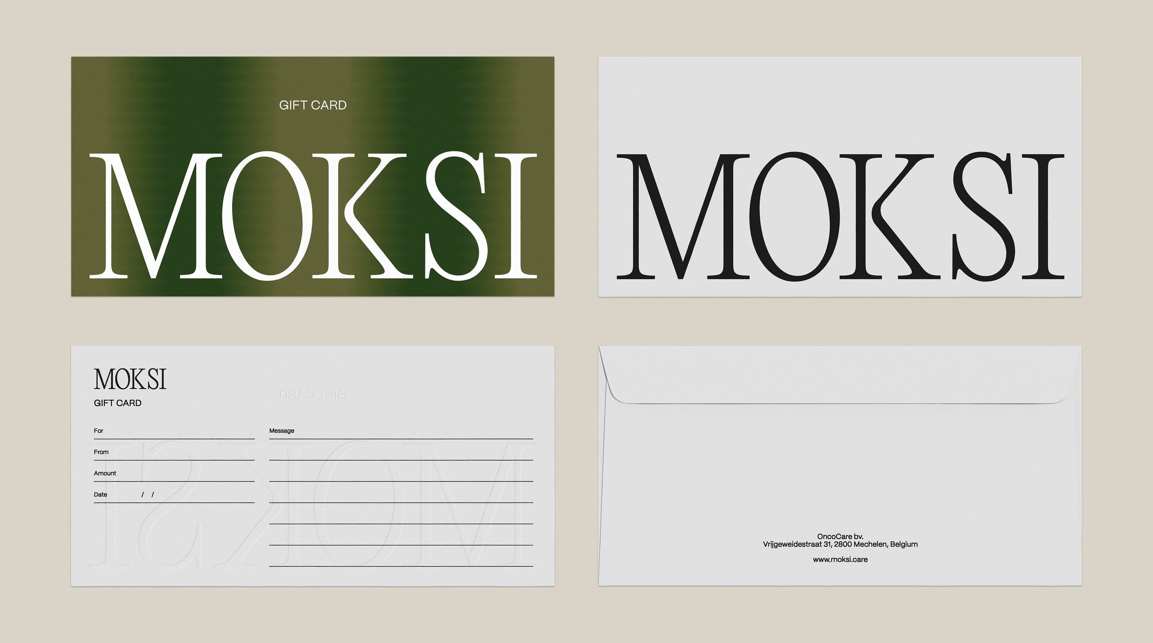
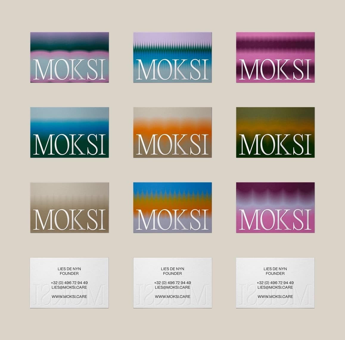
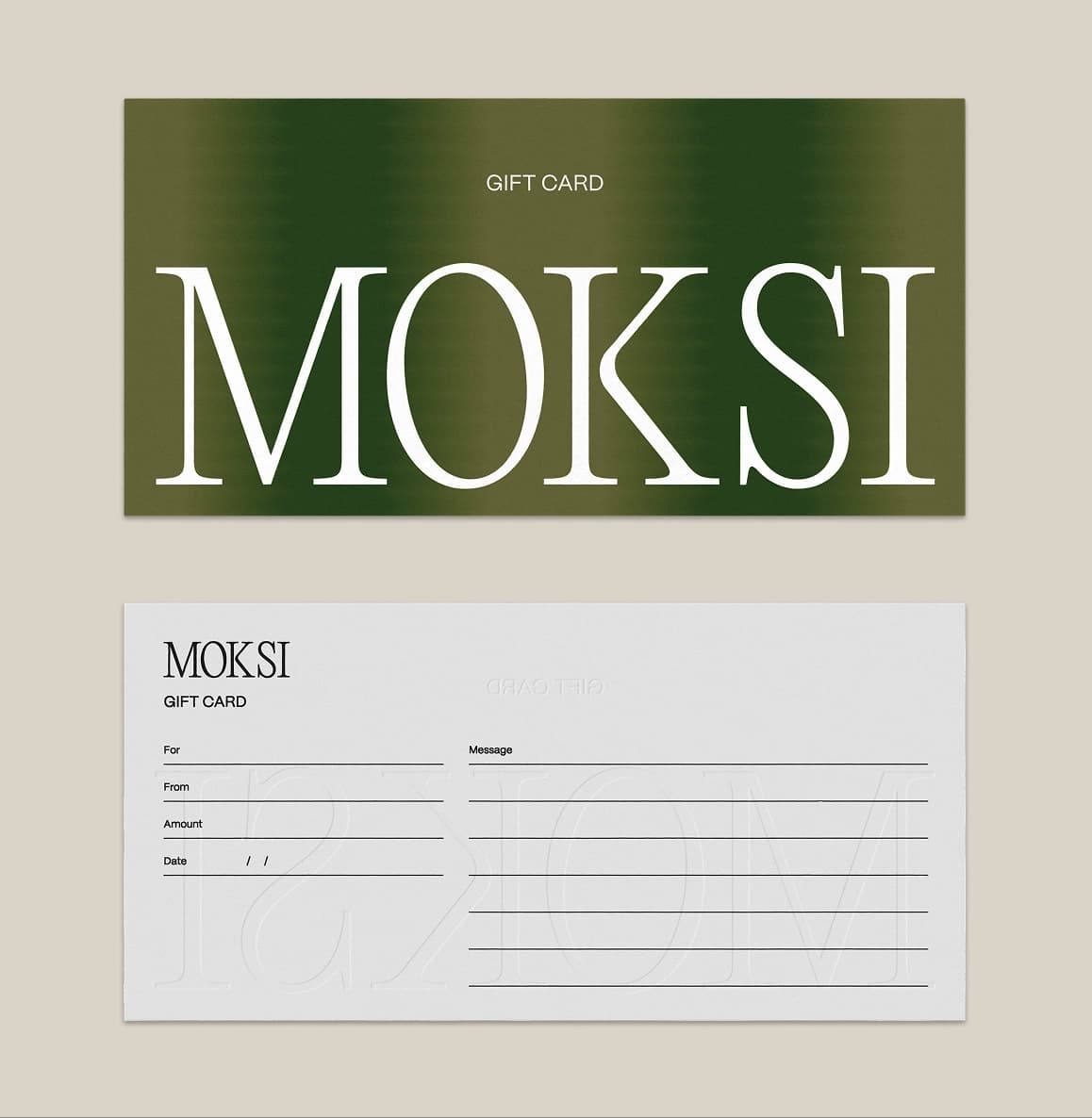
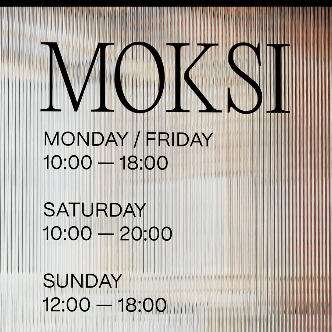
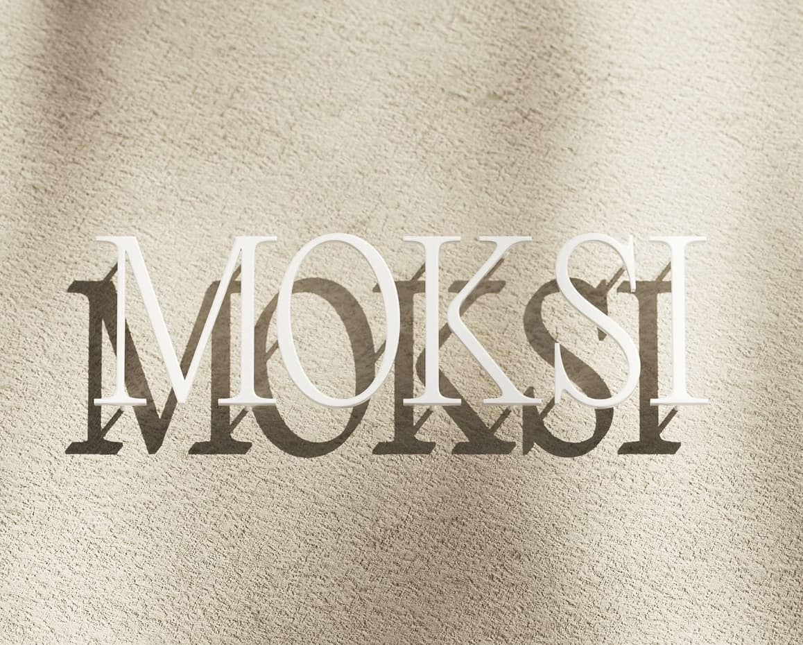
Our collaboration began at inception. Upon meeting Lies, the word “moxie” immediately resonated, leading to a distinctive spelling with a strong ‘K’, a key logo element that gave the brand neutrality beyond traditional femininity. We selected PP Editorial New Ultralight and PP Mori Regular by Pangram Pangram, balancing a classic serif with modern clarity. The subtle ‘K’ modification enhanced identity and distinction, while Mori ensured legibility and calm.
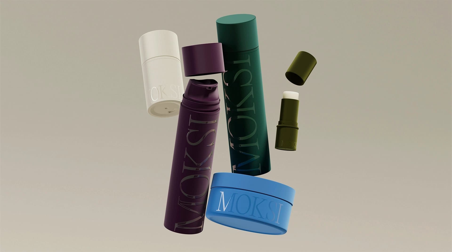
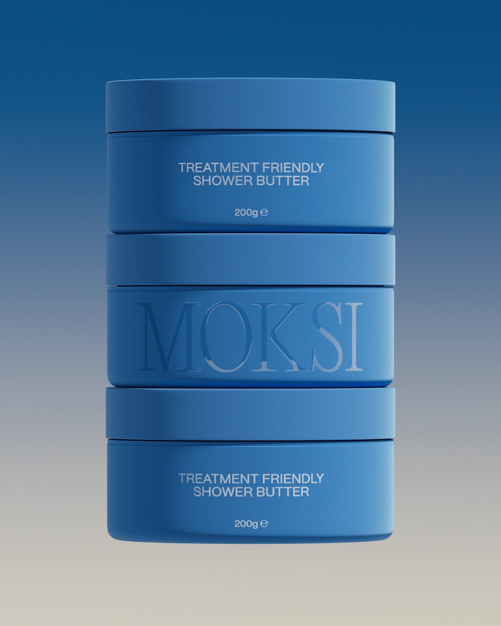
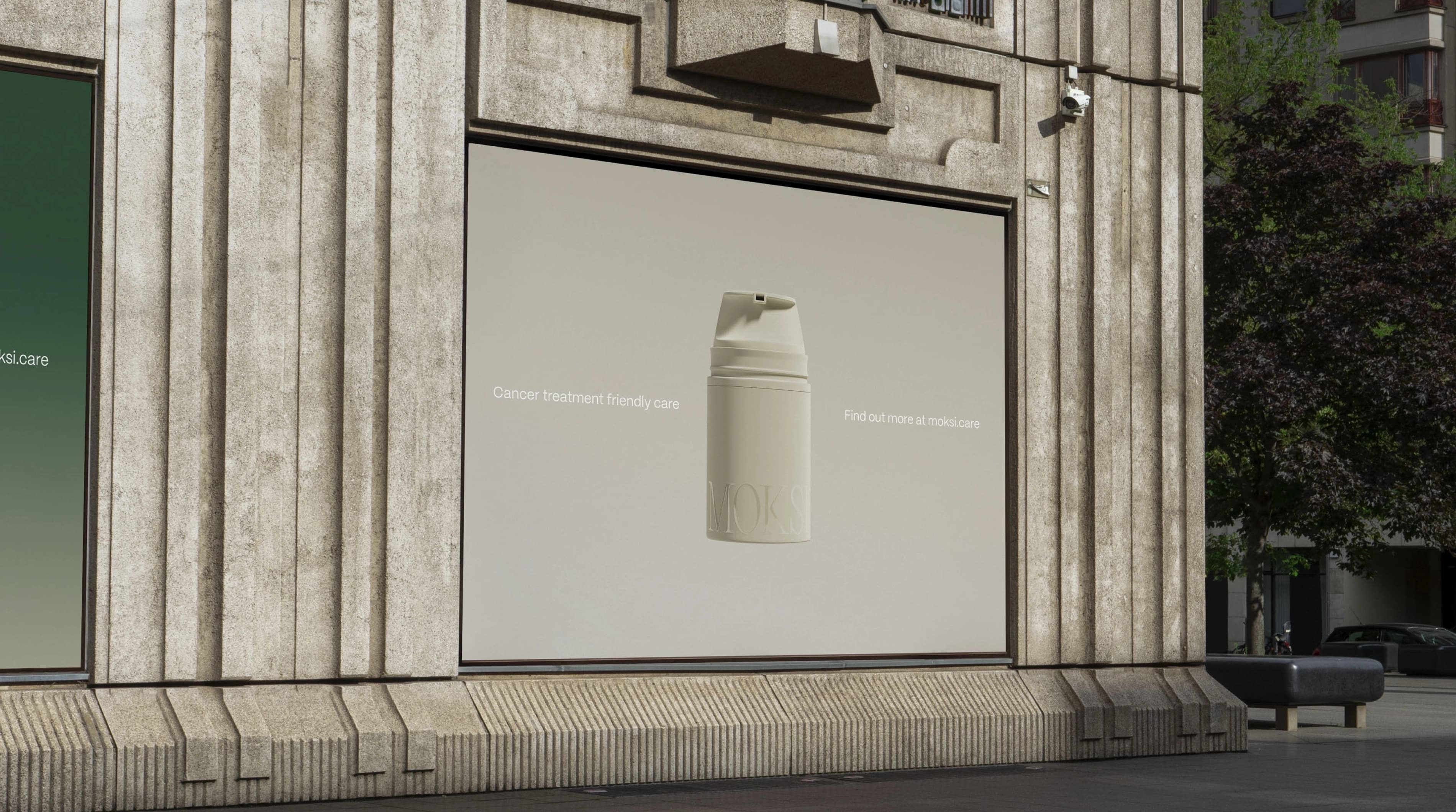
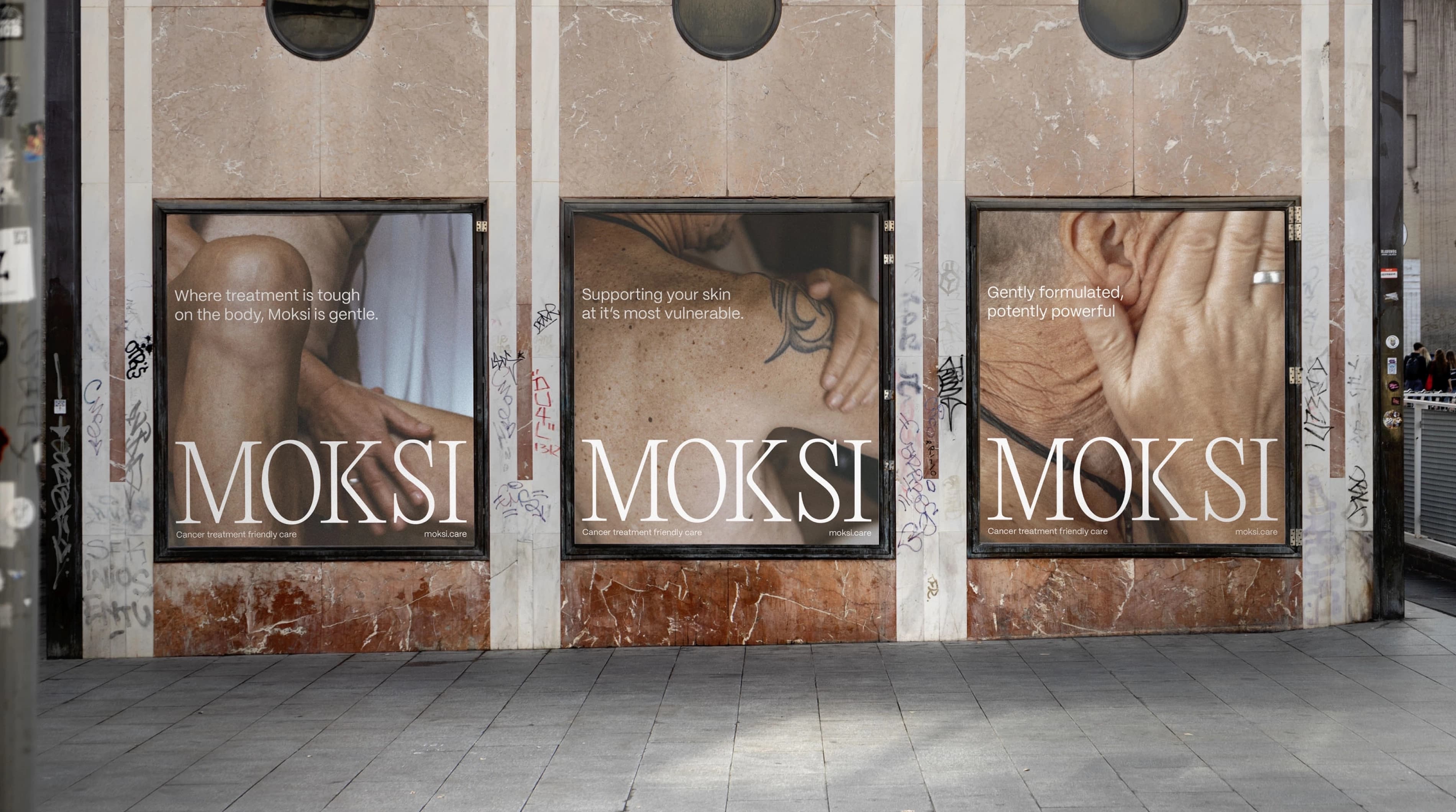
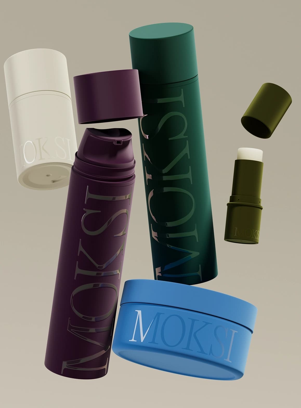
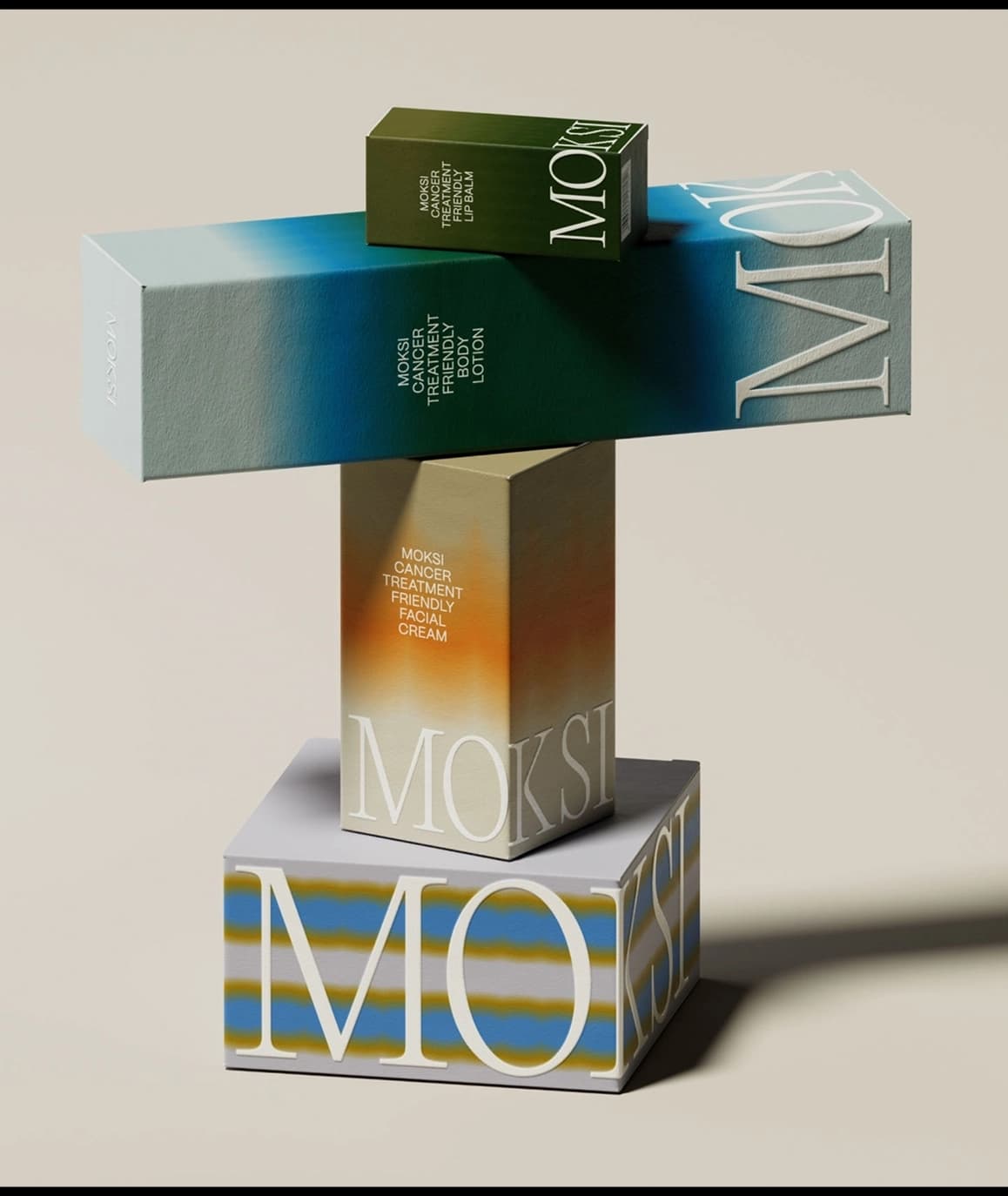
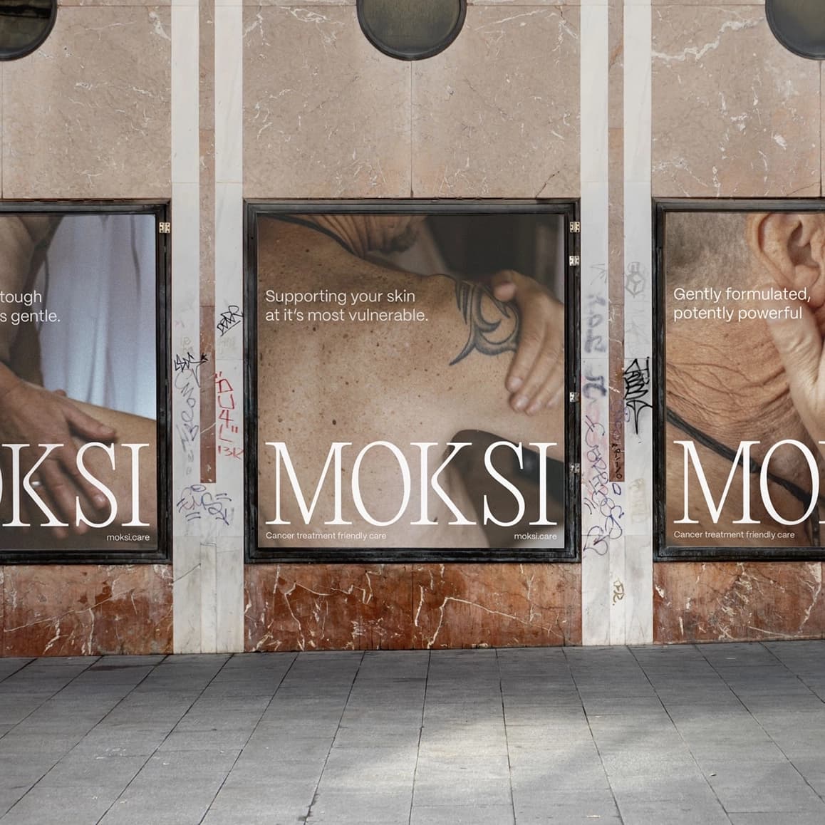
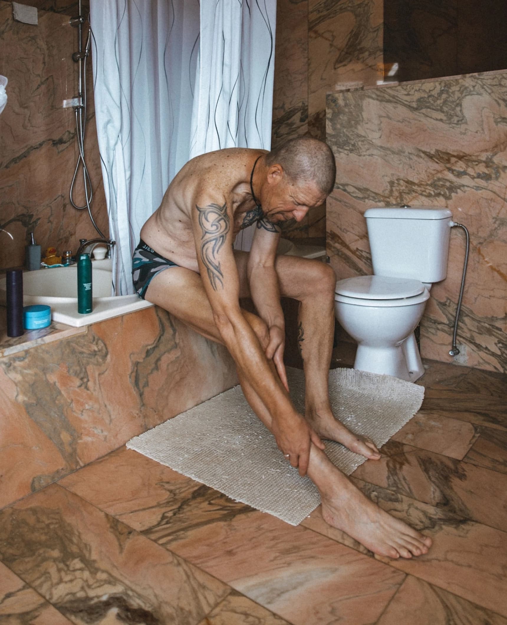
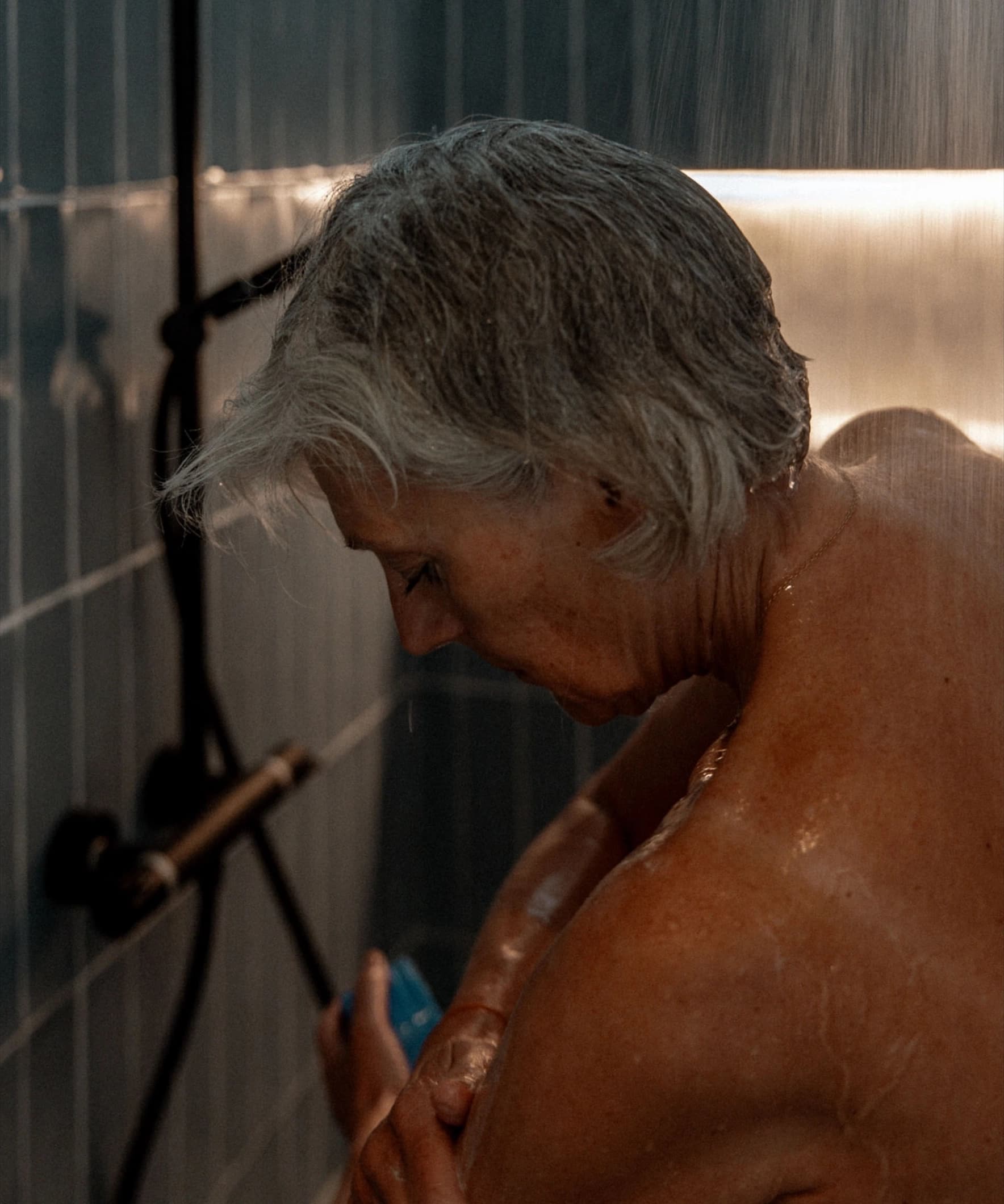
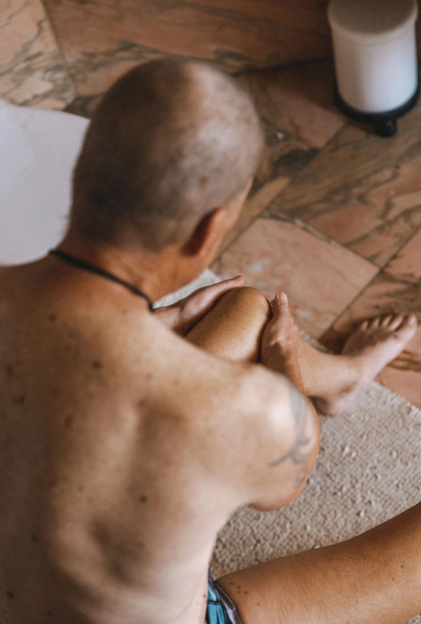
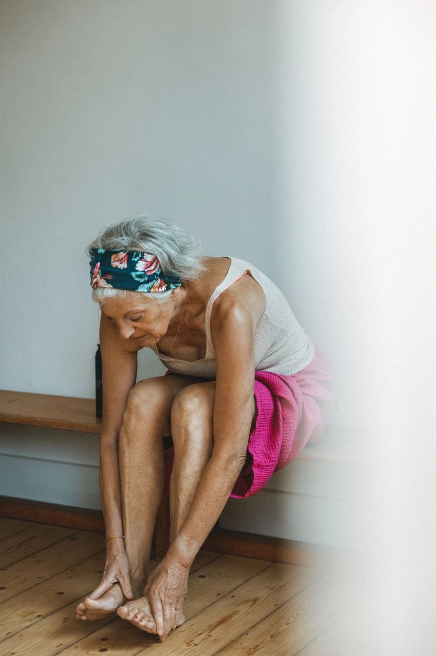
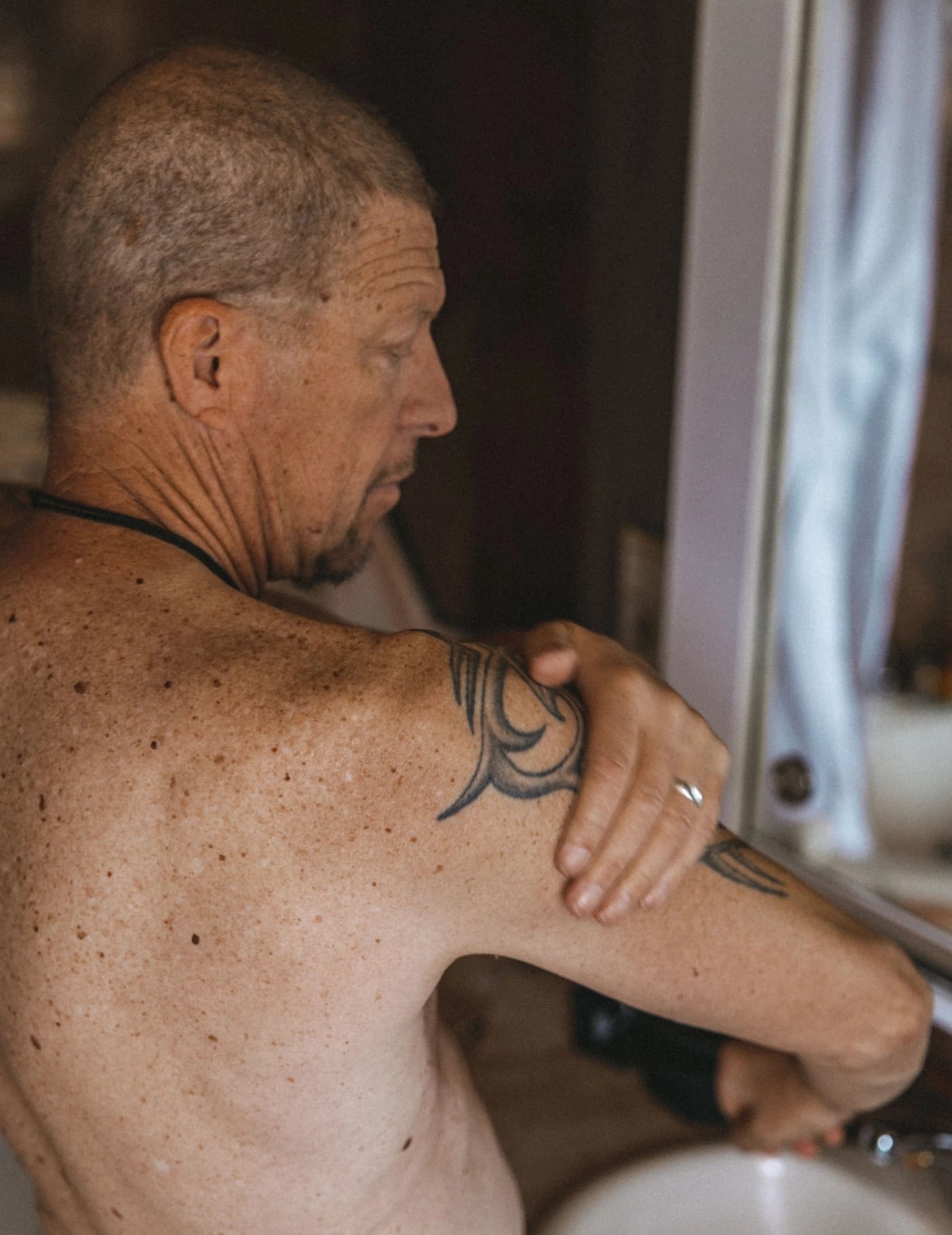
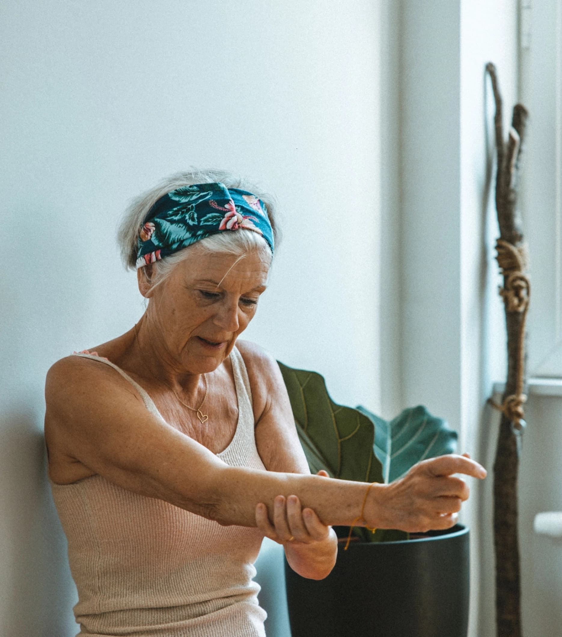
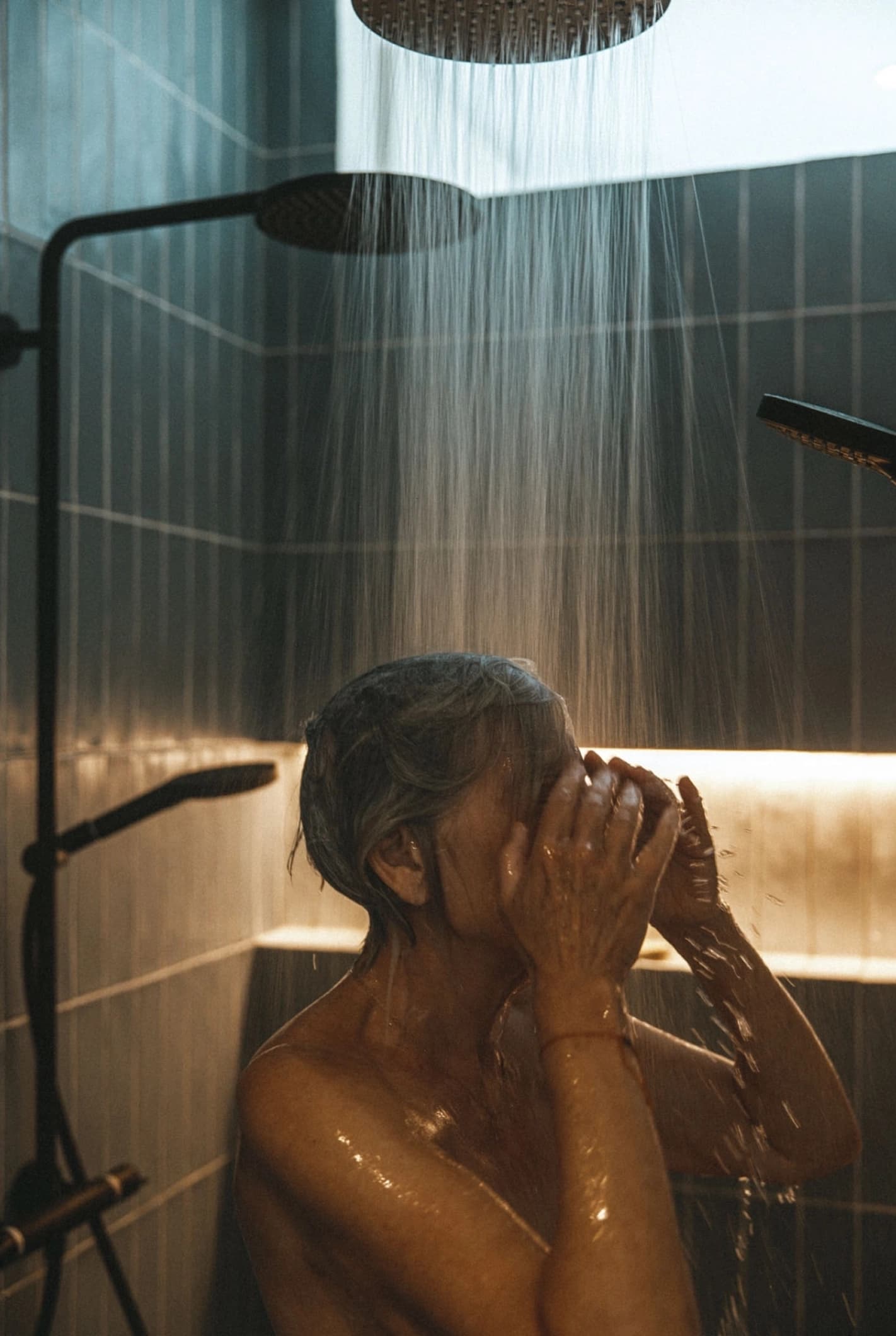
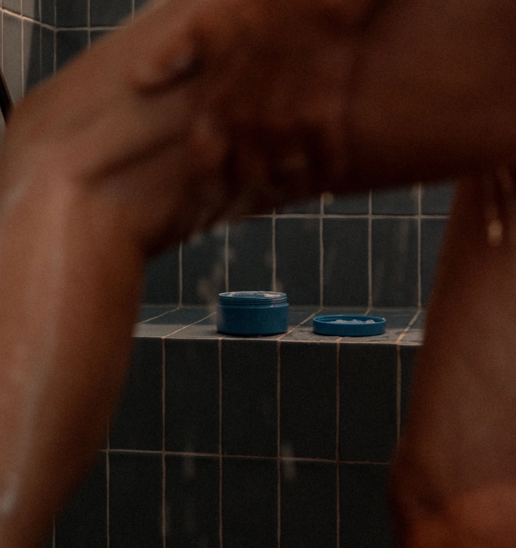
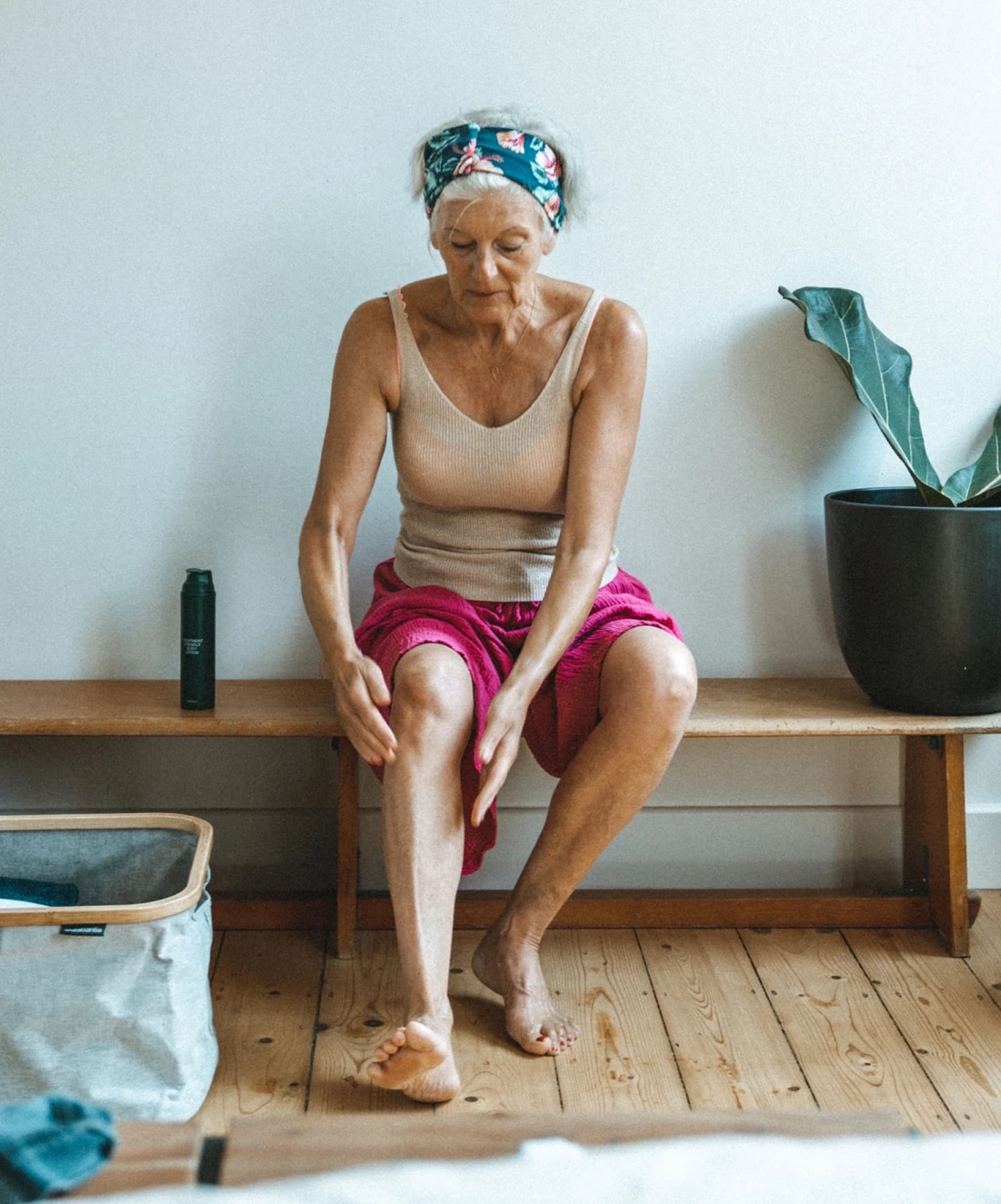
The colour palette drew from dawn-sky gradients, symbolising new beginnings and optimism. Clean product design ensured accessibility and shelf differentiation through unique tones. Photography in natural light captured real people and authenticity, reinforcing the brand’s commitment to transparency and connection.